At the end of 2023, I felt that I had stagnated as a designer. Whether that be from social growth or my own skill set, I felt that something needed to change. That change now stands in this project as the culmination of 300+ hours of work, over 3.6 million social views, and a renewed passion for graphic design.
The idea was to encompass everything I’ve done in sports design into one project for the NBA. That meant new jerseys, new courts, and artworks for each team. As well as new logos where I saw fit.
While I did follow the NBA's current Association-Icon-Statement-City-Classic Jersey model, I made some Association Jerseys cream colored. I also embraced completely colored courts for a few teams, providing the ultimate home court advantage.
The result is my idealized version of the NBA brand. One with 32 teams, a Jazz team in New Orleans, and an All-Star Weekend that feels unique.
After 8 months of work, here is the NBA Redesign Project.
Atlanta Hawks
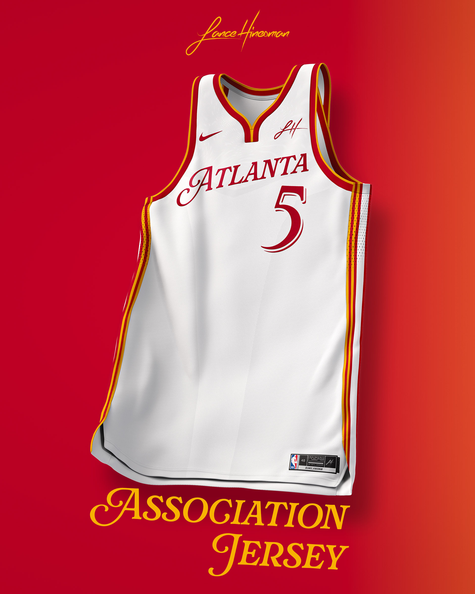
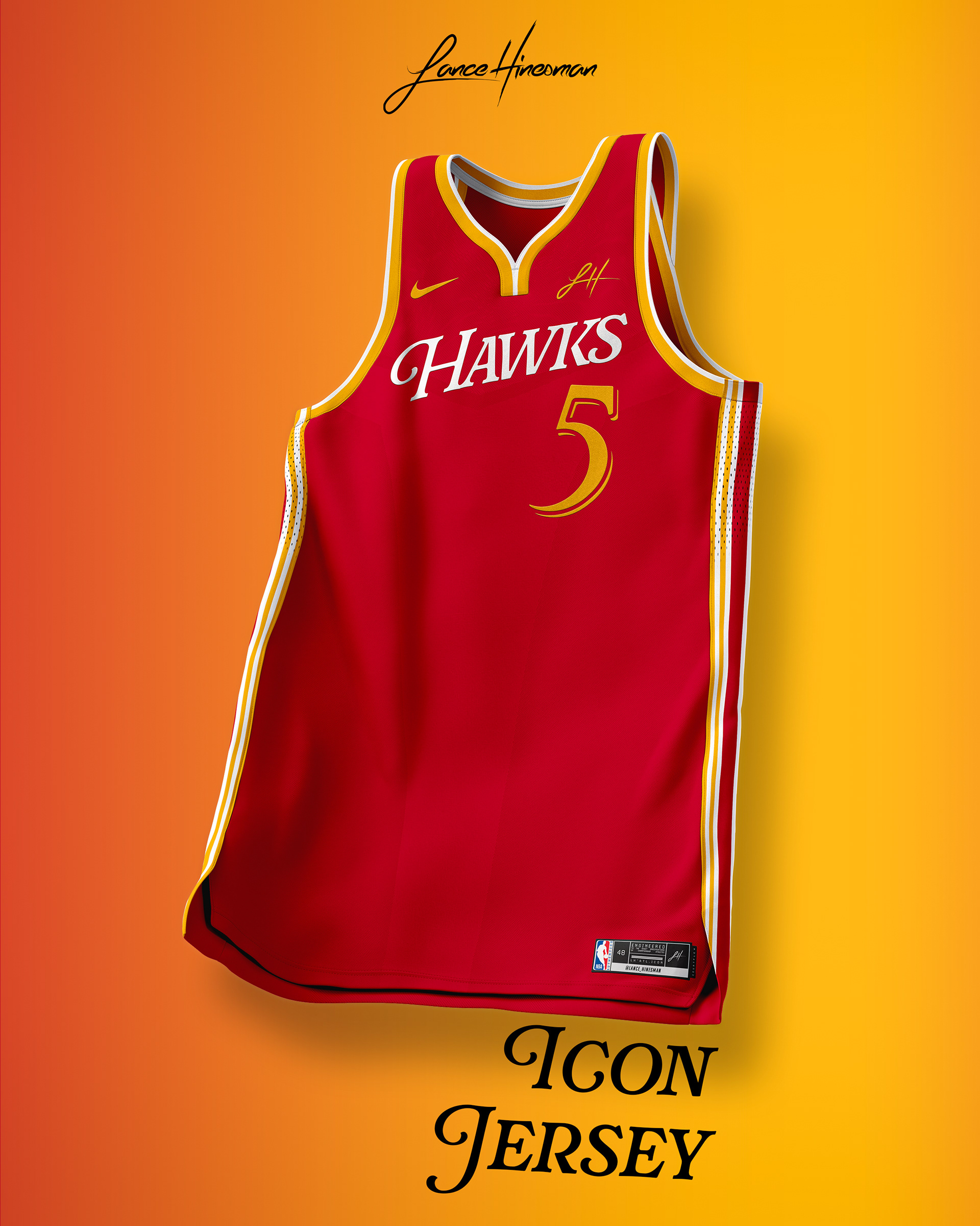
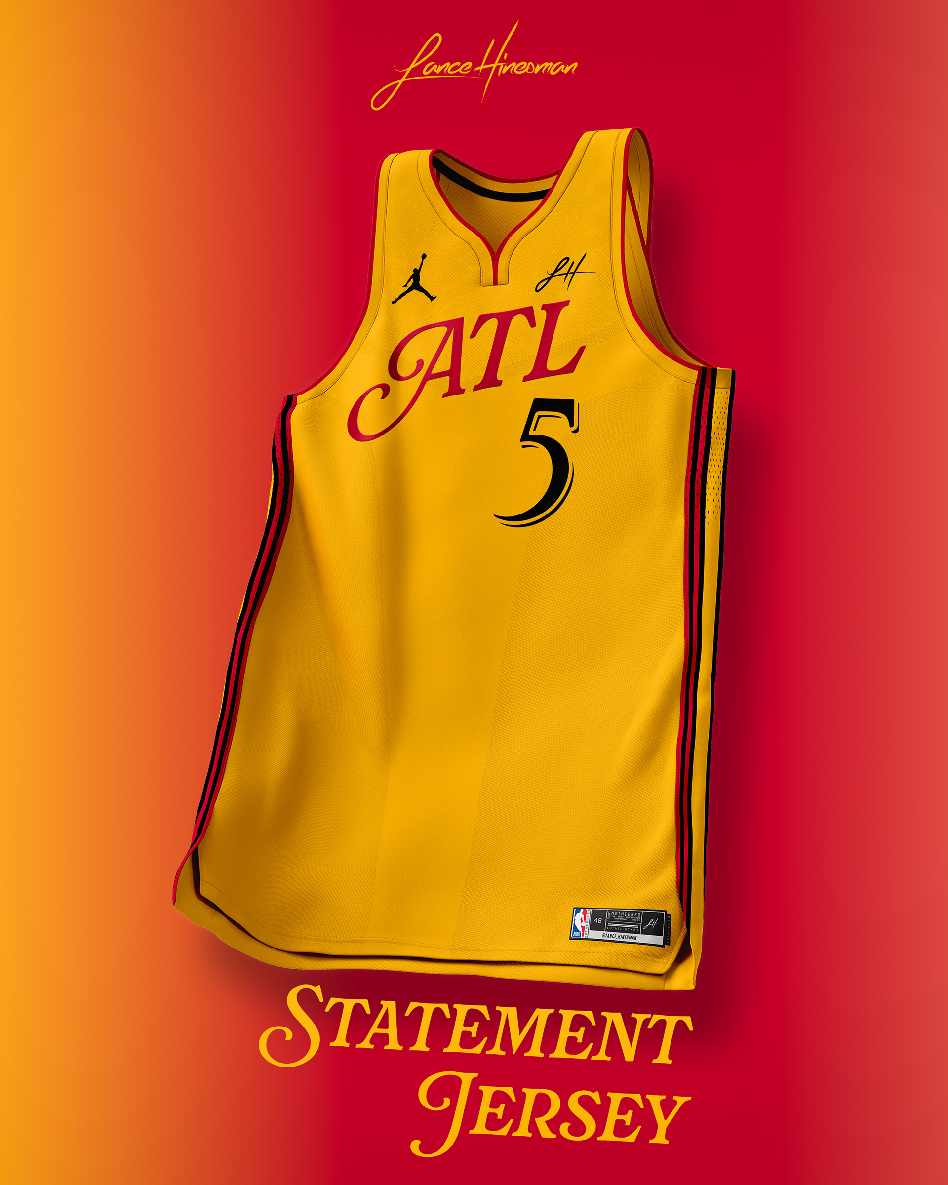
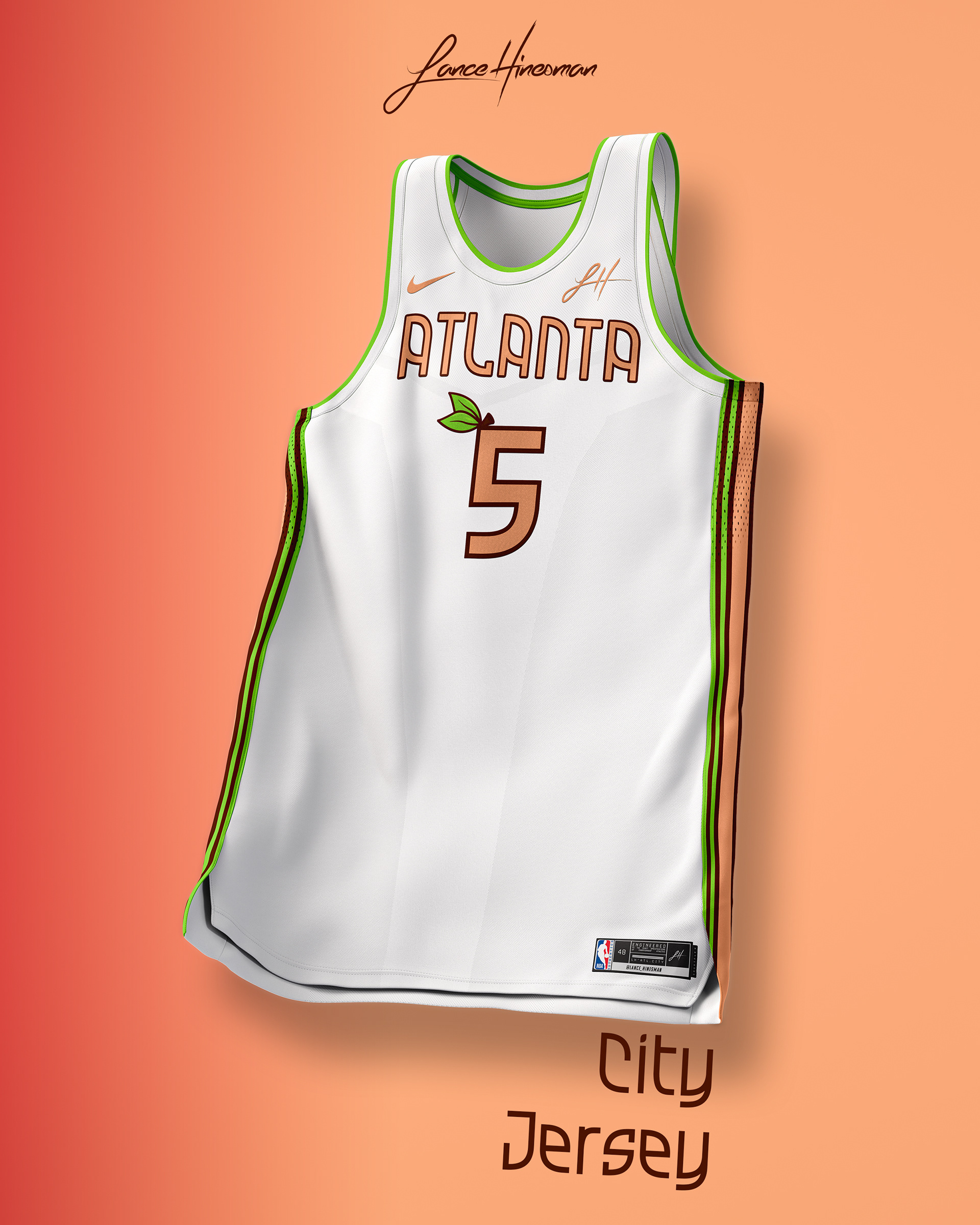
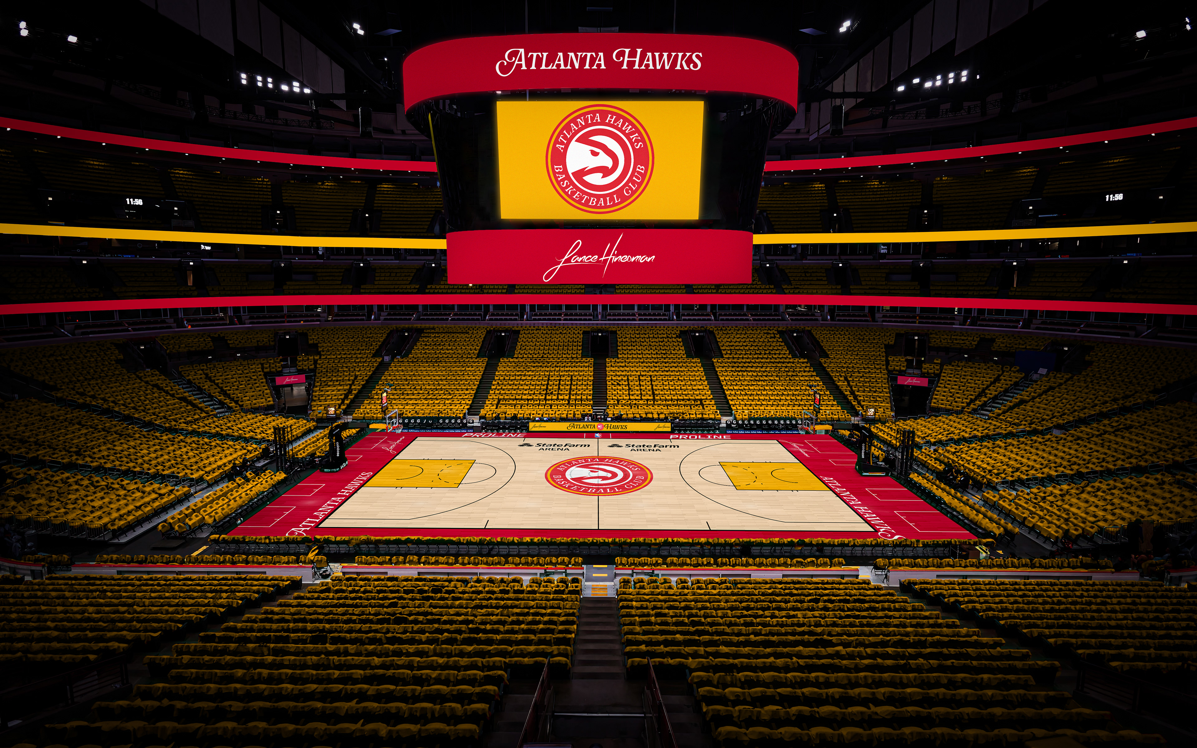
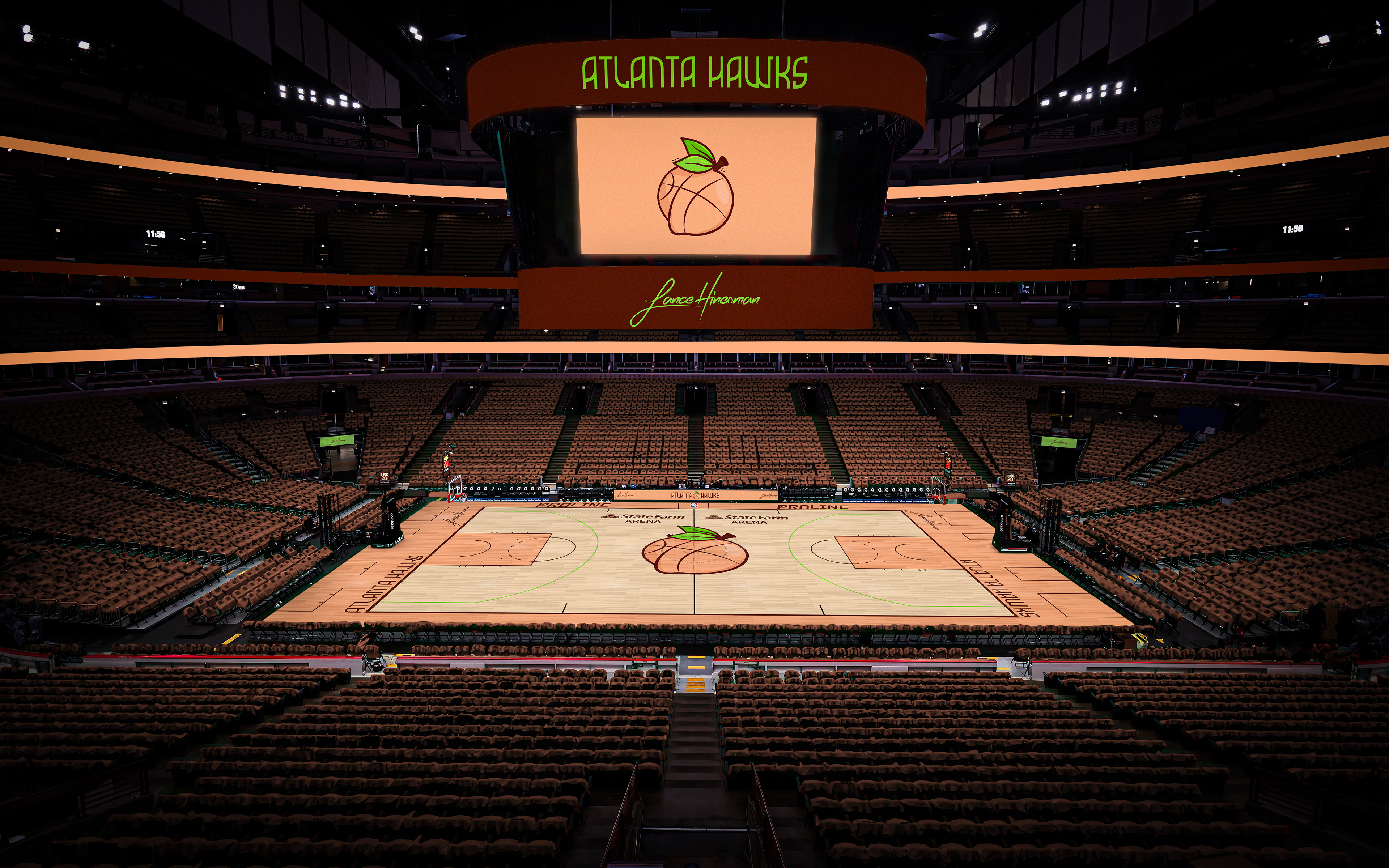
After coming across a font I loved for a school project, I used it for the wordmarks here. The main logo remains the same, just with the updated font. The city branding is inspired by Georgia's nickname with the jersey featuring a leaf on the numbers.
Boston Celtics
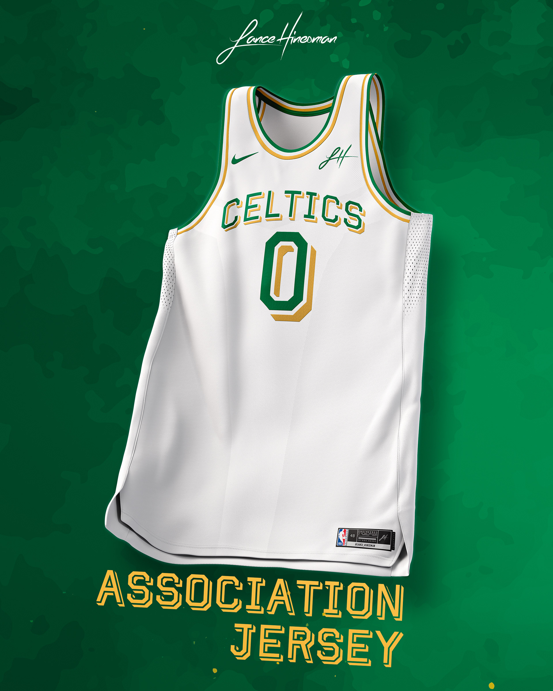
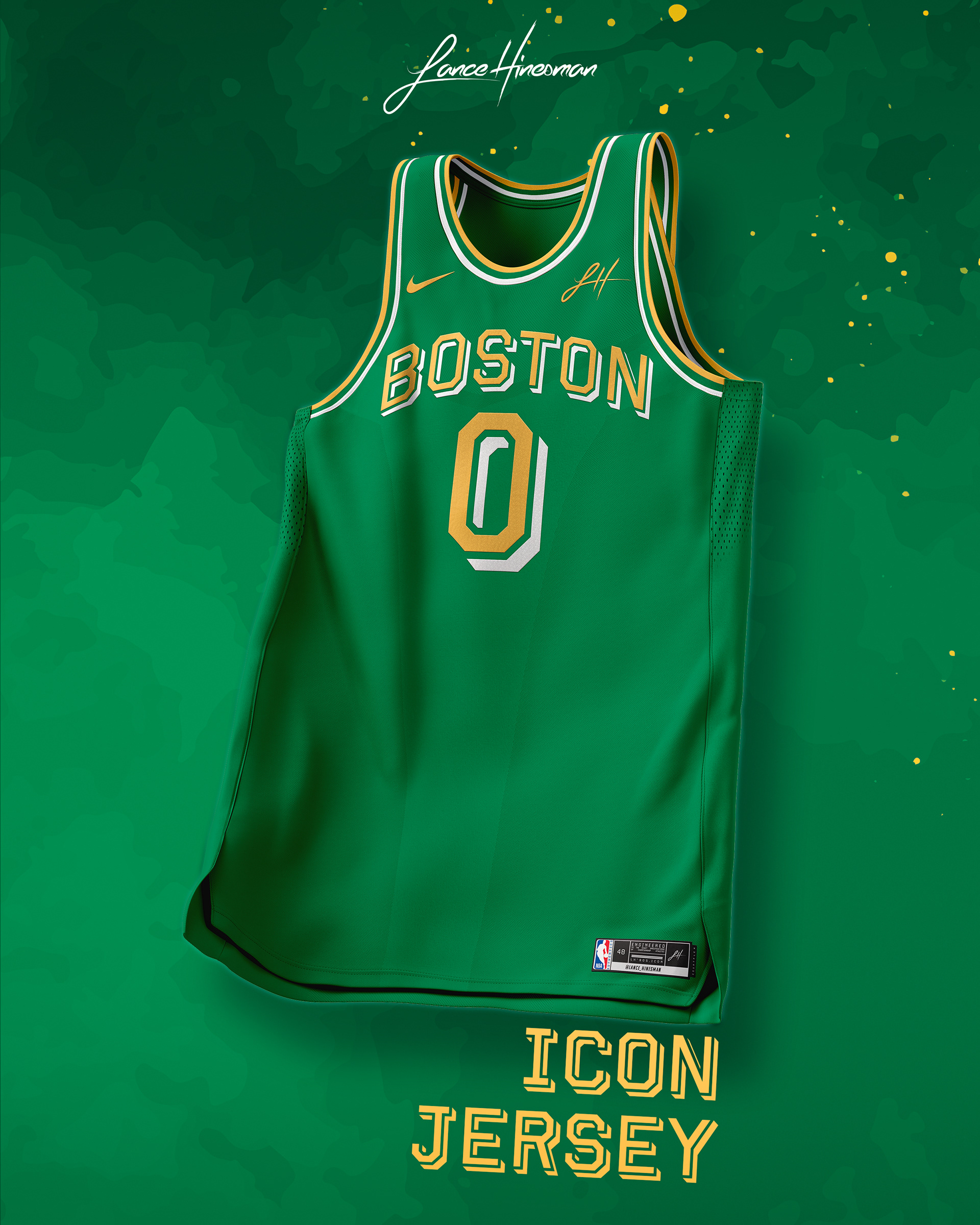
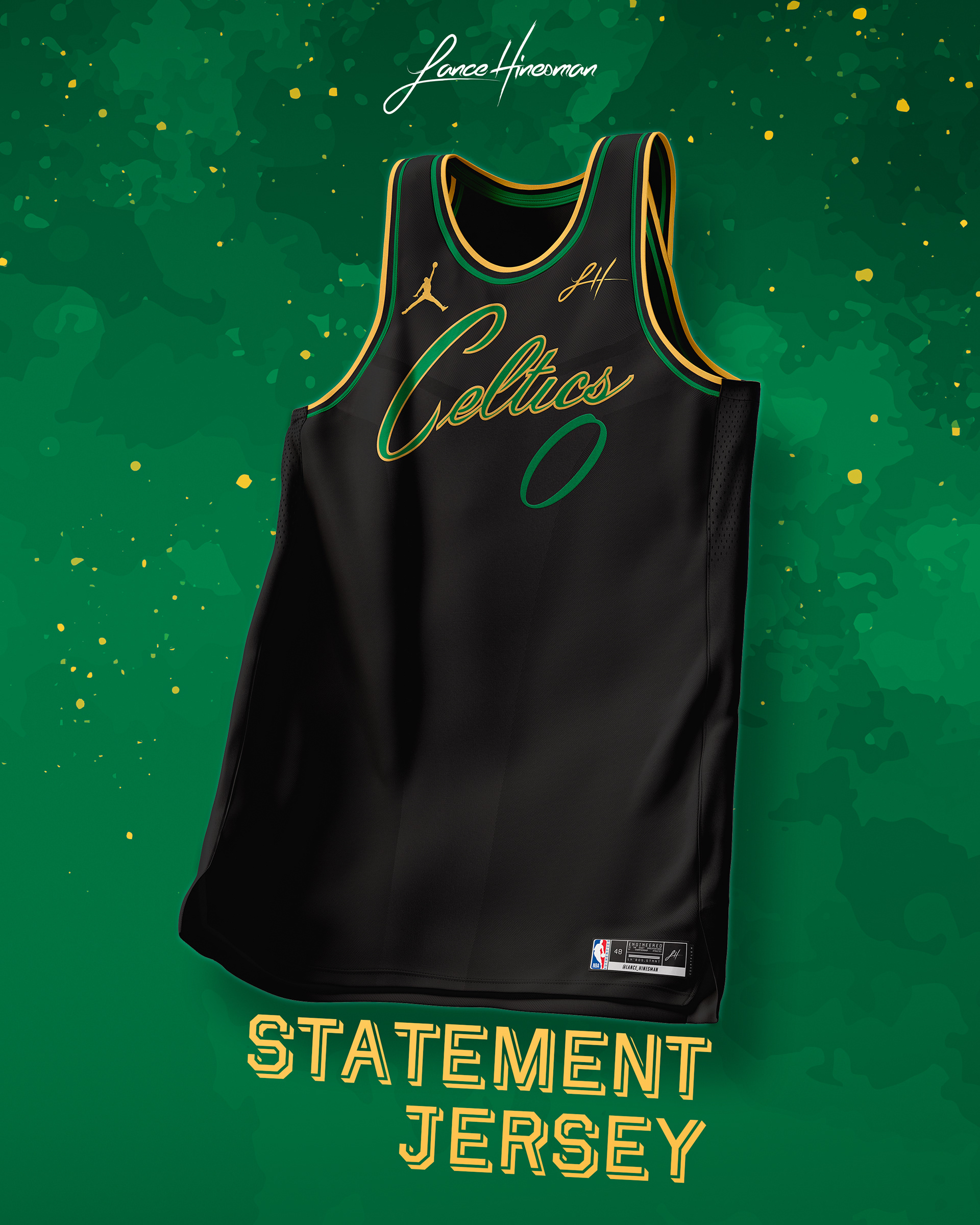
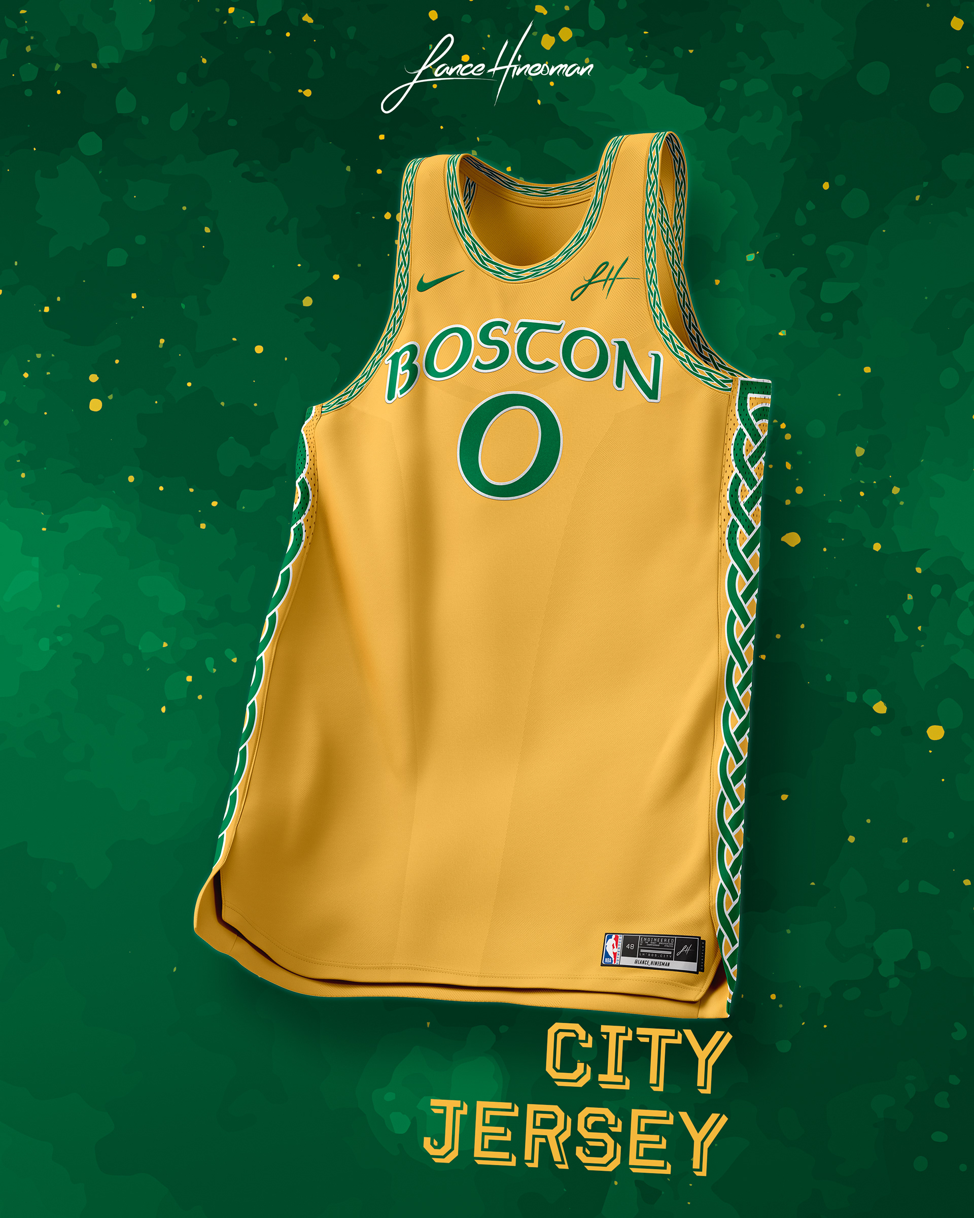
The goal of the Celtics rebrand was to find a balance between their tradition and history and a bolder look. The first way I sought to do this was to incorporate more gold into their timeless branding. With that, came a new wordmark for the Association and Icon jerseys. The City Jersey takes inspiration from the 2019 Celtics City Jersey and features a Celtic knot along the side, collar, and sleeves.
Brooklyn Nets
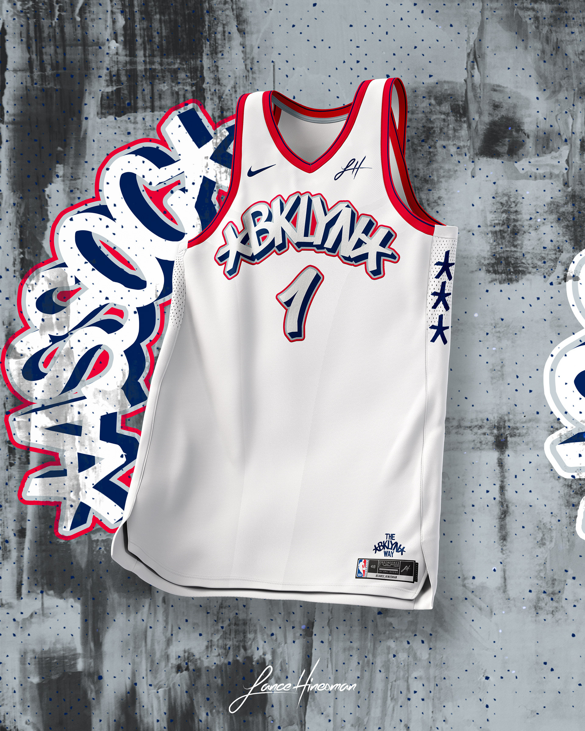
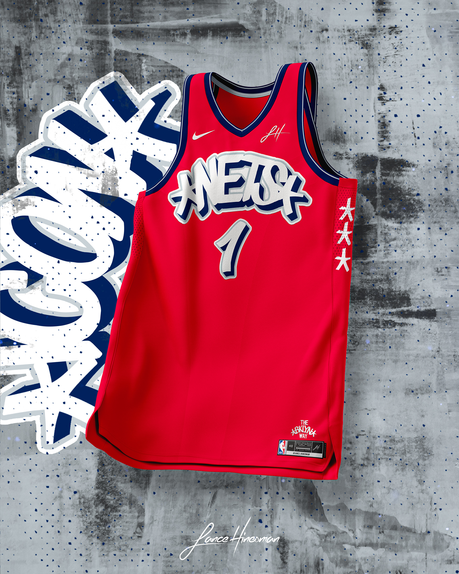
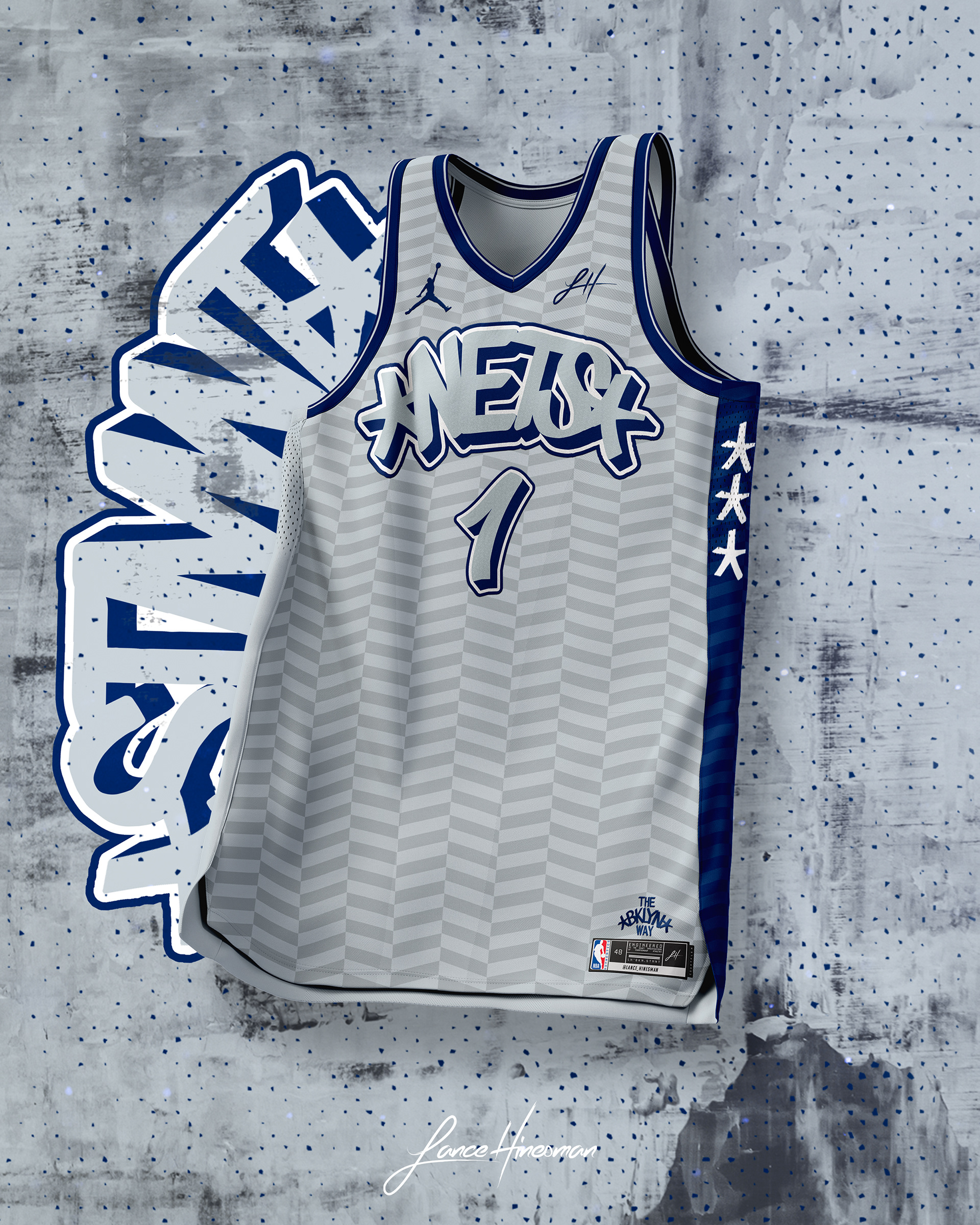
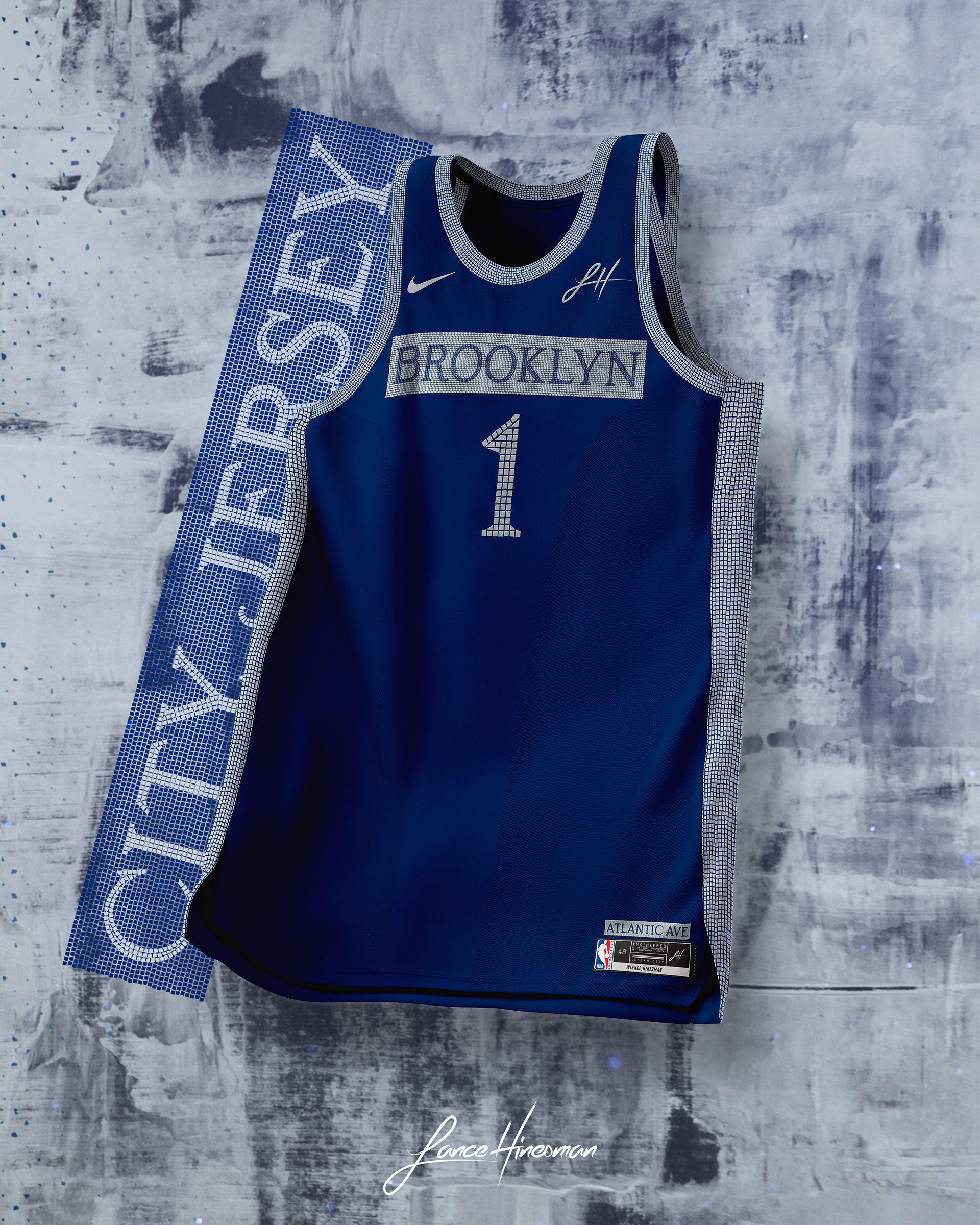
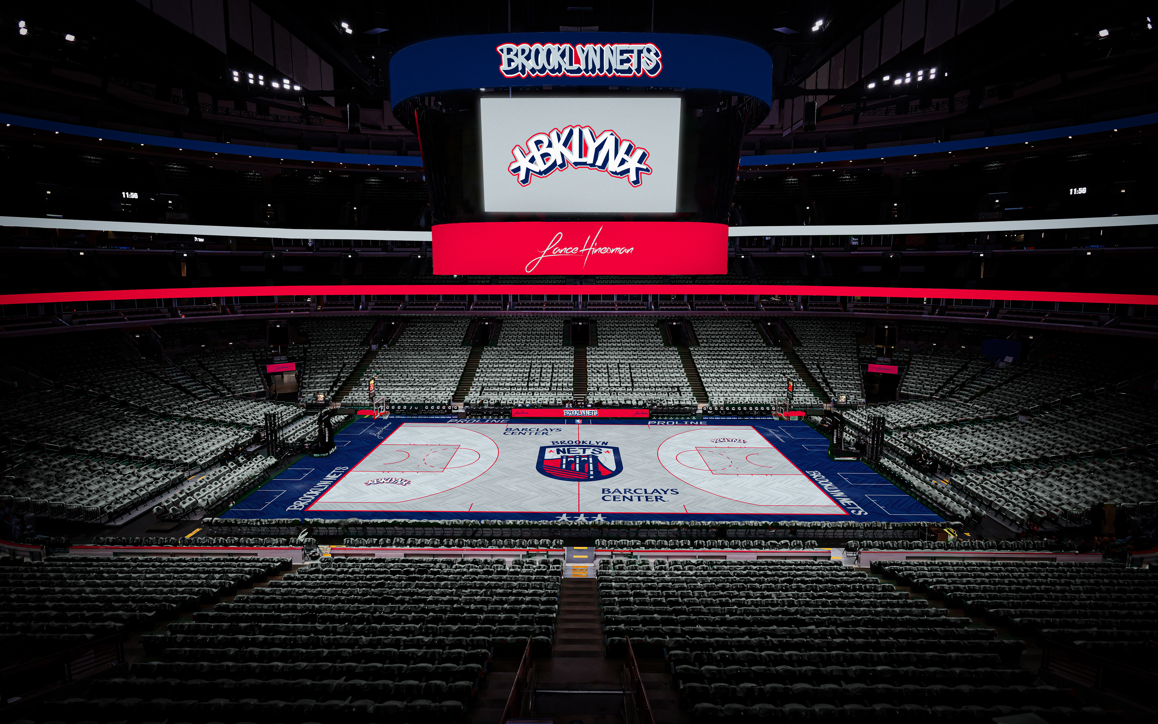
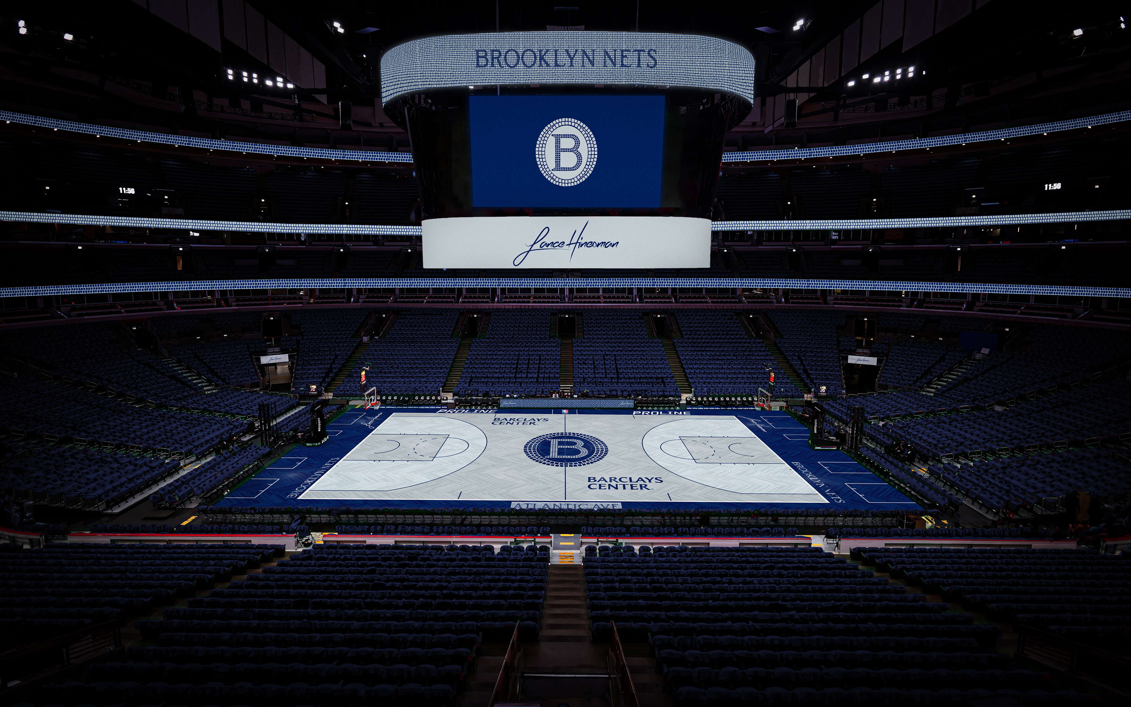
In an effort to give the Nets more character, I ditched the black and white color scheme for a return the New Jersey Nets colorway of the 2000s. Additionally, I created a new primary logo featuring the Brooklyn Bridge. The wordmarks and typography come from Eric Haze’s previous work with the Nets and the City Jersey and court are inspired by NYC subway mosaics.
Charlotte Hornets
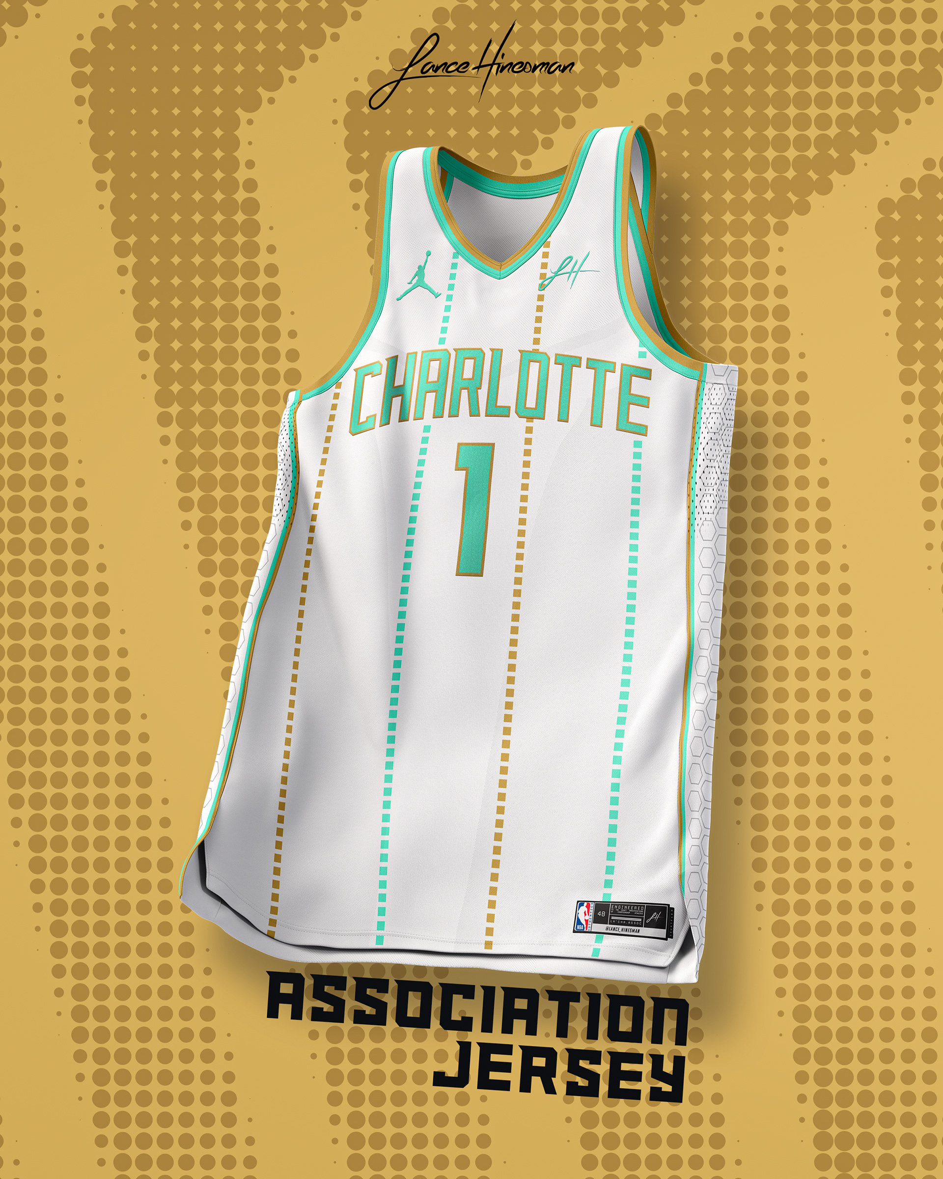
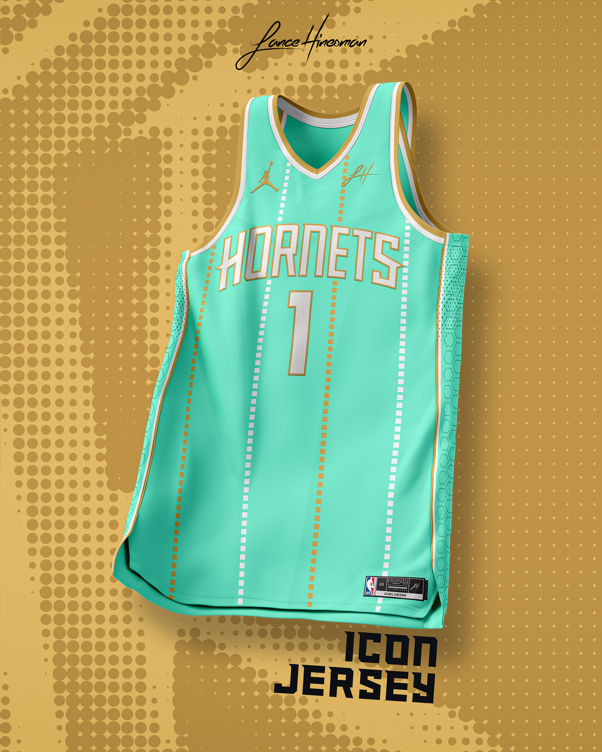
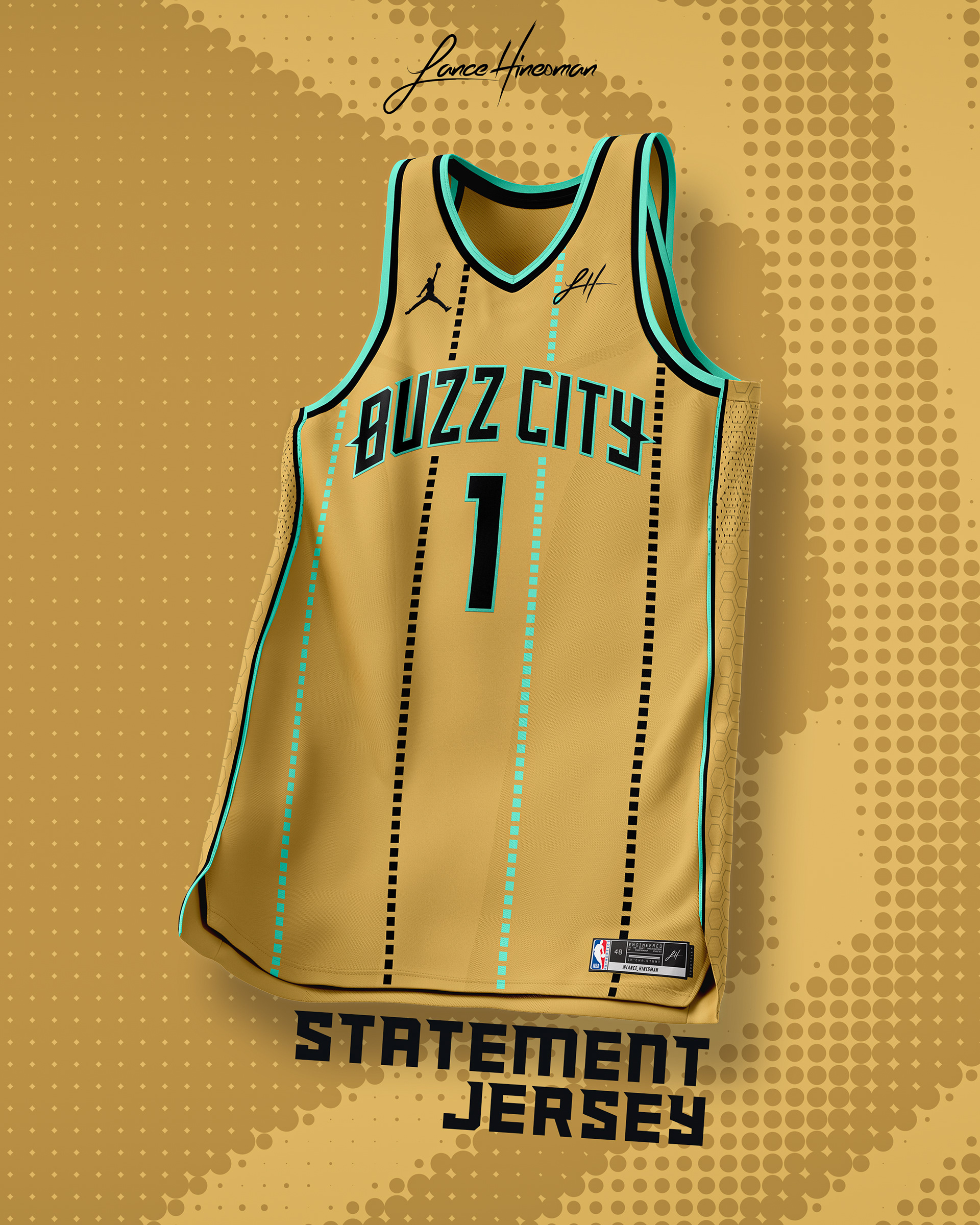
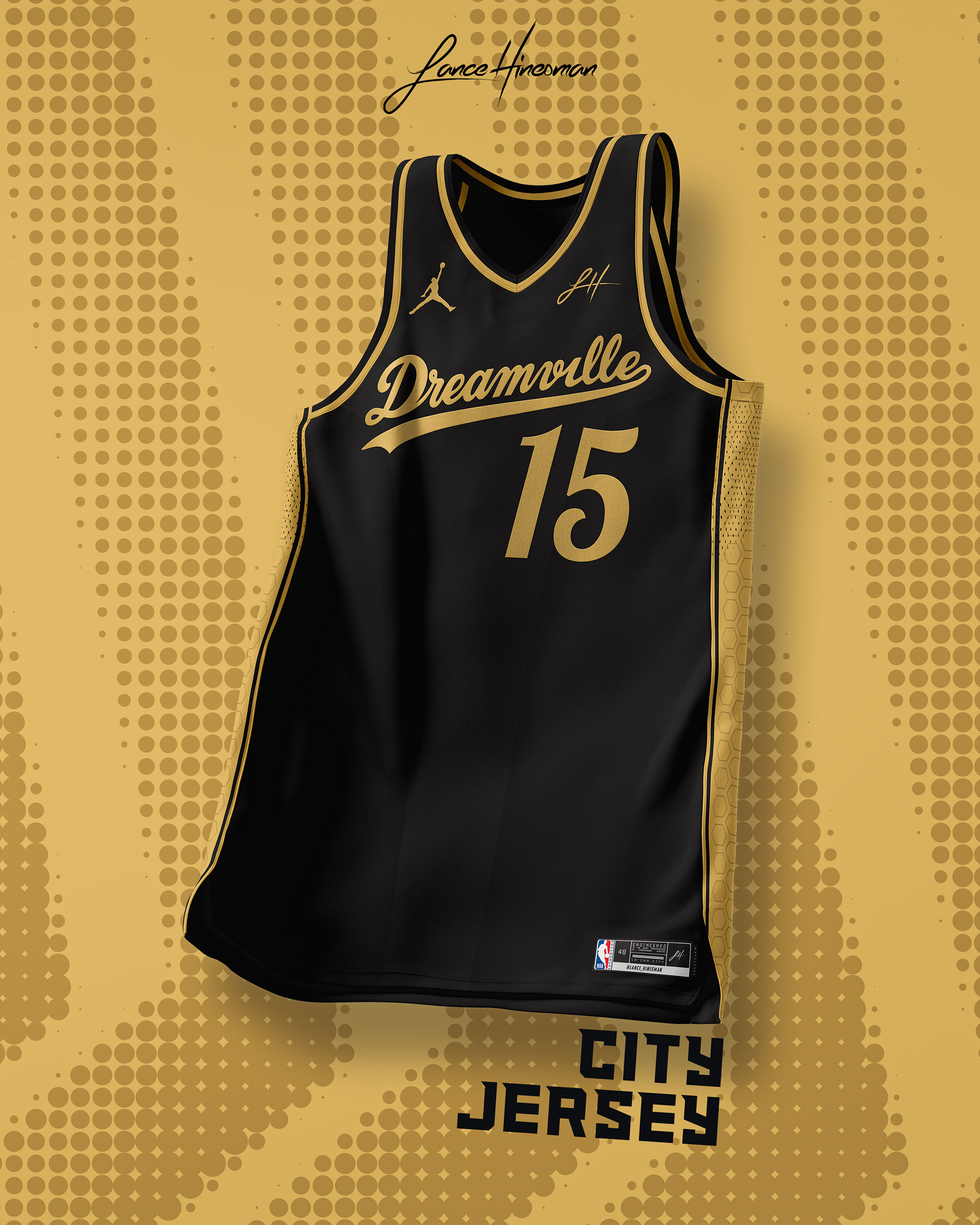
I love the Hornets’ current color scheme but wanted to try a full jersey set using the mint and gold color scheme from their previous city jerseys. The logos were too good to change, so I opted for a simple recolor and a greater use of their alternate logo. I also used Dreamville as the inspiration for the City Jersey.
Chicago Bulls
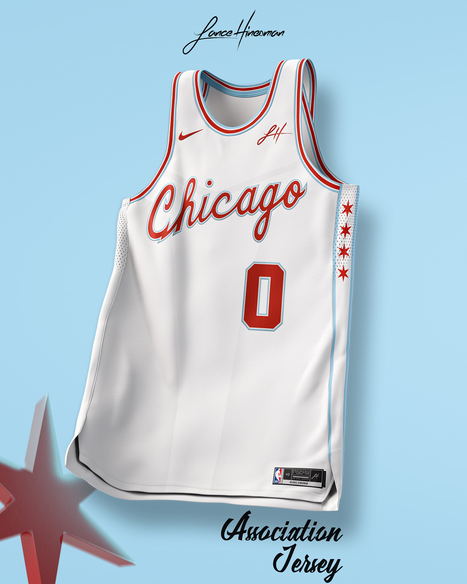
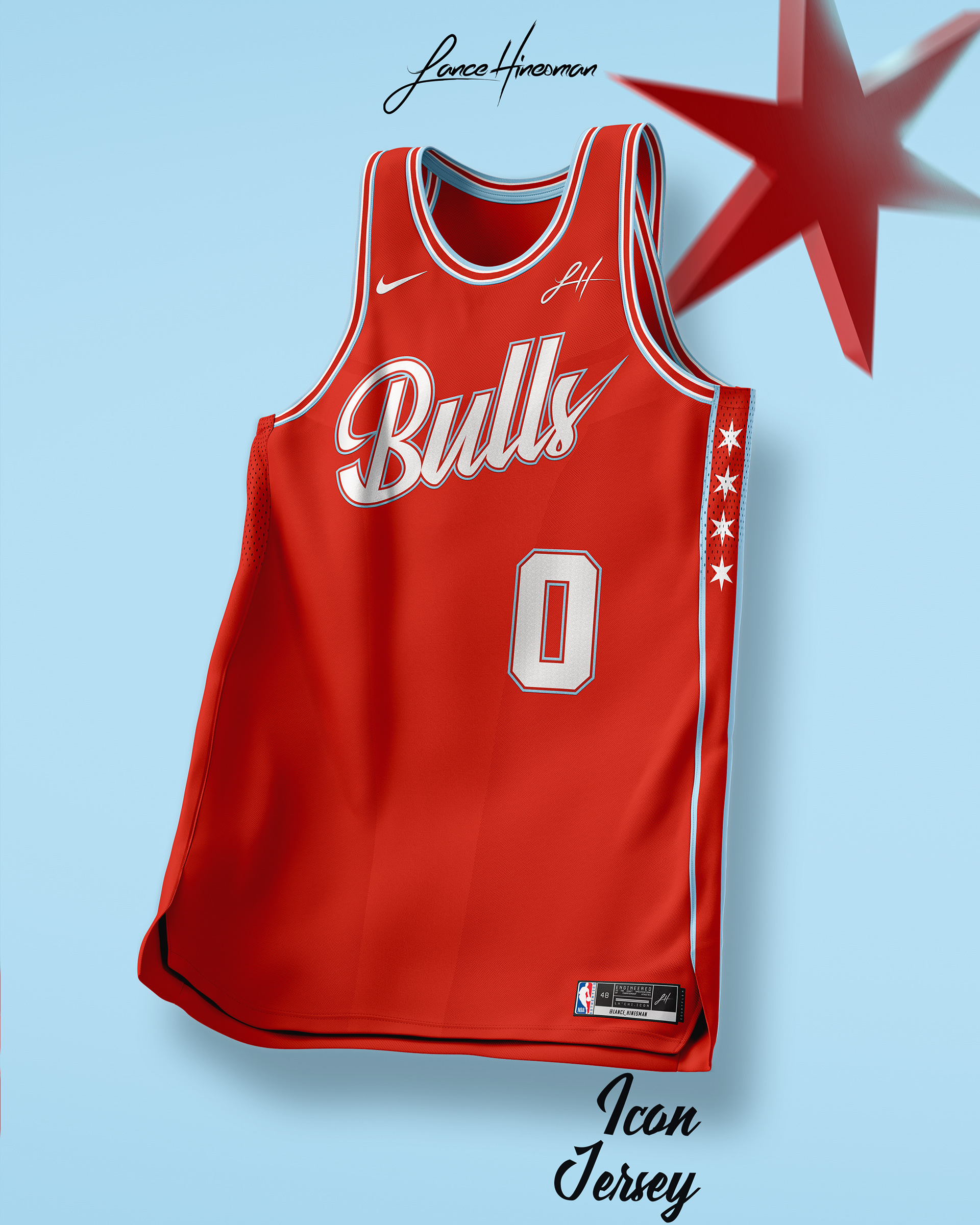
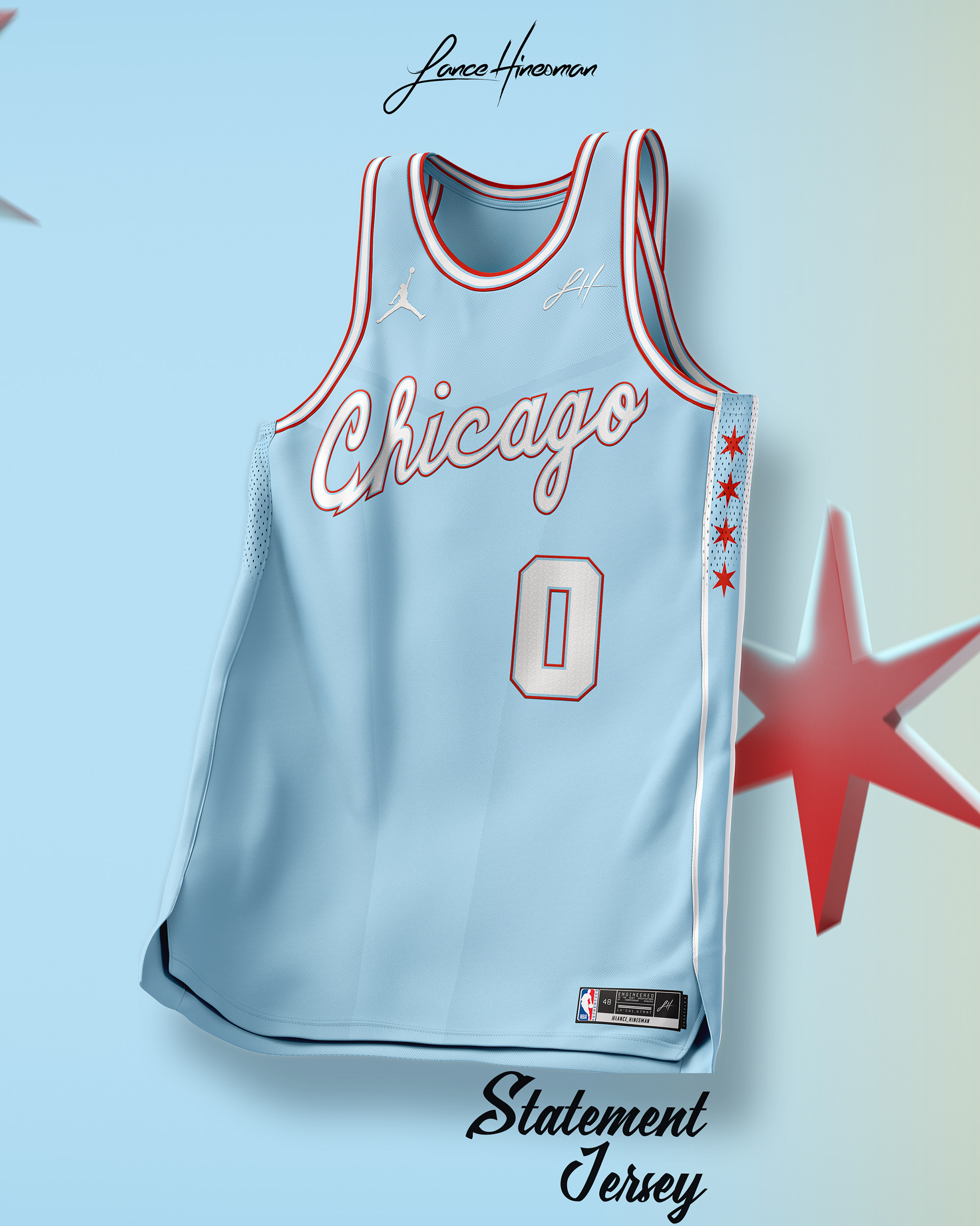
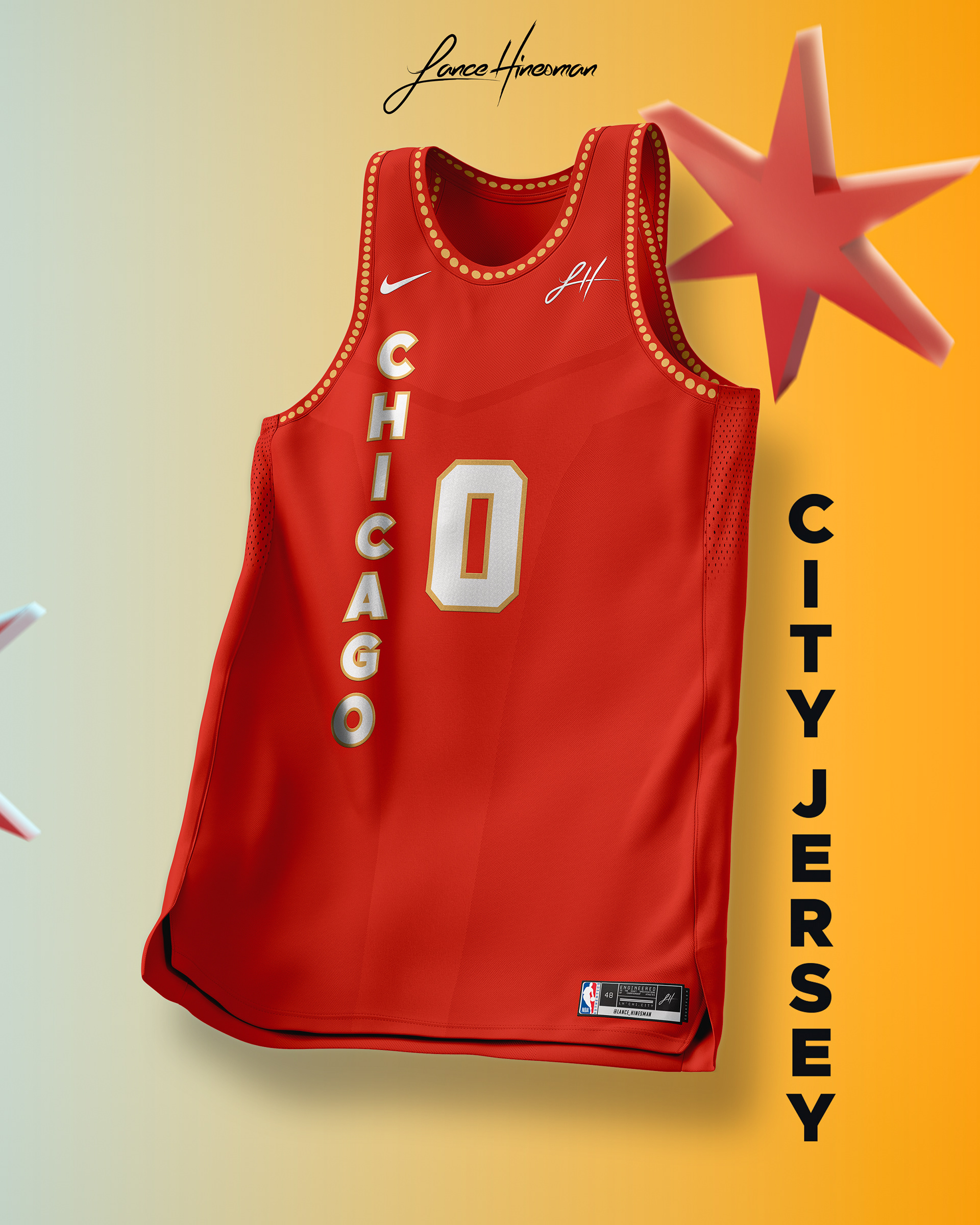
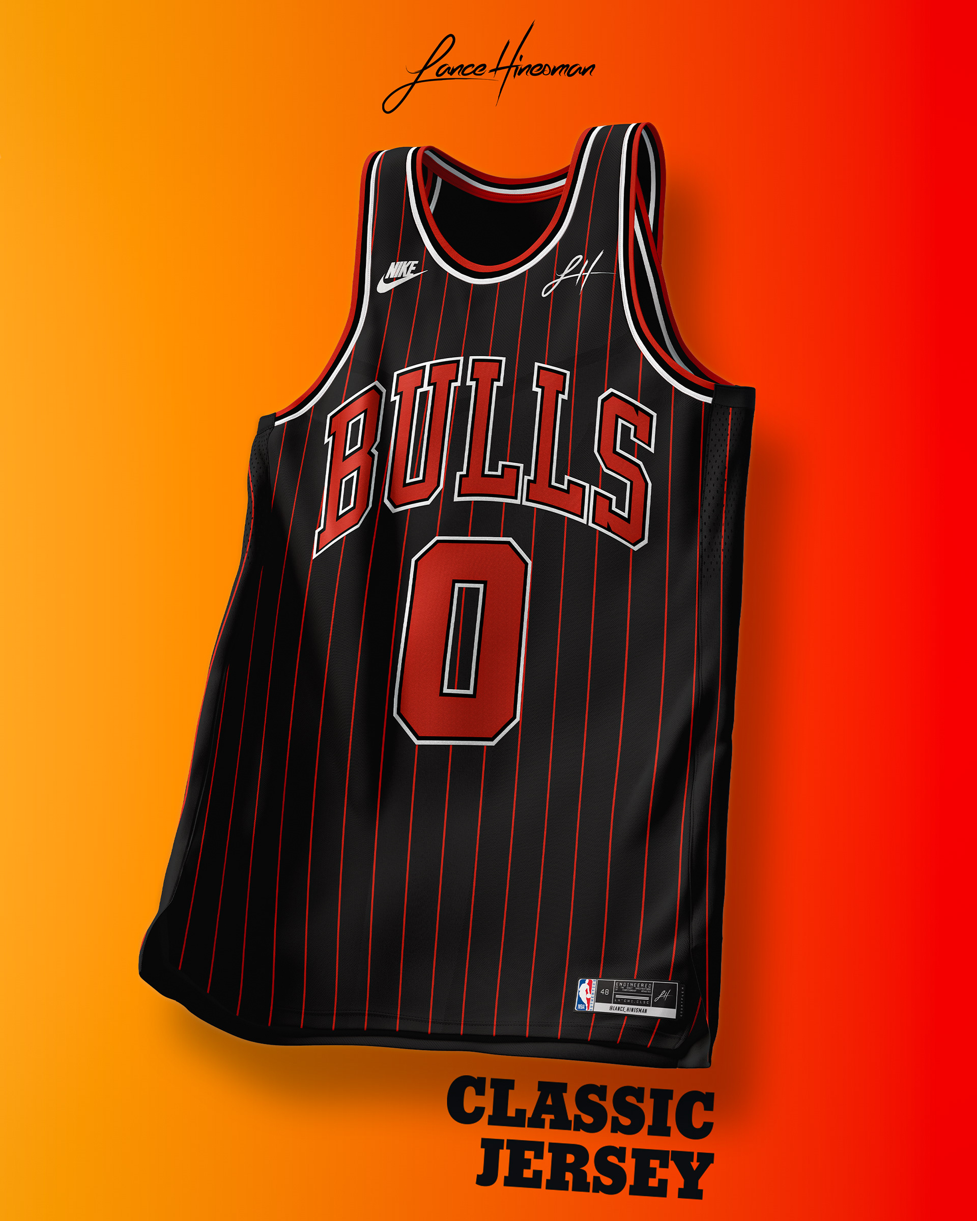
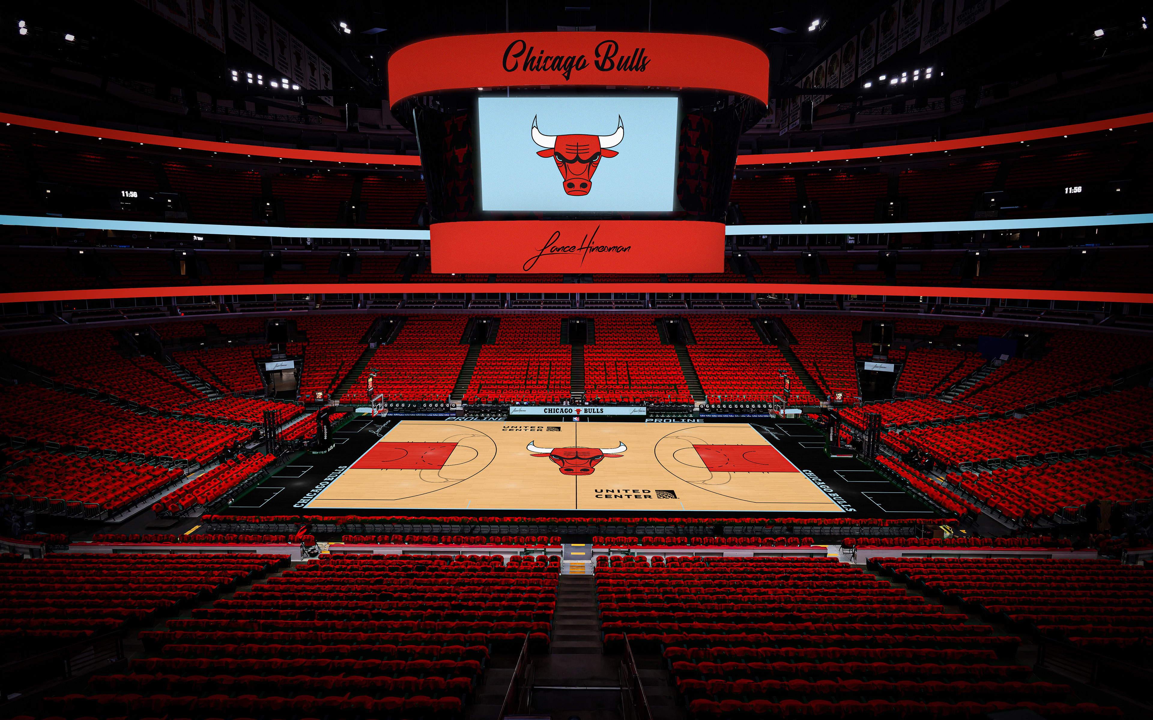
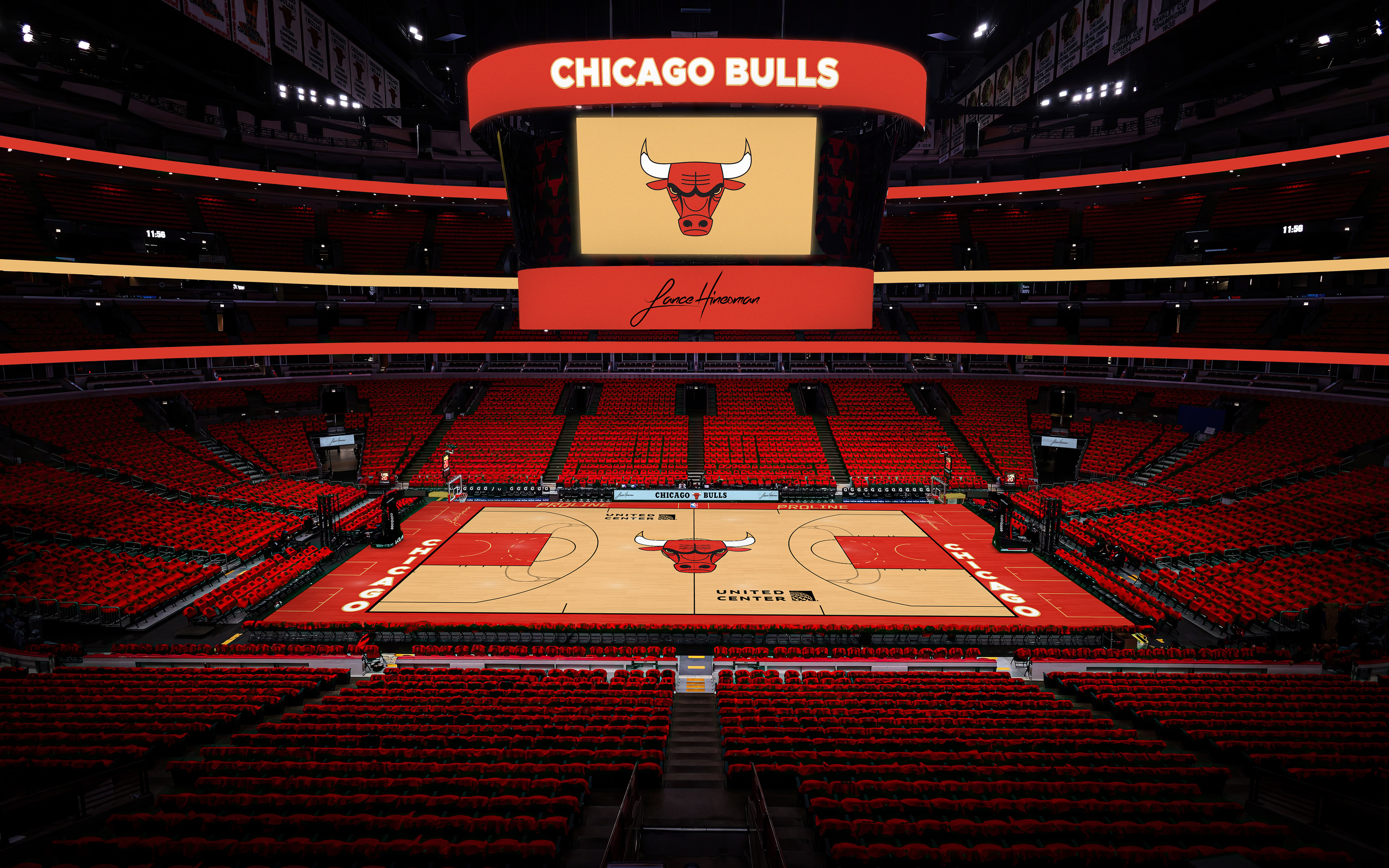
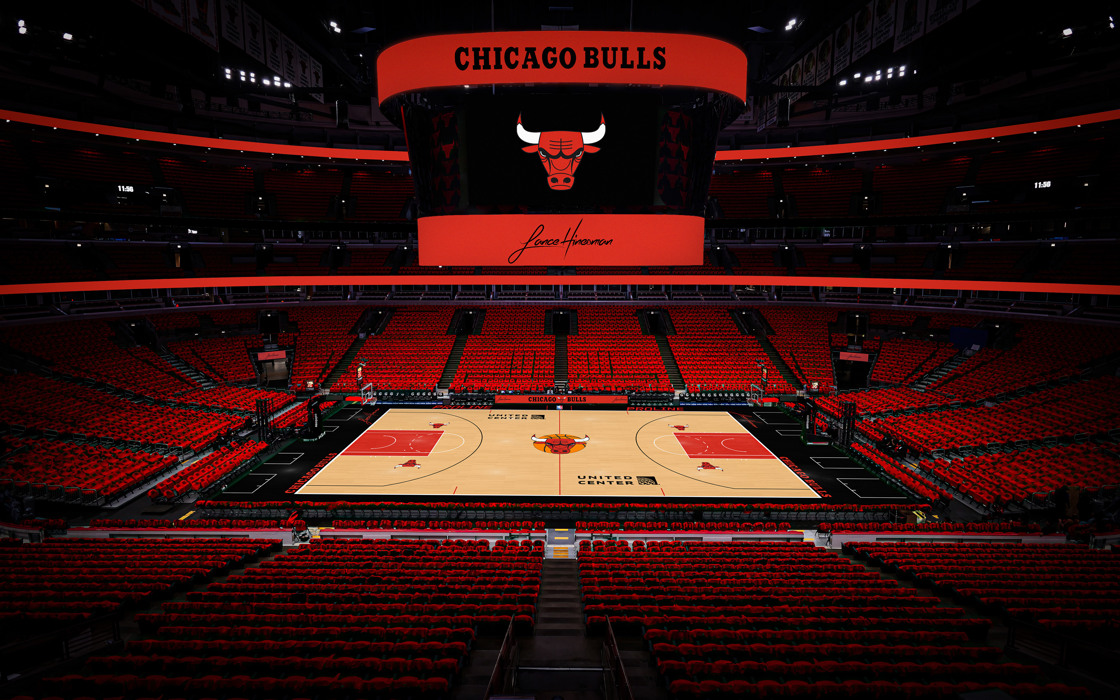
I based the core jersey designs on the Chicago flag colors and old Bulls' script logo. Then I tried my own take on the Bulls' 2023-24 City Jersey this year for my own concept; I based my design more on the Chicago theater sign rather than the Chicago stadium sign. The first classic jersey of the project is my favorite Bulls jersey ever, with a era-specific court to match.
Cleveland Cavaliers
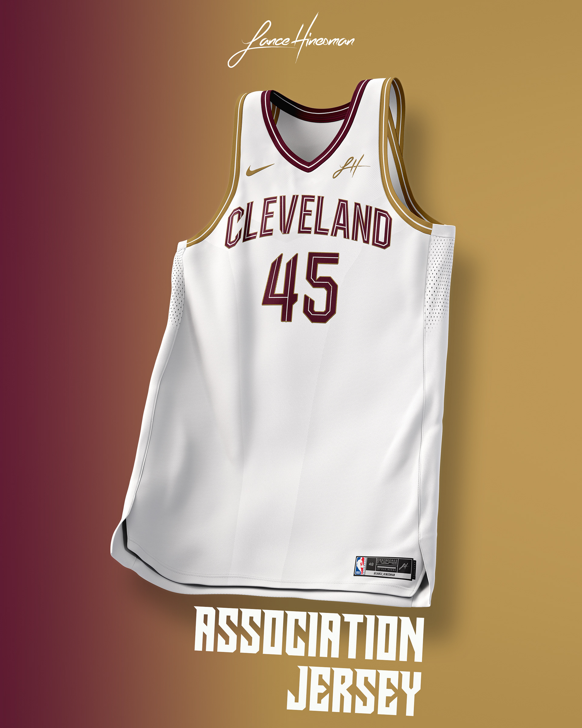
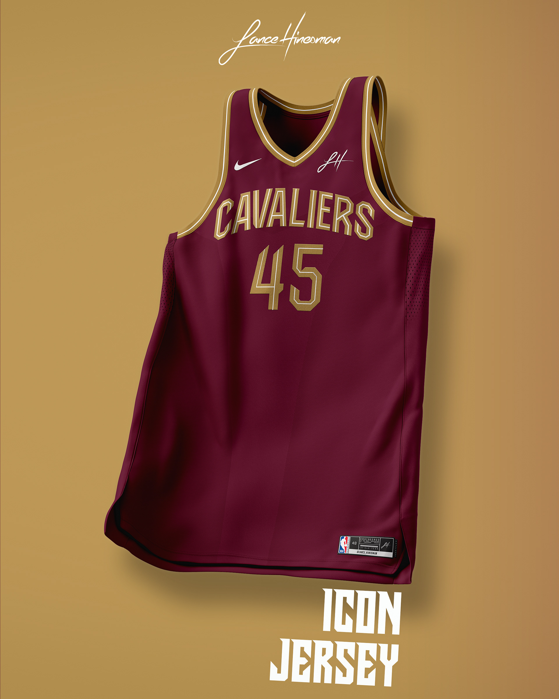
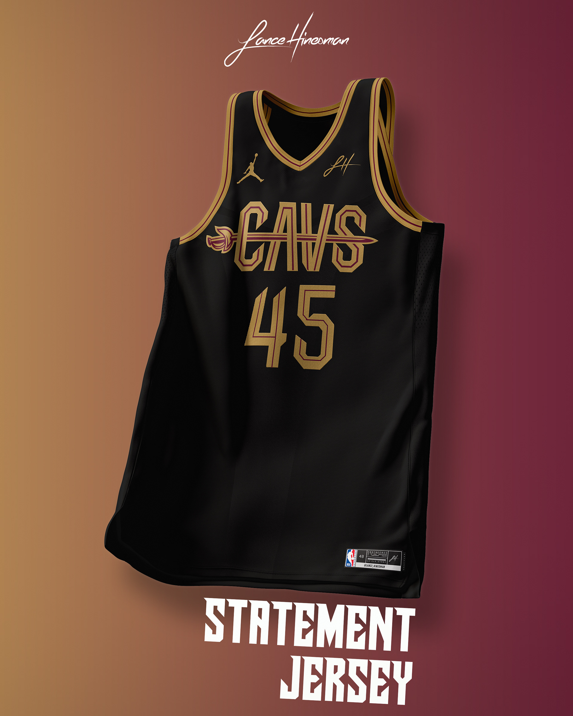
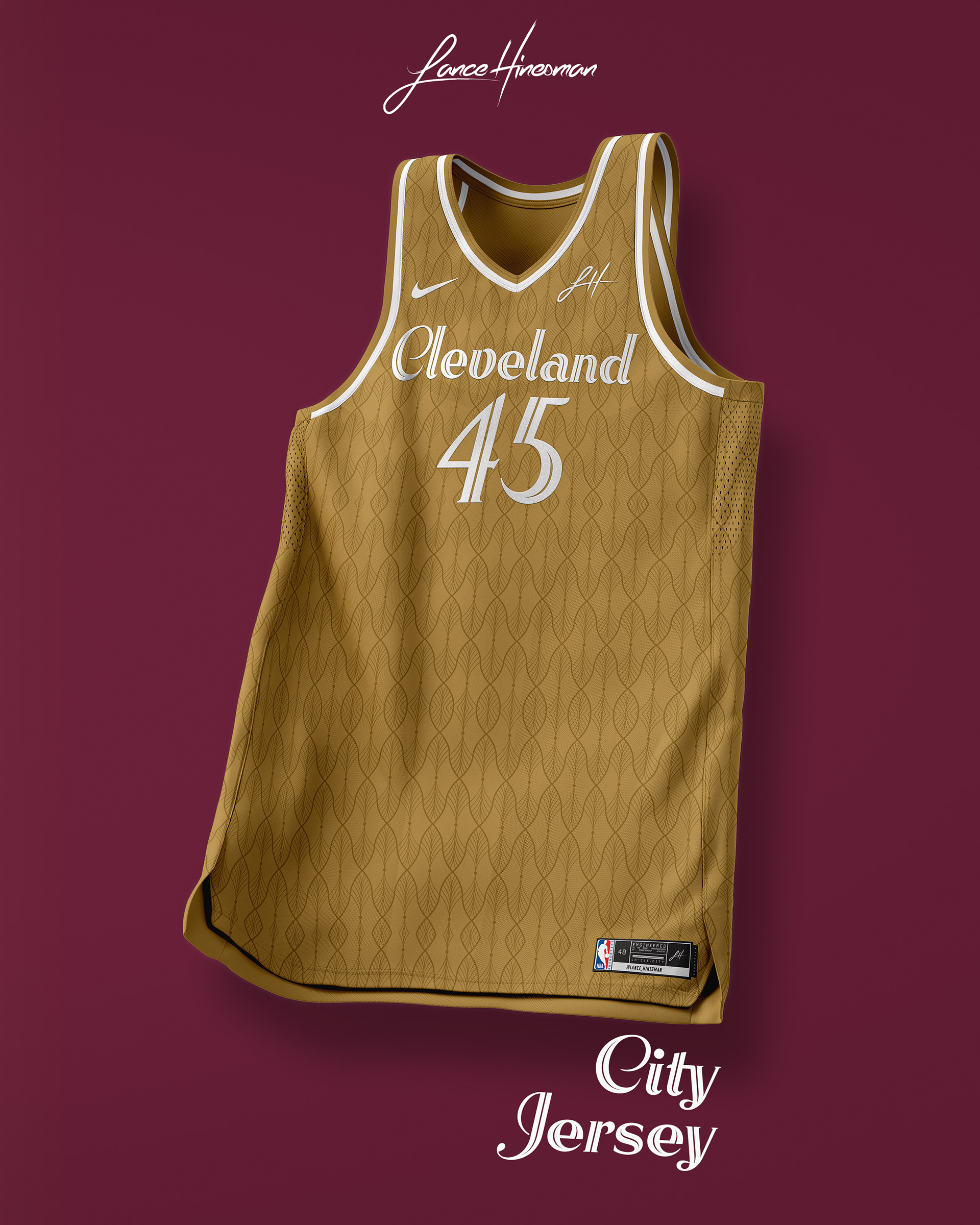
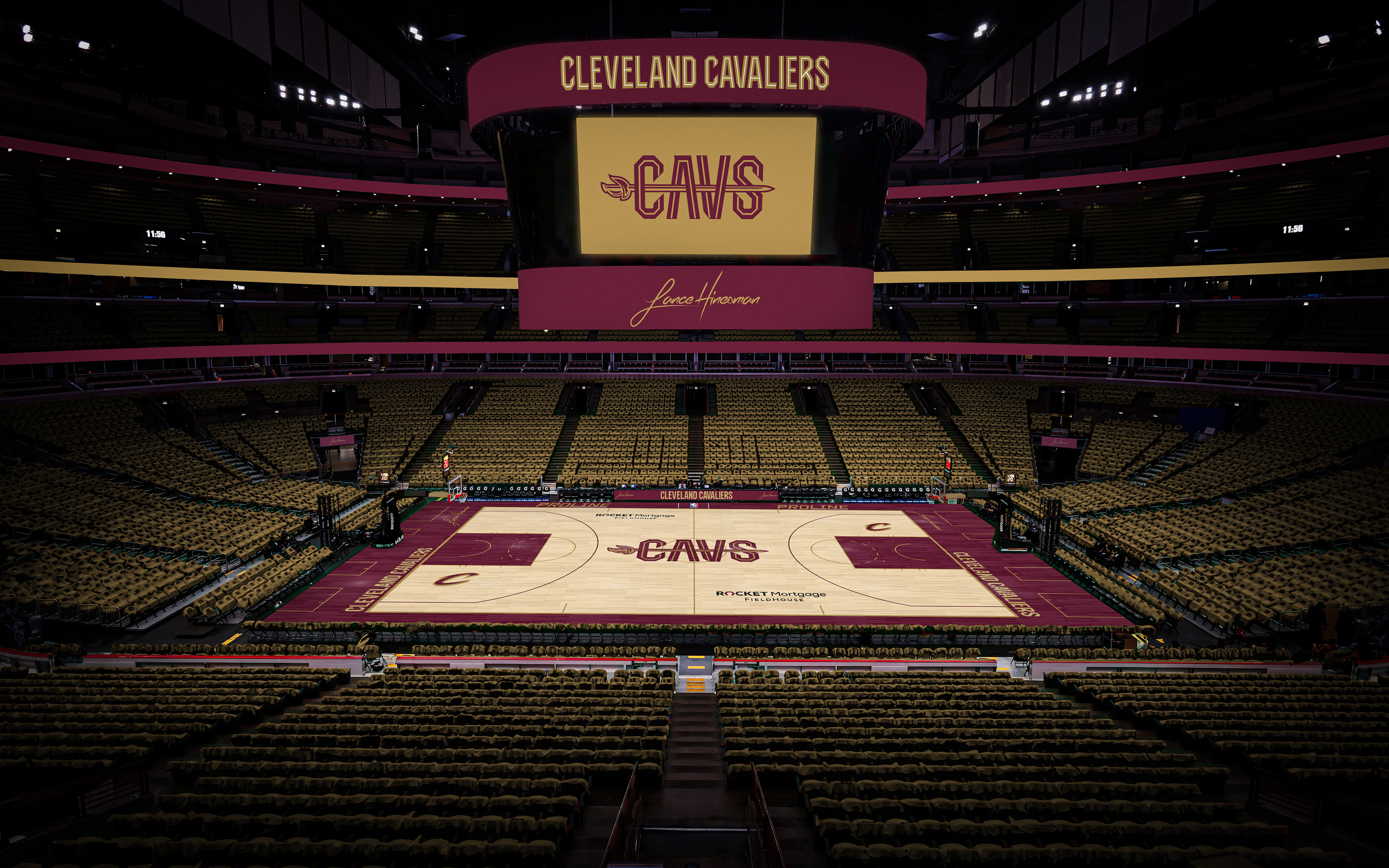
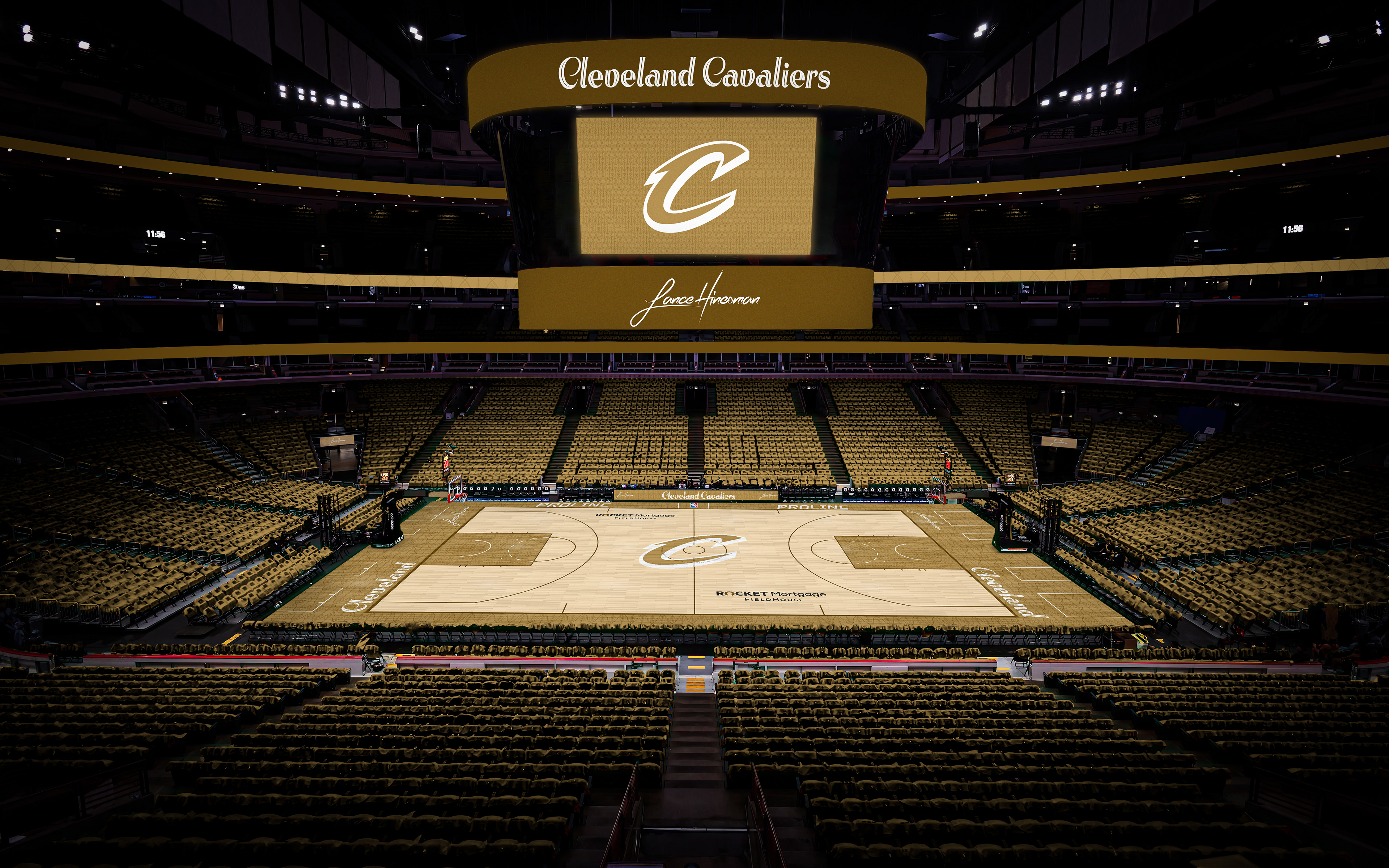
Since the Cavs recently rebranded their uniforms, I didn't want to move too far away from them, and made slight tweaks to the Association and Icon jerseys. For the statement, I brought back the sword and combined it with the 'CAVS' wordmark. The City Jersey took inspiration from the signage at the Cleveland Cultural Gardens.
Dallas Mavericks
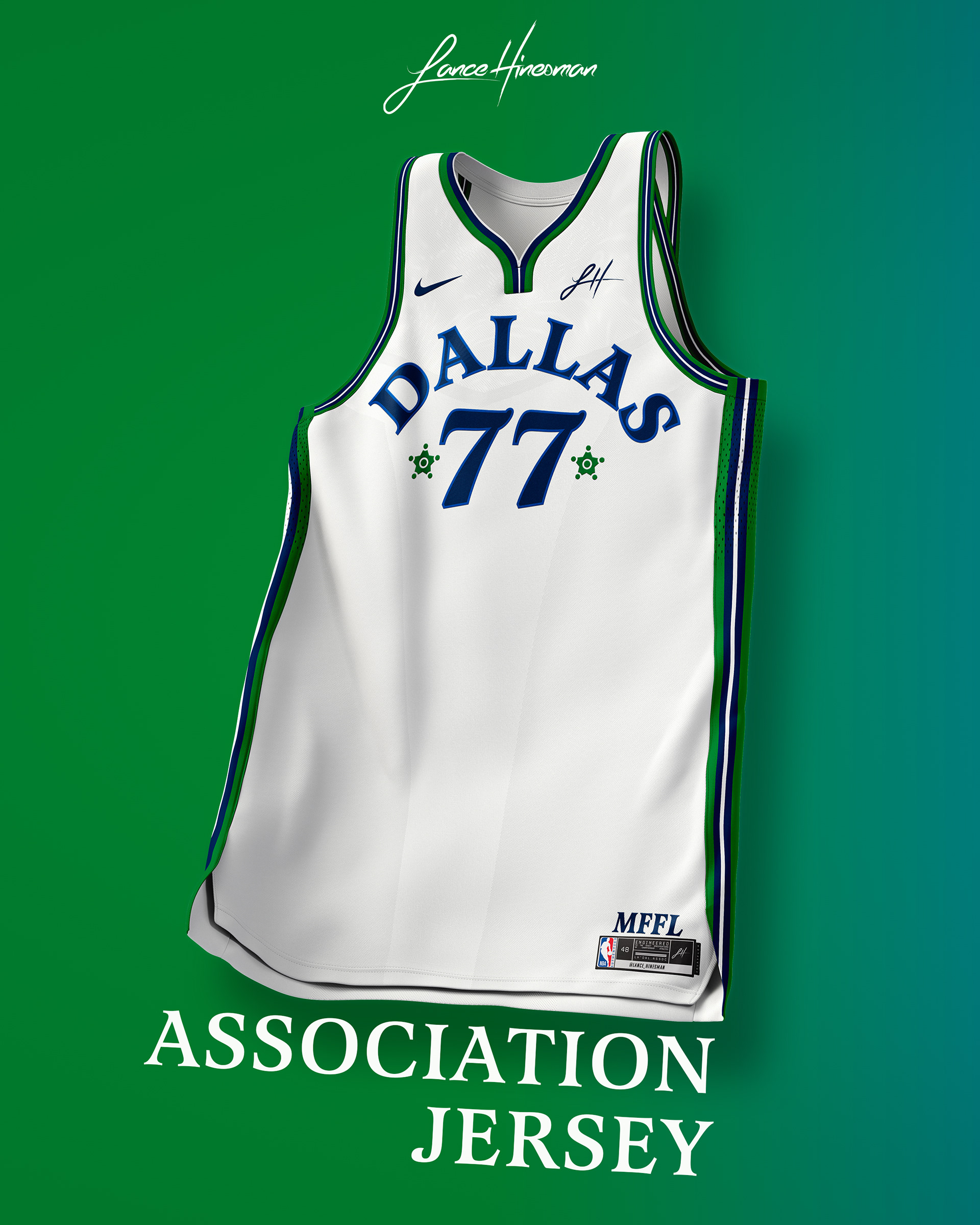
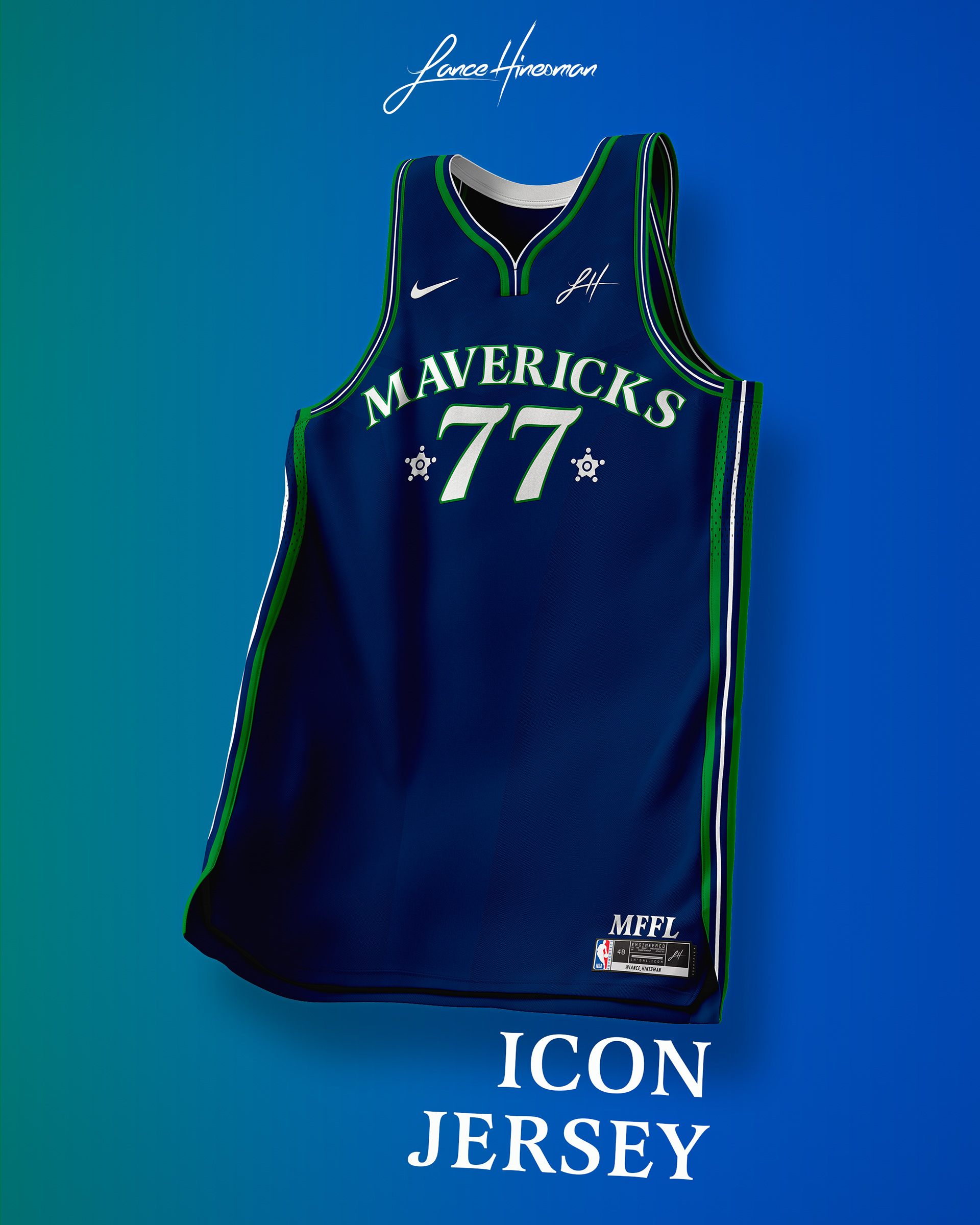
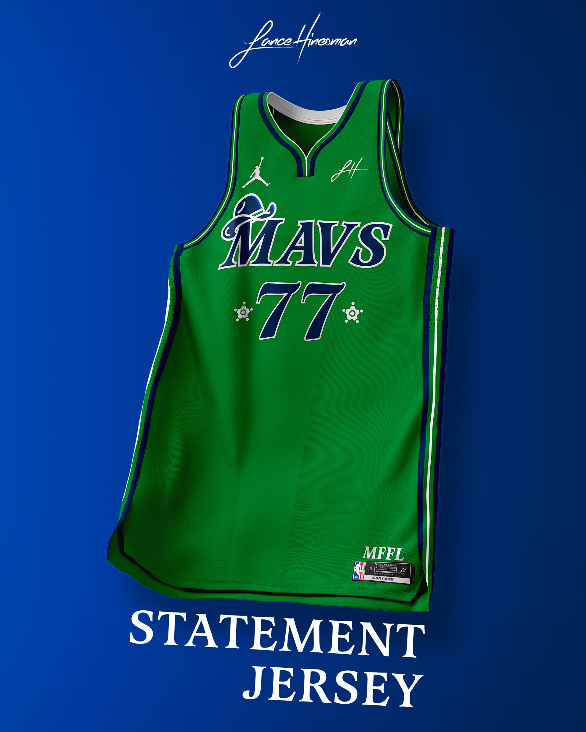
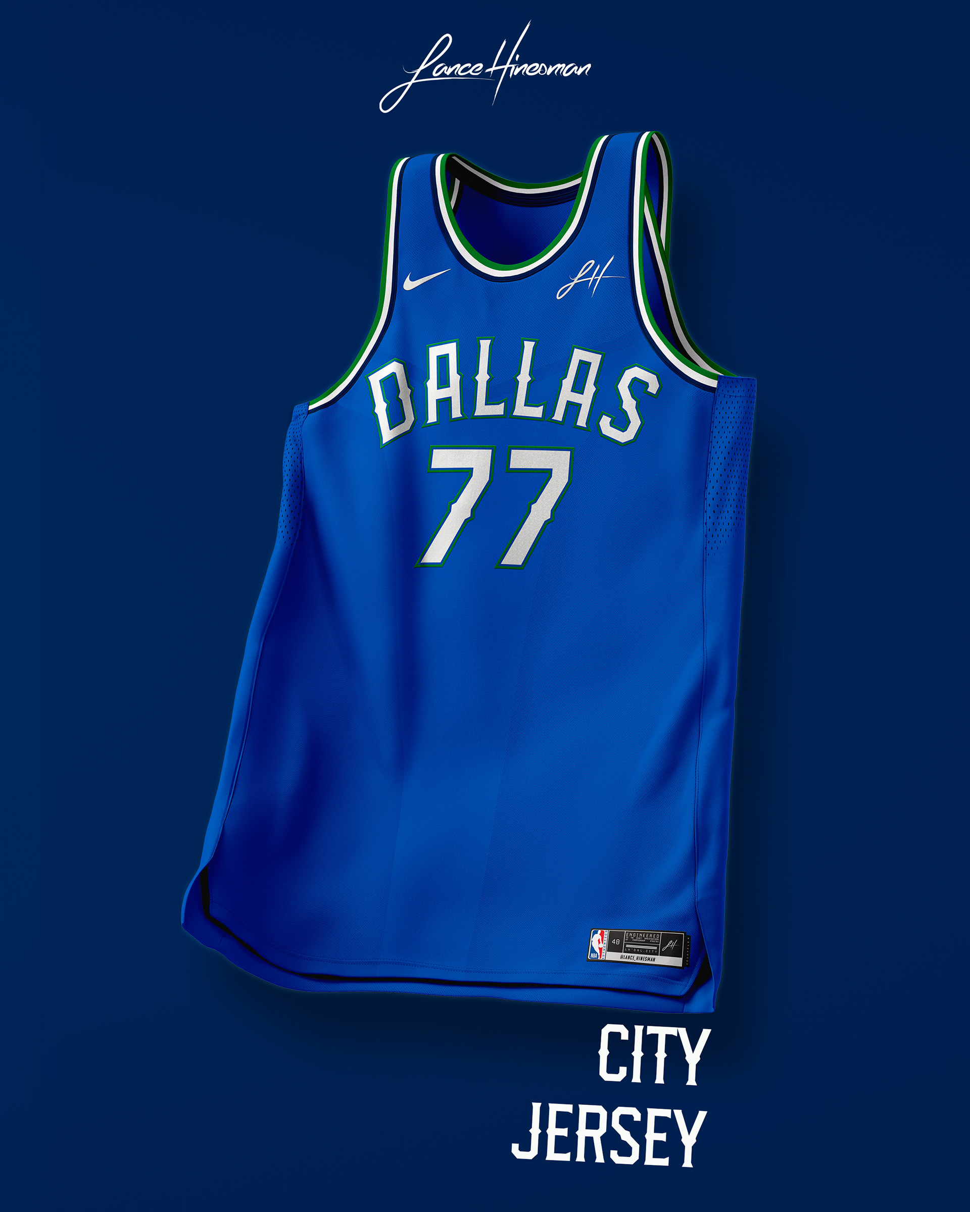
I embraced more green in the primary branding as well as revamped the old cowboy hat logo for the Statement Jersey and court. The City Jersey is inspired by the defending World Series champions.
Denver Nuggets
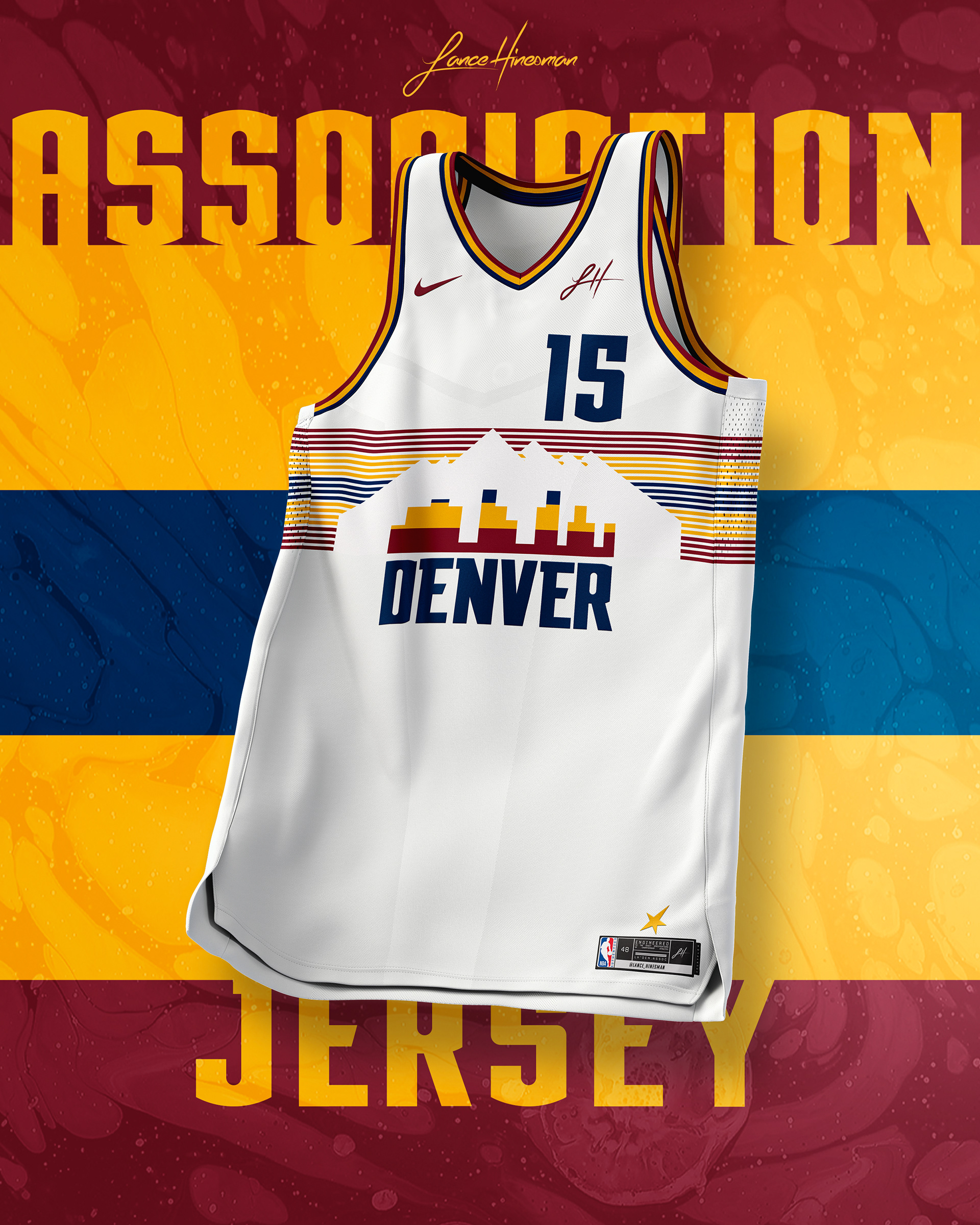
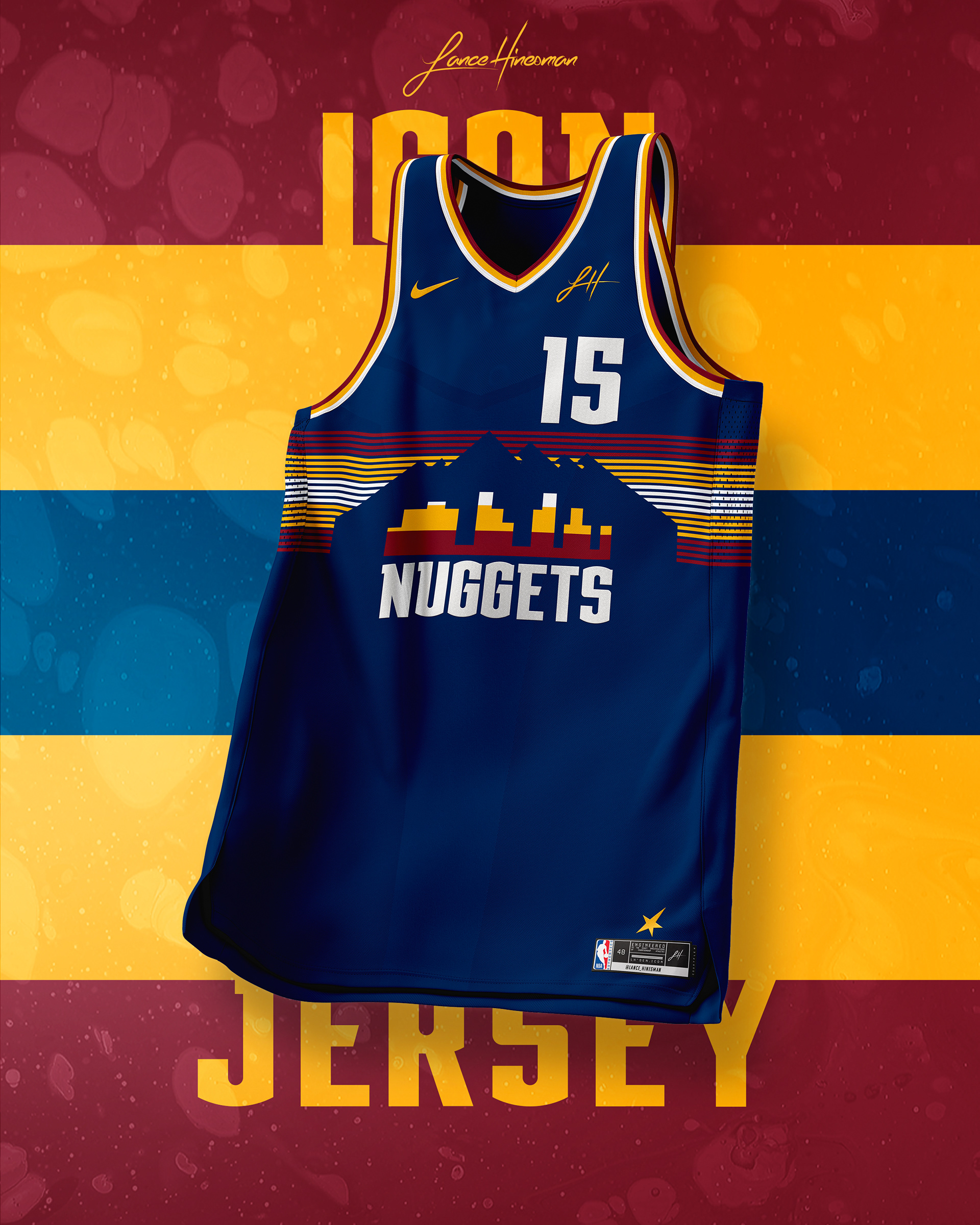
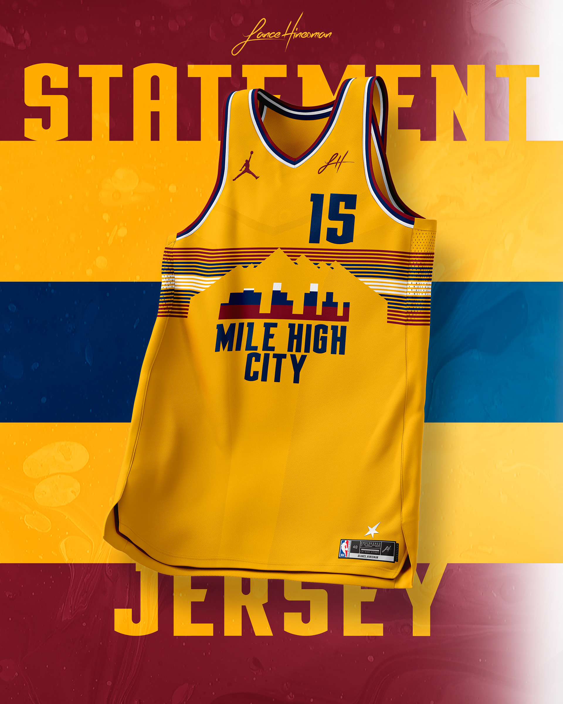
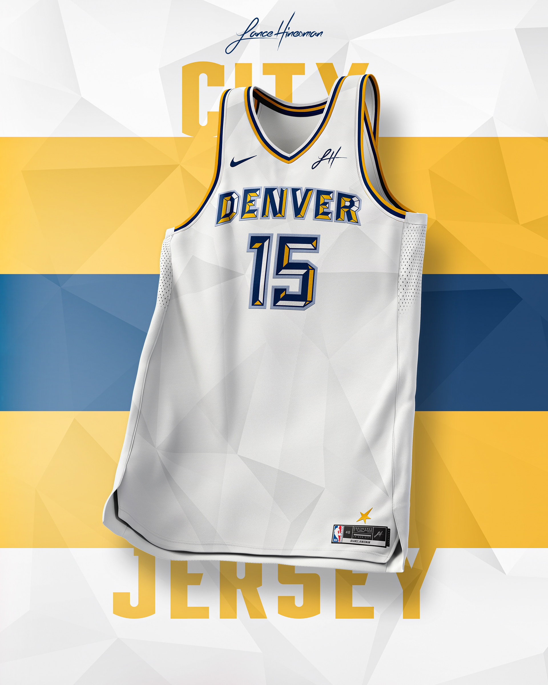
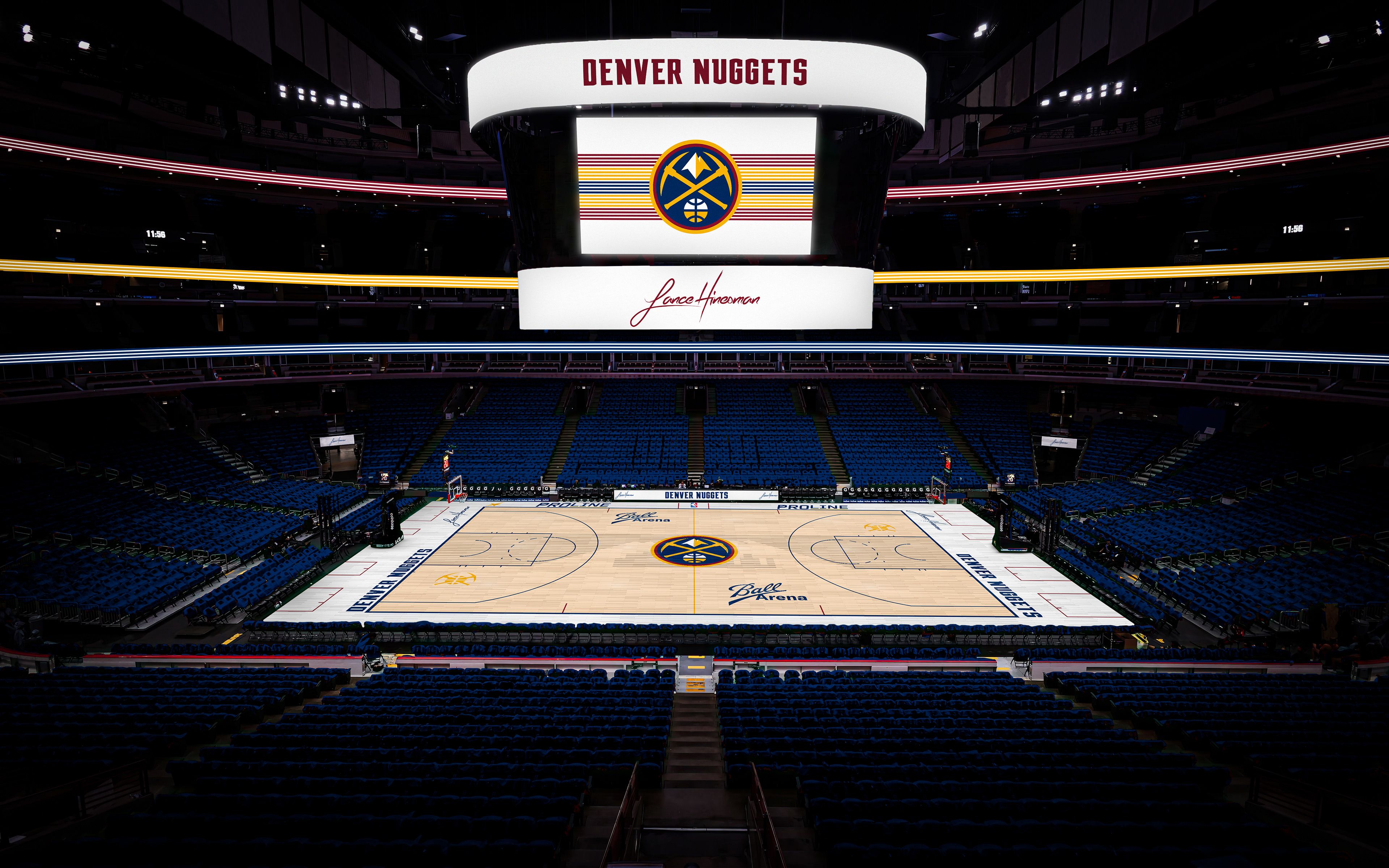
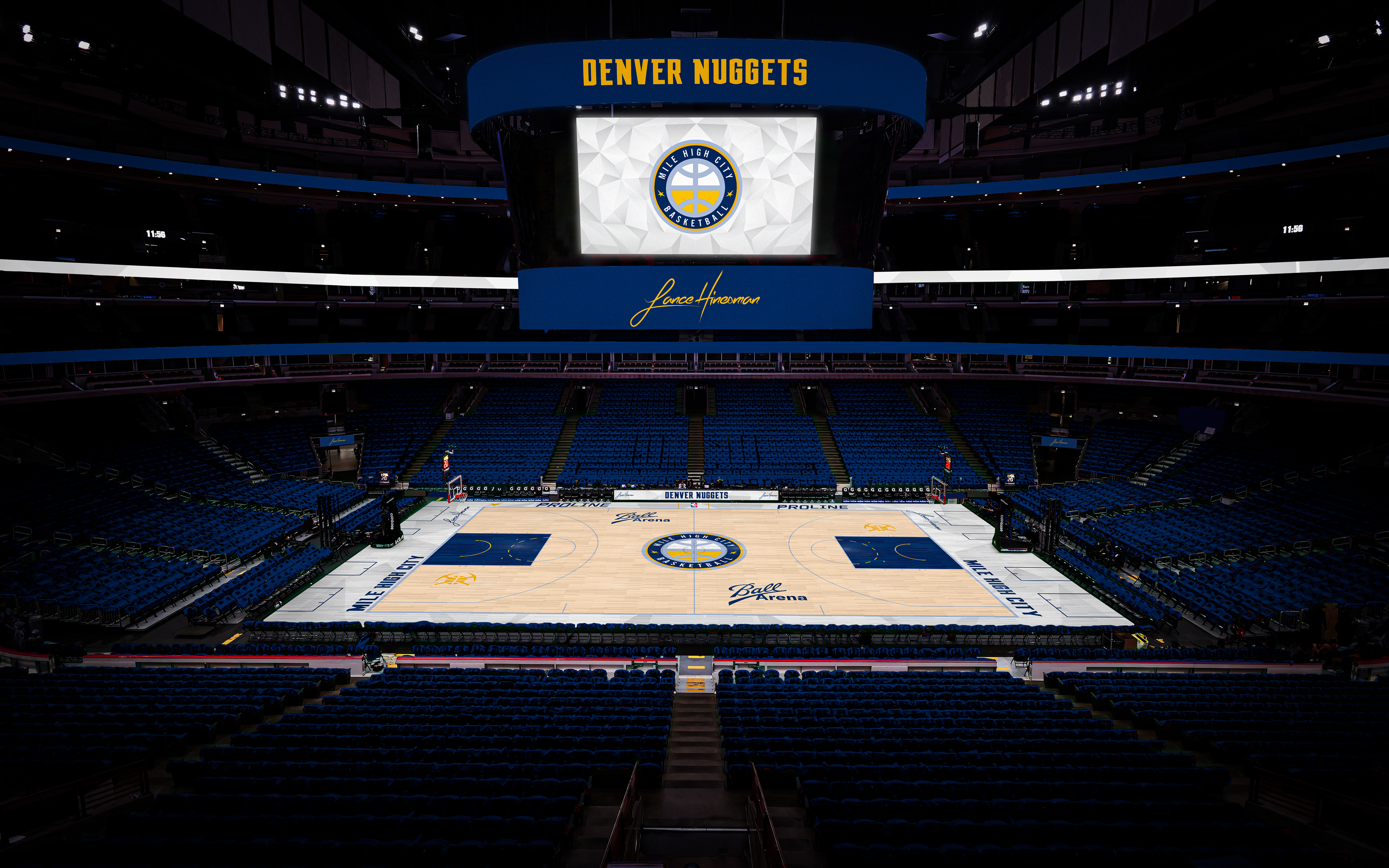
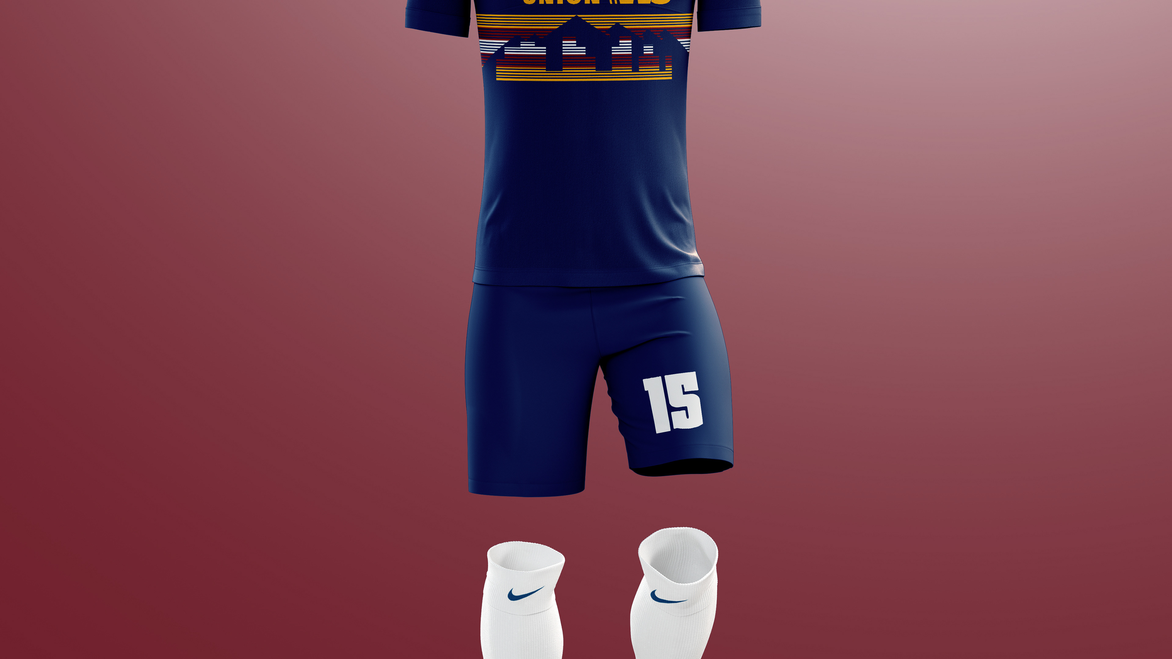
I refined some older concepts of mine based around Denver's City Jerseys from 2018-20. I really love the current color scheme though and opted to keep it instead of the rainbow one. The City Jersey is inspired by Pat Milbery's “Love this City” mural.
Detroit Pistons
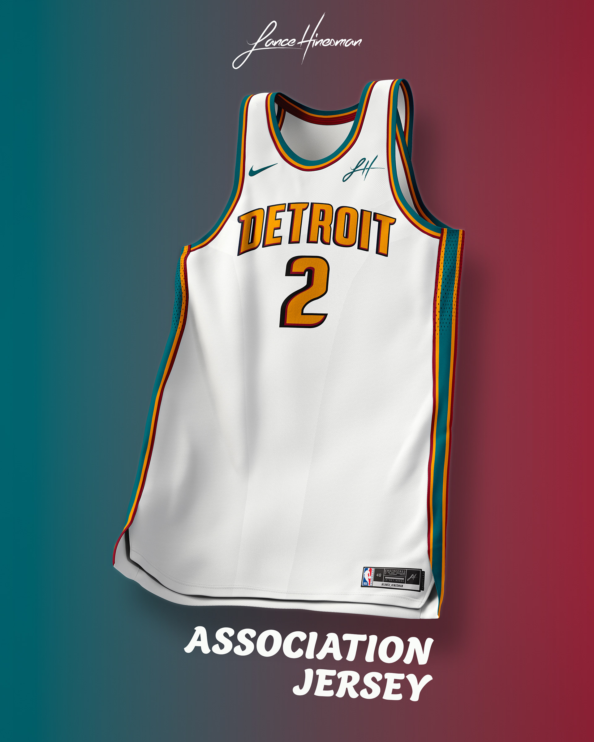
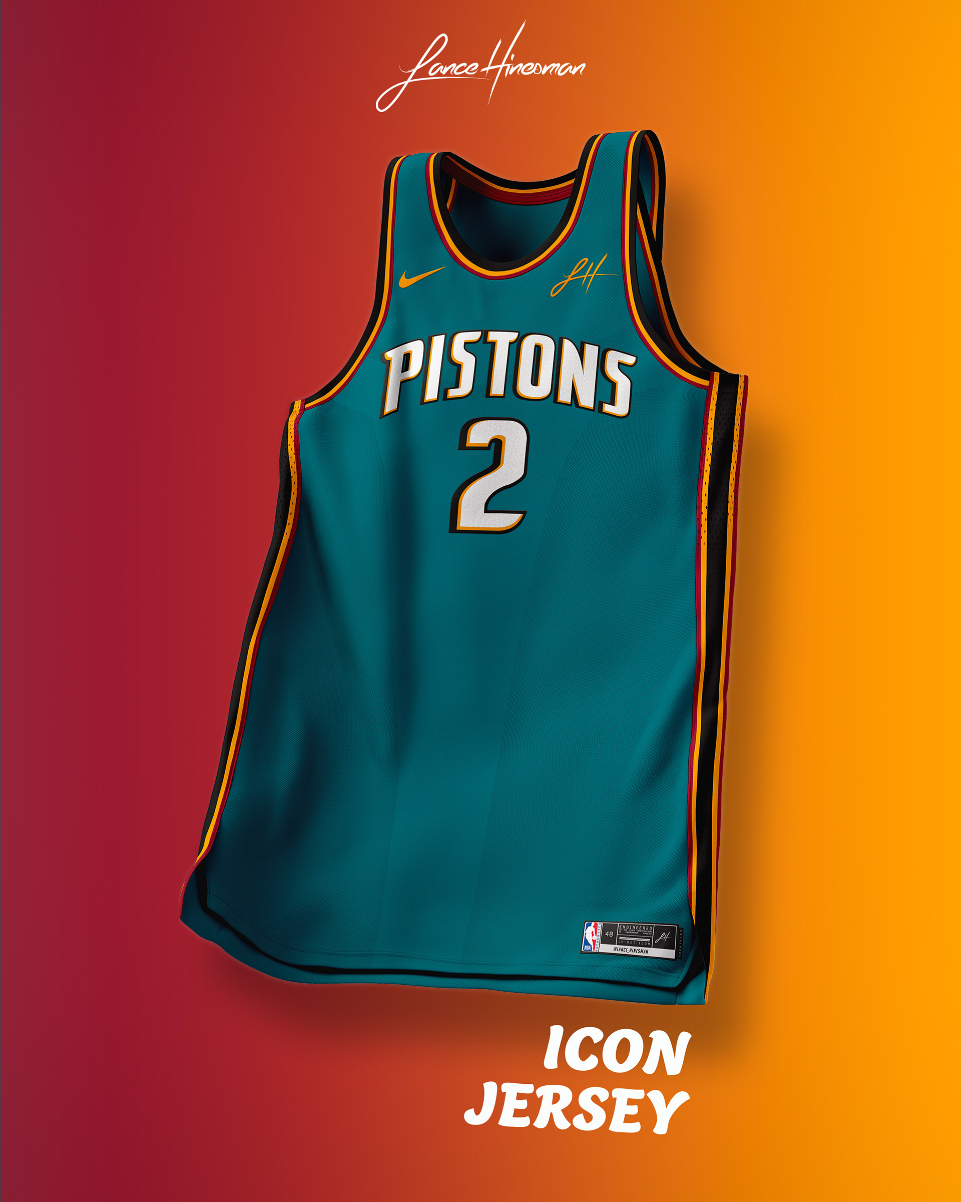
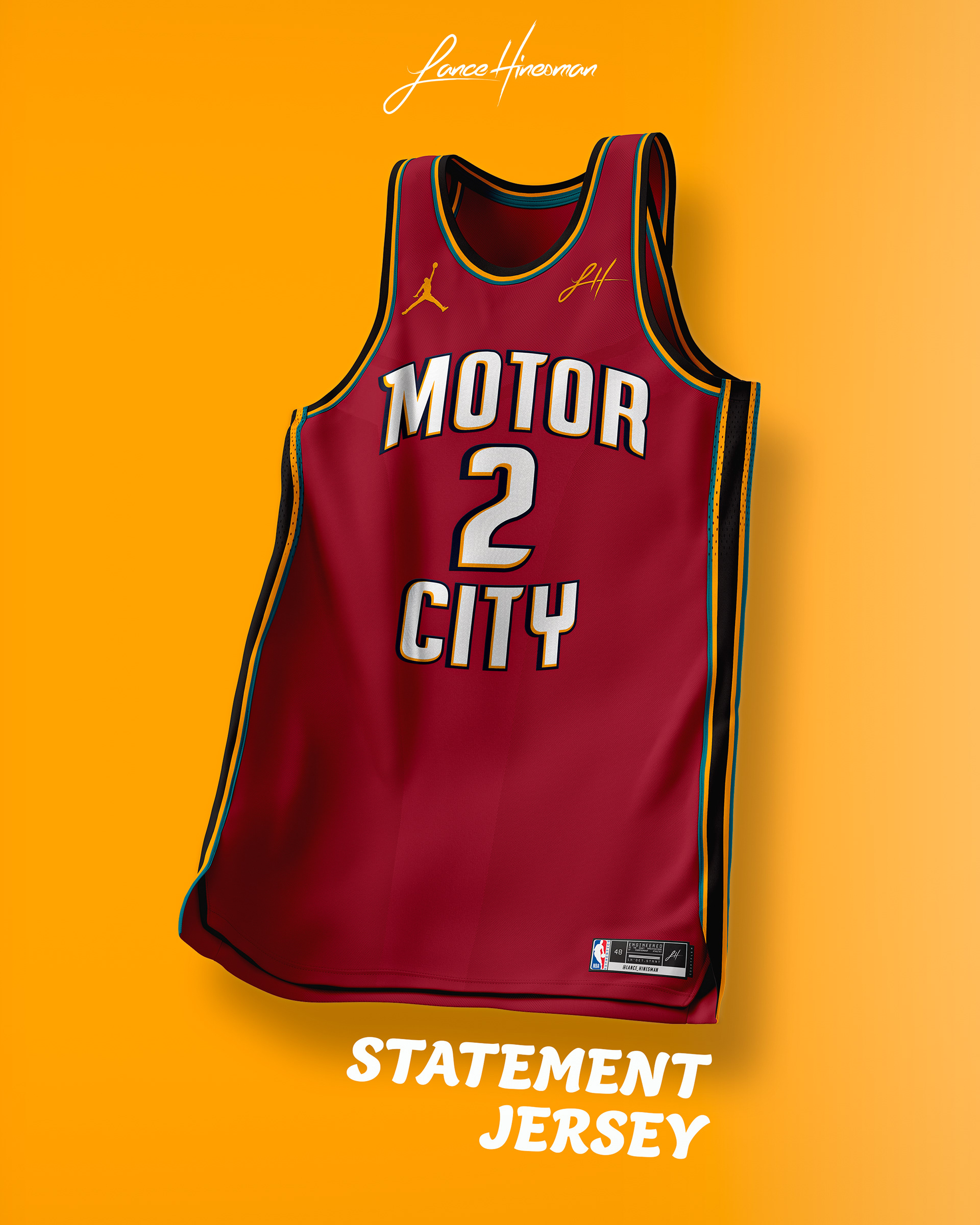
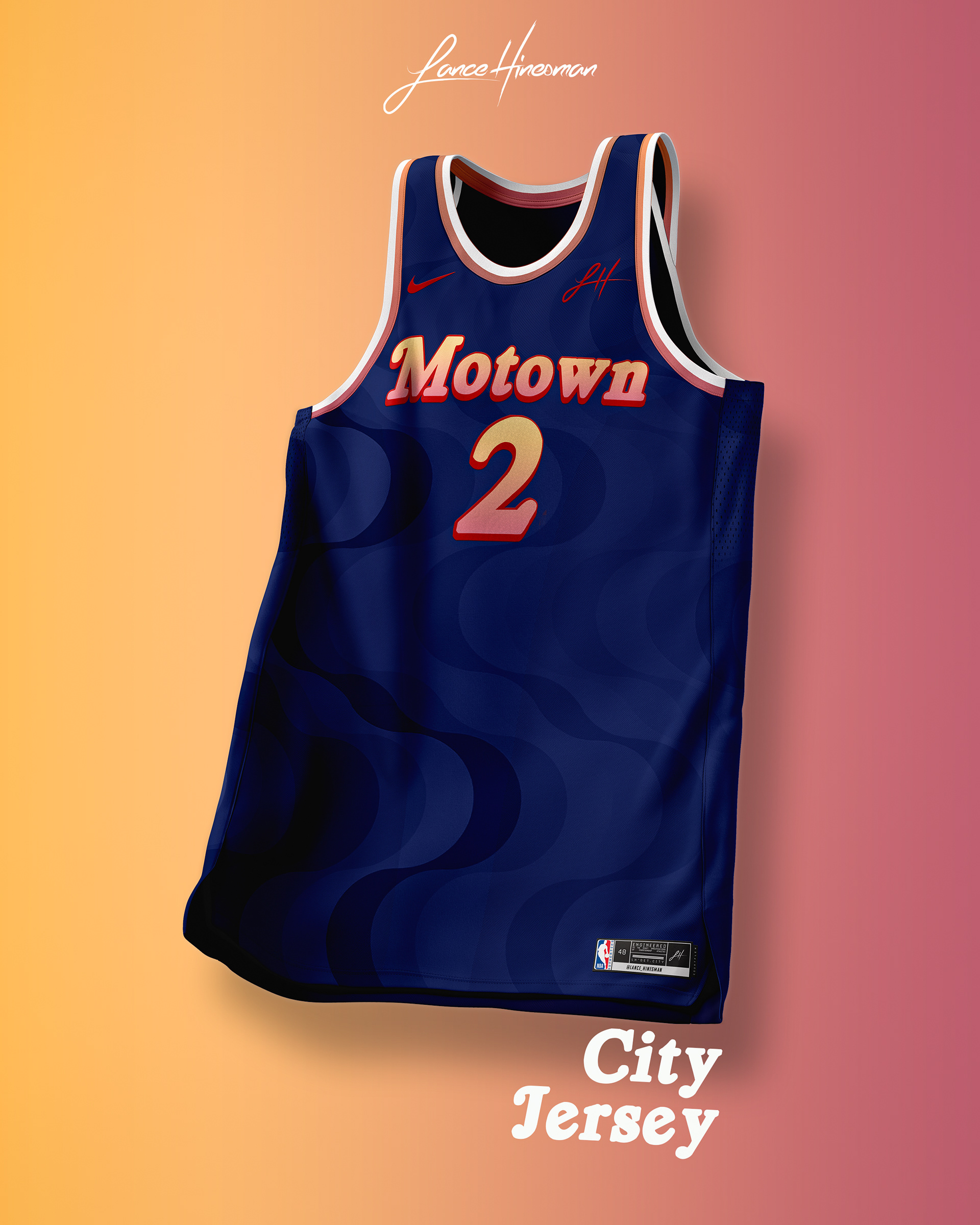
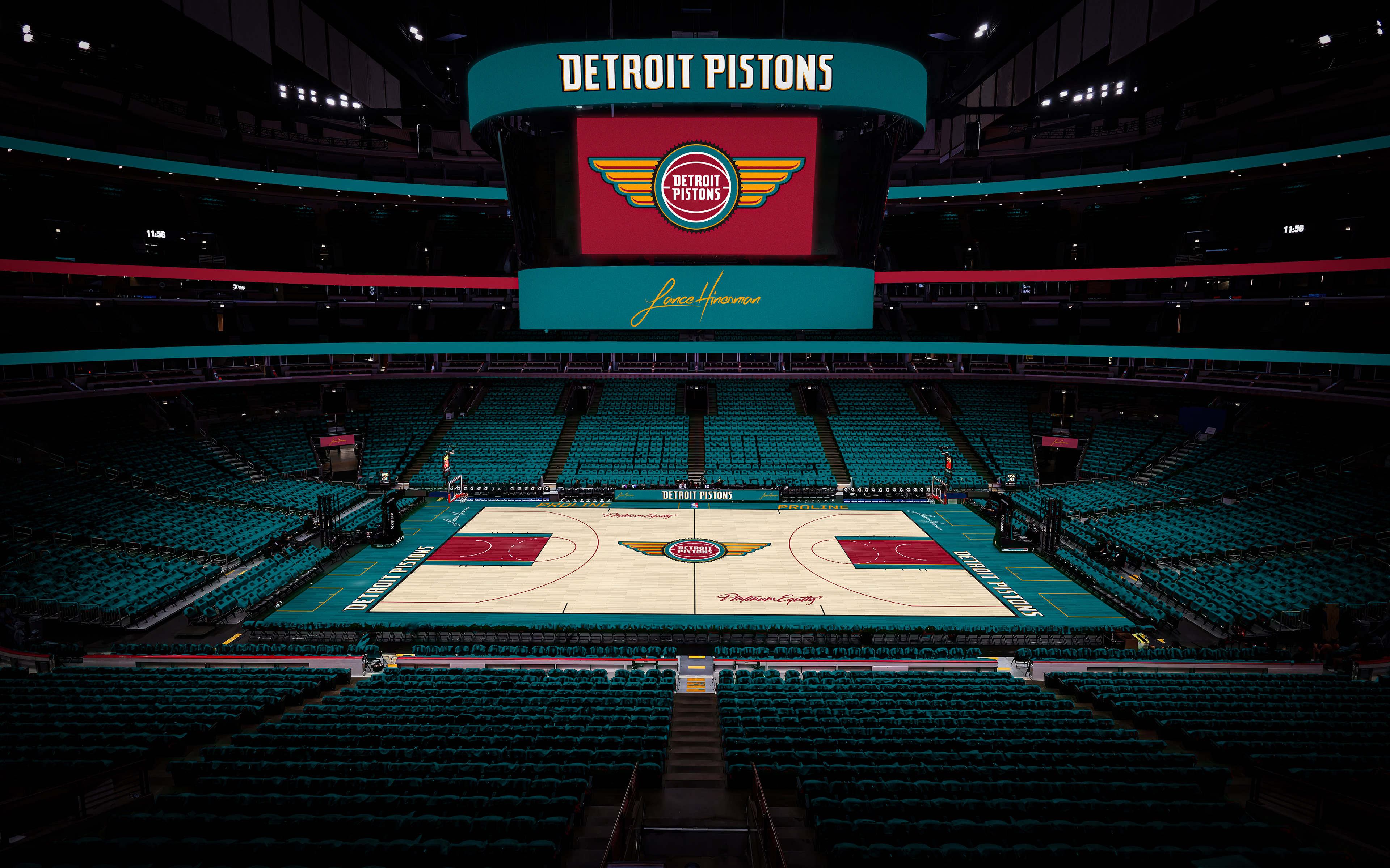
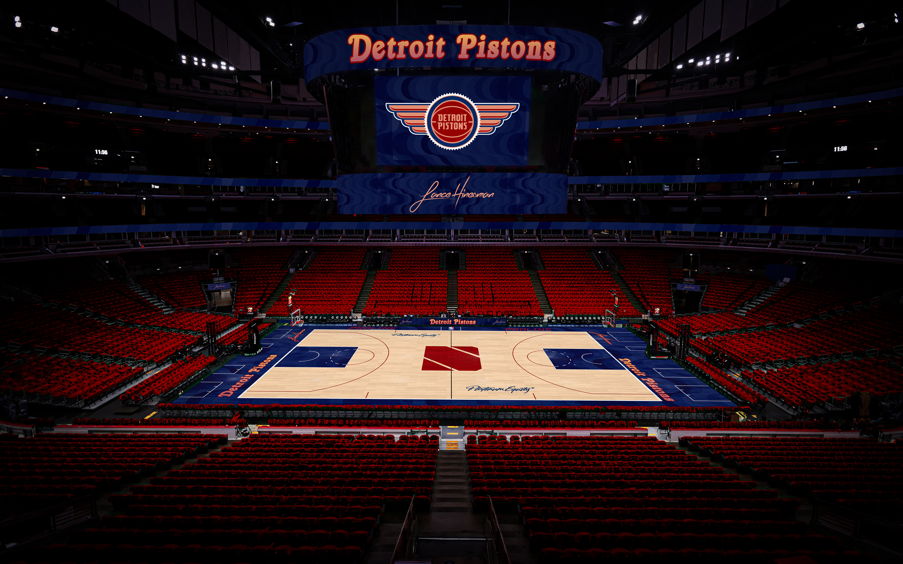
I felt that Pistons were close to having a great visual identity without changing too much of their current looks. Adding wings to the current logo, and using the teal color scheme were changes that seemed obvious to make. For the City branding, I paid homage to Motown, and even created a ‘D’ in the style of the Motown ‘M’.
Golden State Warriors
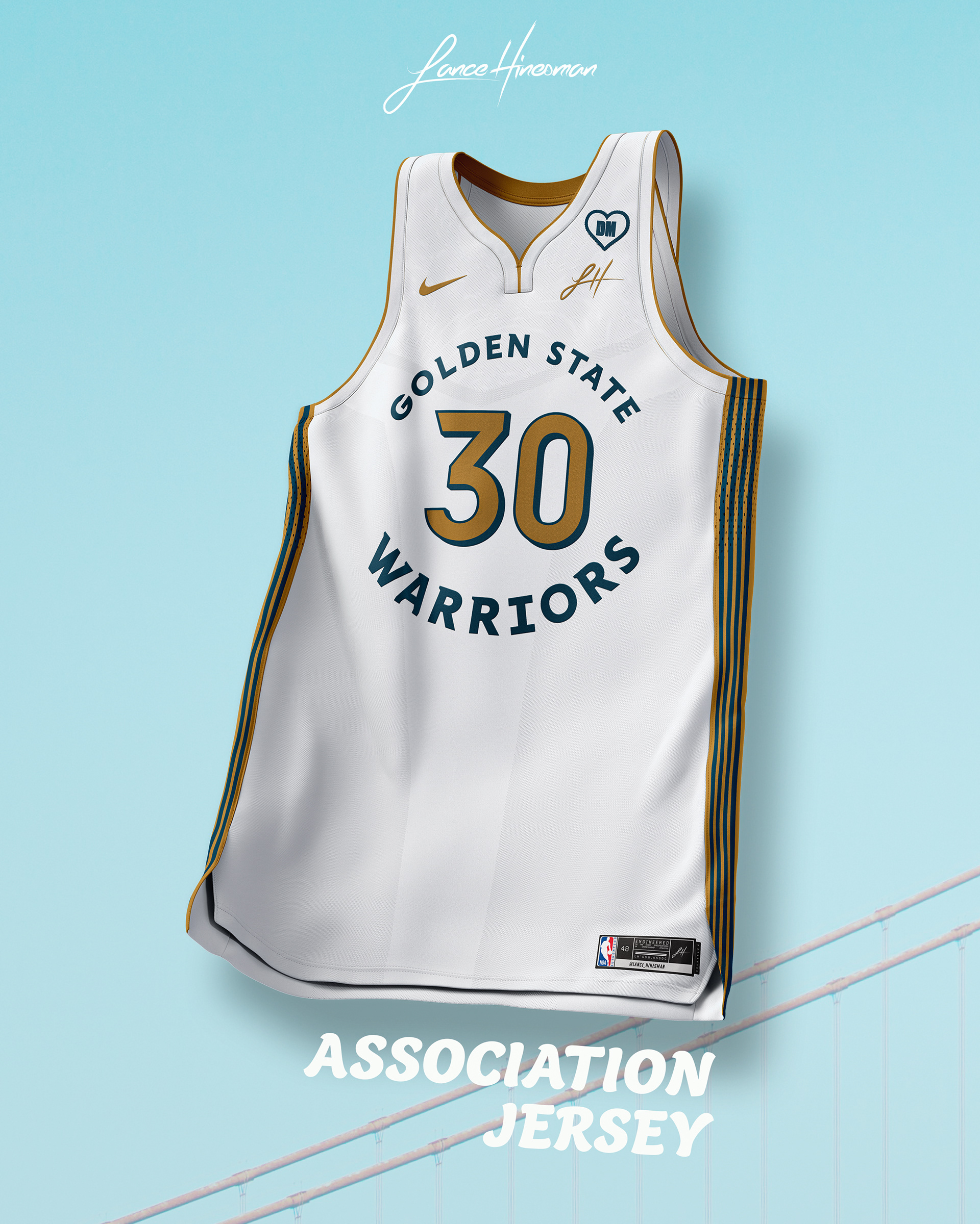
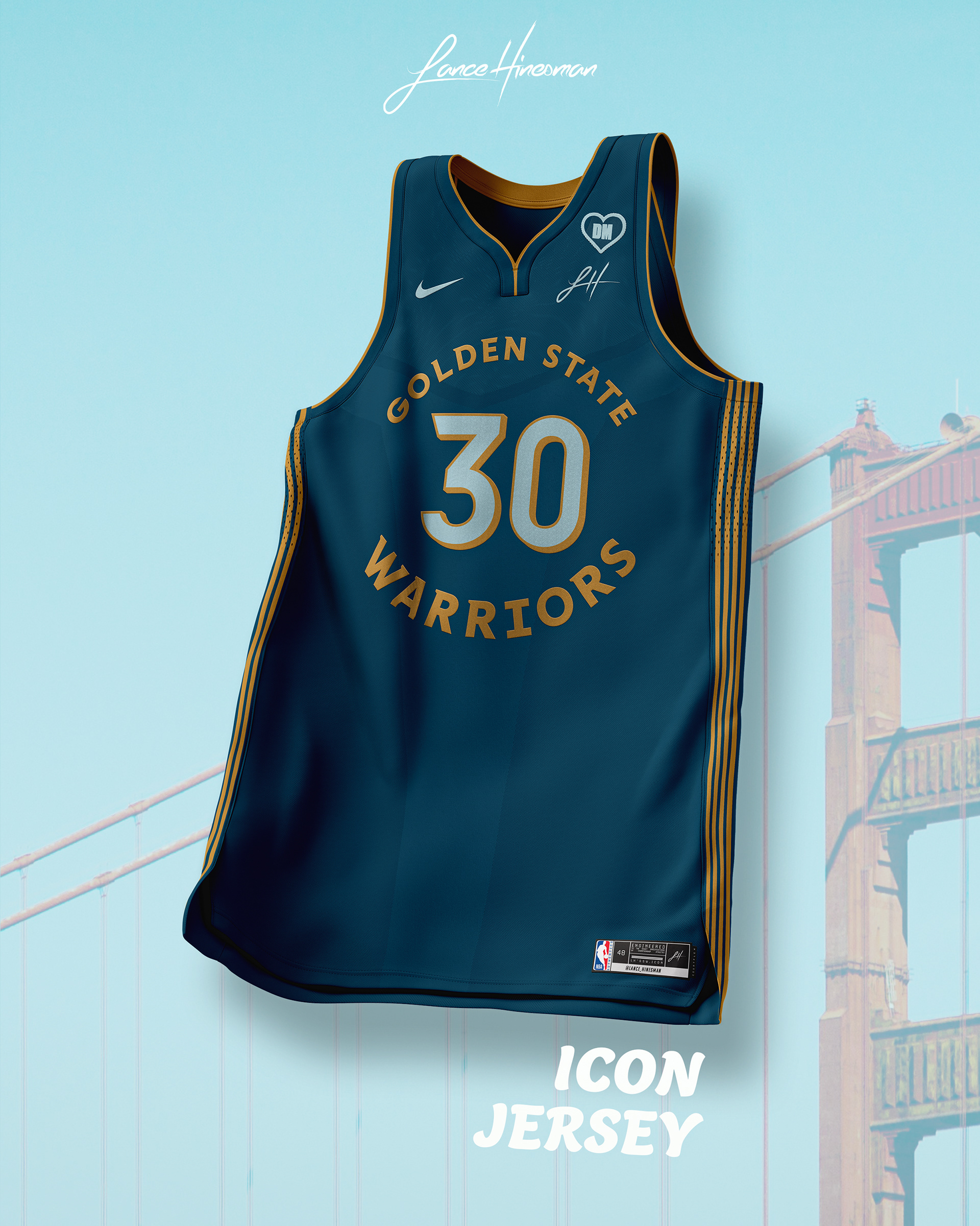
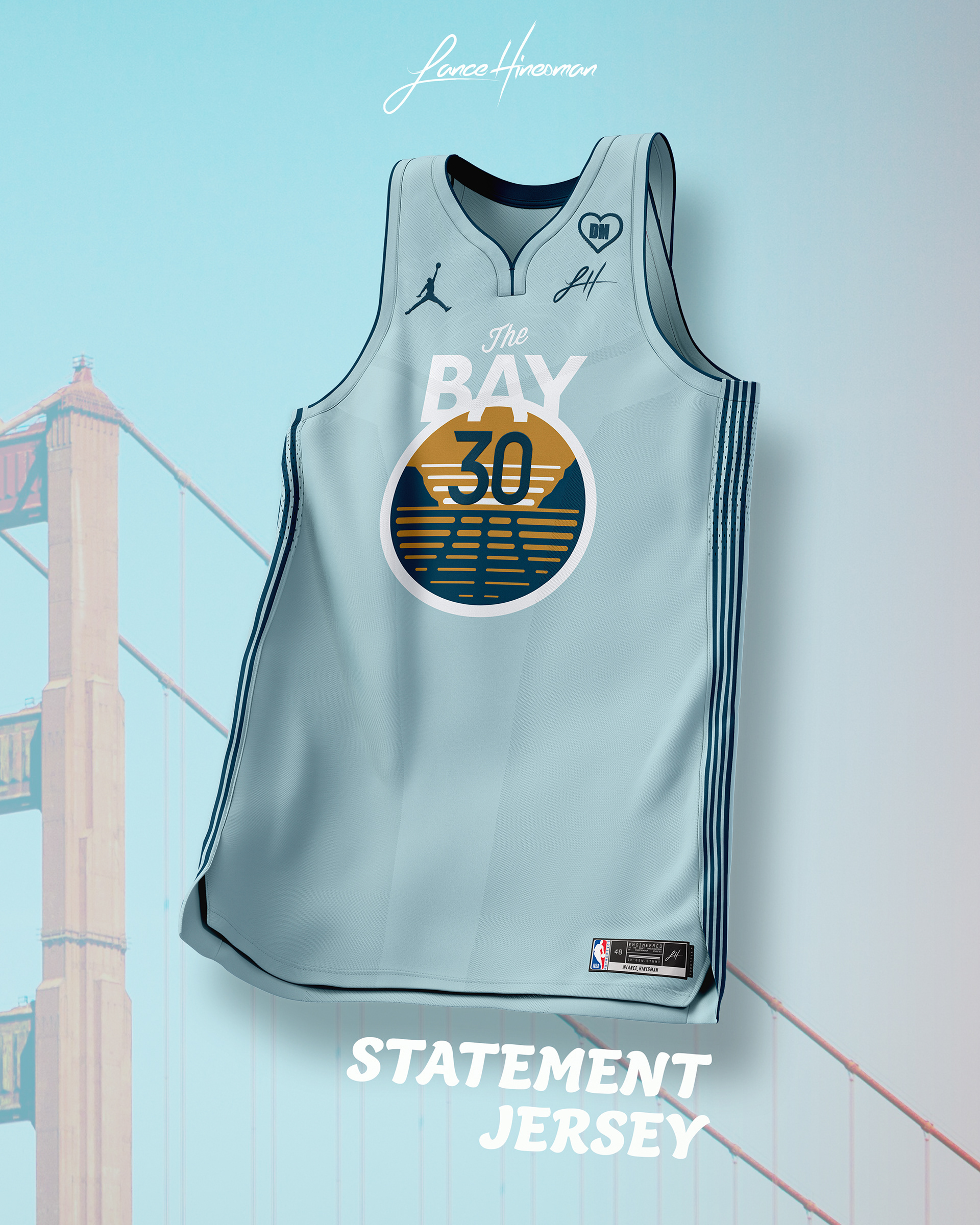
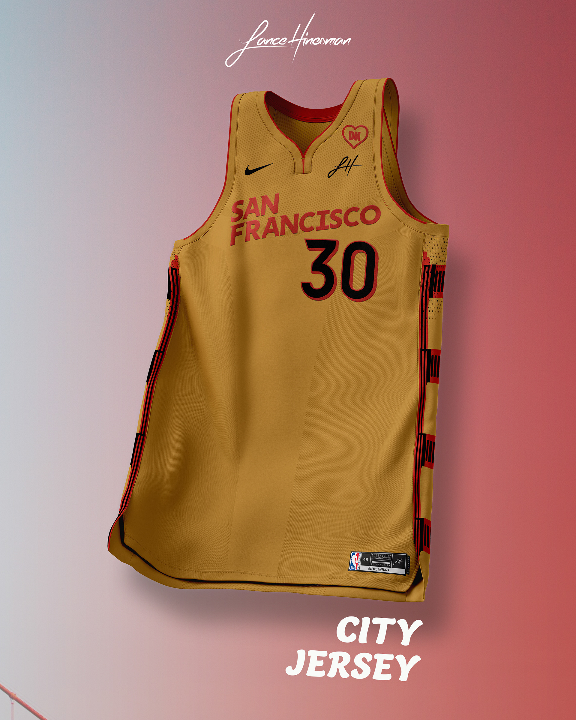
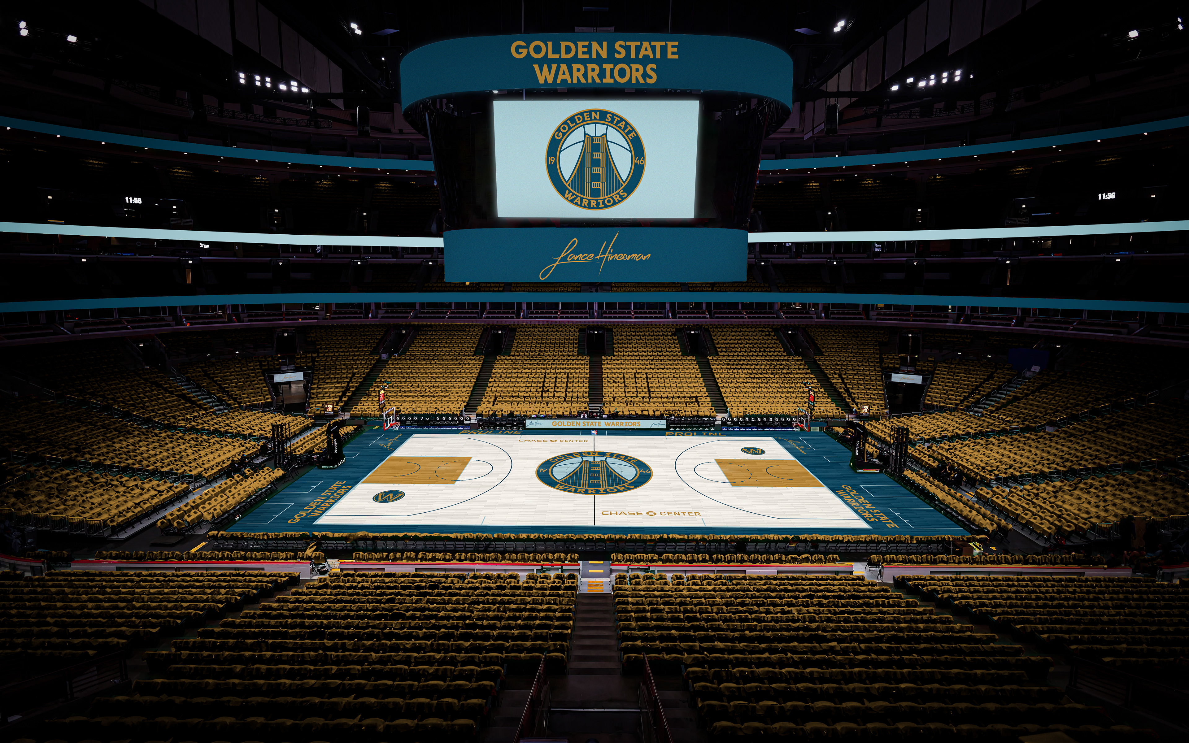
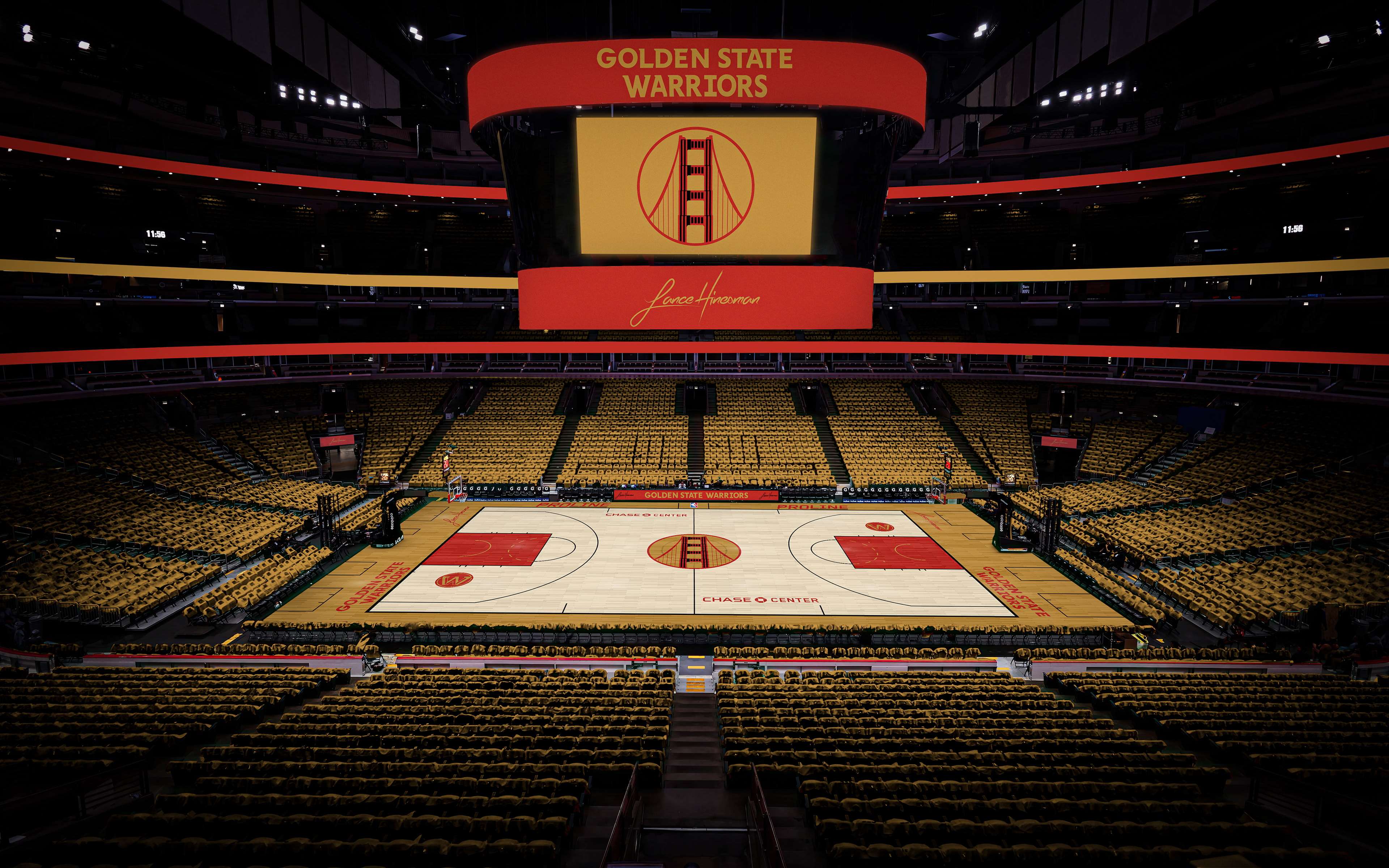
I really like the Warriors' current number and wordmark font so I wanted to keep them, but I went for a new color scheme with a darker blue and gold. The redesigned logo features the Golden Gate Bridge from a new perspective. I also brought back their previous Statement Jersey because it was gone too soon and based the City Jersey on the Golden Gate Bridge itself.
Houston Rockets
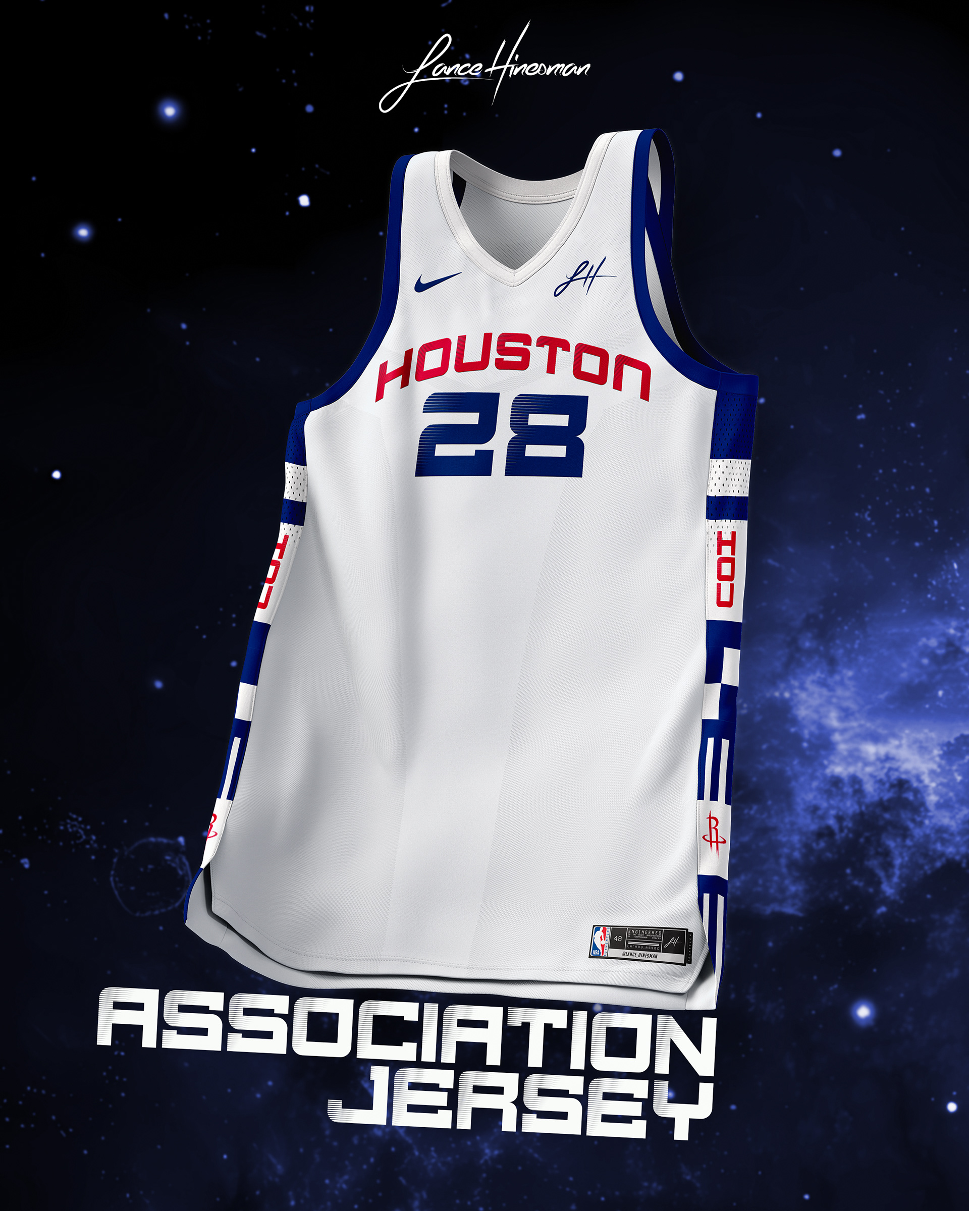
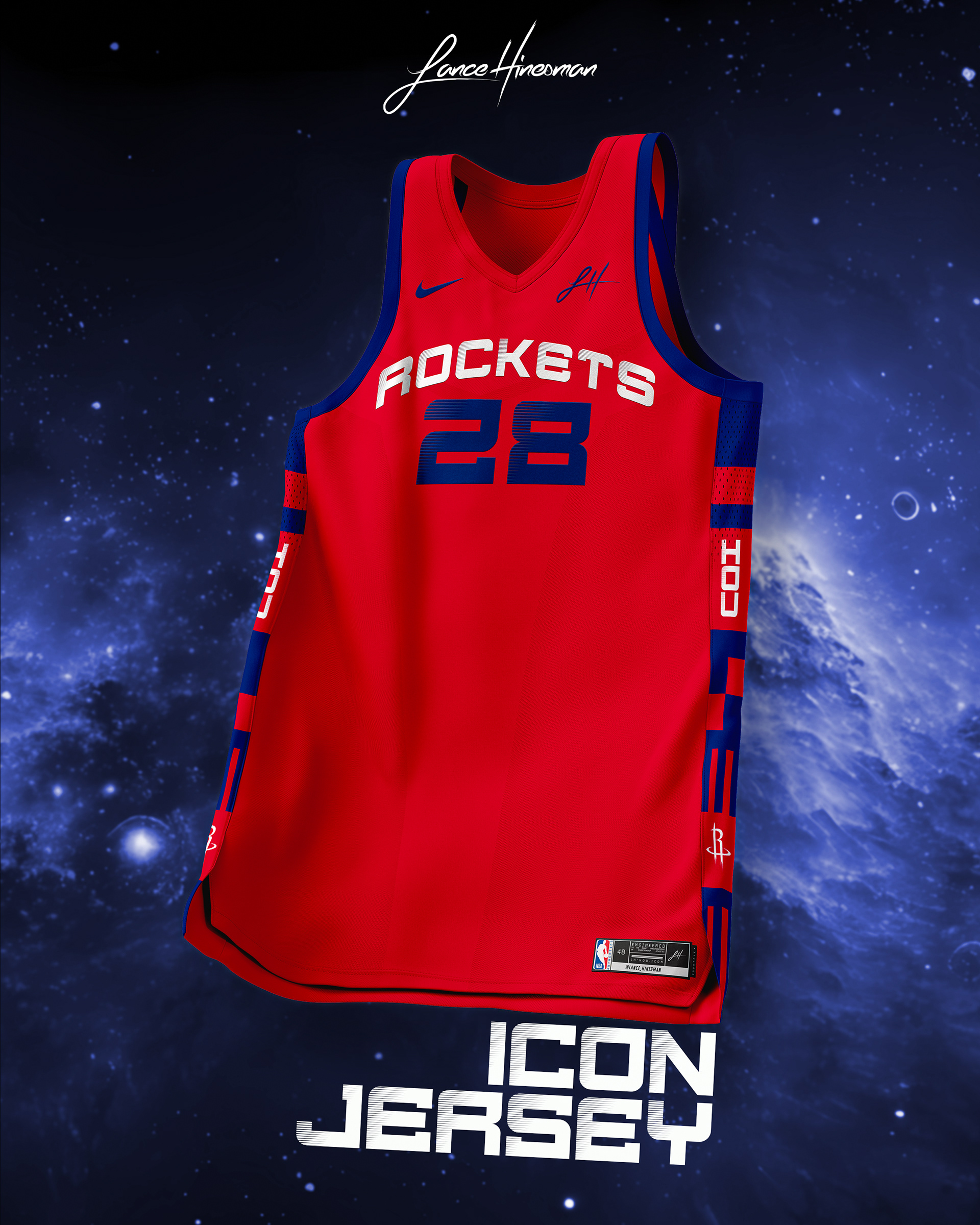
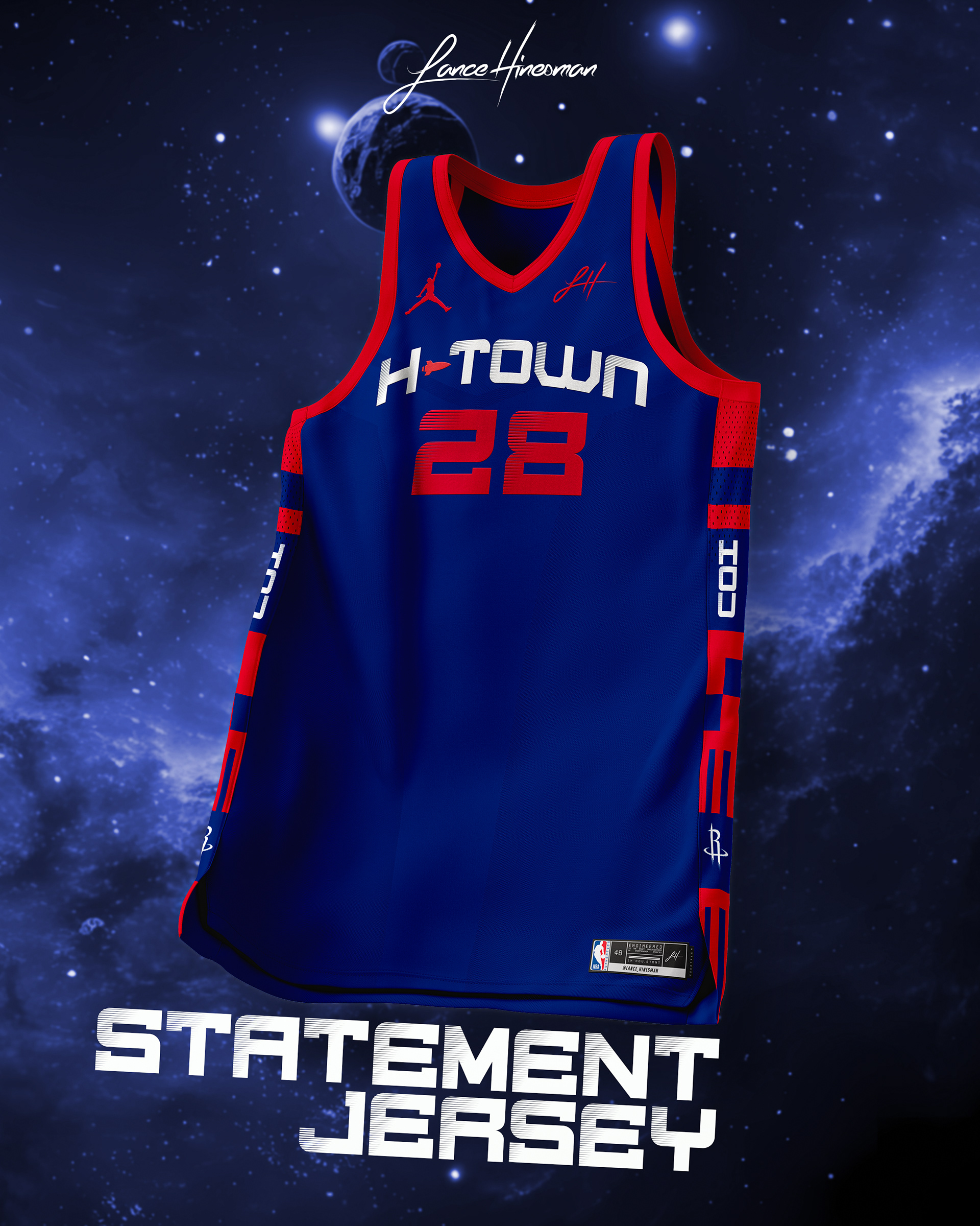
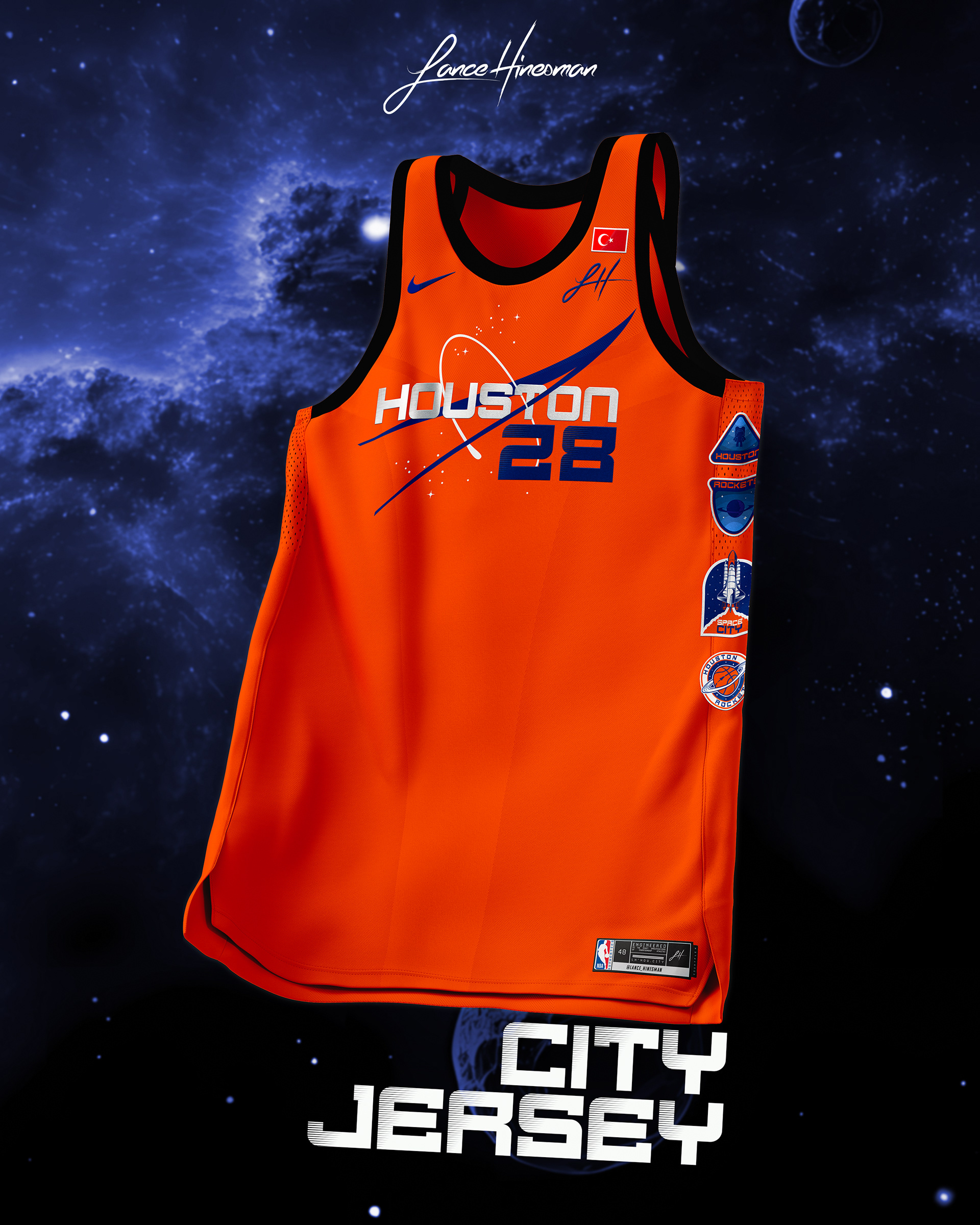
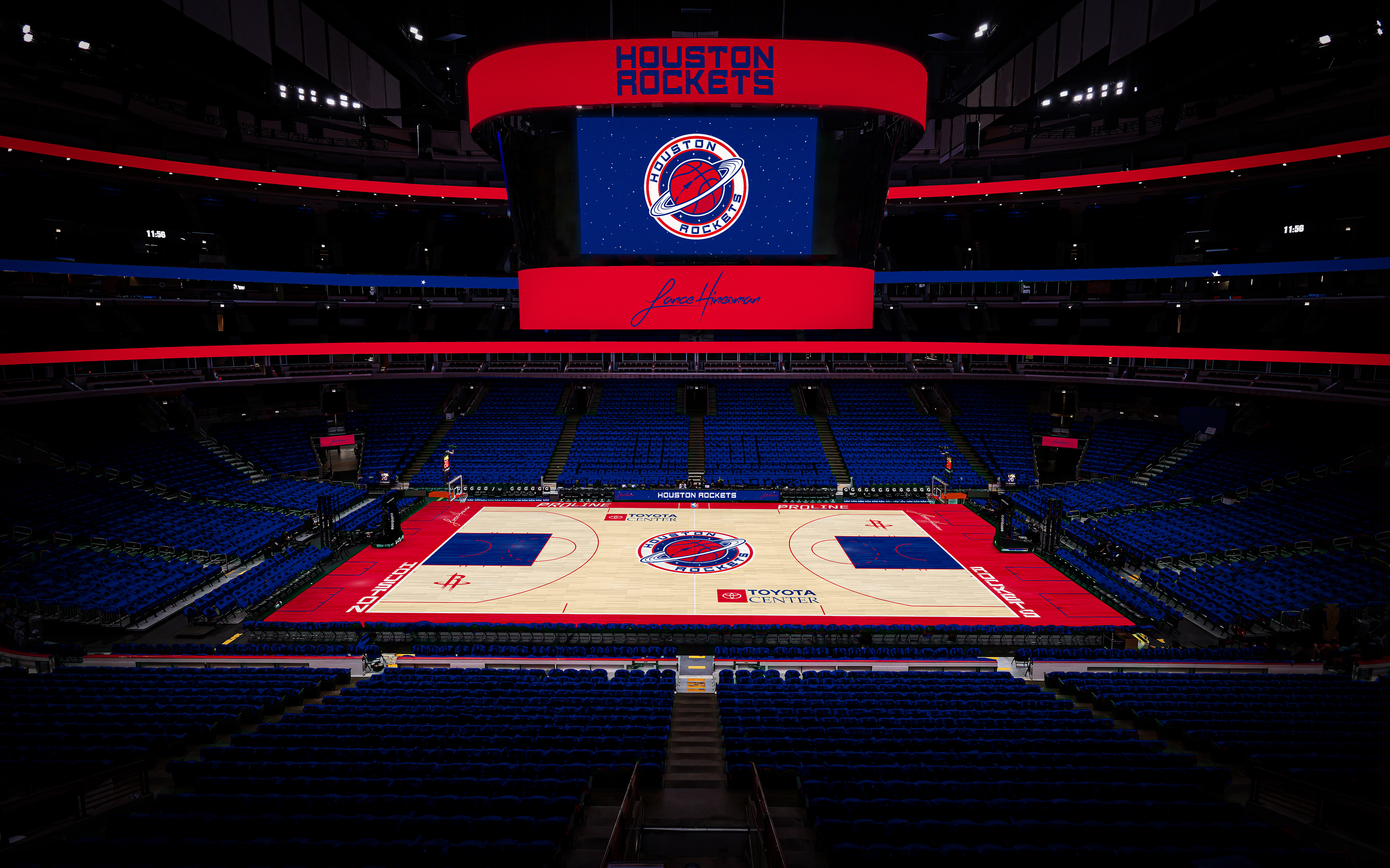
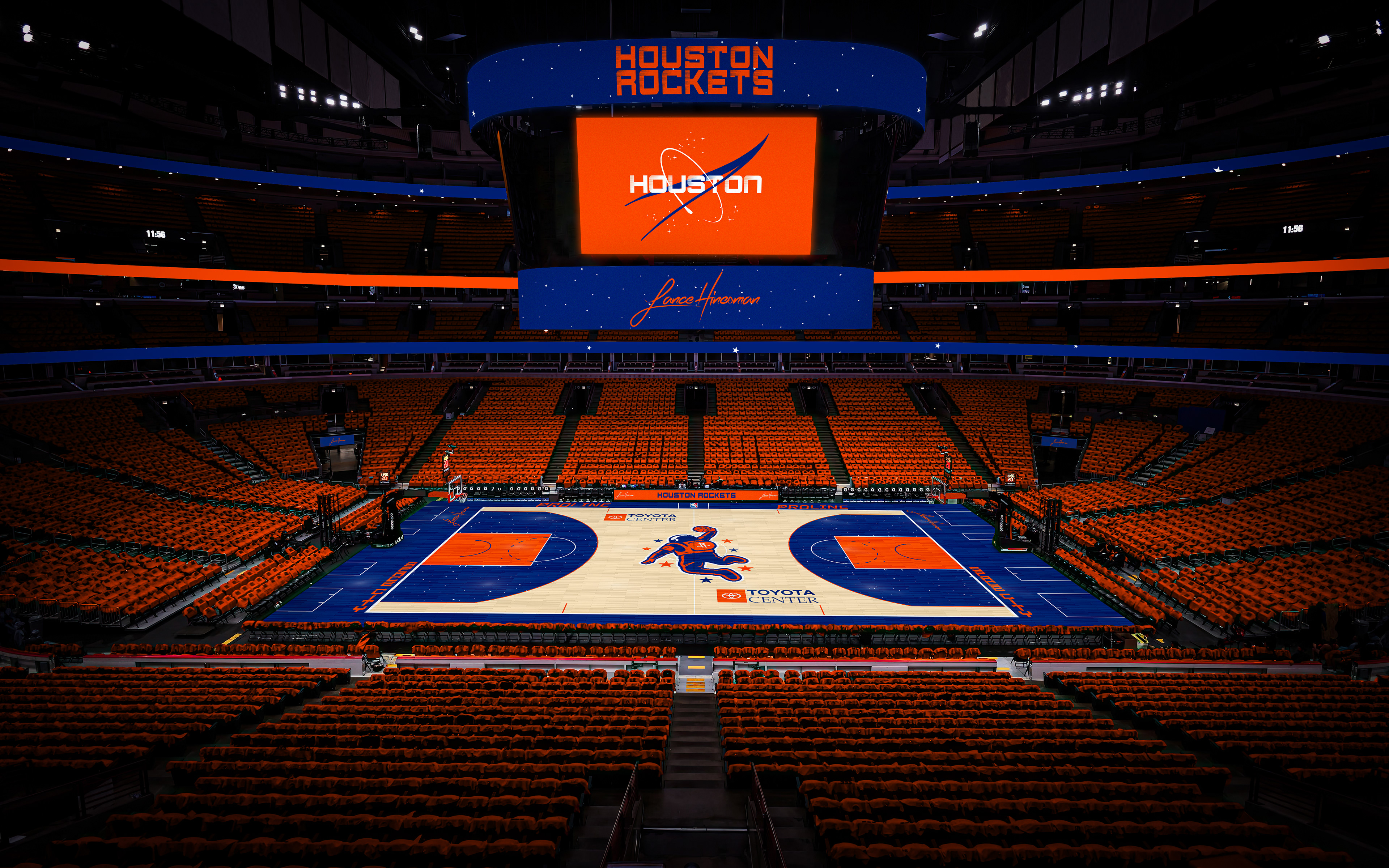
I moved away from most of the Rockets' current brand, using a new set of wordmarks and the retro color scheme. With those, I created a new planet logo as well. The siding on the main jerseys is based on the Apollo 13 rocket, while the City Jersey references NASA and orange astronaut spacesuits.
Indiana Pacers
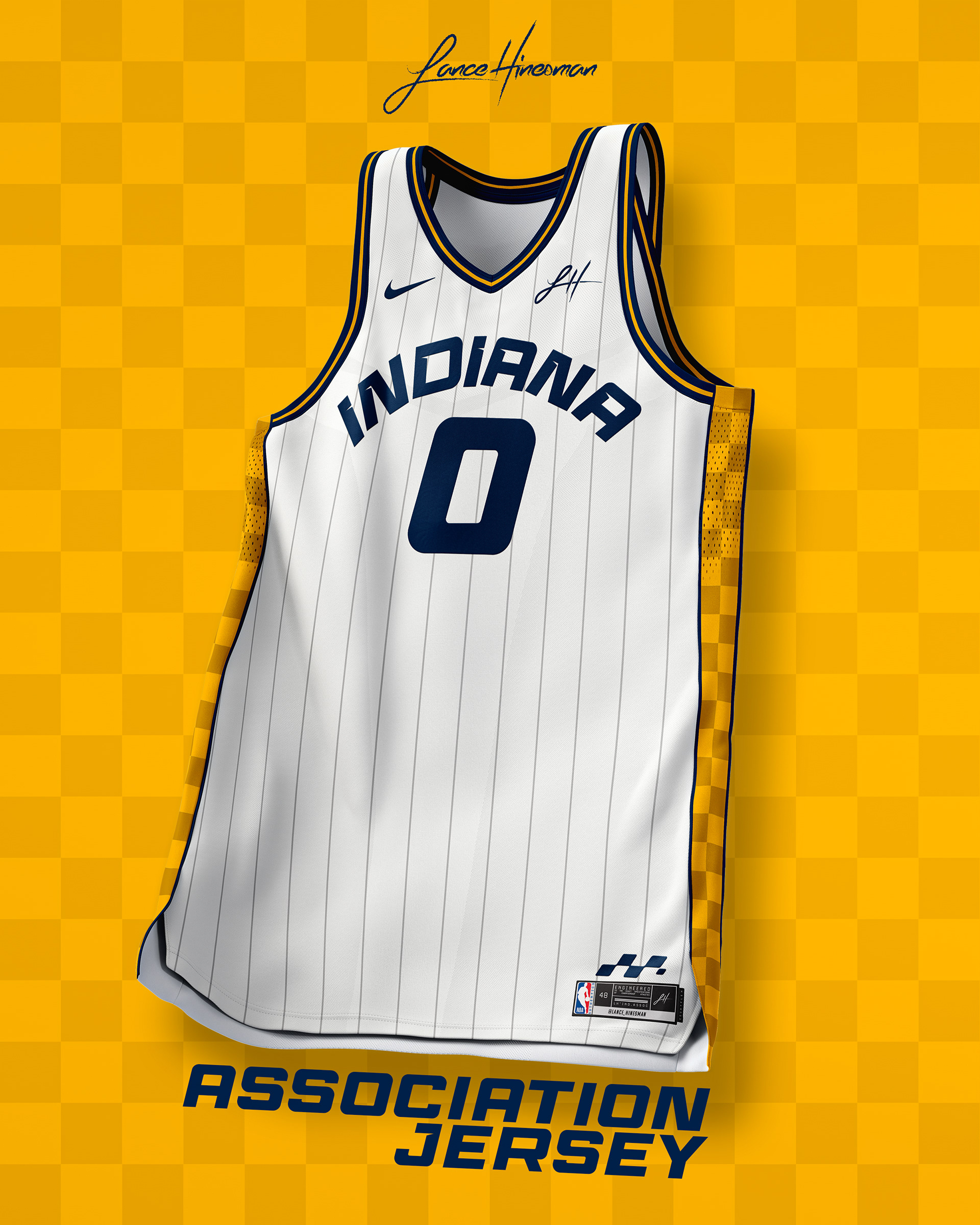
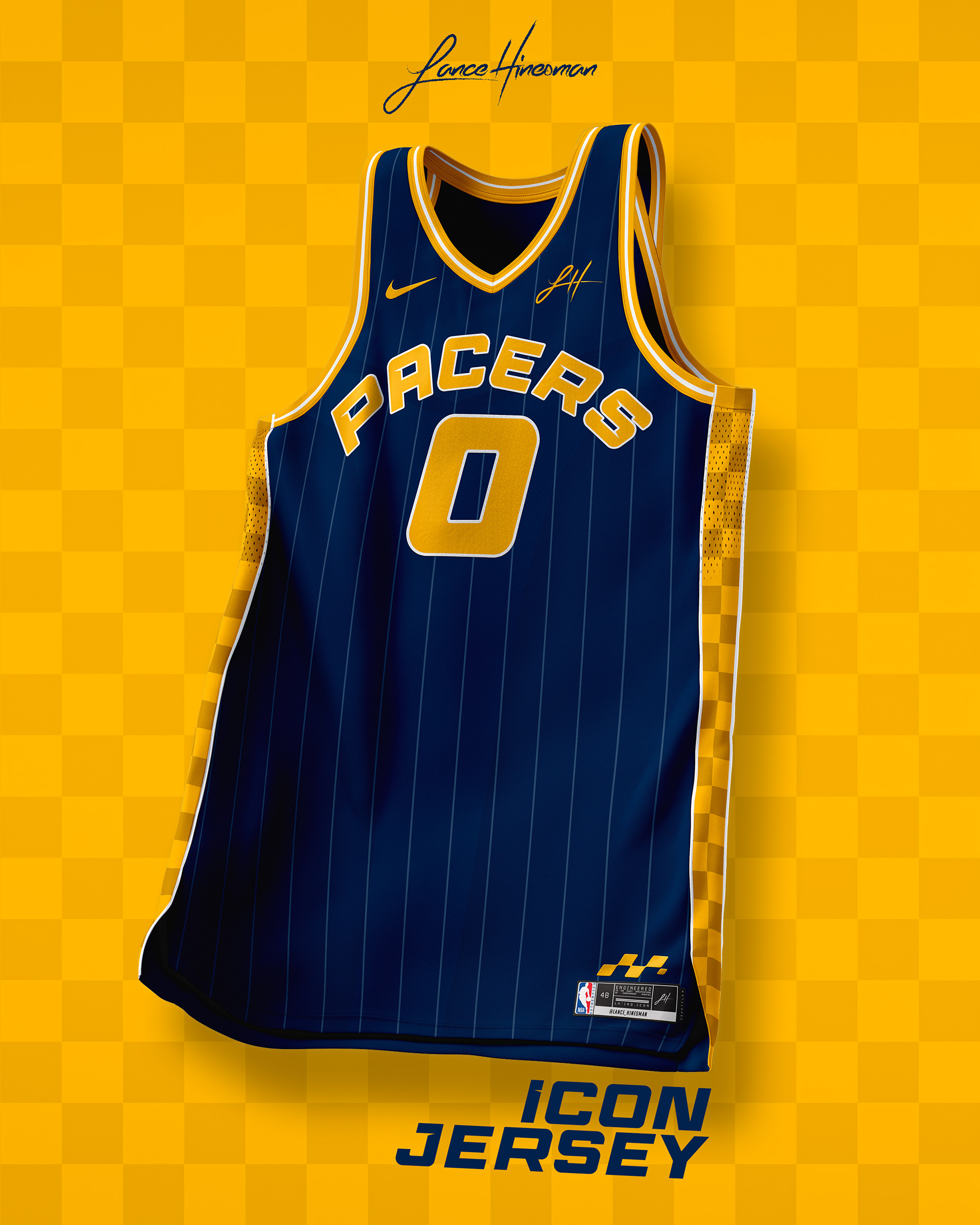
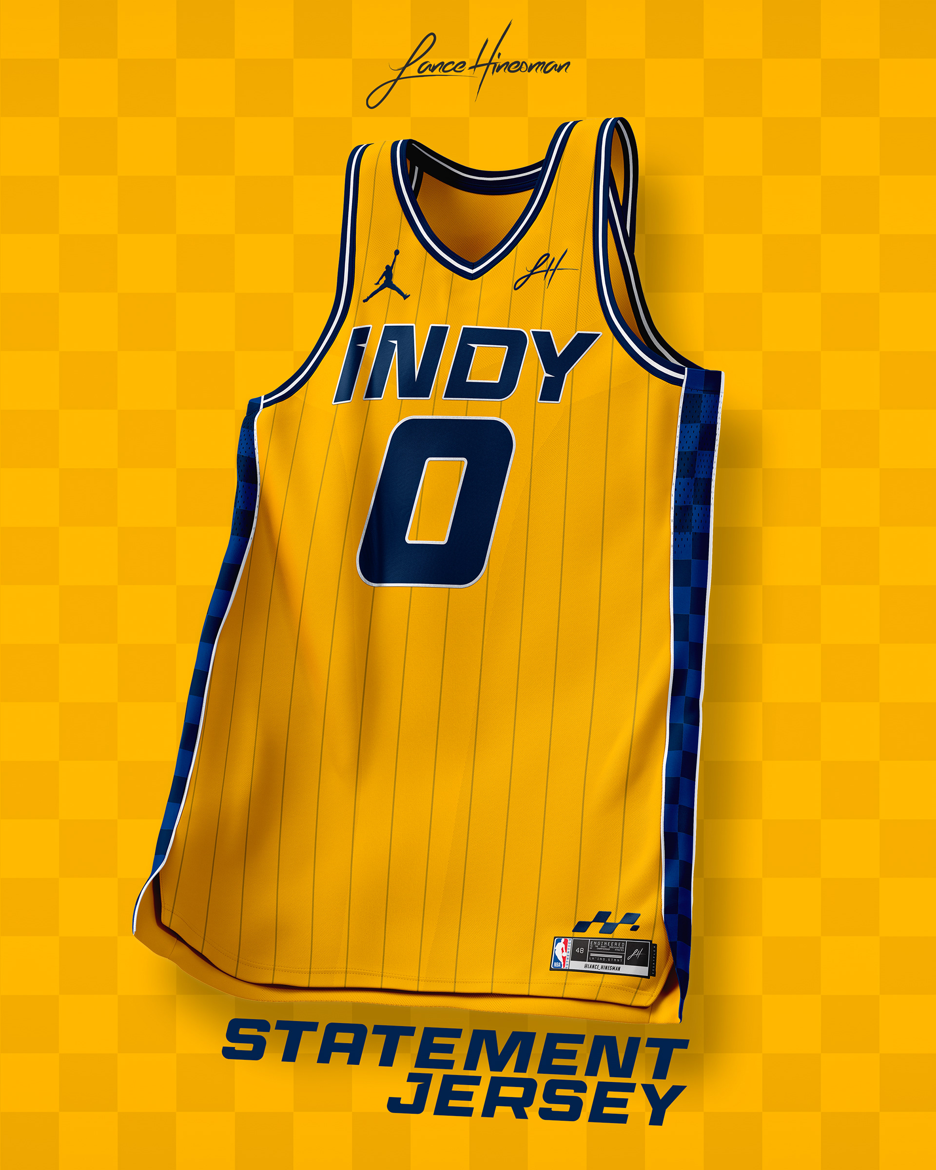
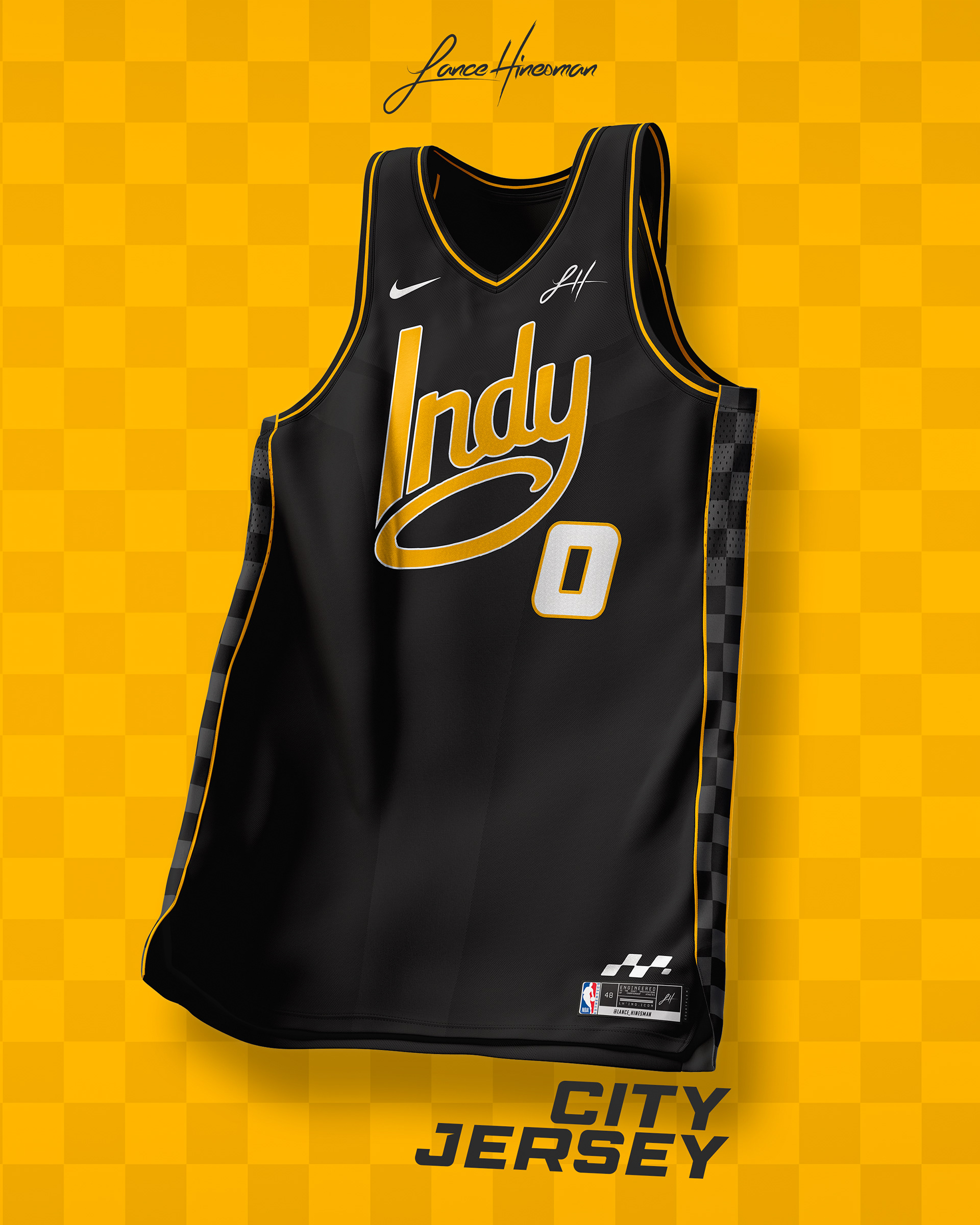
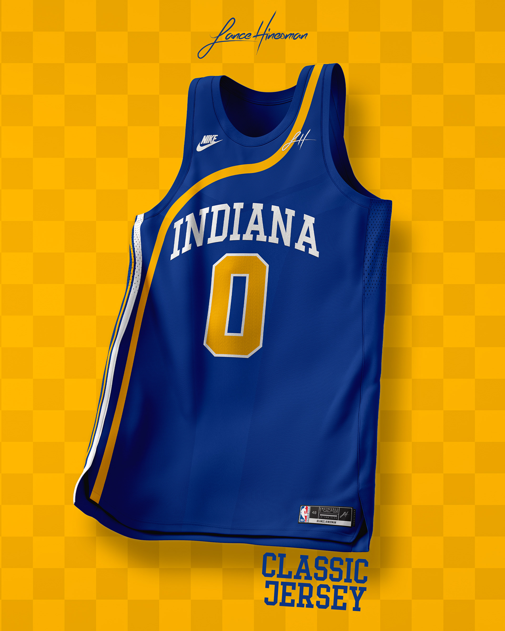
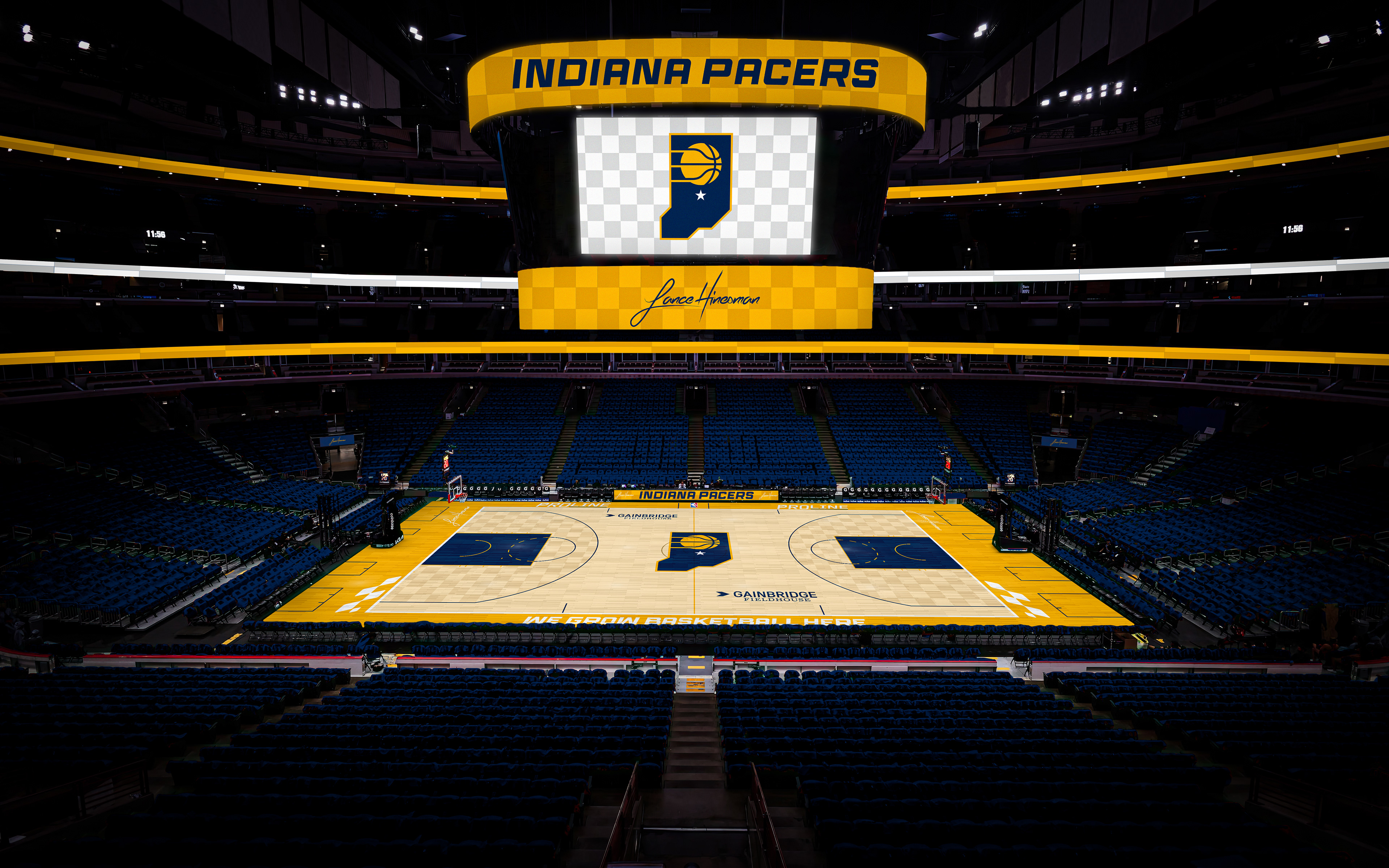
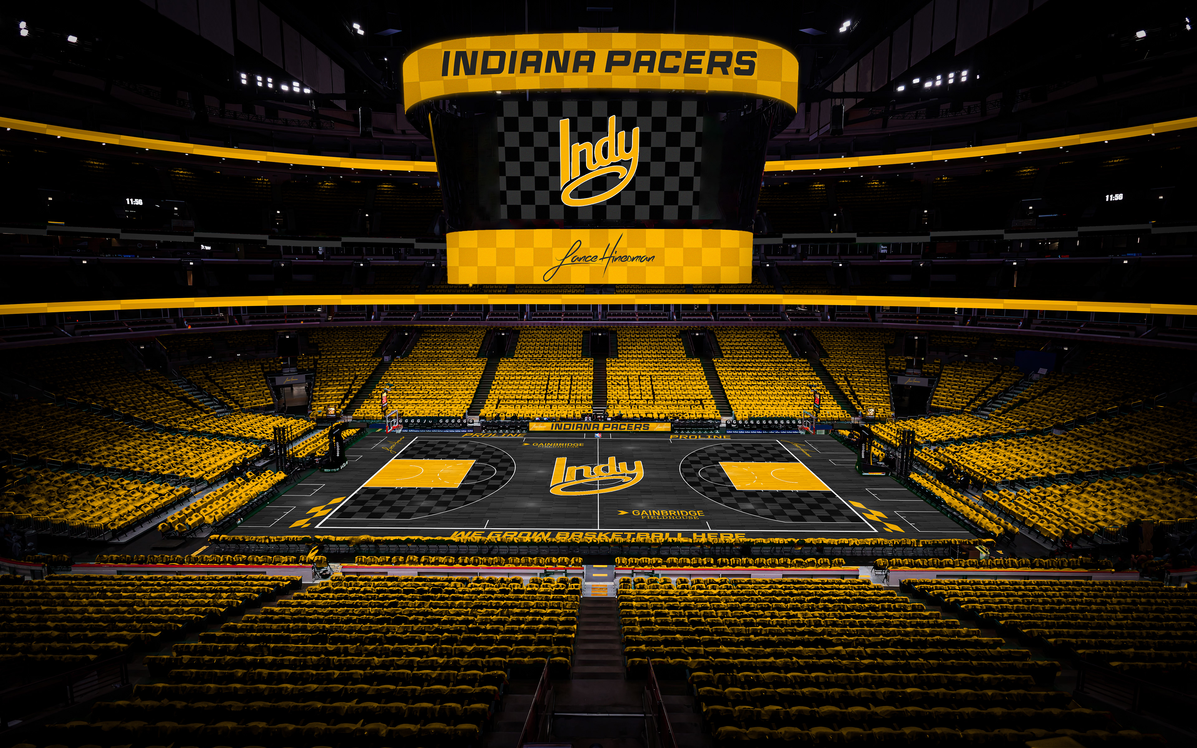
For Indy, I wanted to create more of a racing feel to the team while bringing back the pinstripes of the late 90s and early 2000s. The City Jersey is inspired by the NDY sculptures around Indianapolis. The first dark court of the series is also here to match. The Classic jersey comes from one of the Pacers' ABA uniforms; one of their most underrated looks in my opinion.
Las Vegas 51s
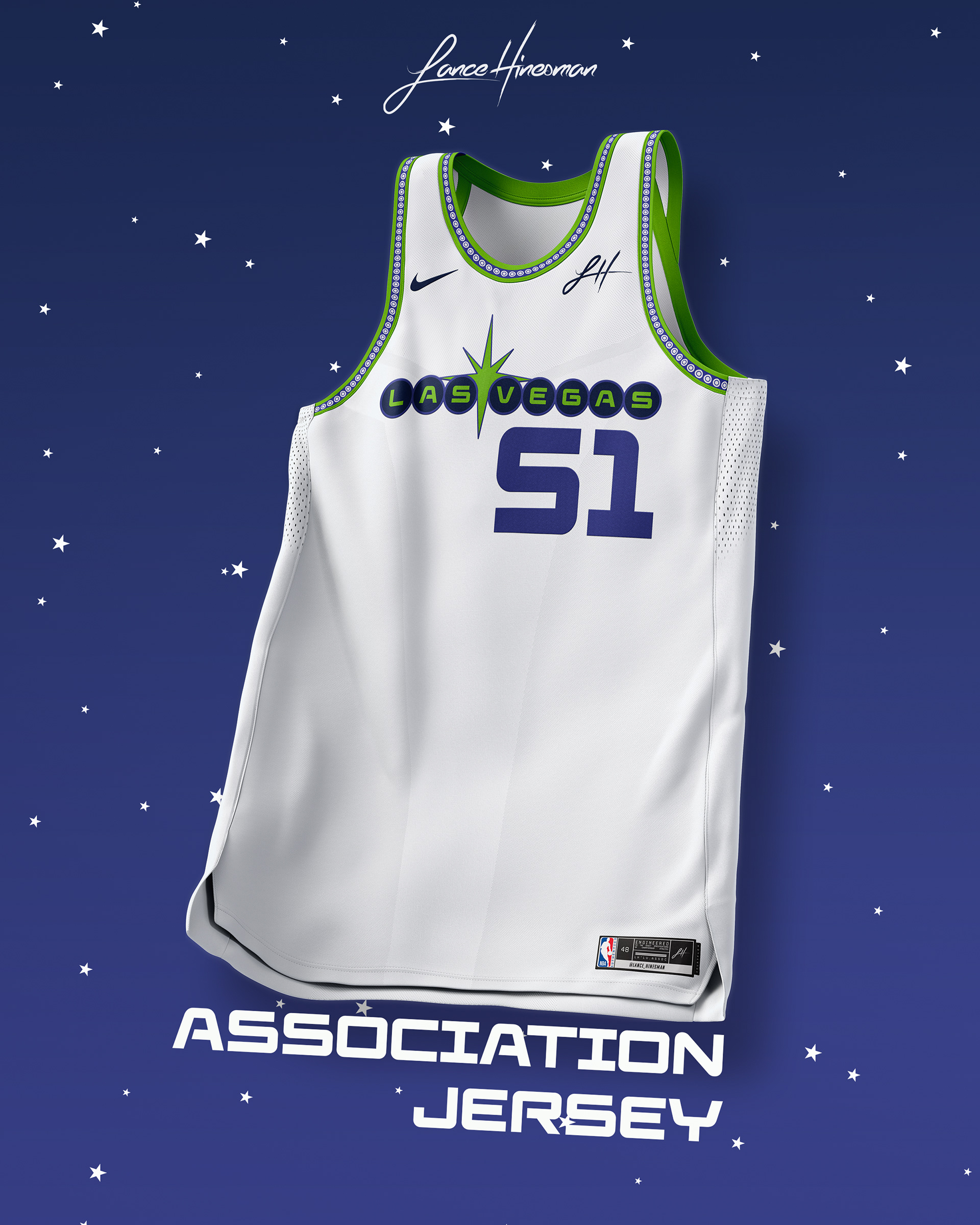
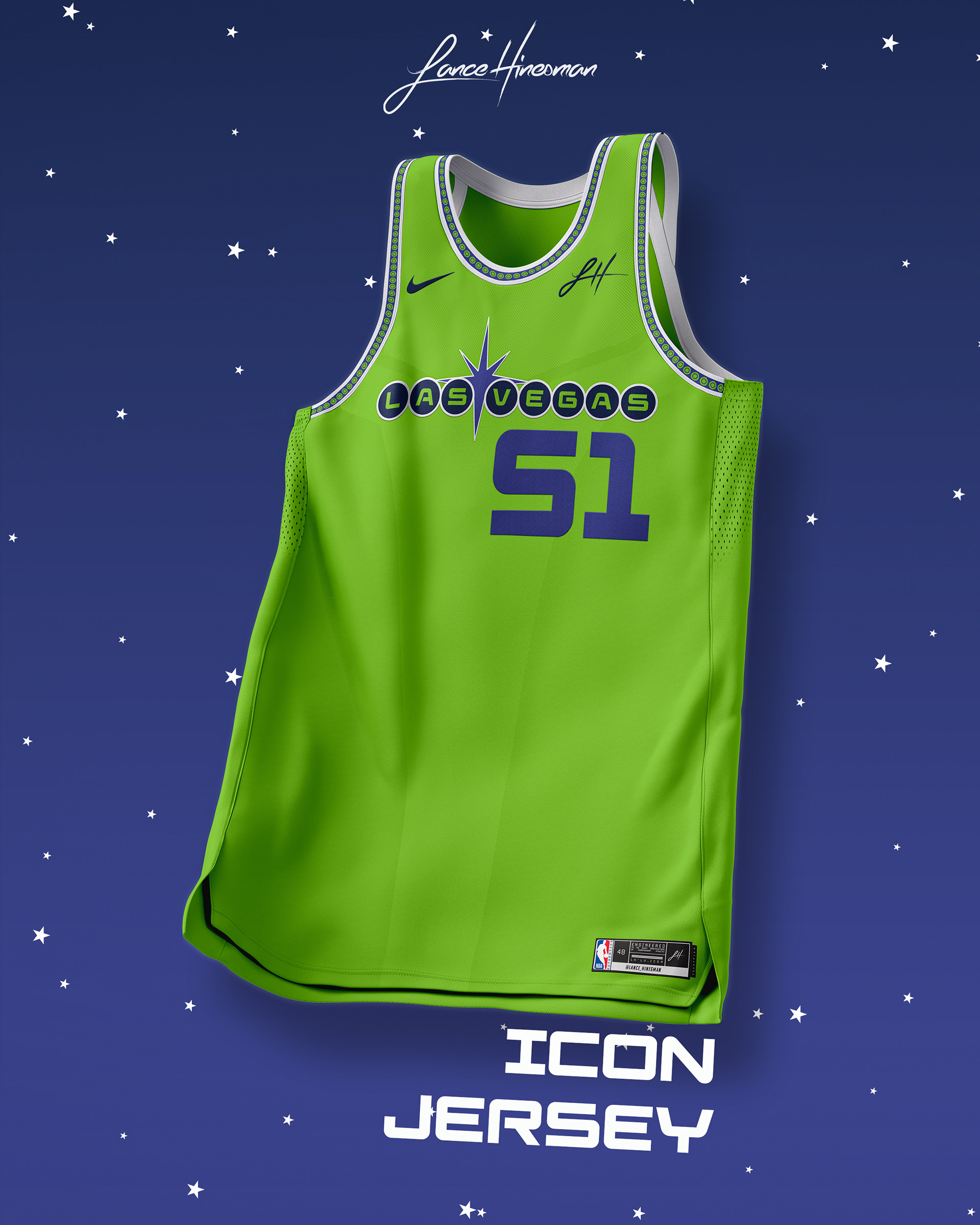
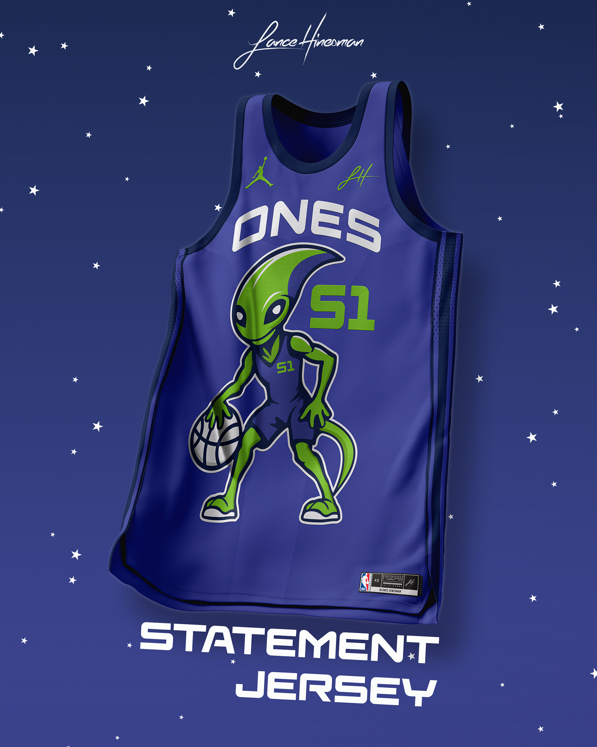
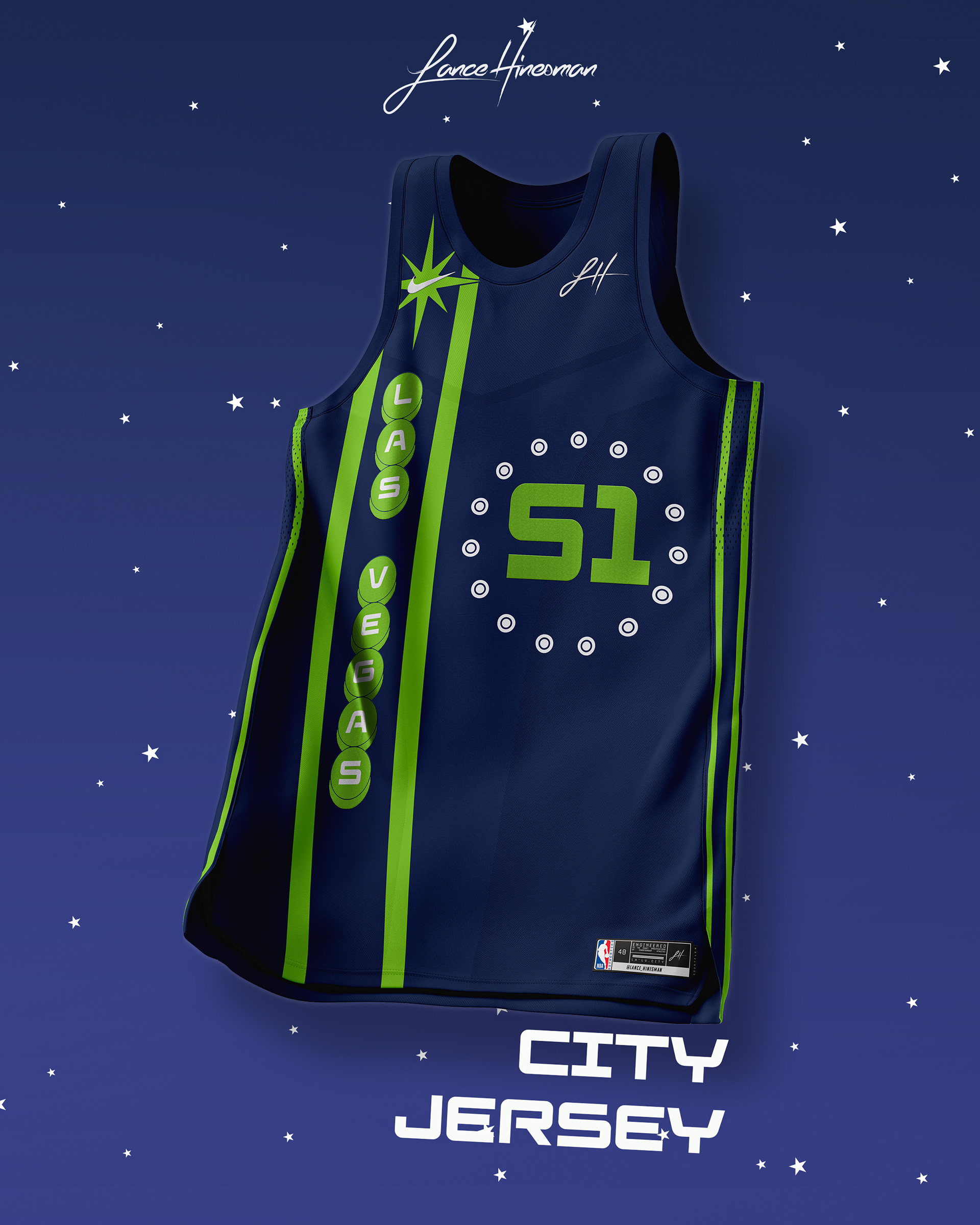
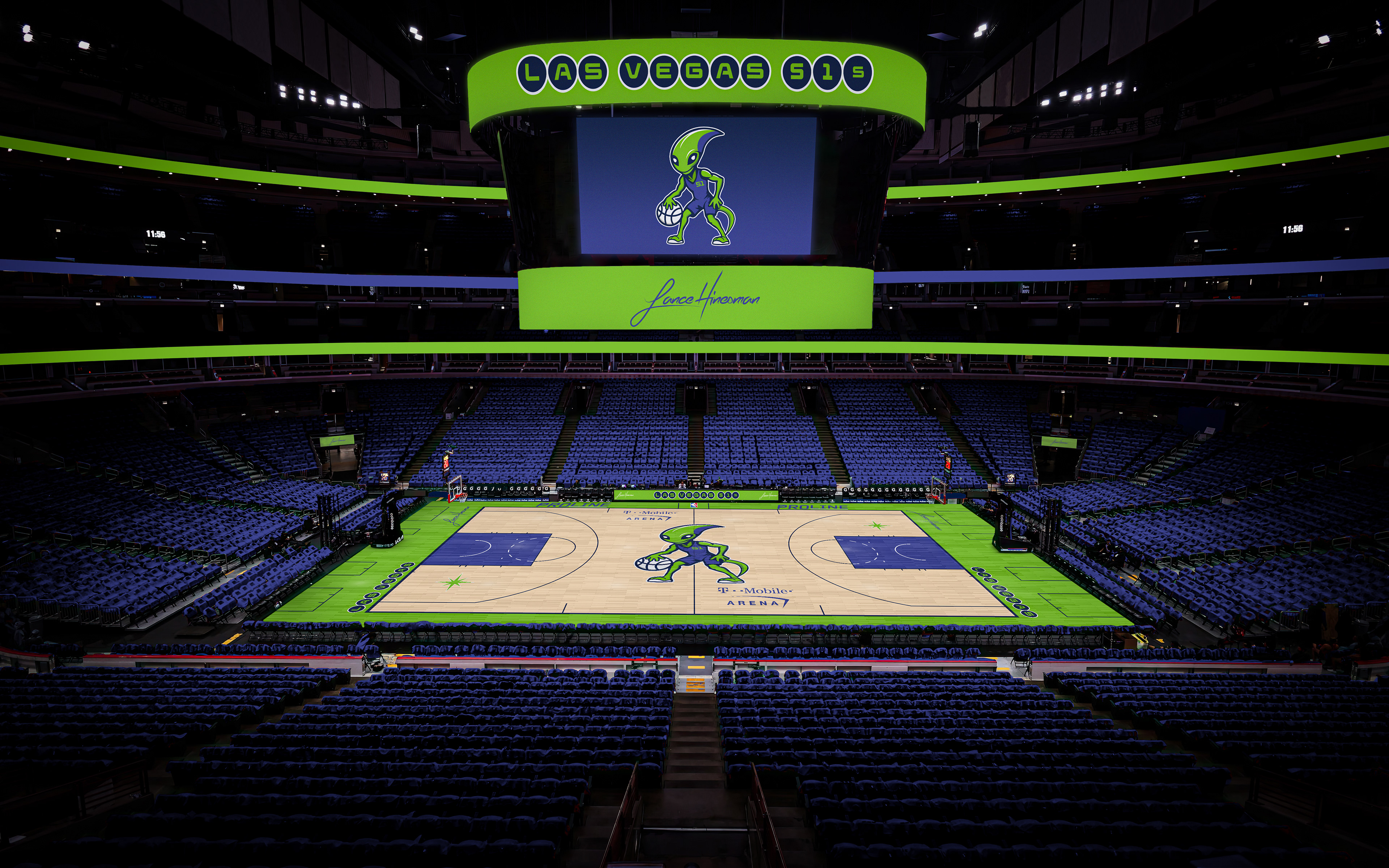
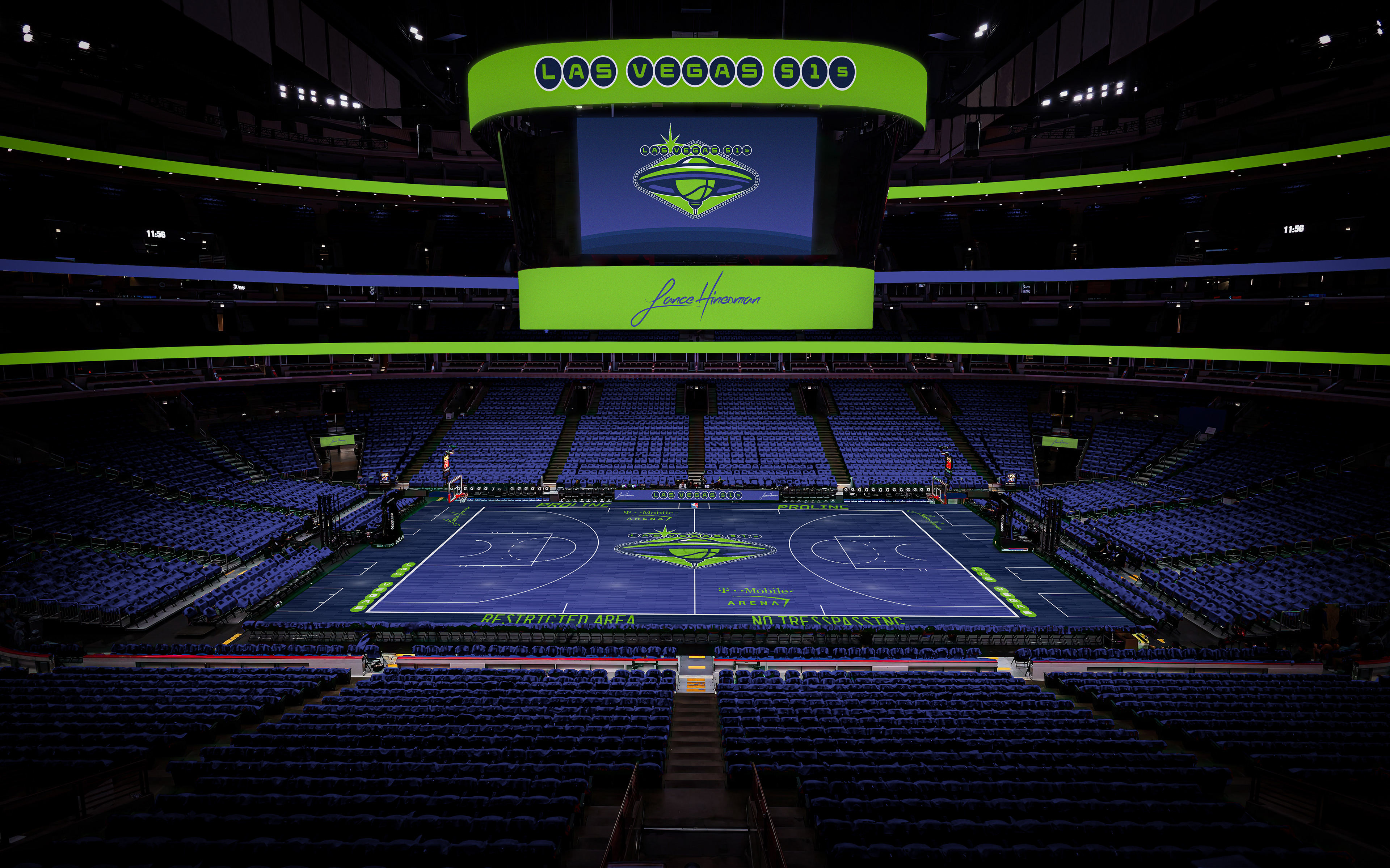
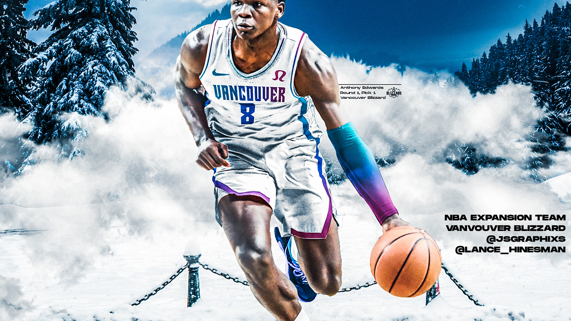
The first expansion team of the project touches down in Sin City. It's also a recreation of an old design I did at a much higher quality. The Statement jersey takes inspiration from the throwback Raptors' unis and prominently features the alien mascot (who I named Dennis). The City Jersey, like the main logo, is inspired by the Welcome to Las Vegas Sign.
Los Angeles Clippers
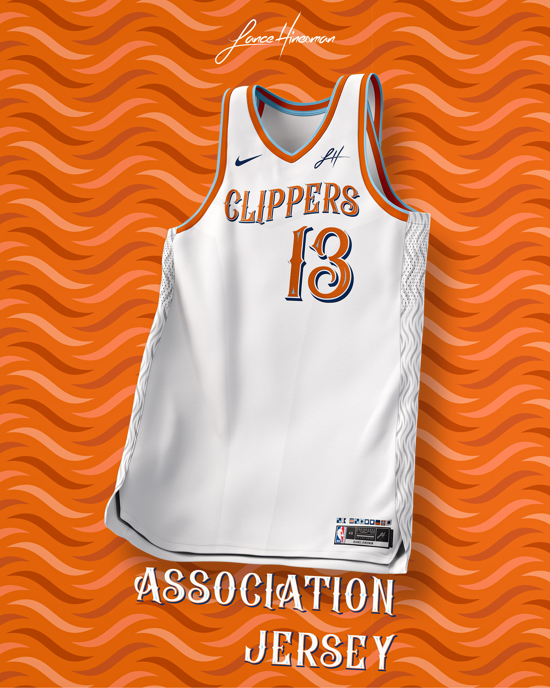
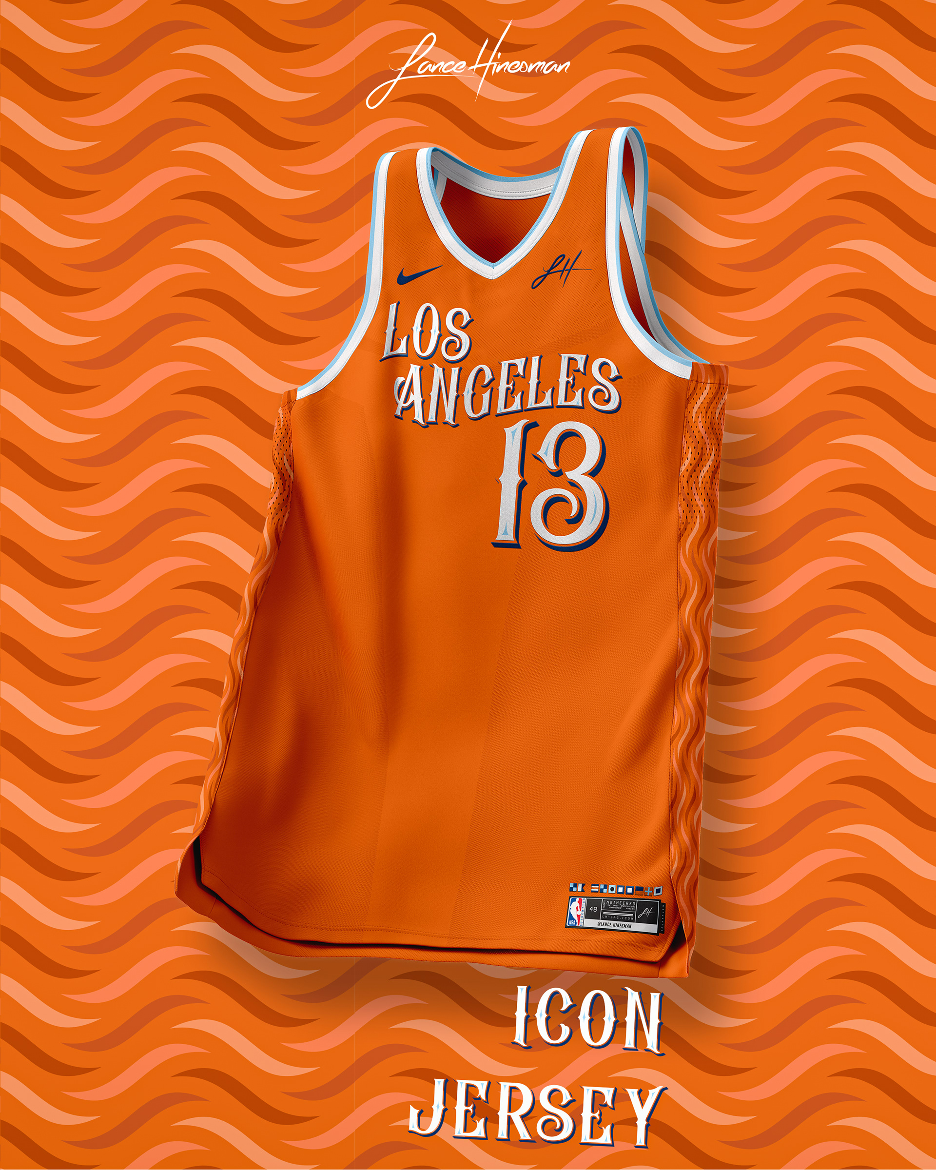
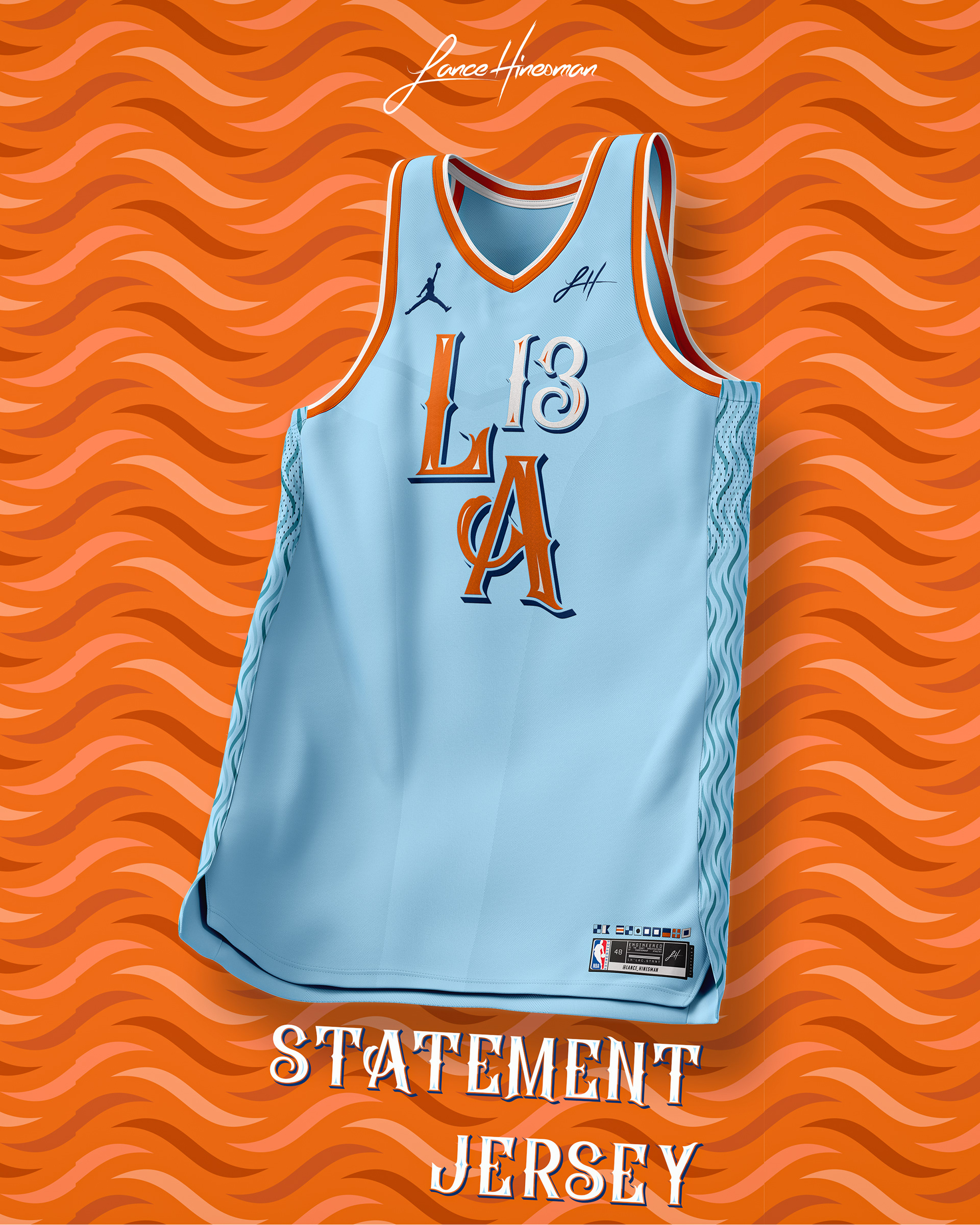
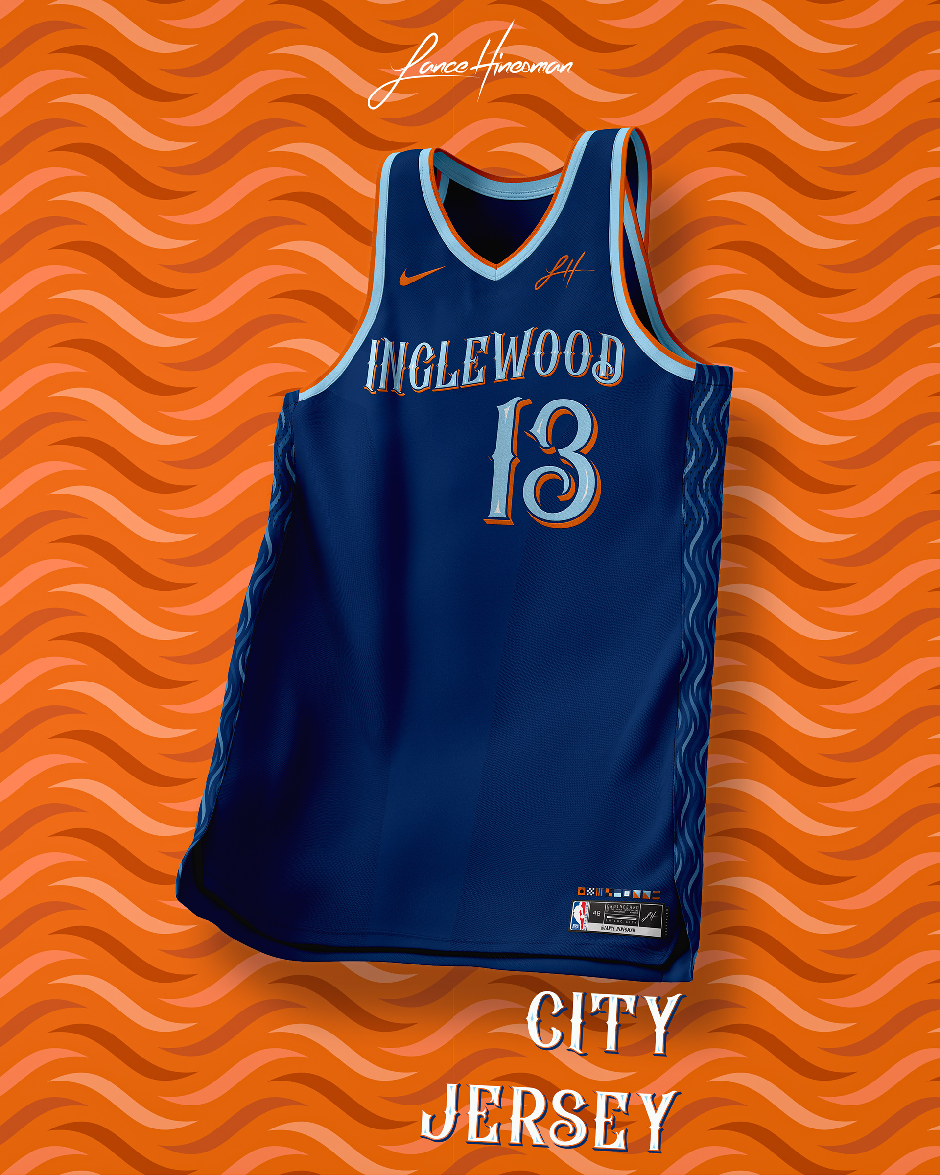
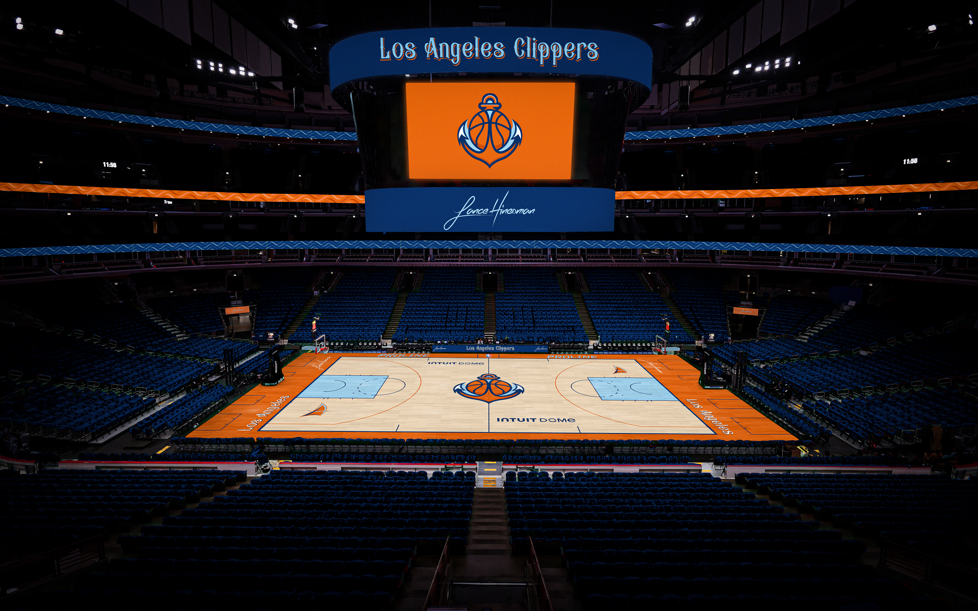
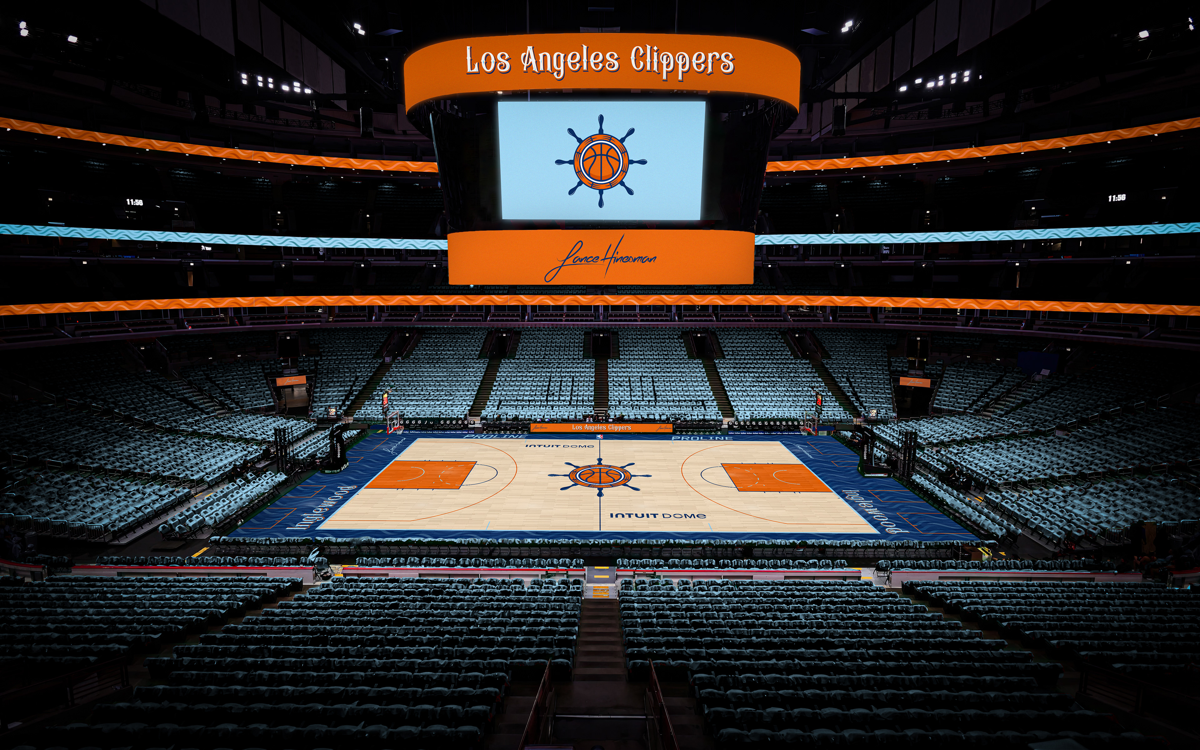
I started working on this design after the Clippers announced their rebrand, but I decided to have my own take different from their previous and unveiled brands. The orange and blue color scheme was a must in my opinion, and with it, came anchor and sail shaped logos.
Los Angeles Lakers
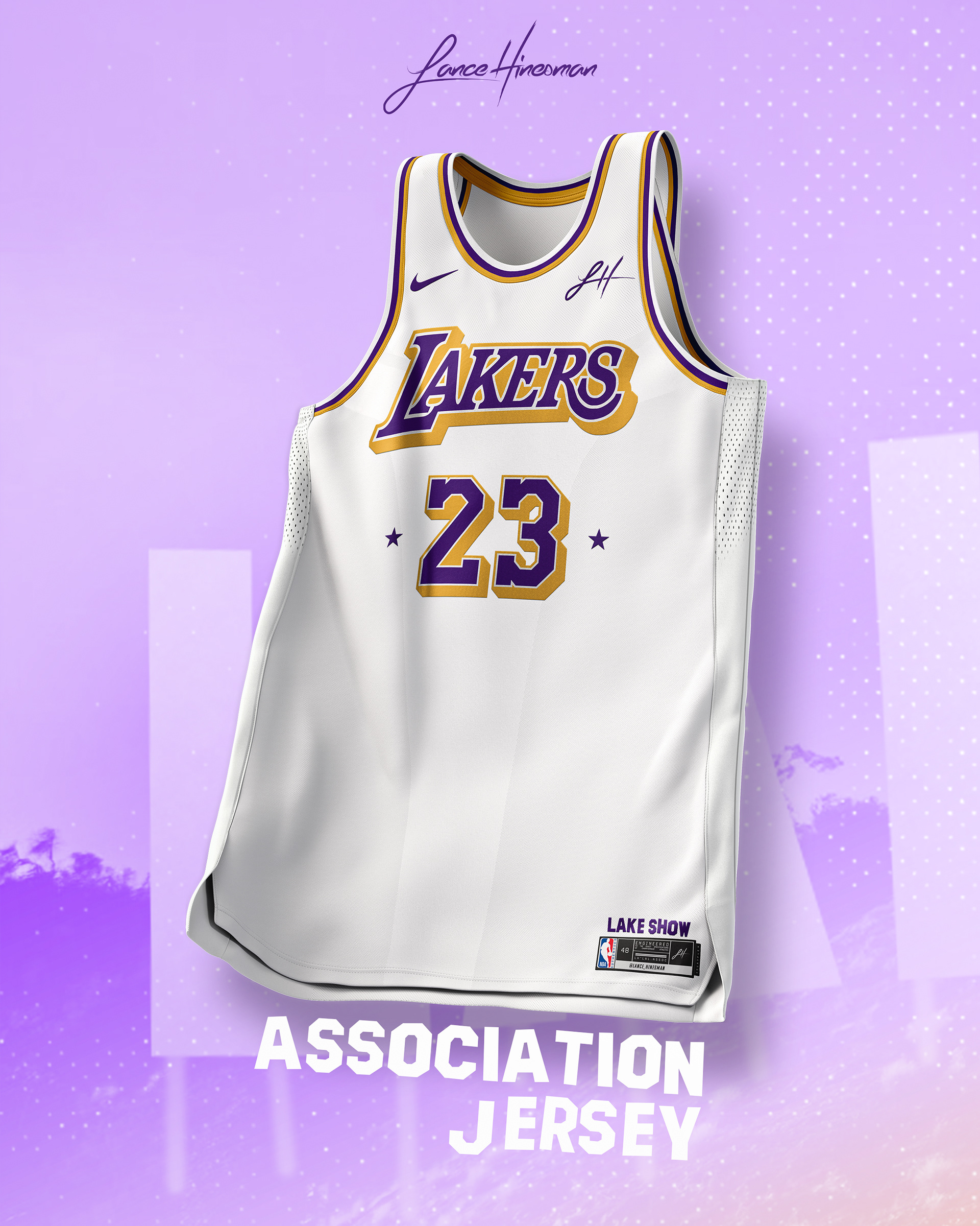
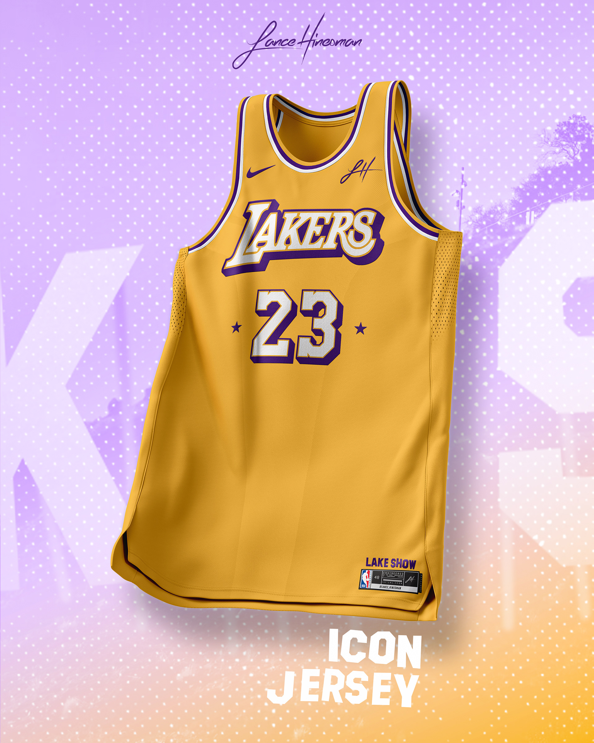
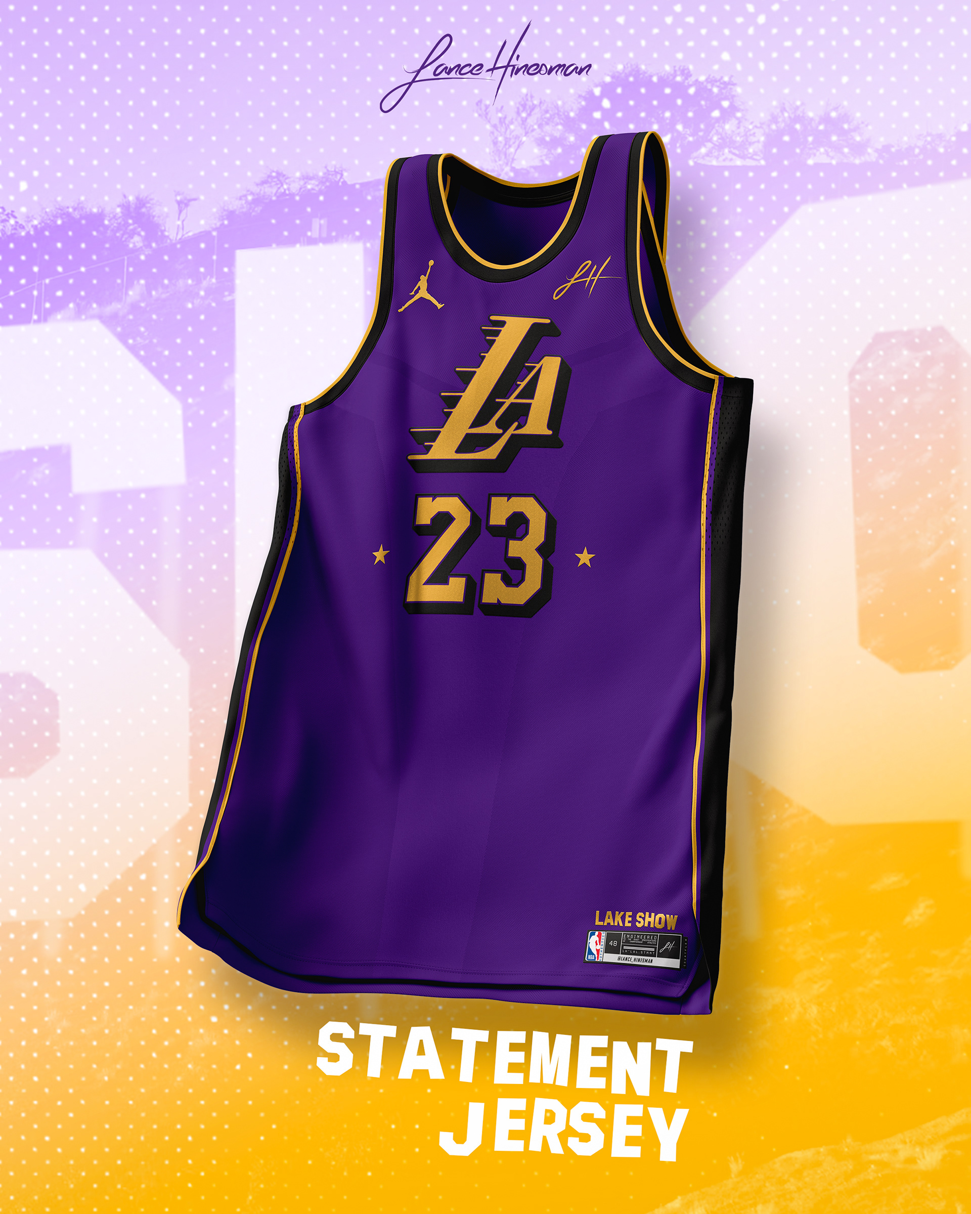
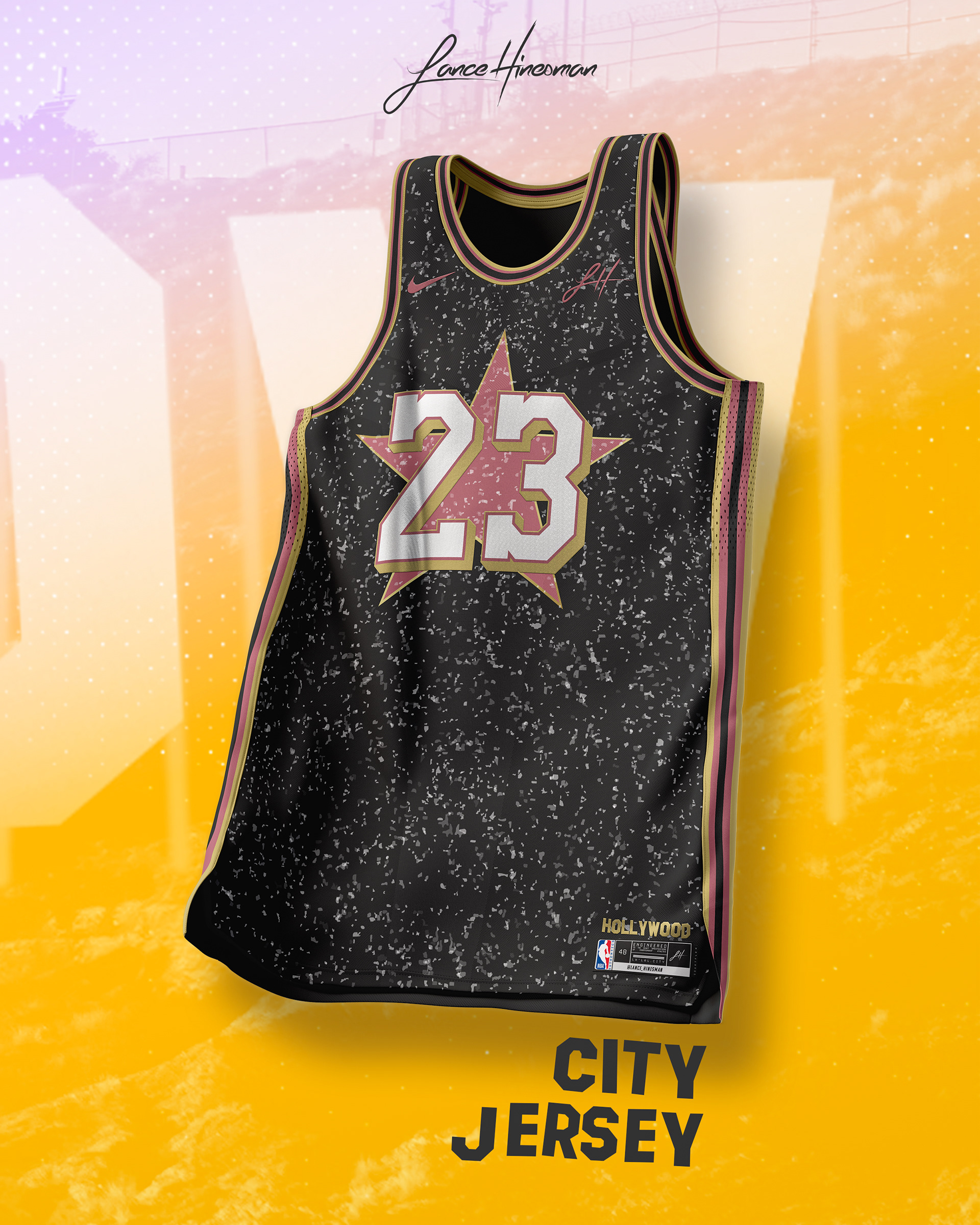
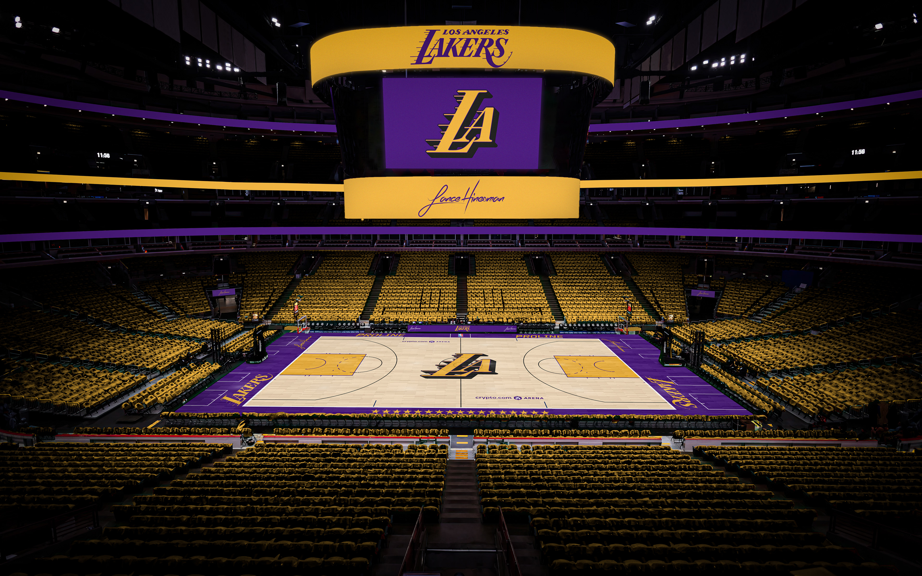
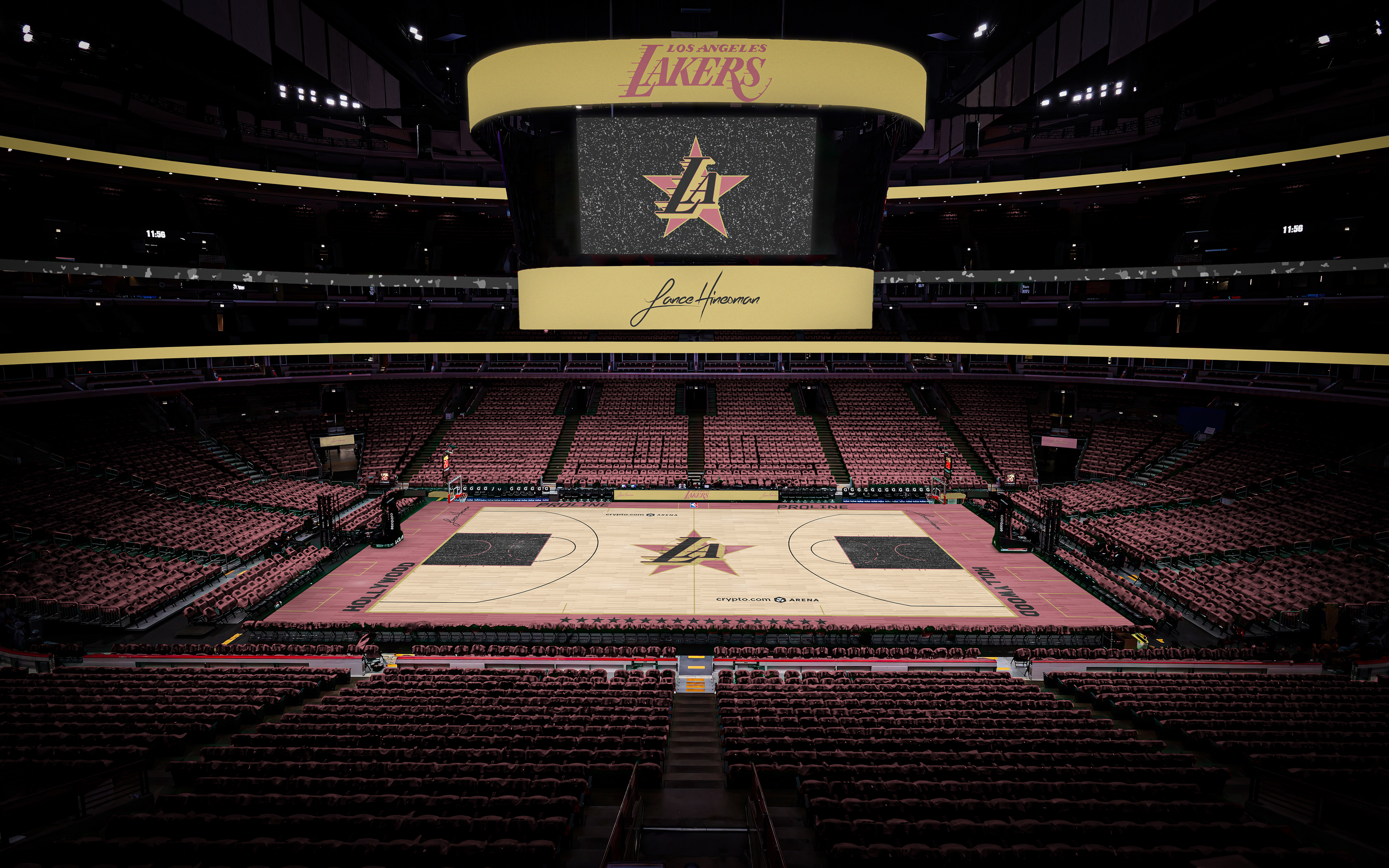
With the Lakers' storied history, I wanted to combine a few of their eras into a new set of uniforms. The City Jersey, based on the Hollywood Walk of Fame, comes from an old concept of mine that I wanted to design a court for.
Memphis Grizzlies
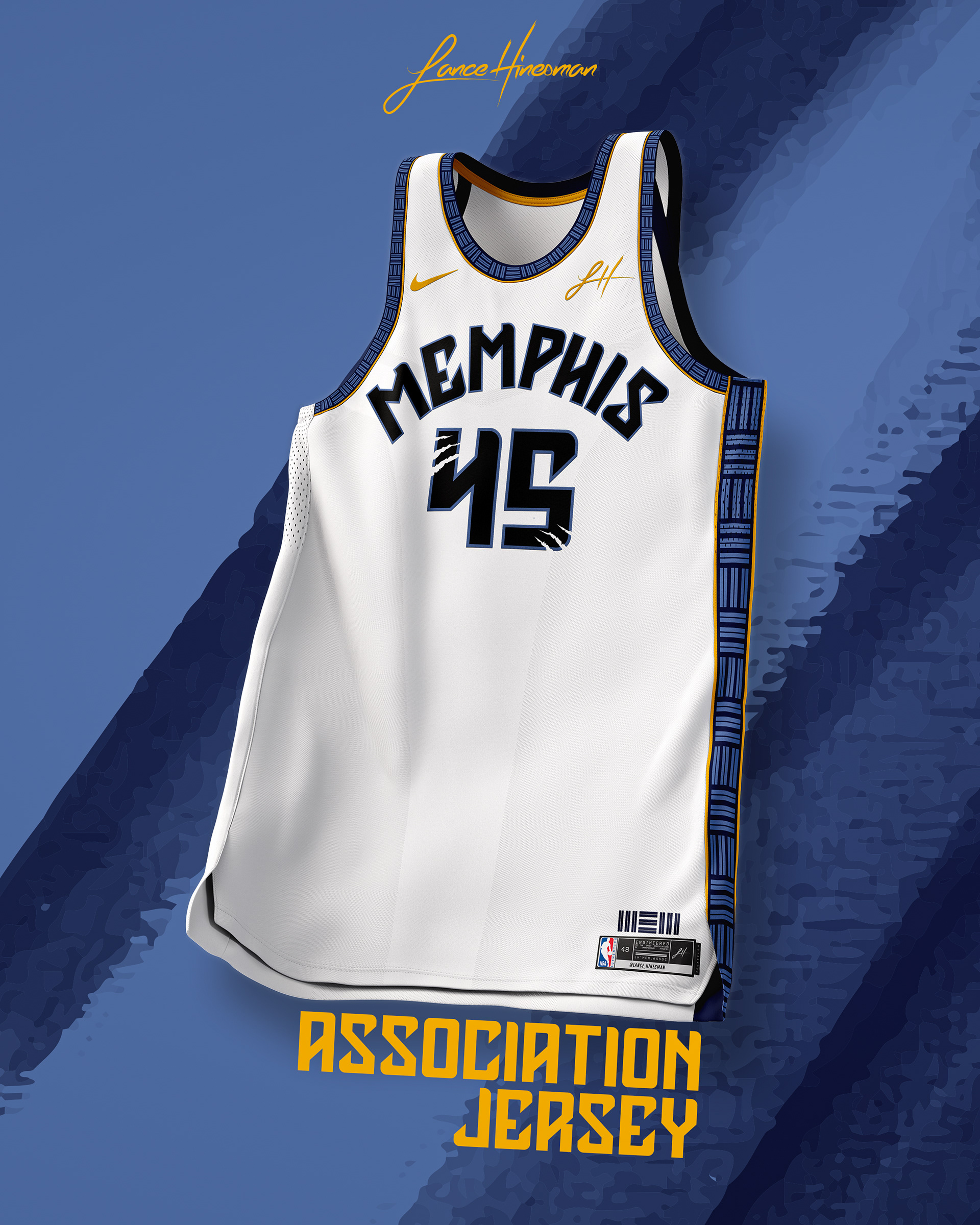
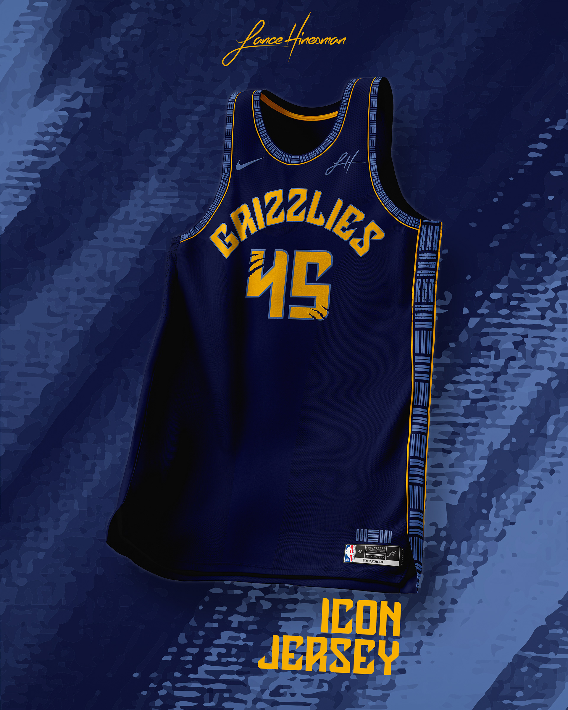
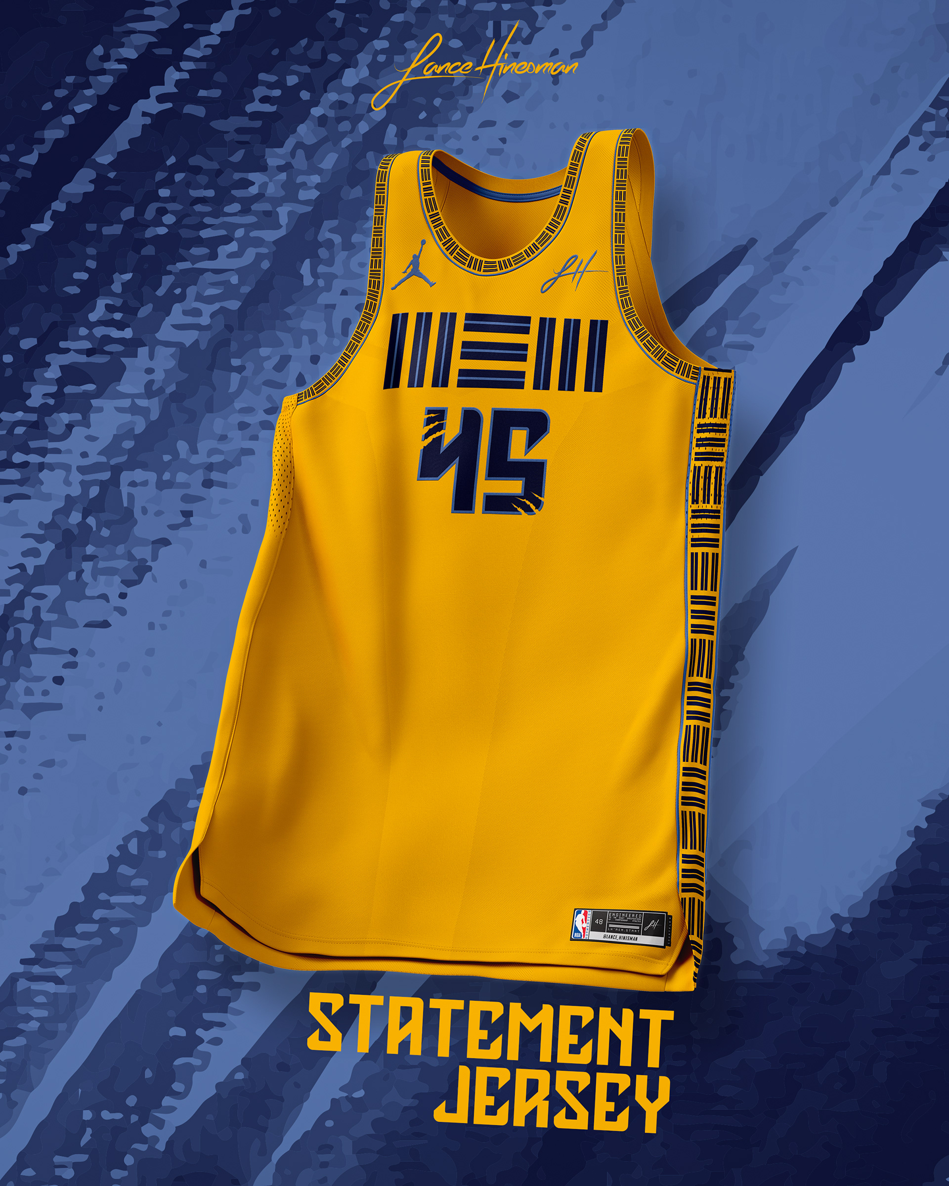
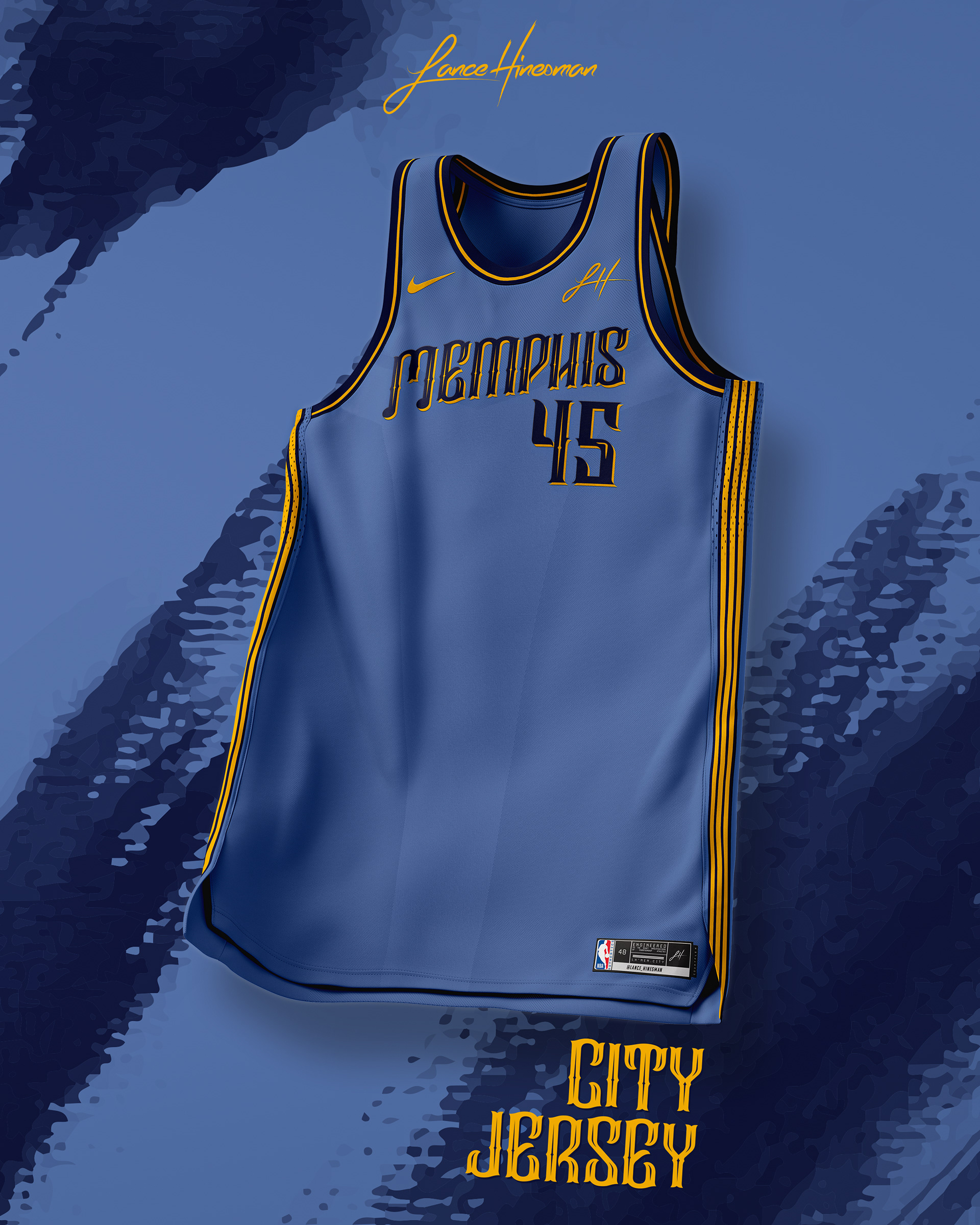
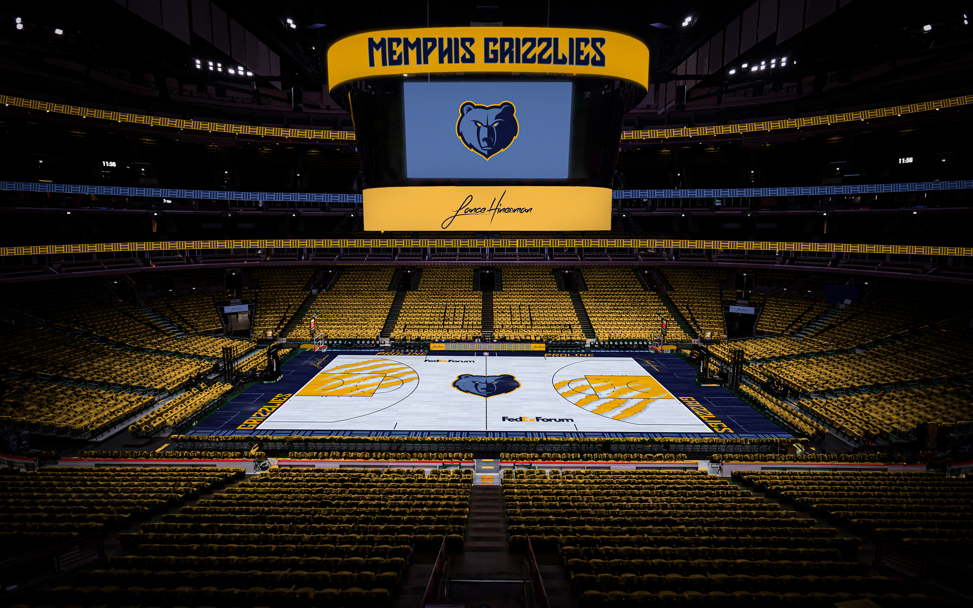
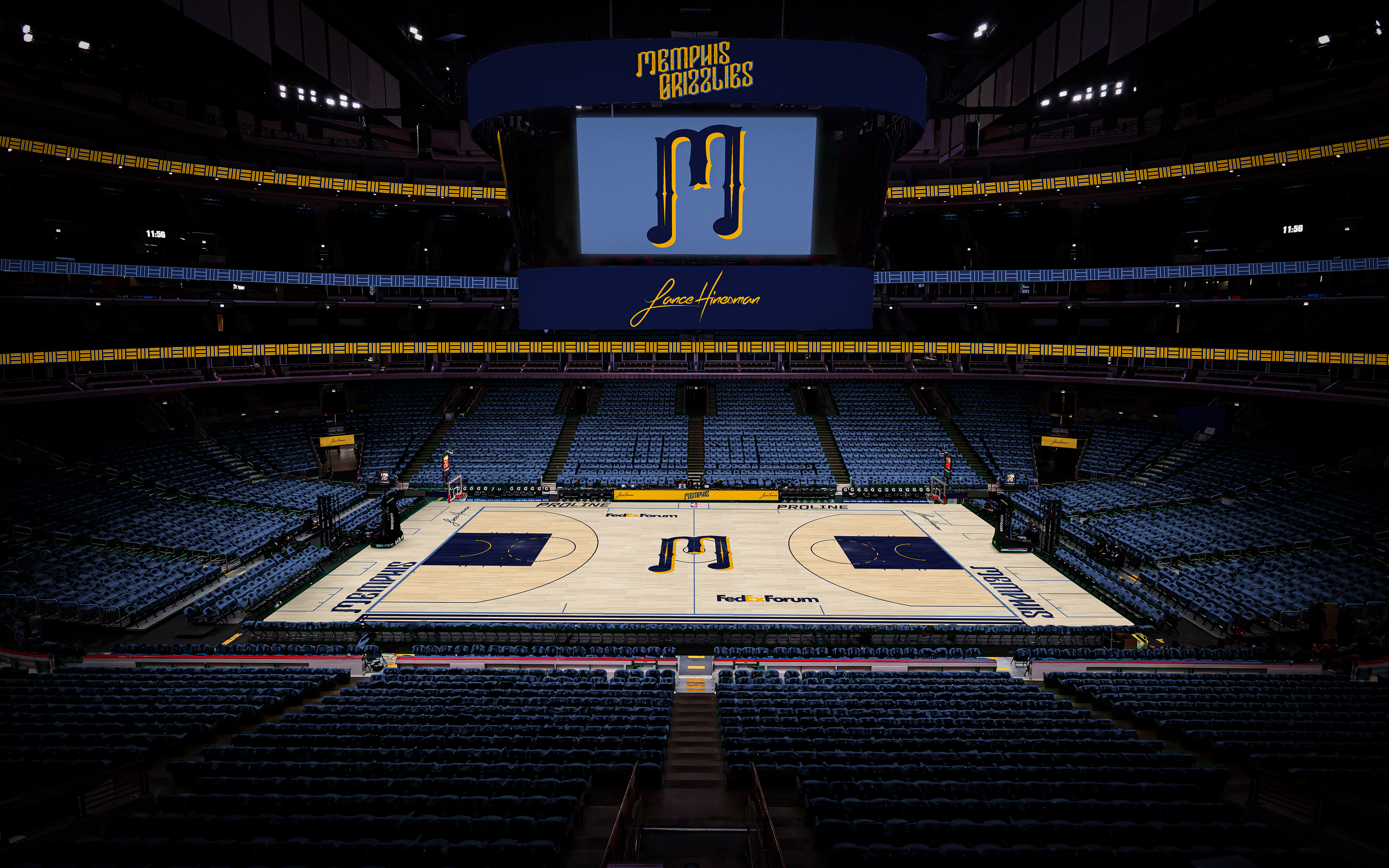
I kept the Grizzlies' current logo, but used a new font for the Association and Icon wordmarks and number. I also used the "MEM" logo as siding and the Statement wordmark. The City Jersey is based on Memphis' ties to music history, with the first 'M' being a music note. The main court is light blue with bear scratches inside the 3 point line.
Miami Heat
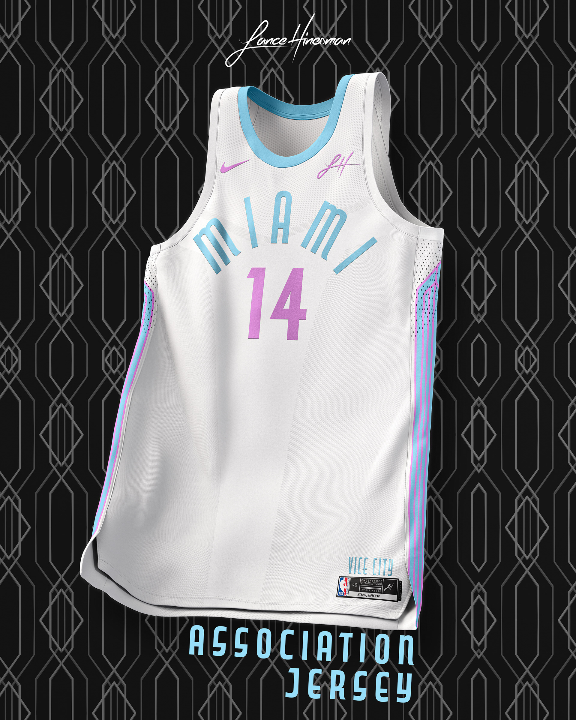
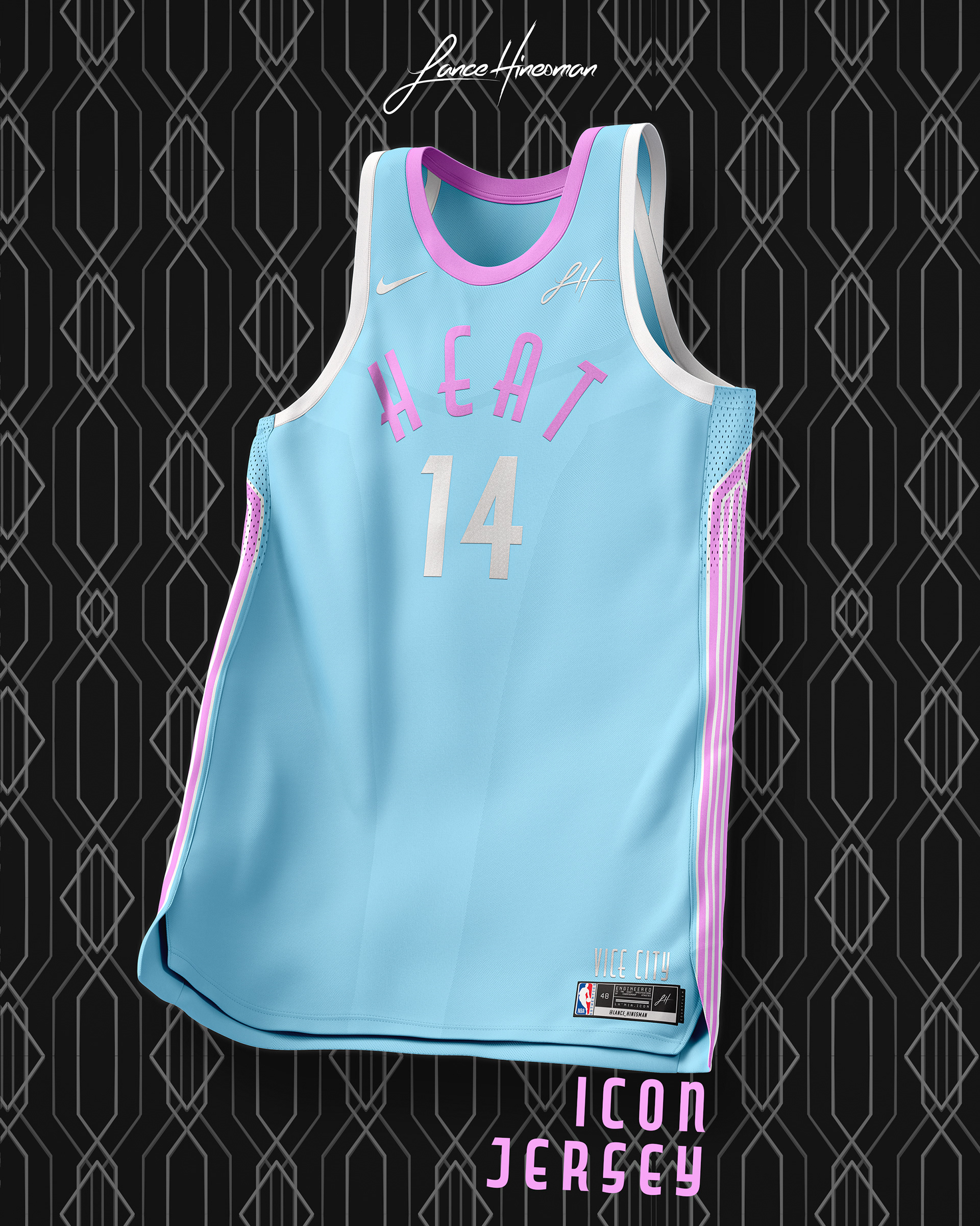
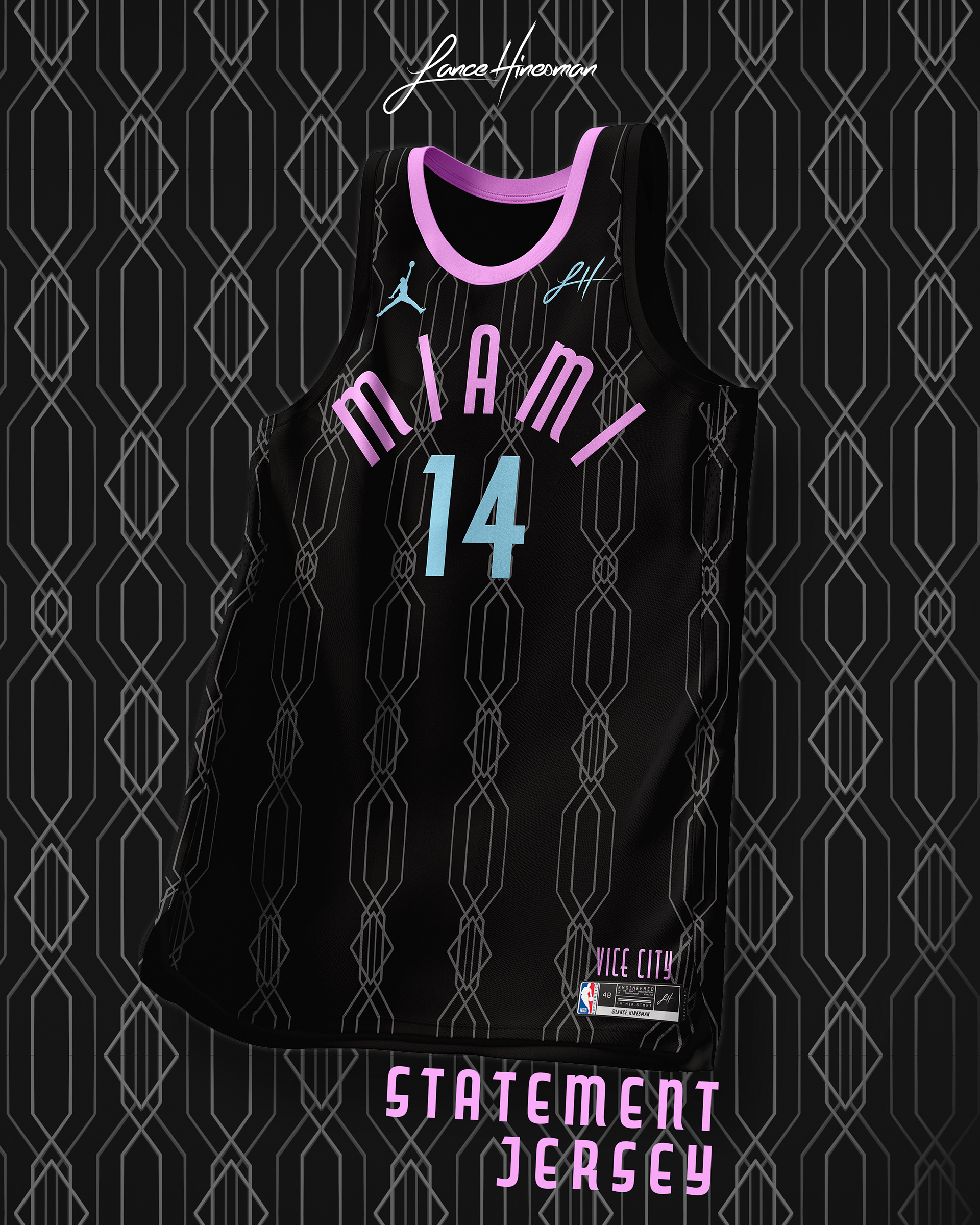
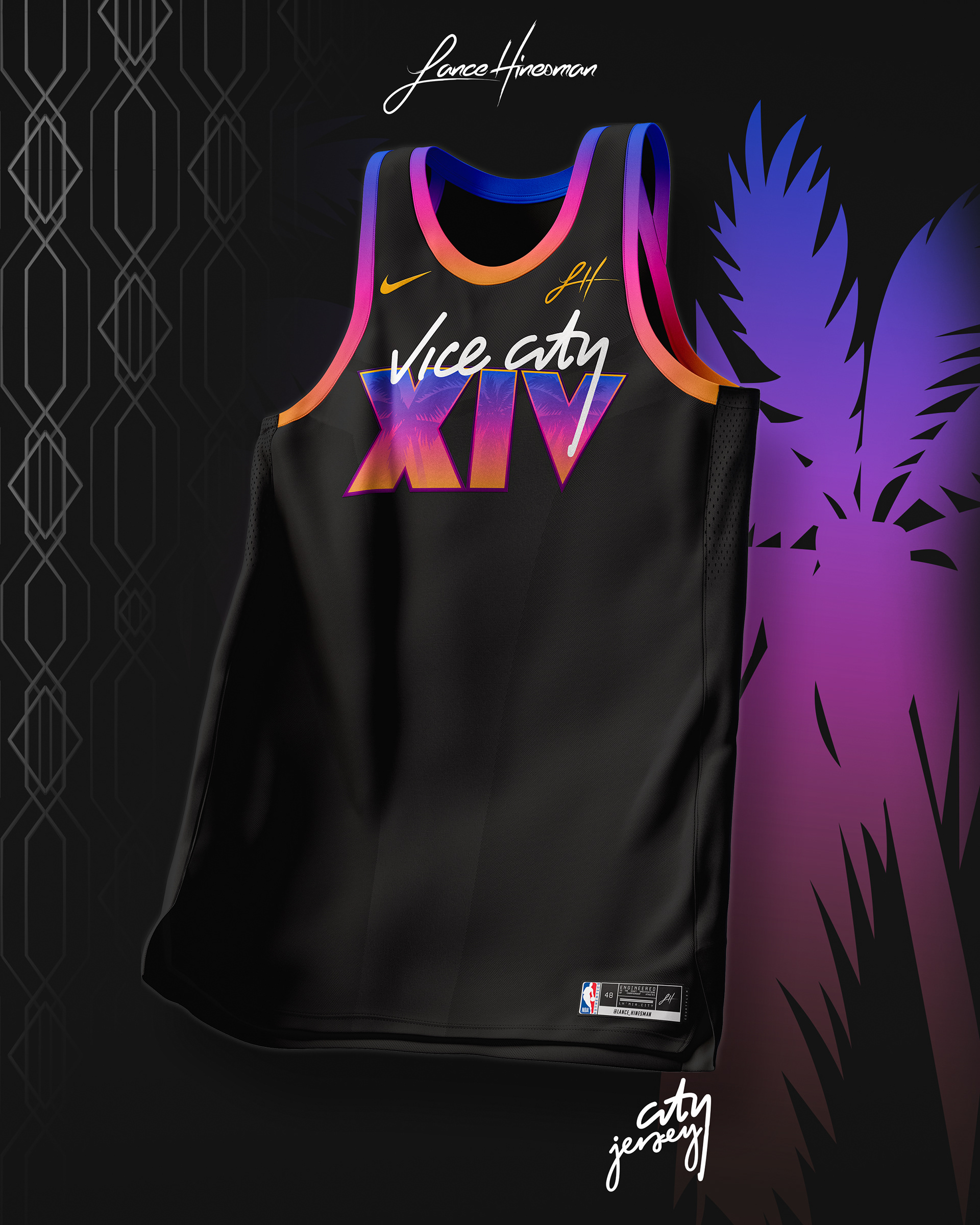
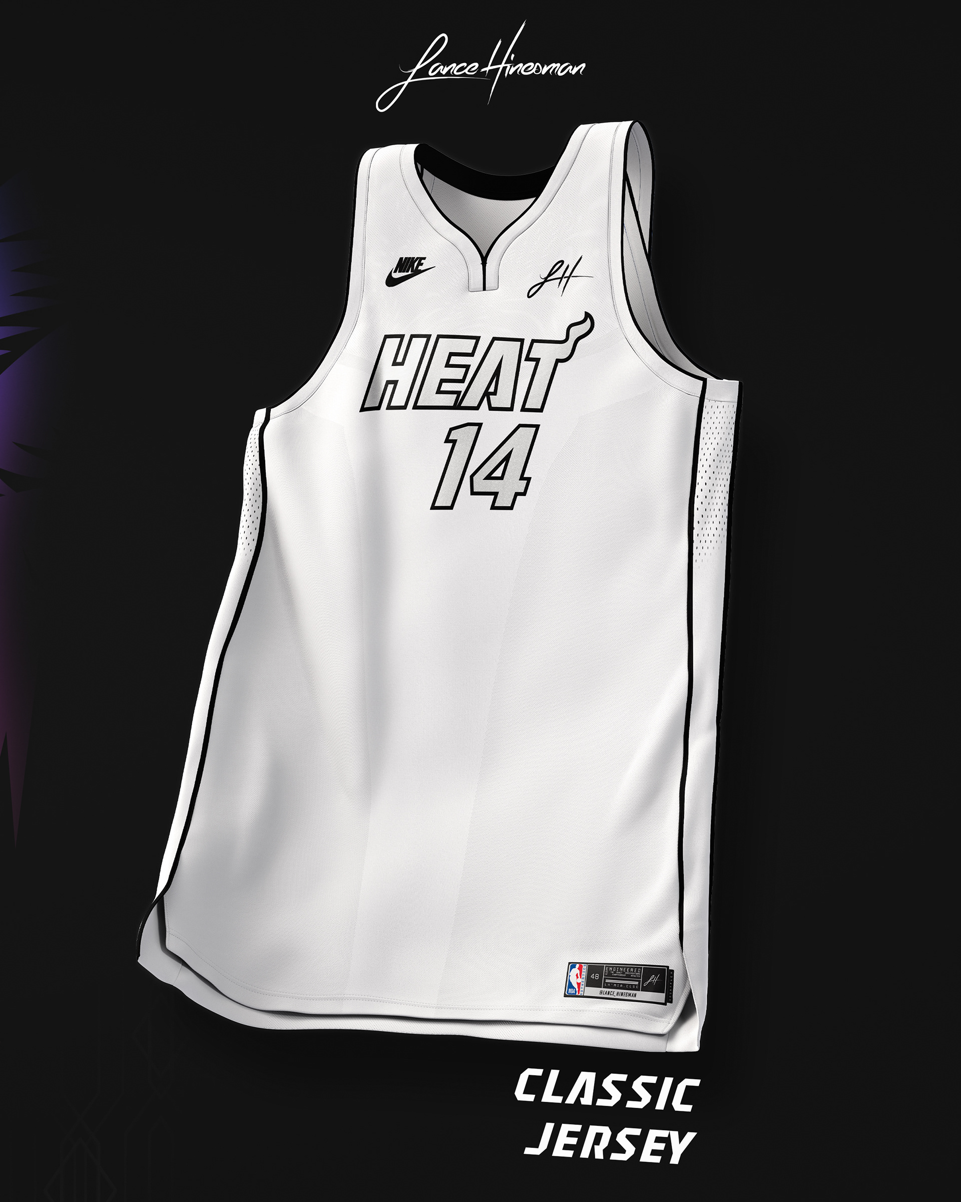
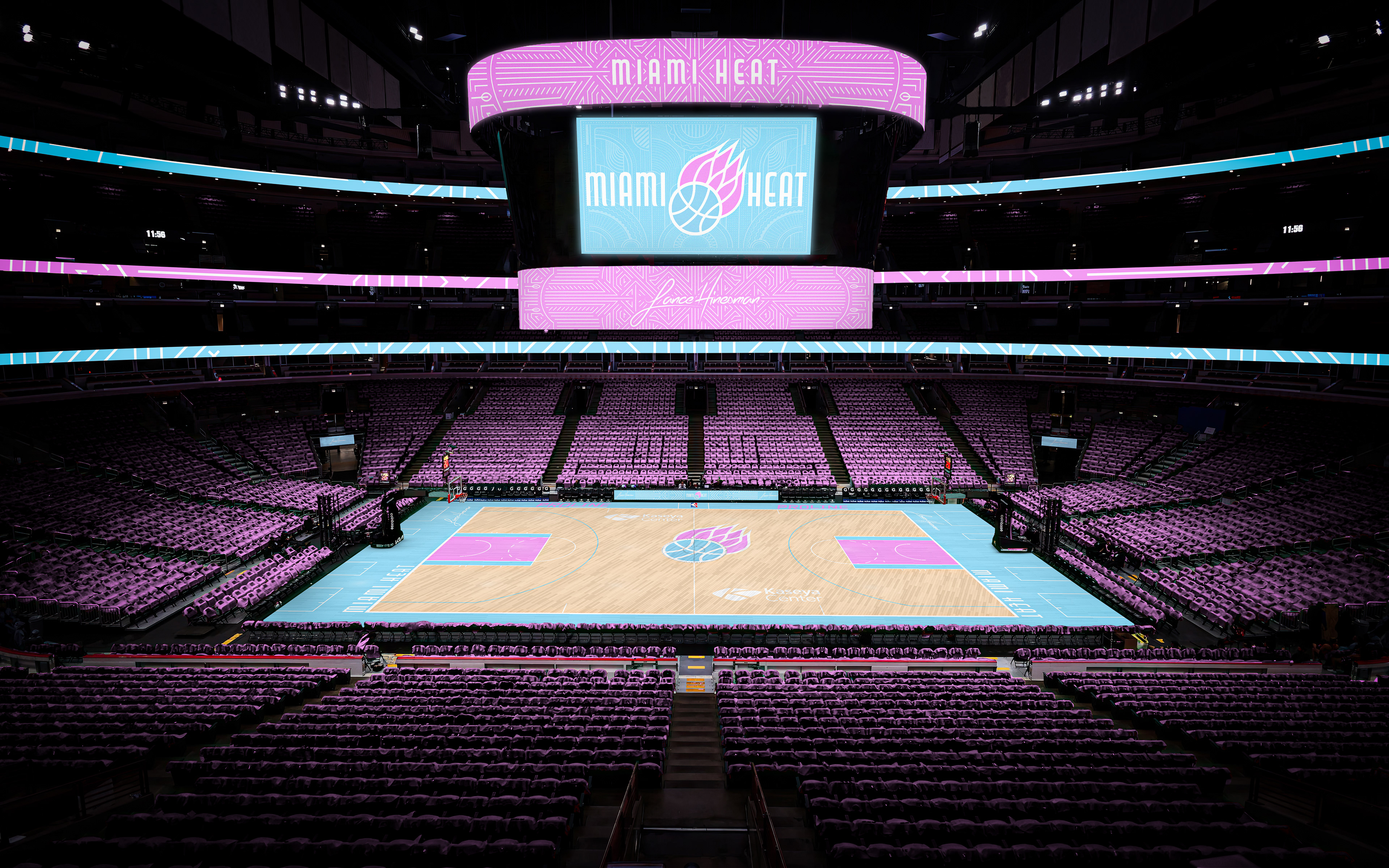
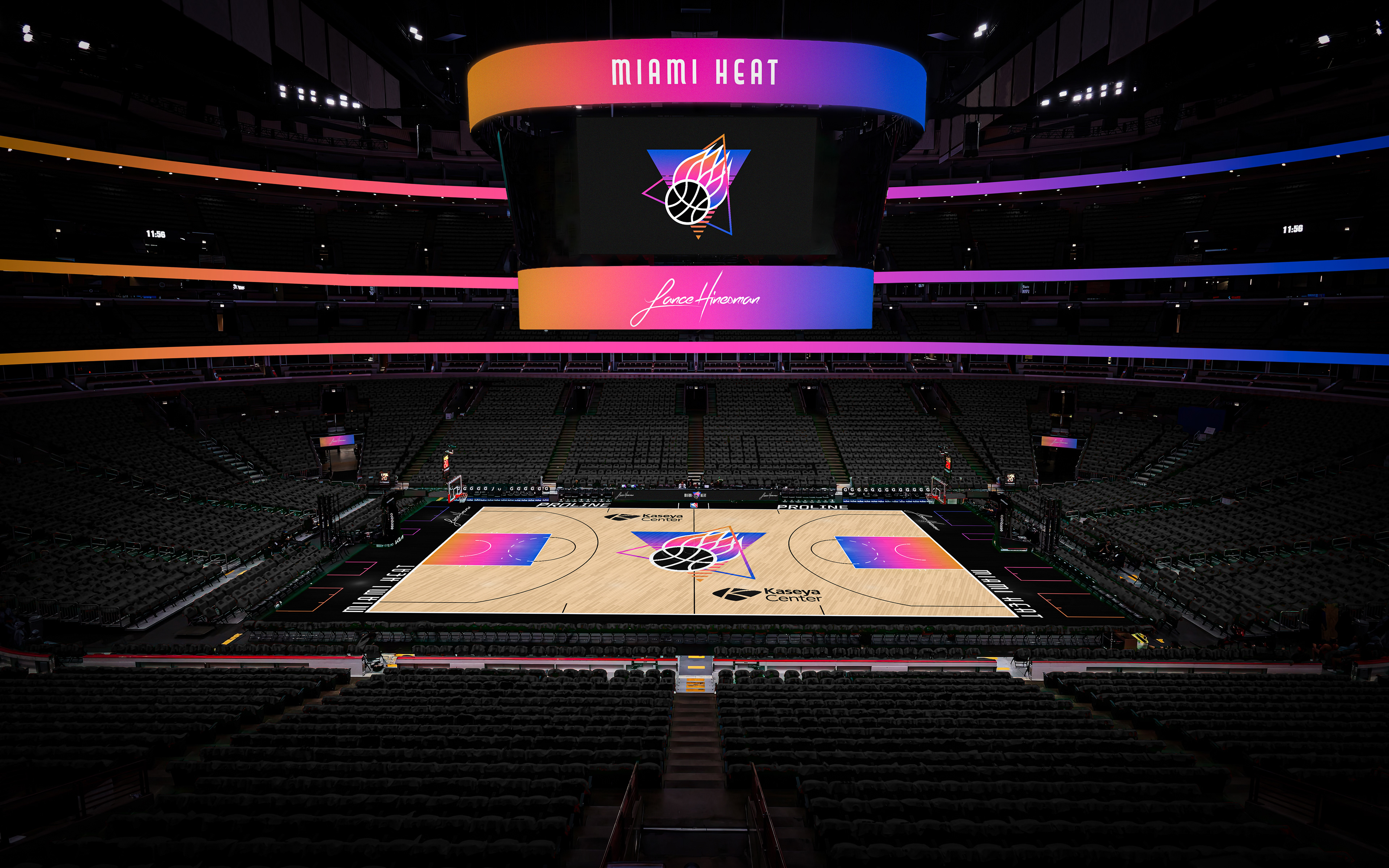
While wanting to bring the Miami Vice colorway back, I based the redesign off Miami's art deco and pastel colored architecture. The City Jersey is inspired by GTA 6 and features GTA style roman numerals across the front. I don’t see this ever being adopted, but I felt it looked cool for just one jersey. Lastly, I brought back the 'White Hot' Heat jerseys for a classic edition. The logo comes from an old concept that never came to fruition before the Heat joined the association.
Milwaukee Bucks
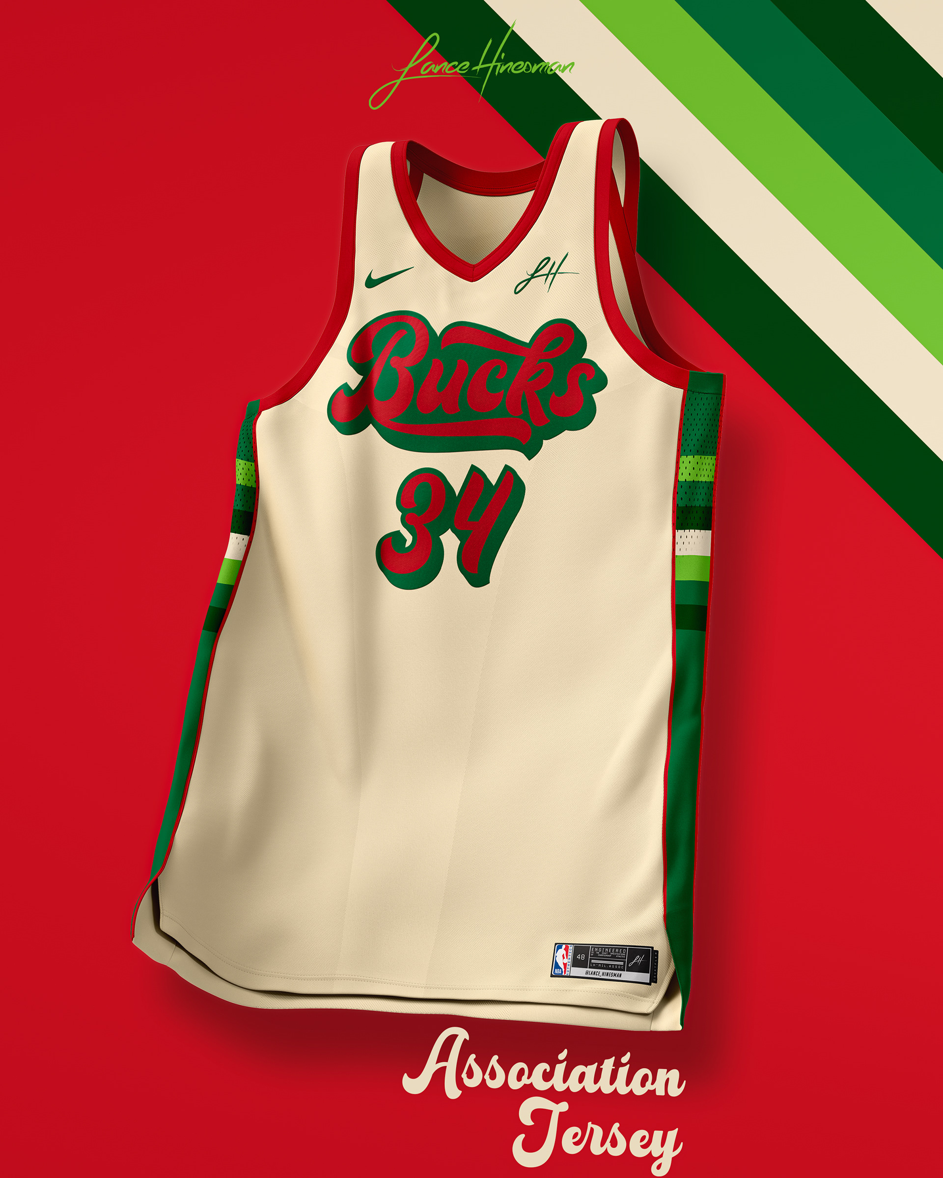
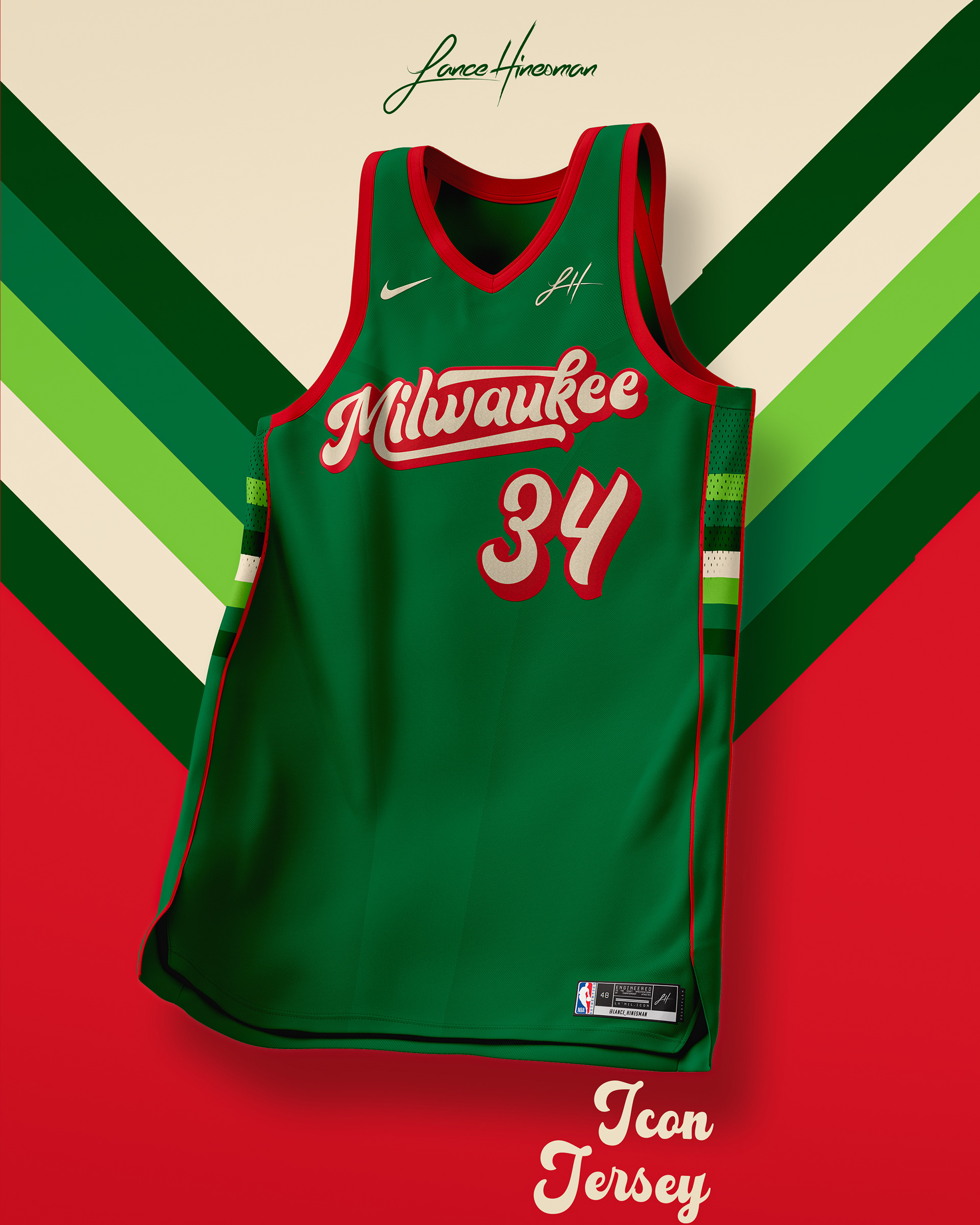
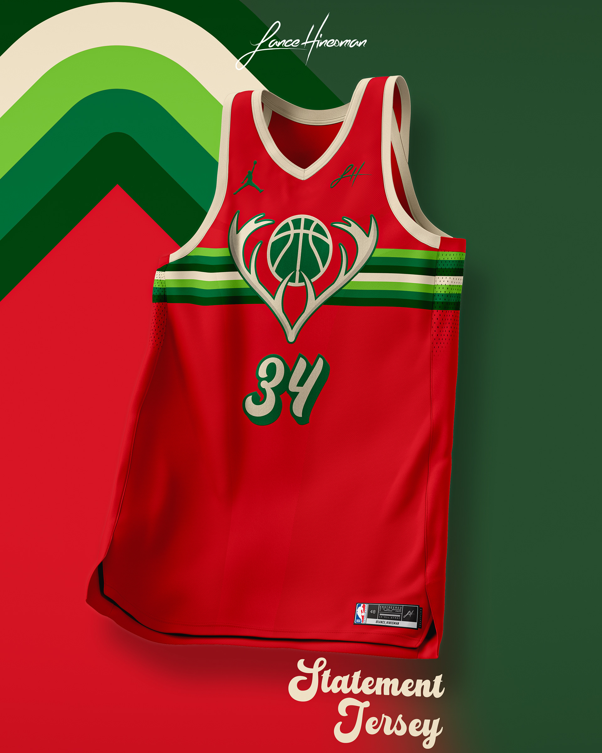
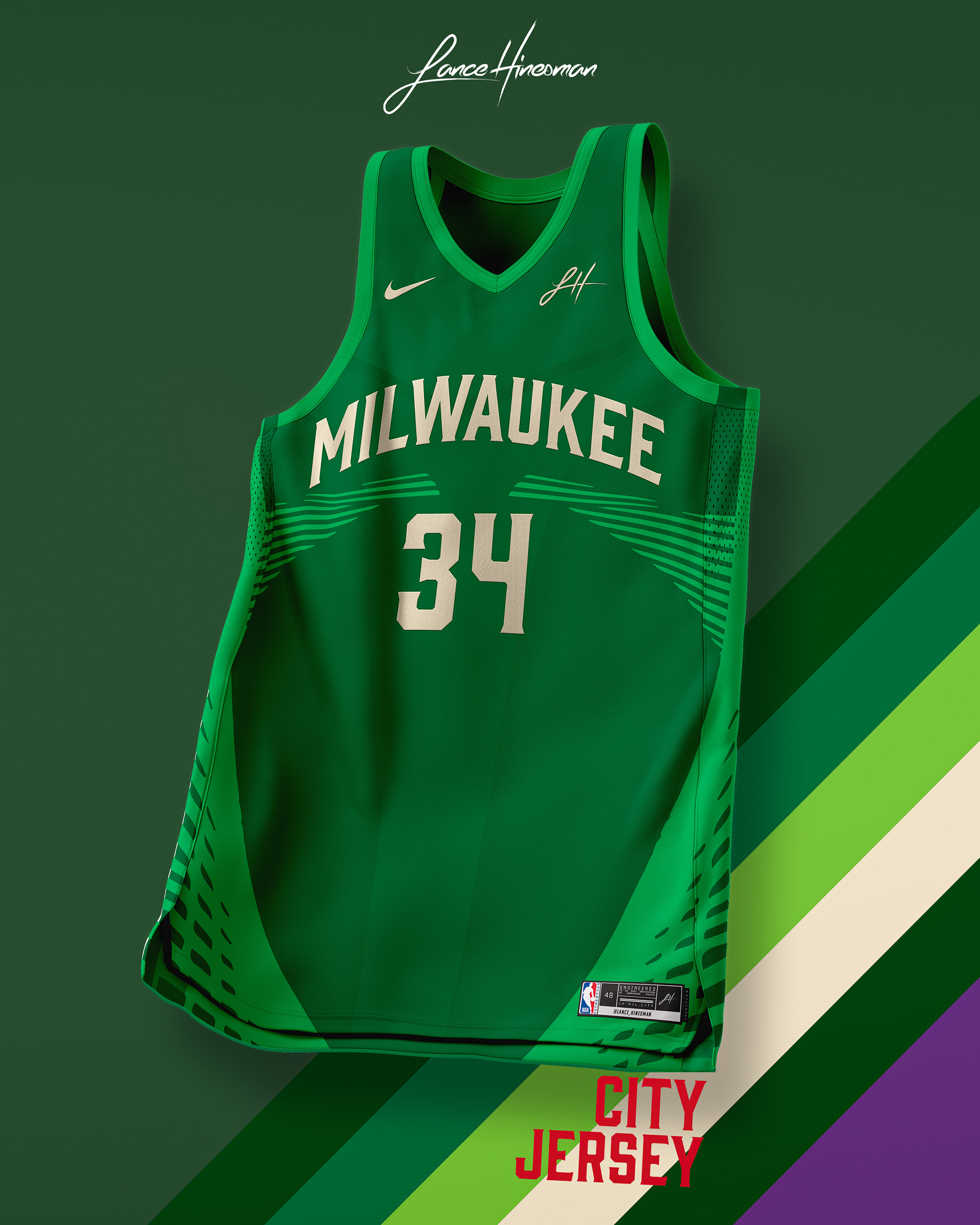
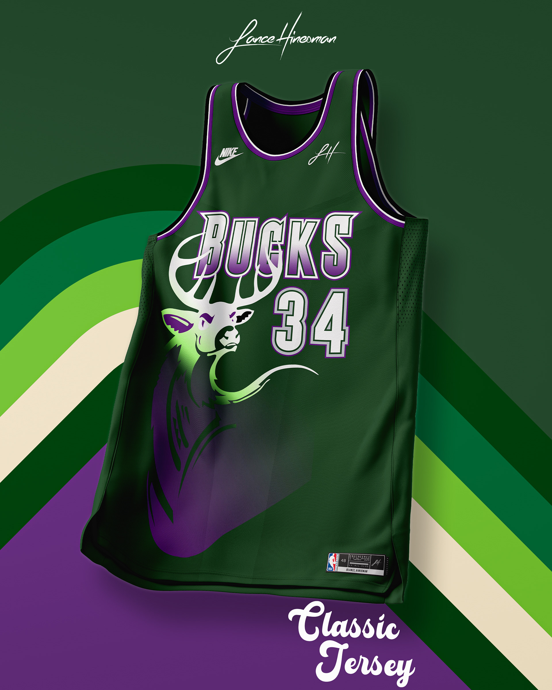
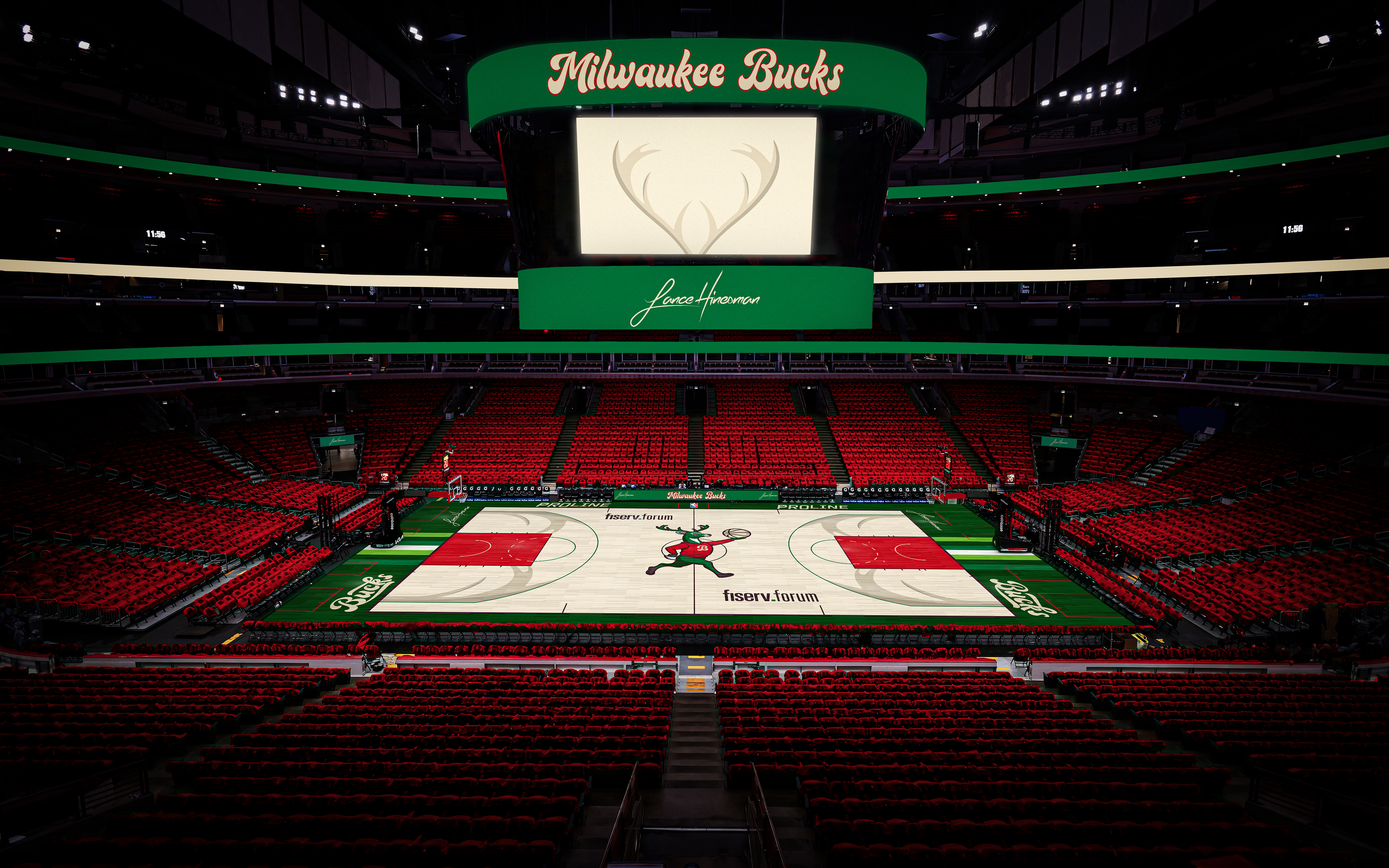
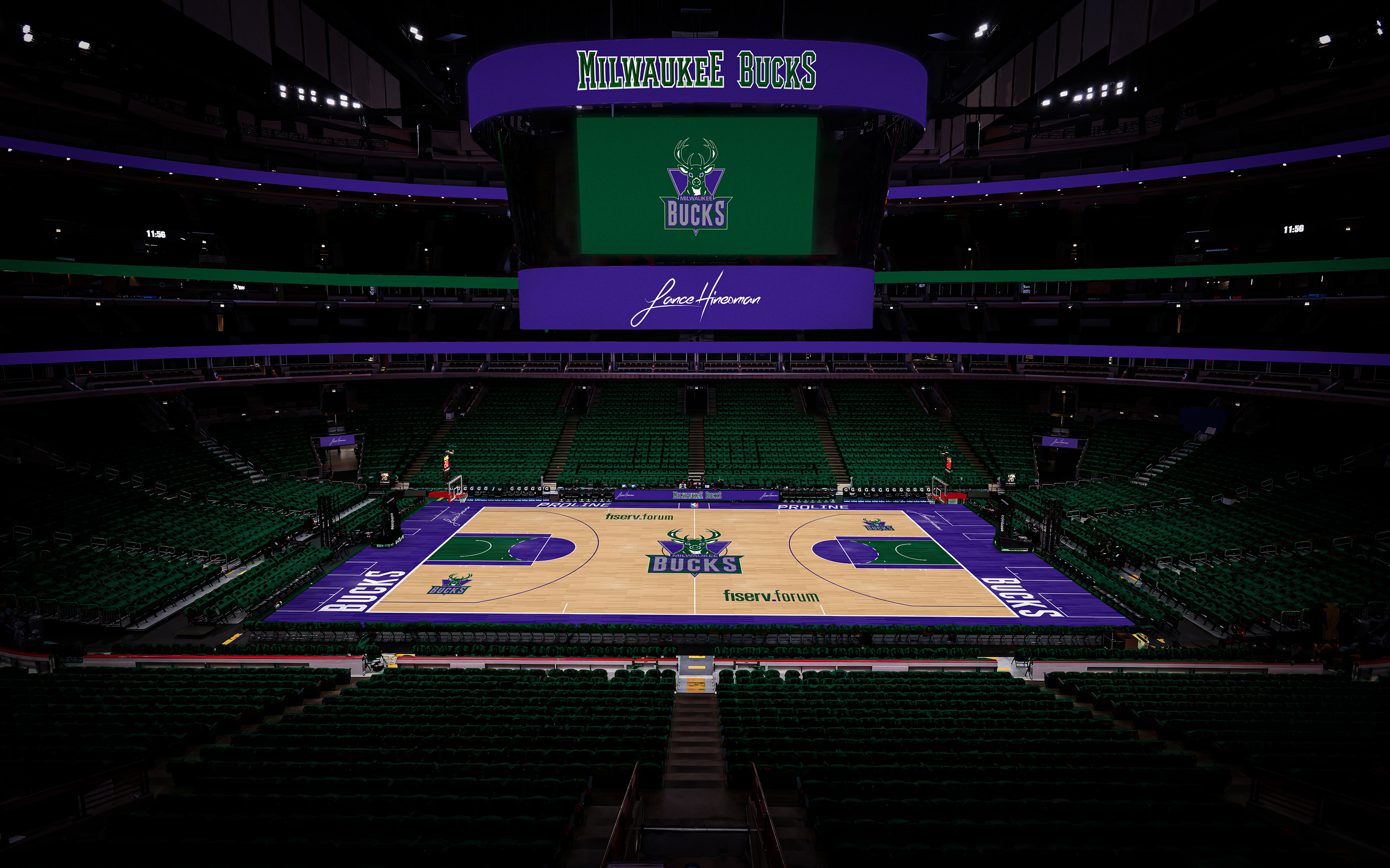
I really wanted to bring a vintage feel to the bucks reminiscent of the Bucks' old school branding from the 70s and 80s. The Association Jersey is cream to match the color scheme which brings back red as well. The City Jersey is inspired by the architecture of the Milwaukee Art Museum.
Minnesota Timberwolves
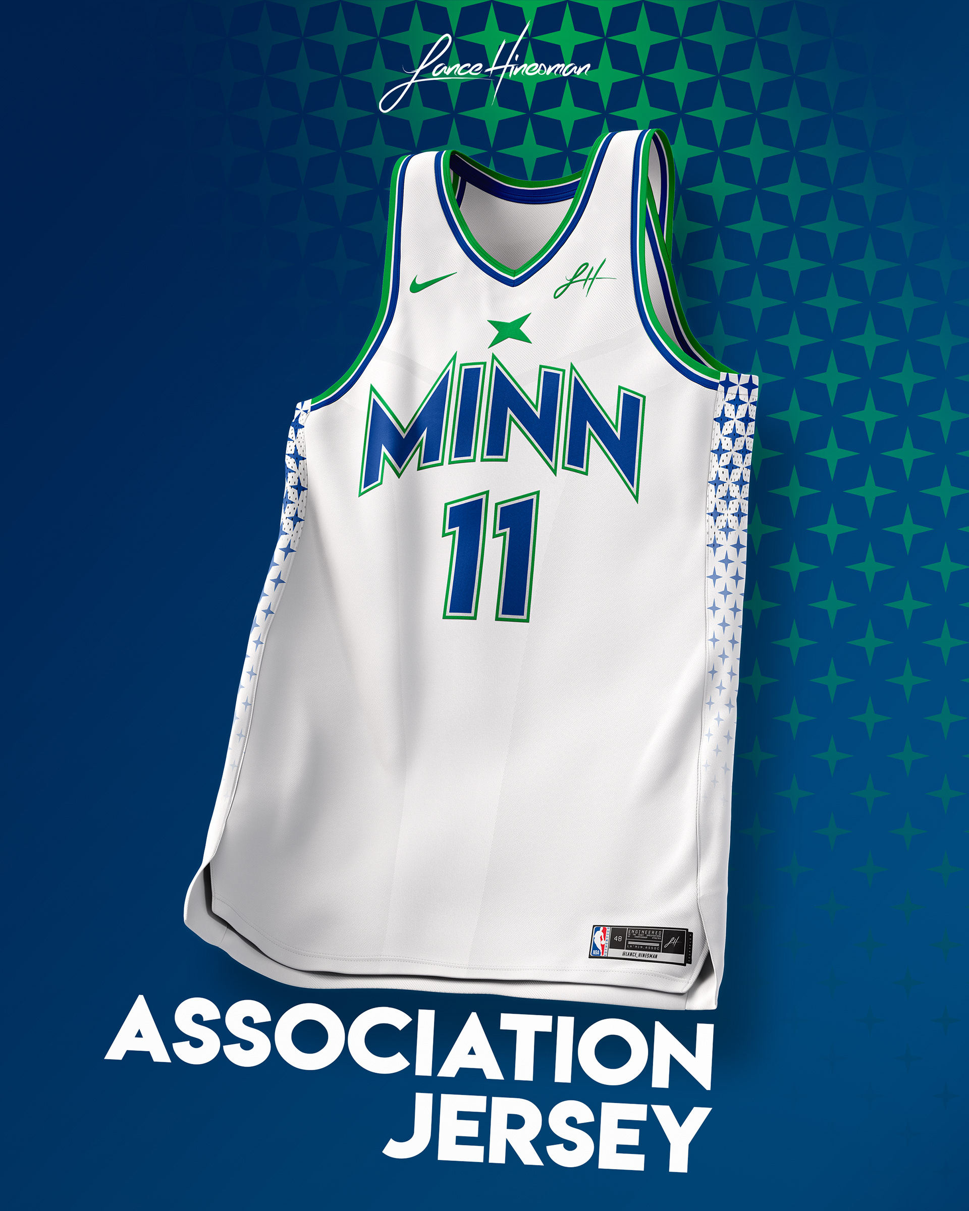
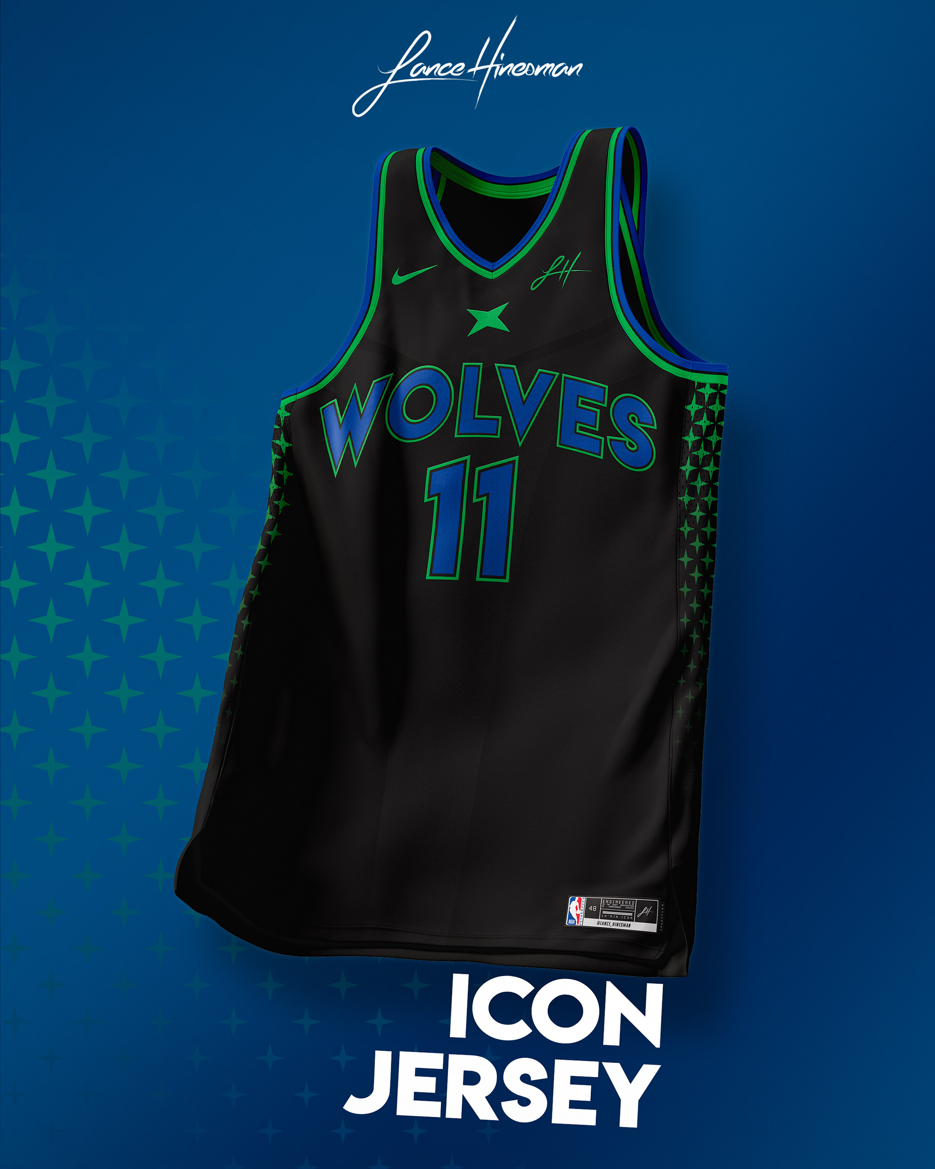
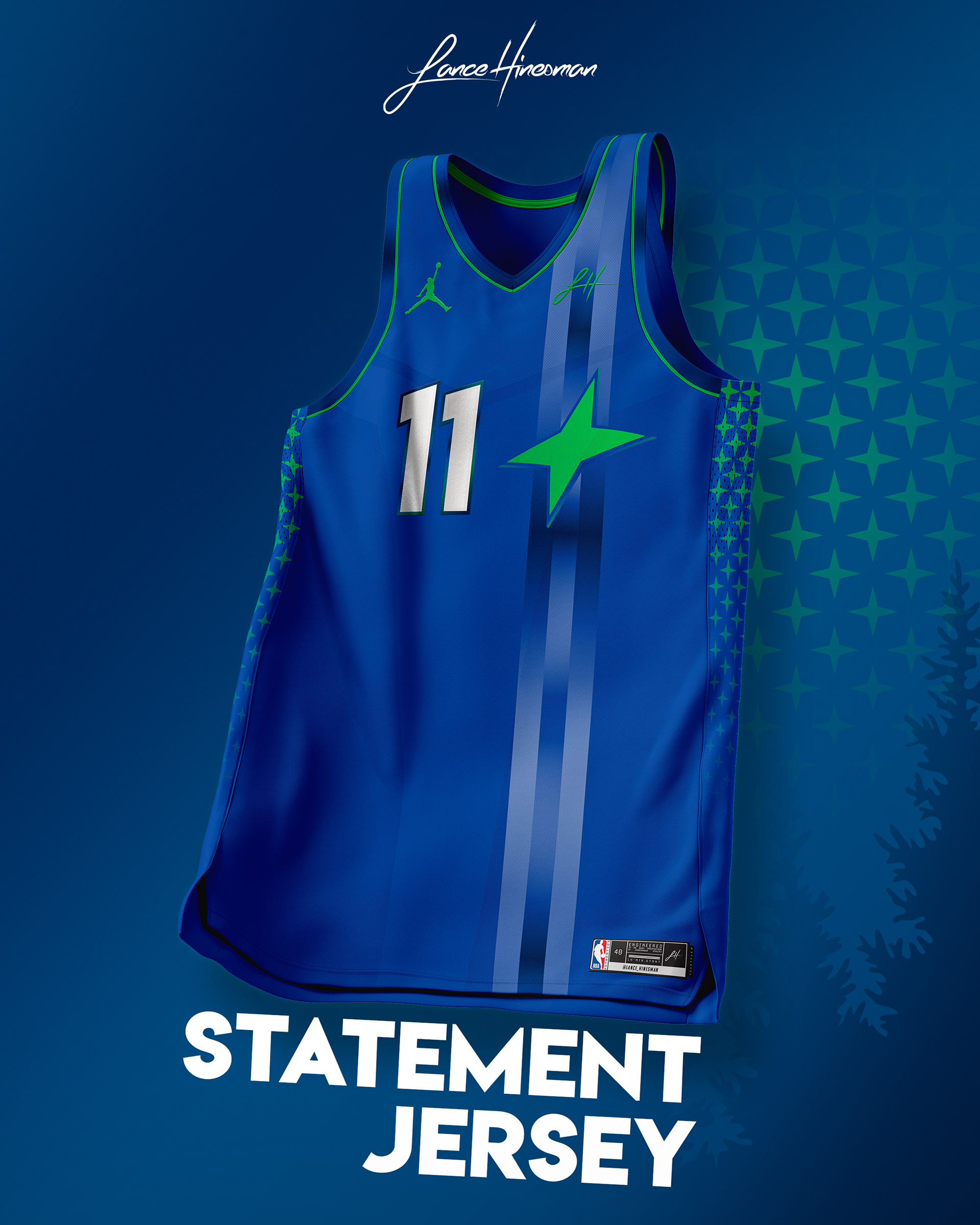
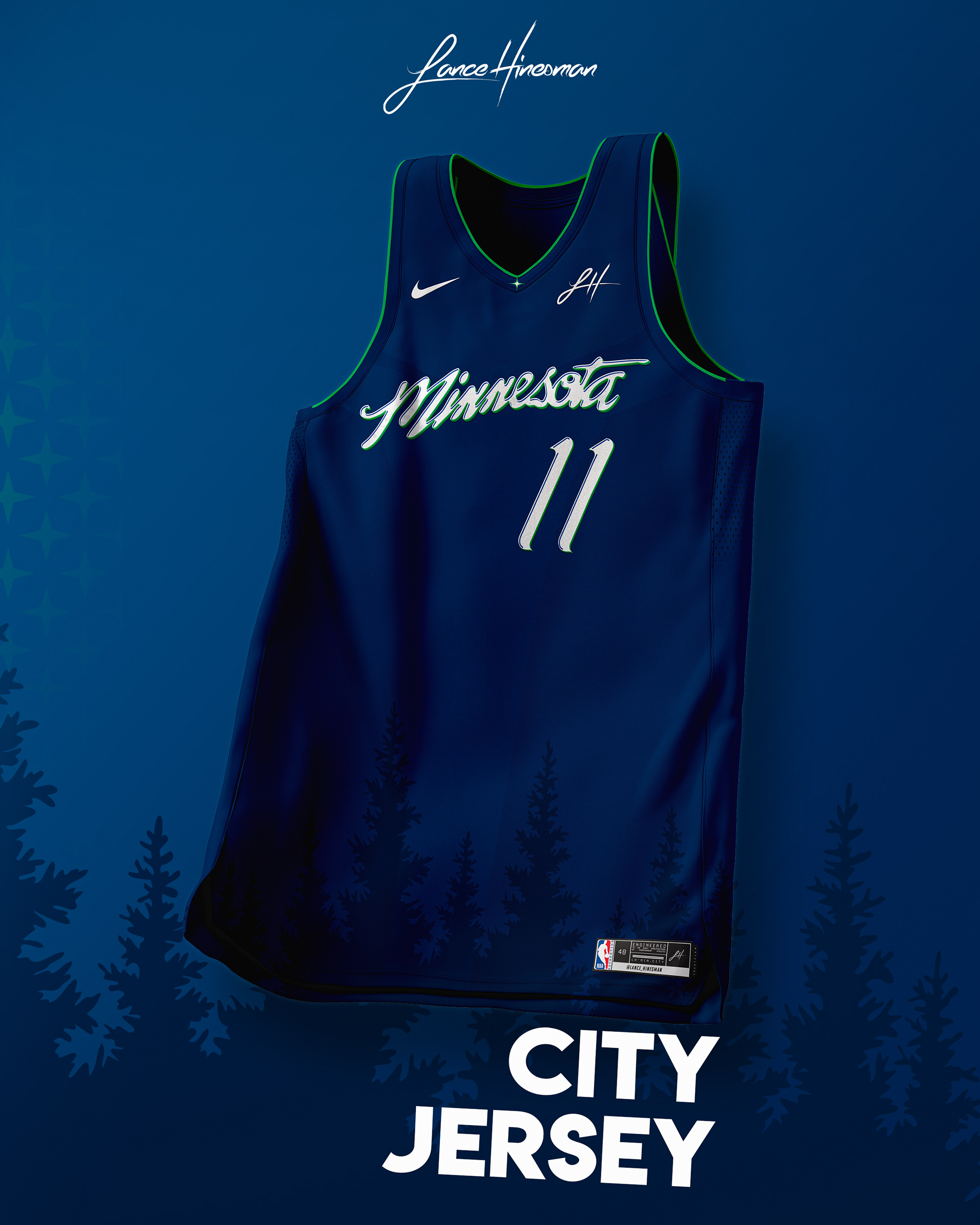
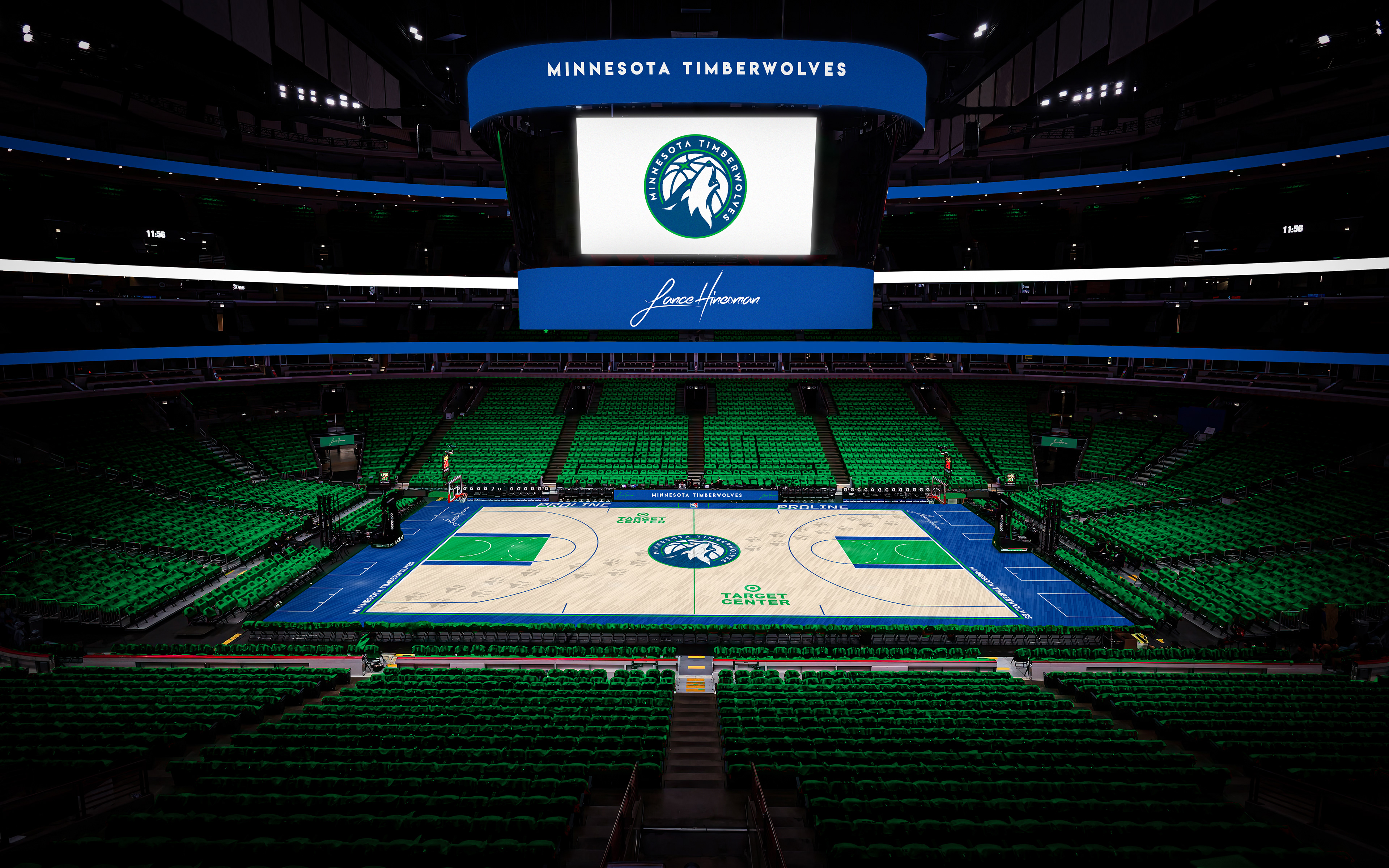
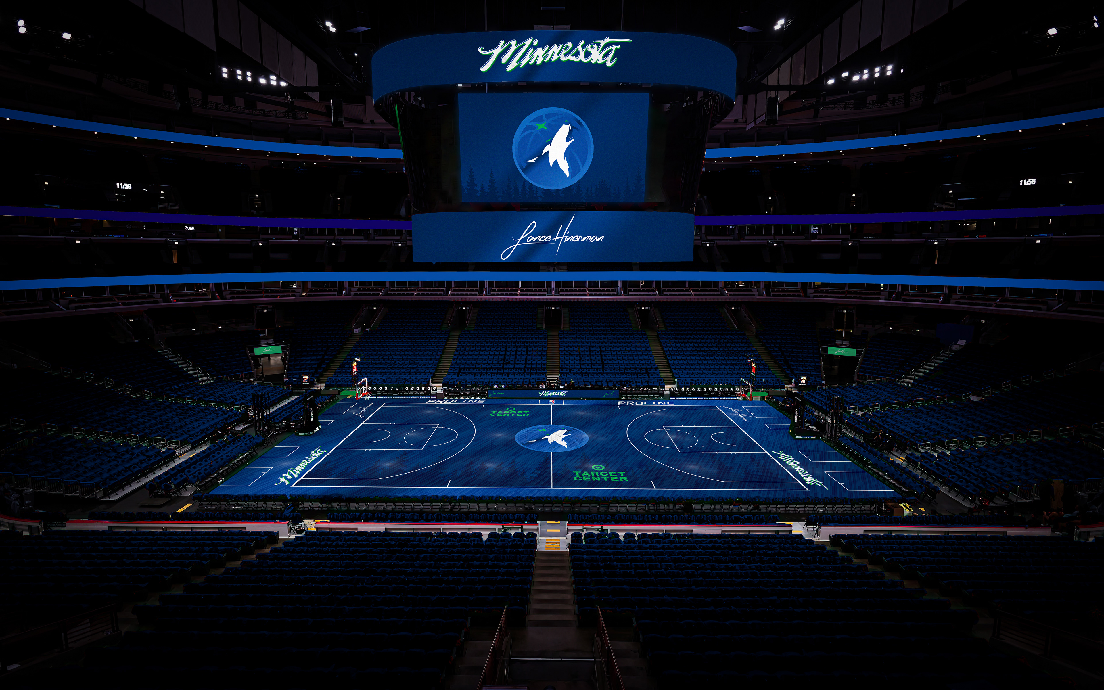
For this set, I took heavy inspiration from the Wolves' classic set as it's been my fav uniform of theirs this season. The statement jersey makes the north star in the Wolves' logo the focus while the city jersey is based on entering Minnesota signage. The city court is another with a dark aesthetic, featuring a recolored, gradient wolf logo.
New Orleans Jazz
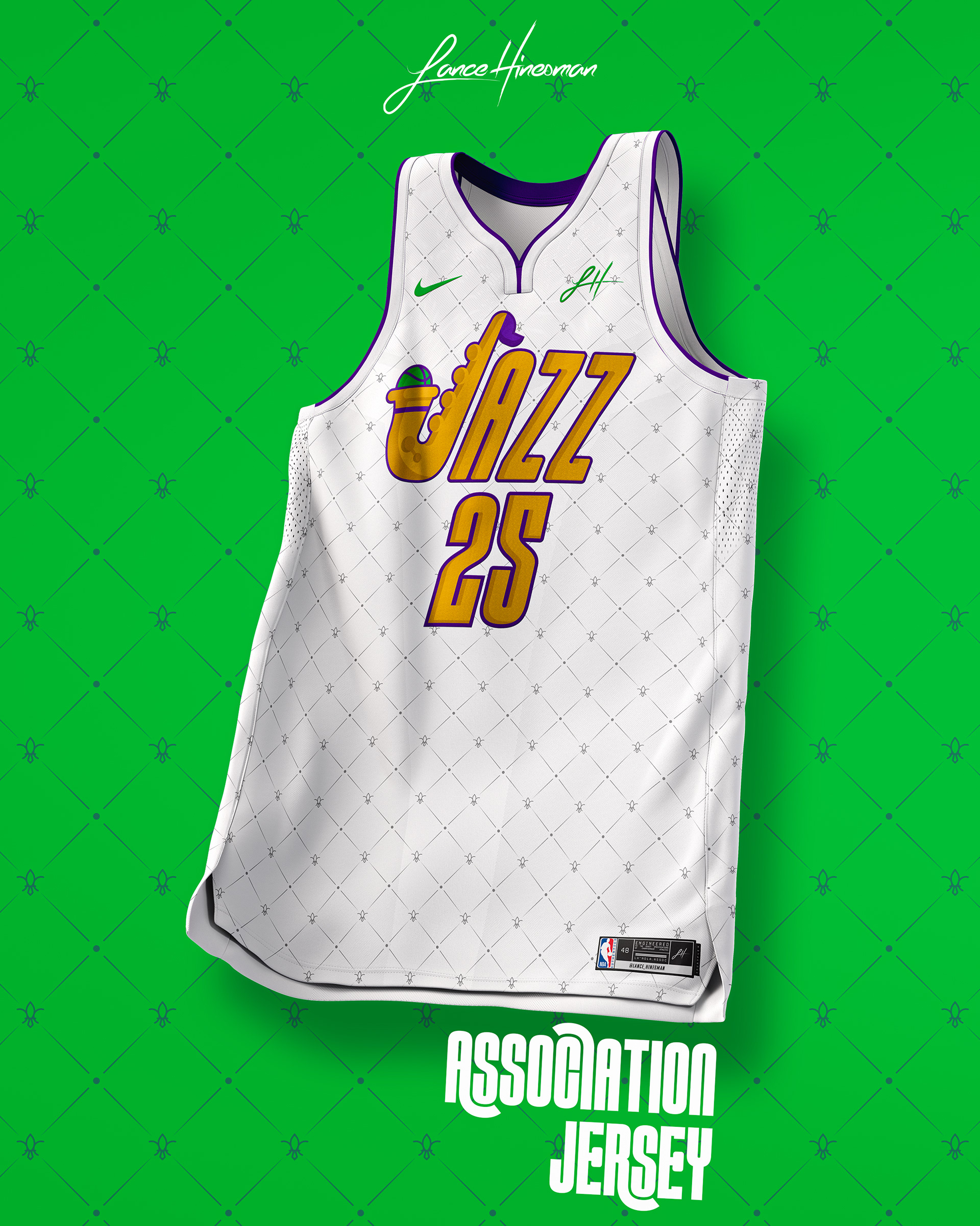
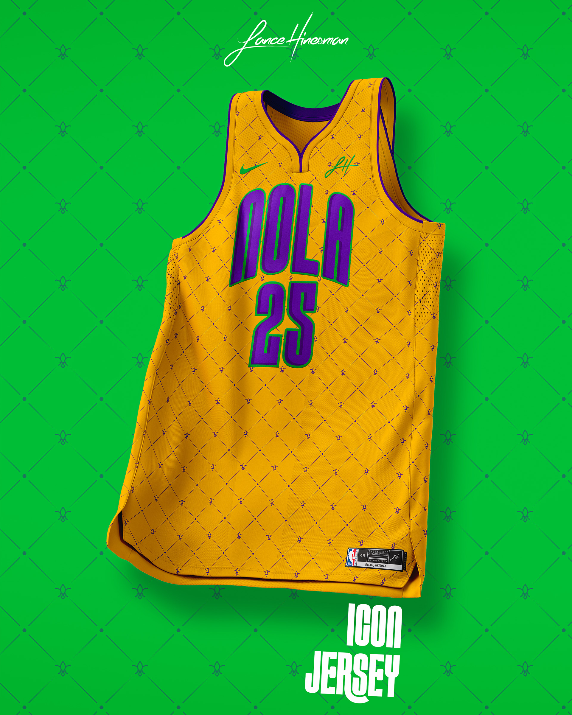
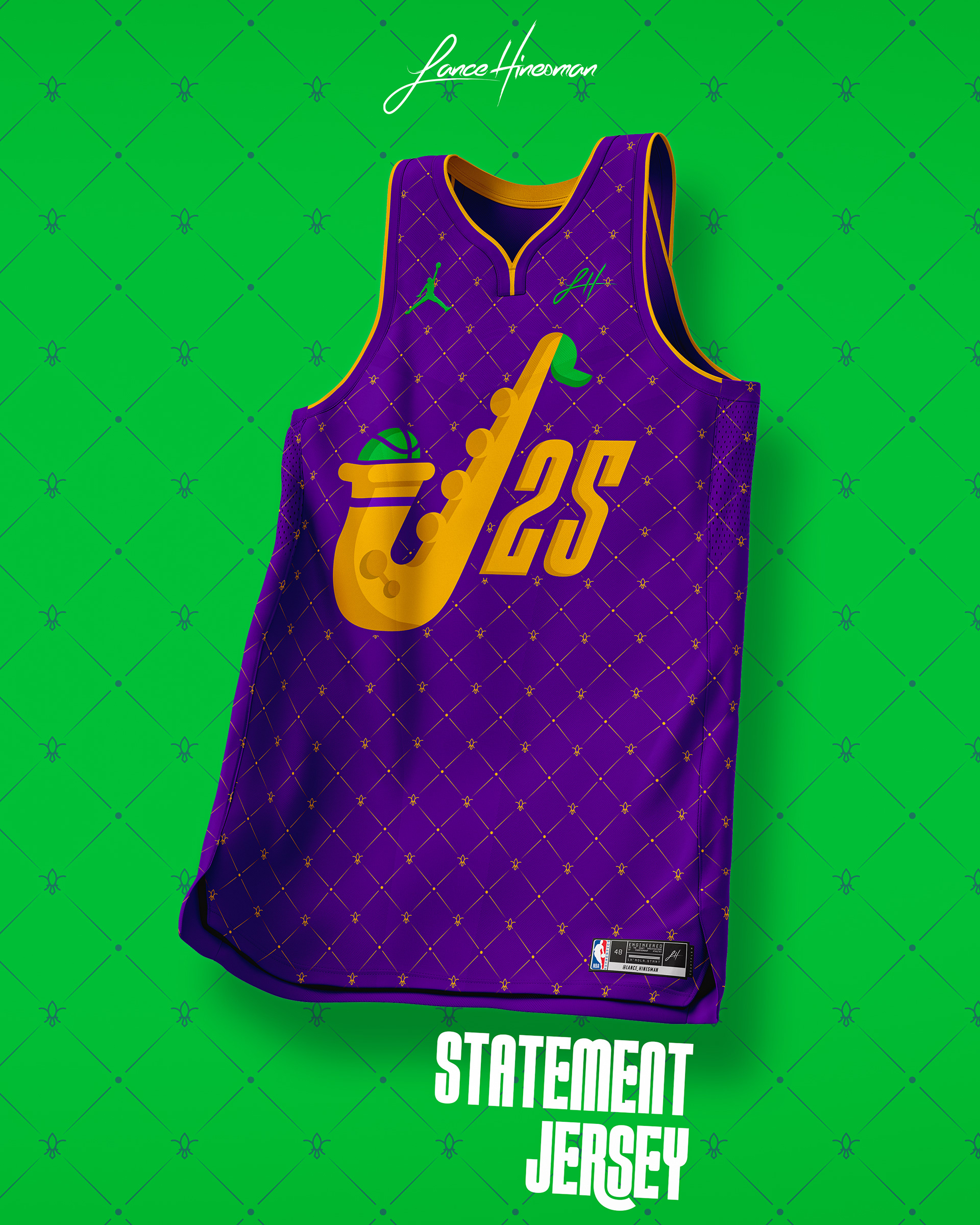
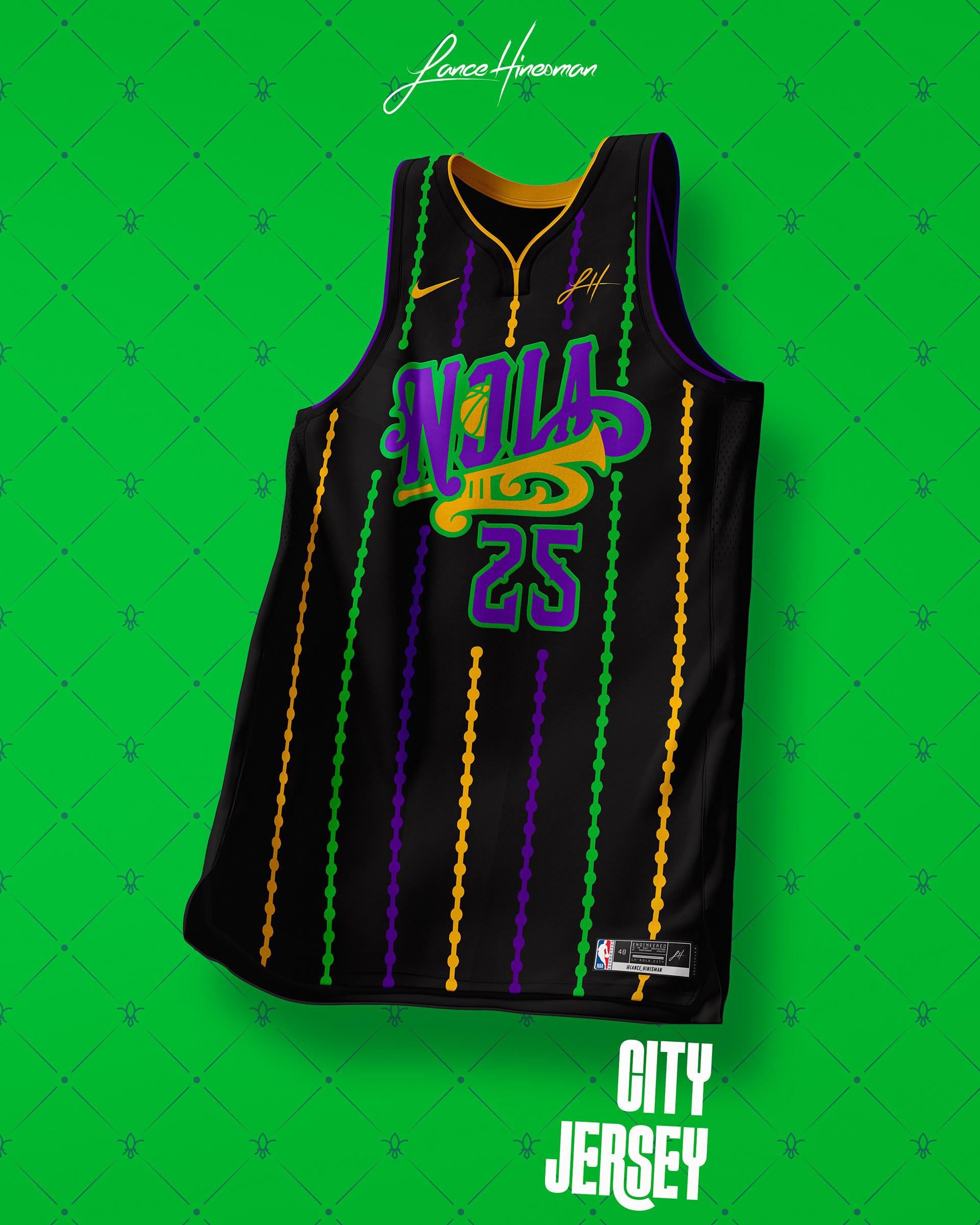
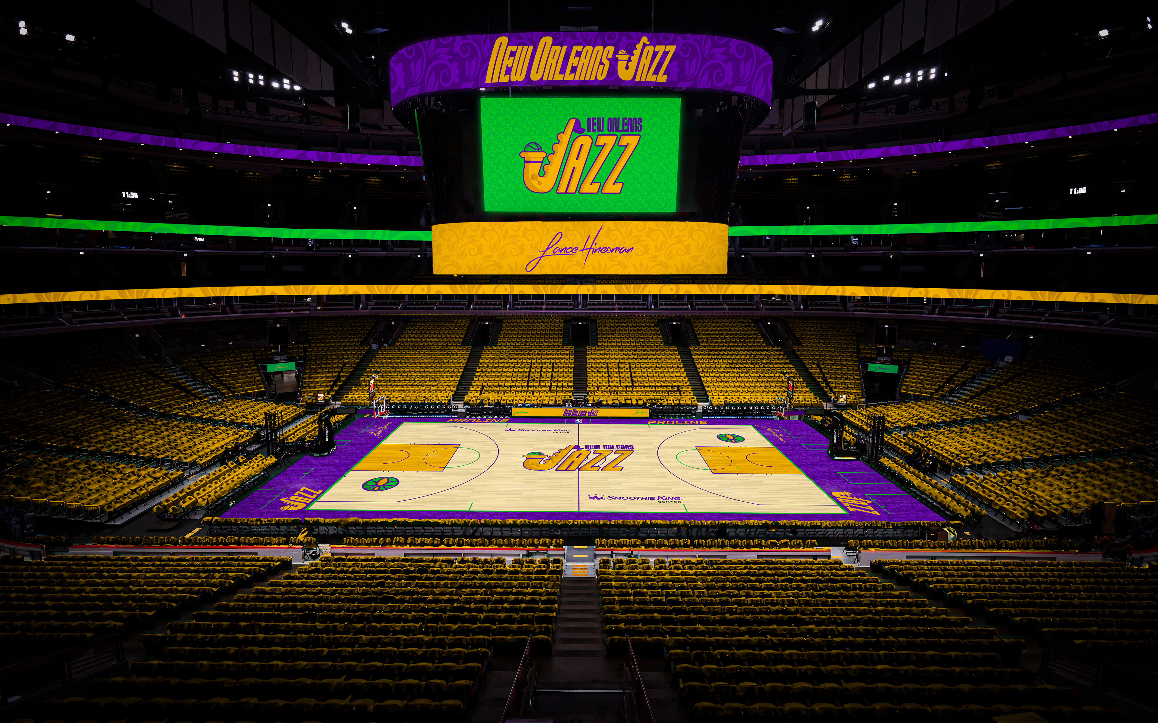
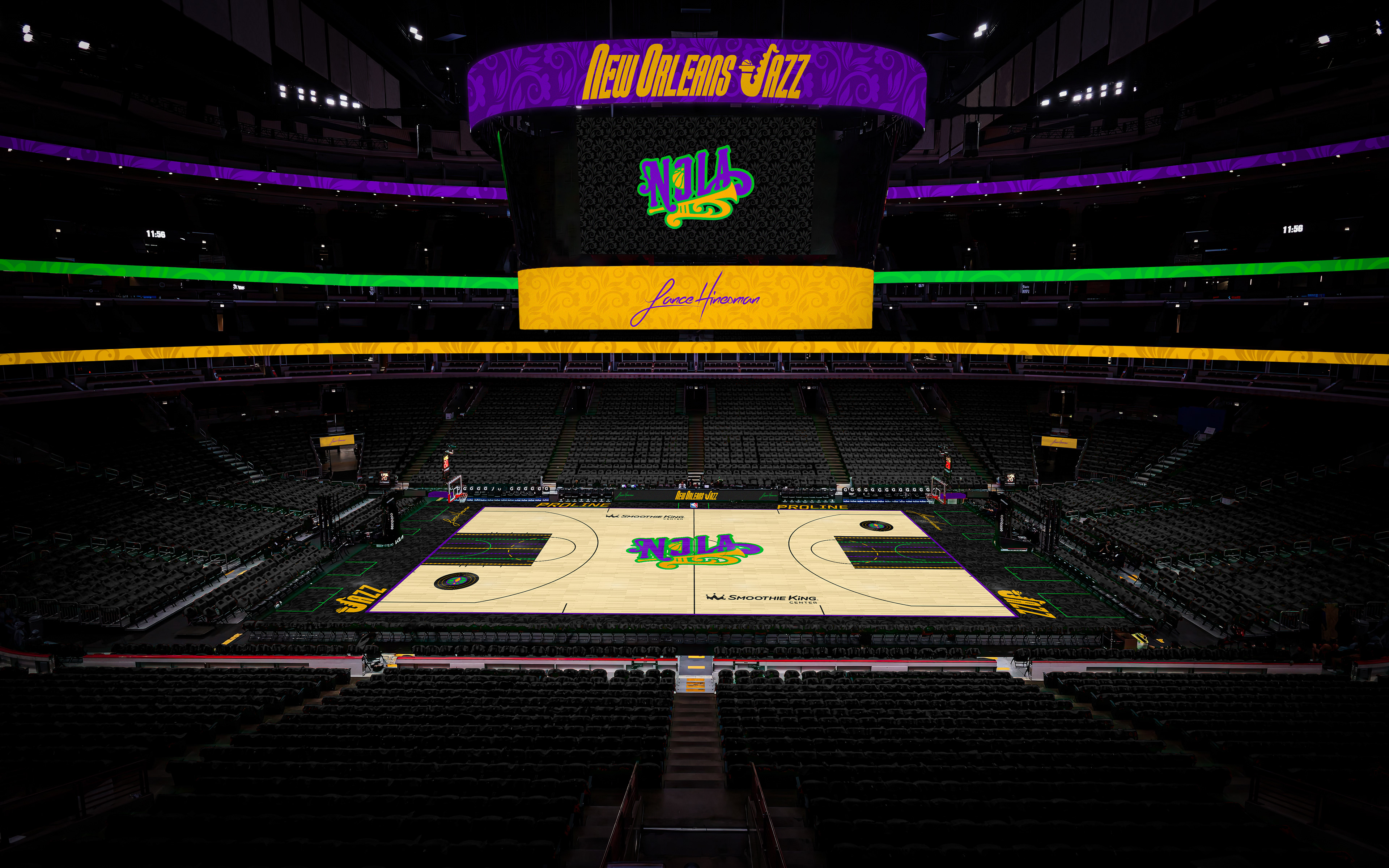
This part of the redesign sees the Pelicans reclaim their old identity, making way for a brand new Utah team down the line. The highlight of the logo is a saxophone housing a basketball with Mardi Gras colors taking center stage. The City Jersey embraces NOLA culture with a beaded pinstripe pattern.
New York Knicks
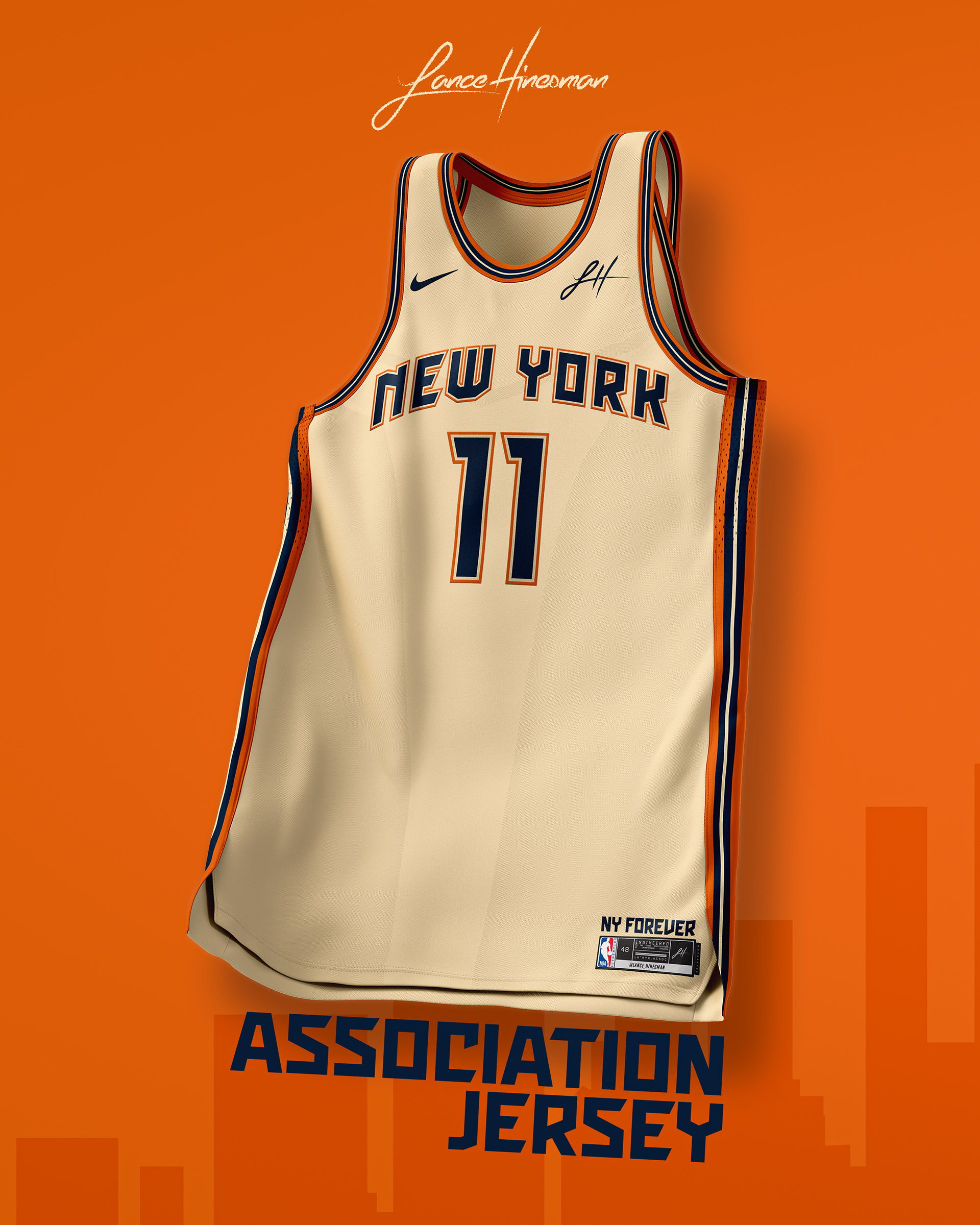
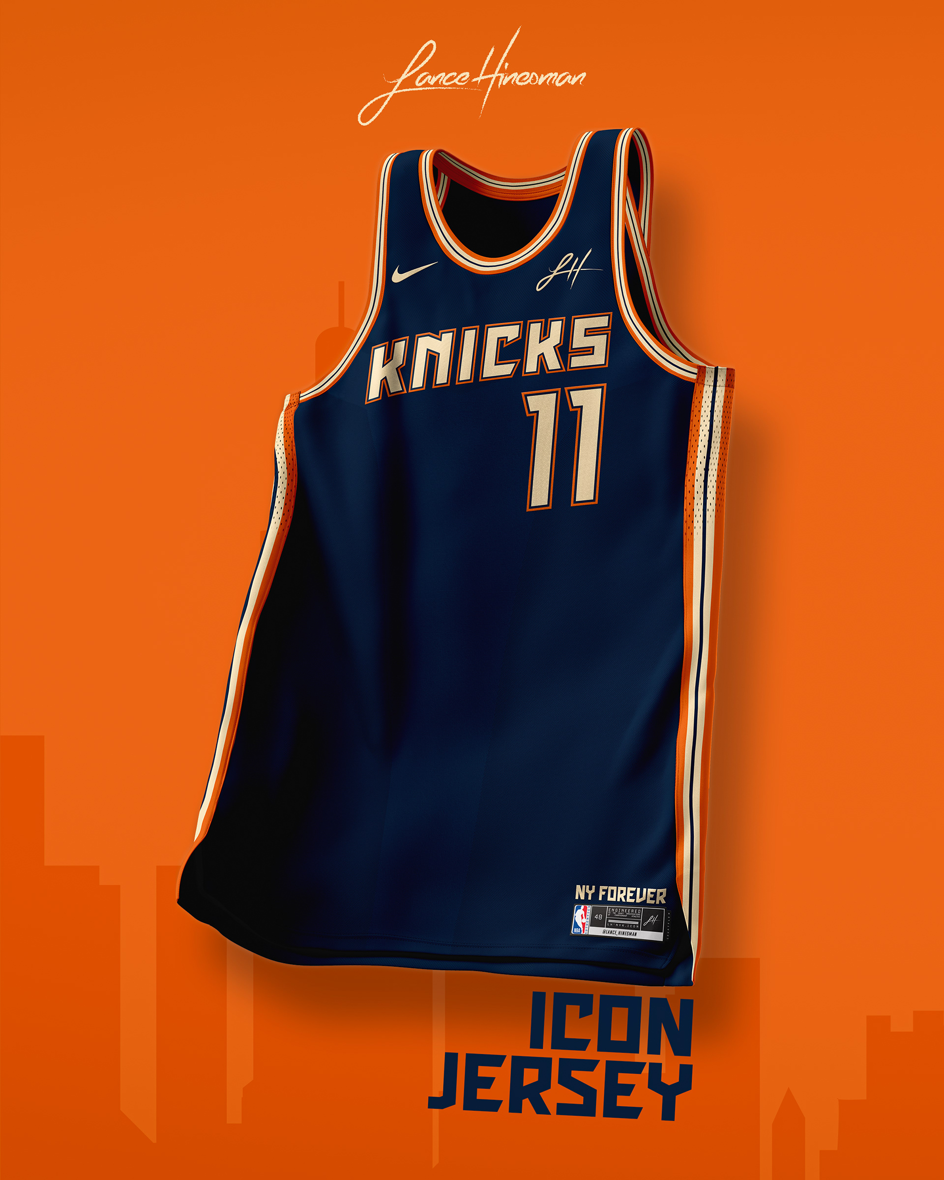
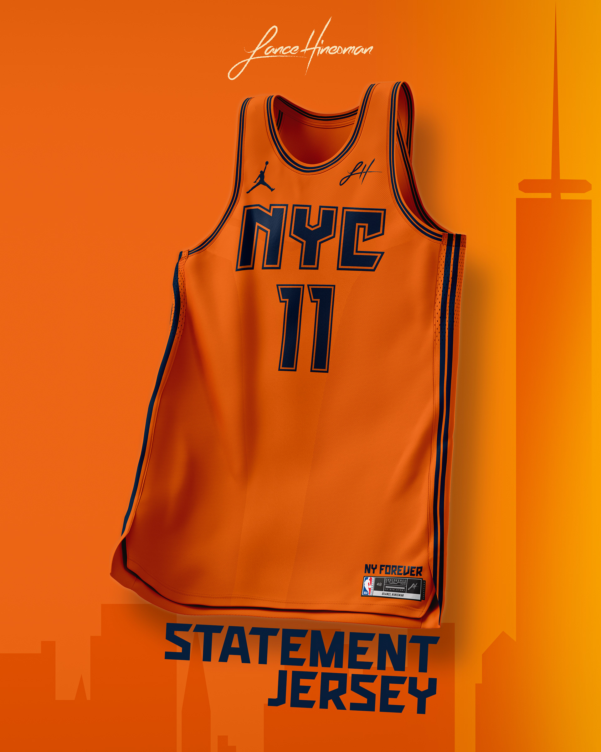
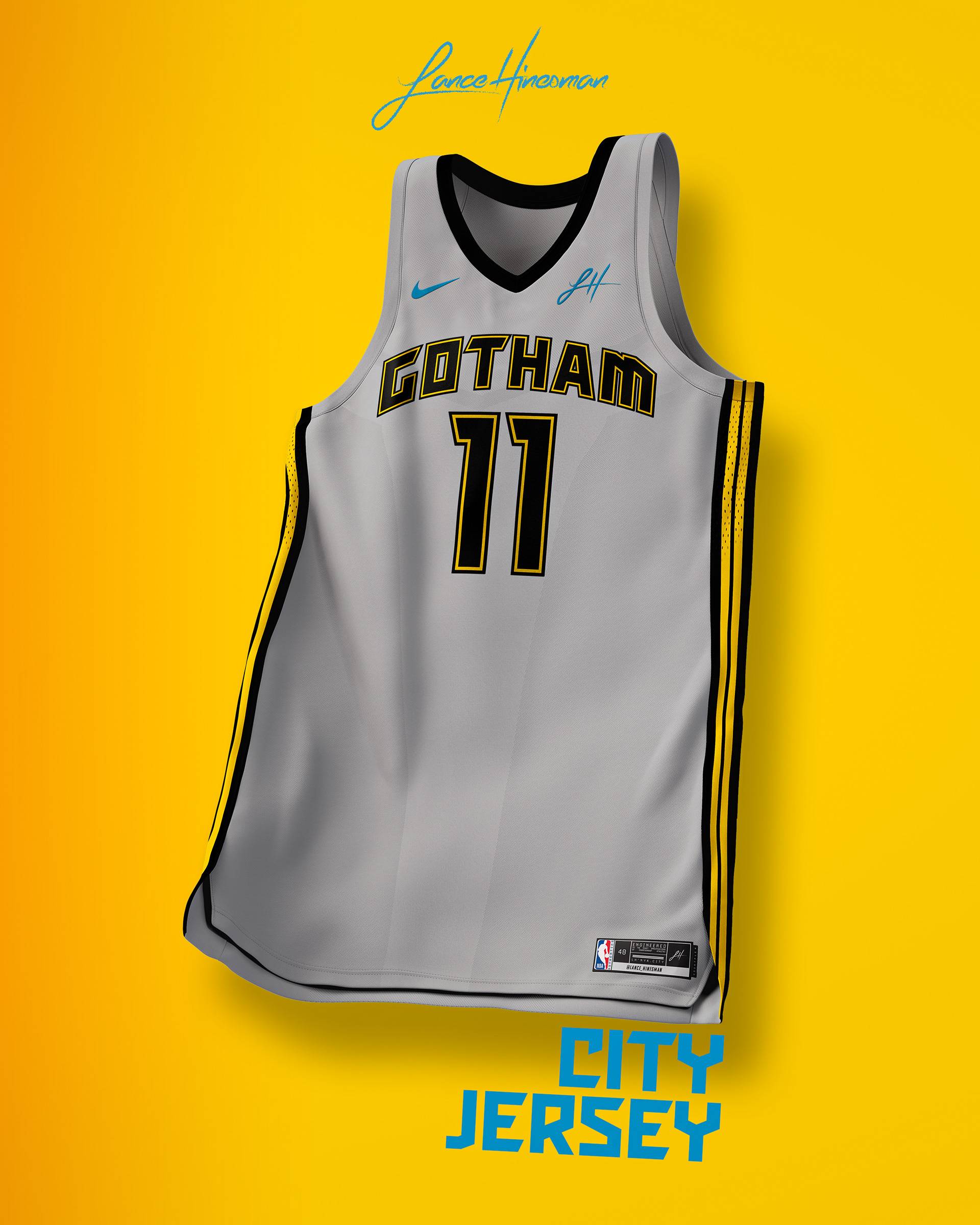
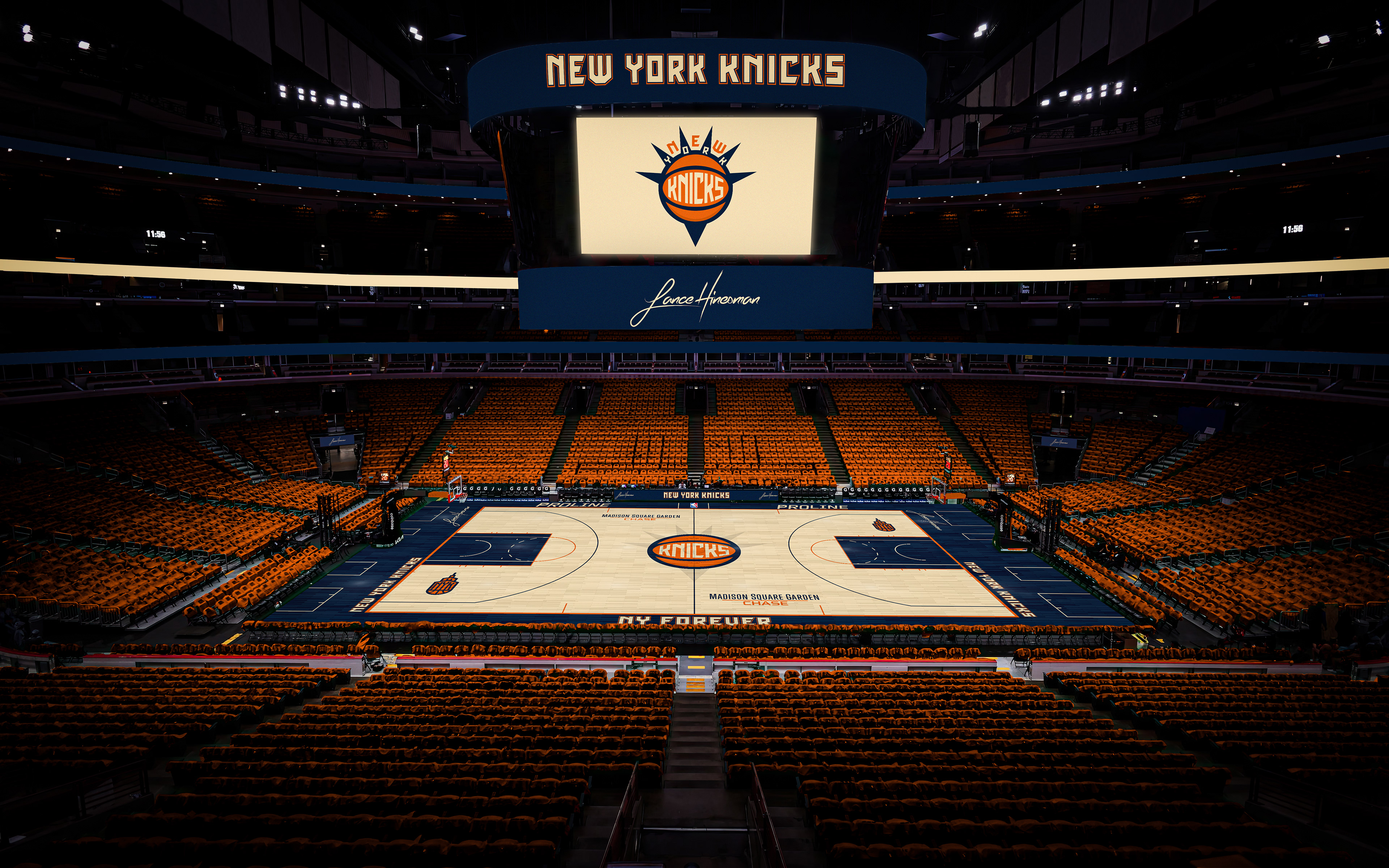
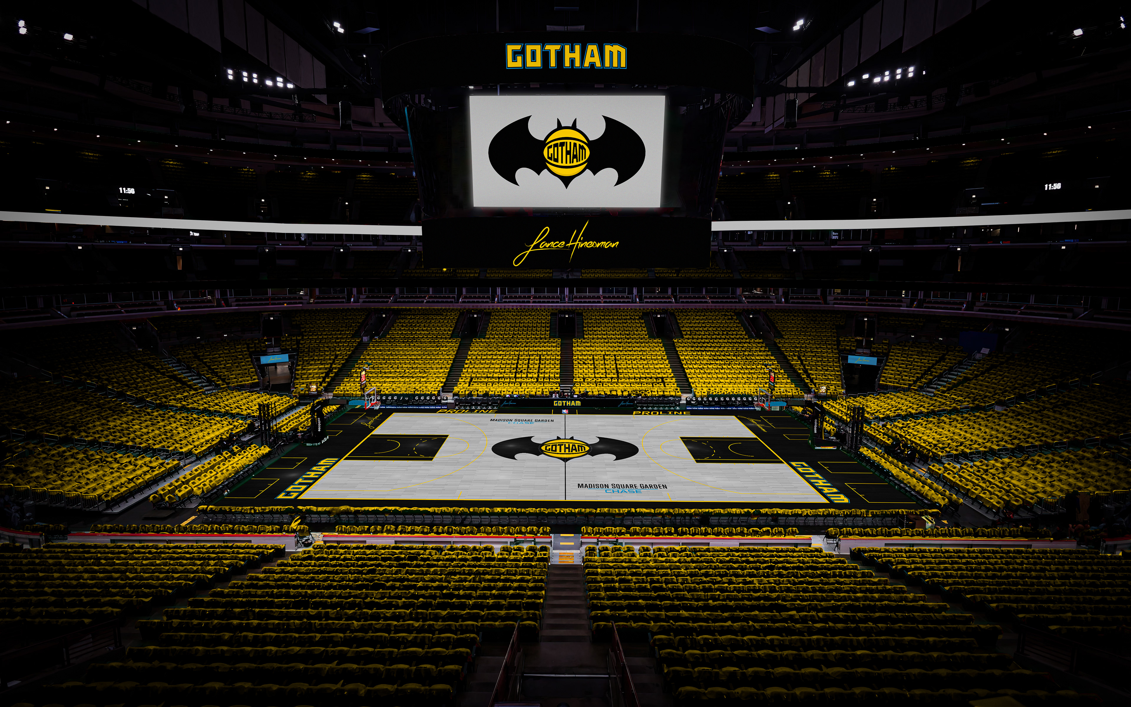
This one is inspired by the color scheme from their 70th anniversary, I created a main logo with shades of the Statue of Liberty. The City Jersey directly references DC's Caped Crusader while being a more subtle nod to one of NYC's oldest nicknames.
Oklahoma City Thunder
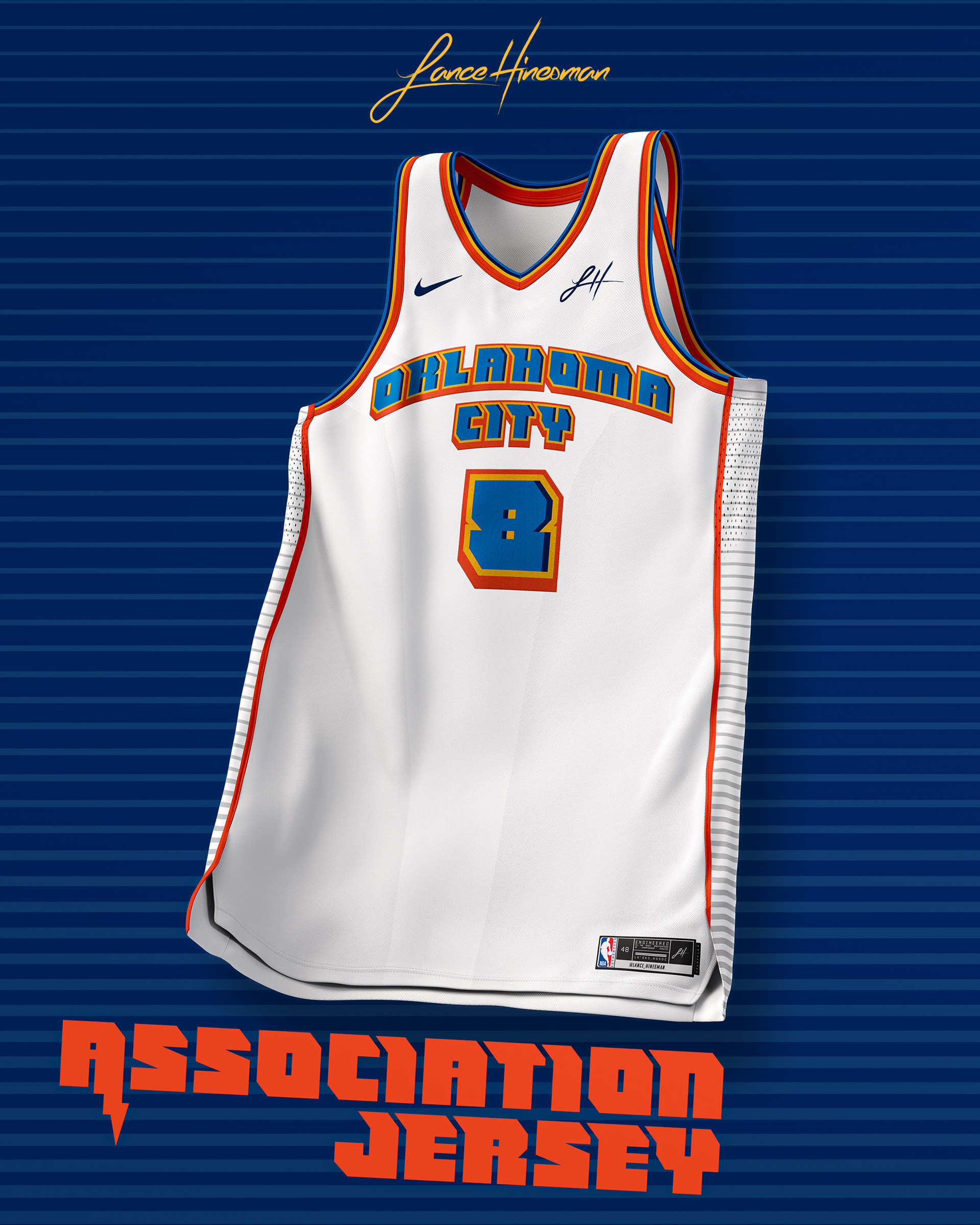
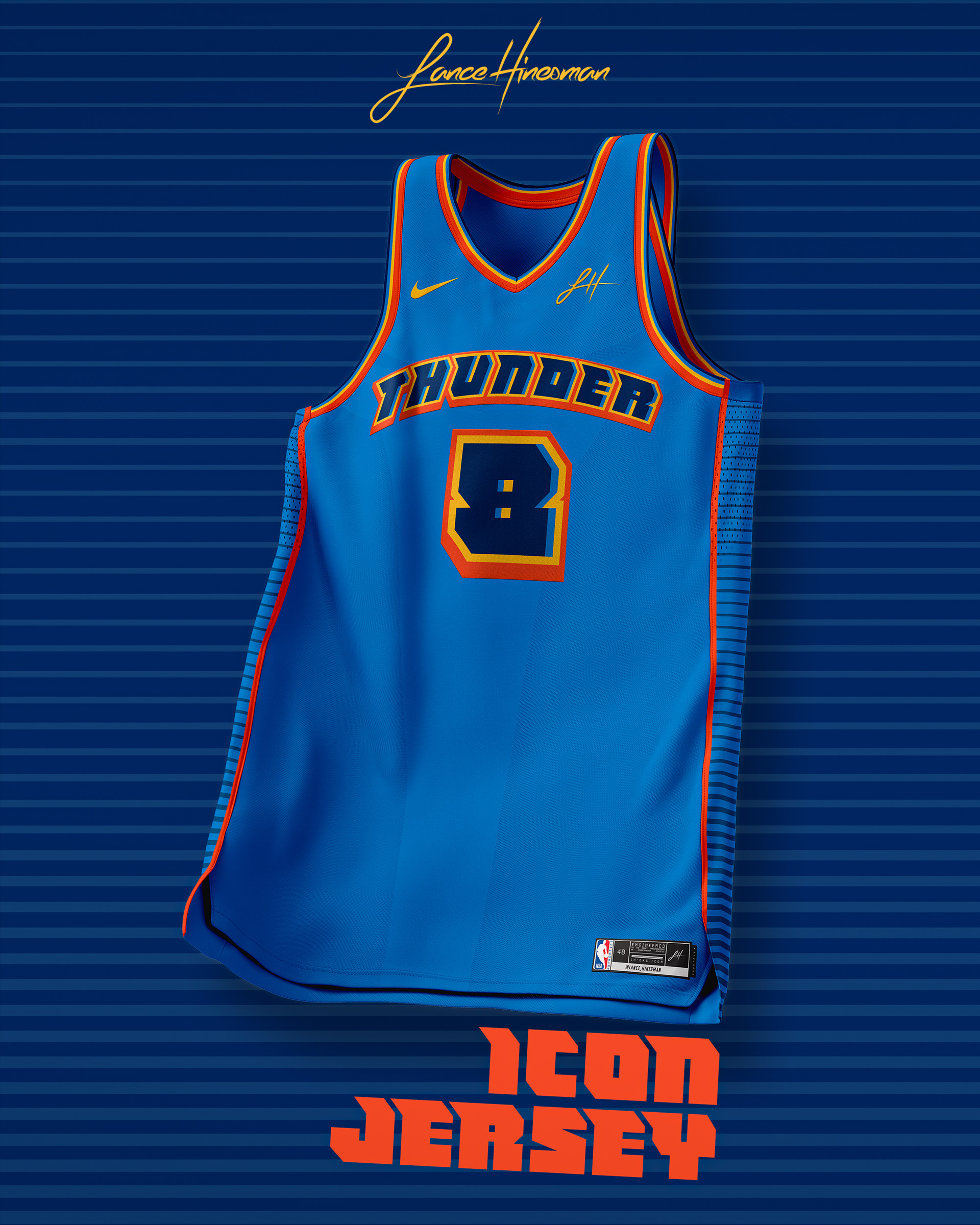
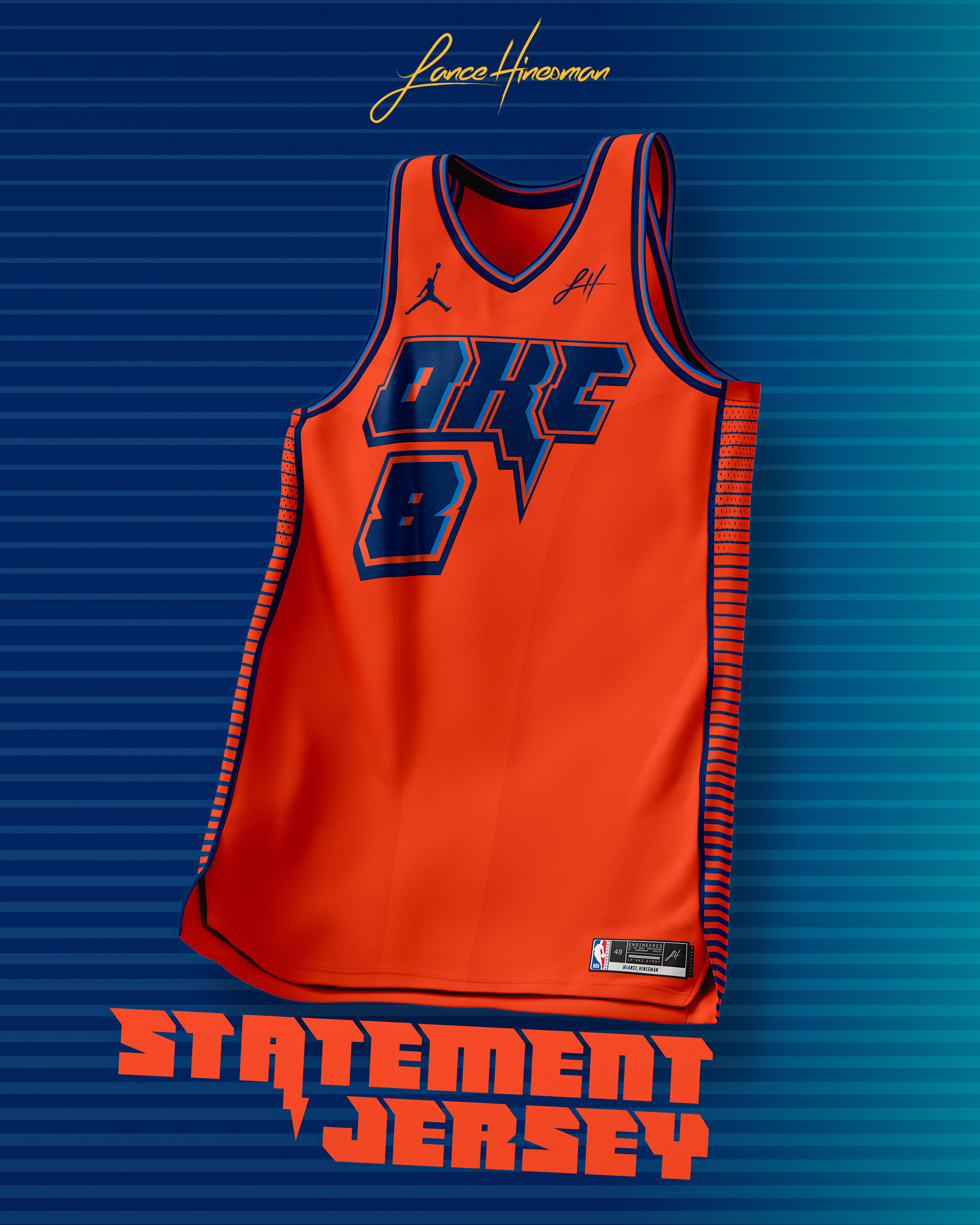
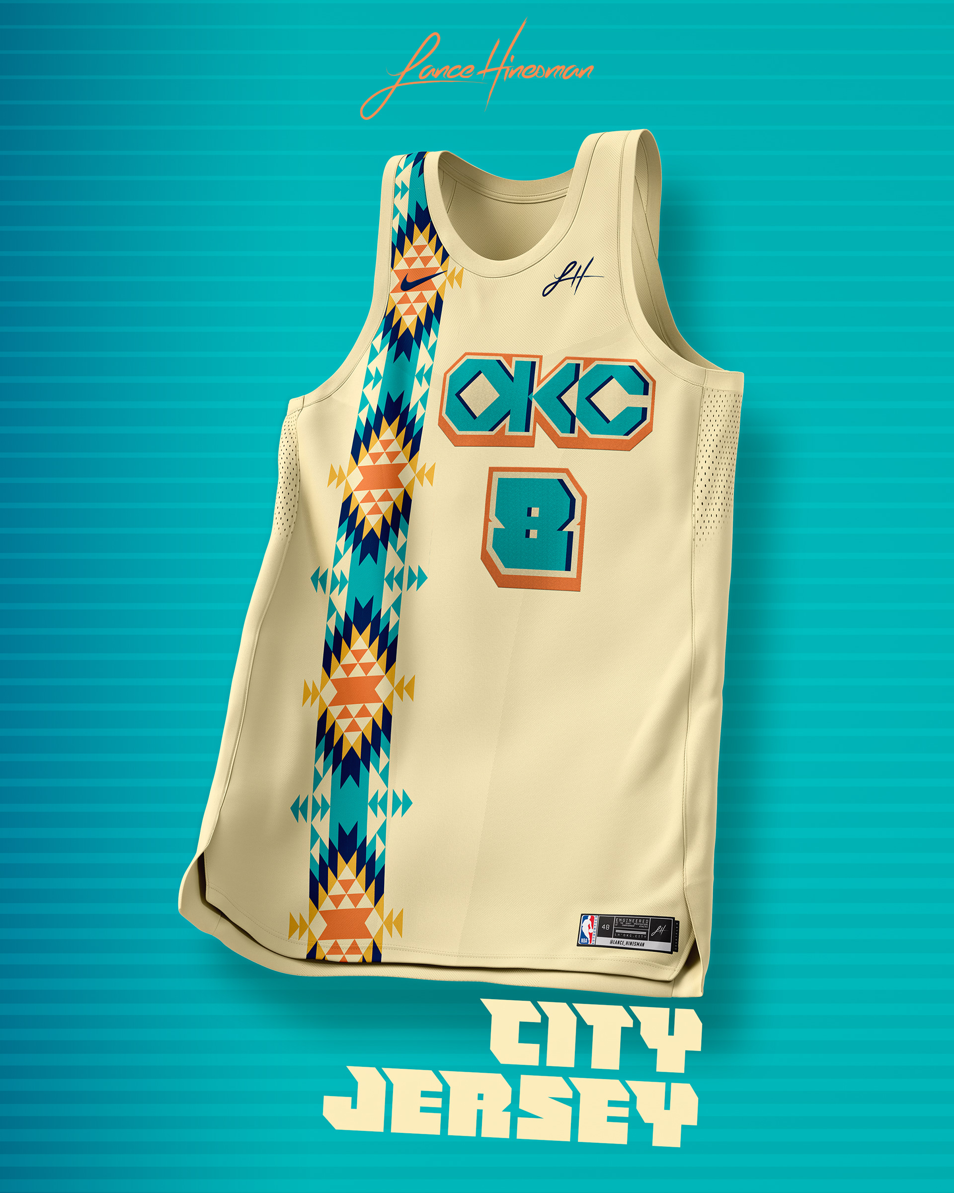
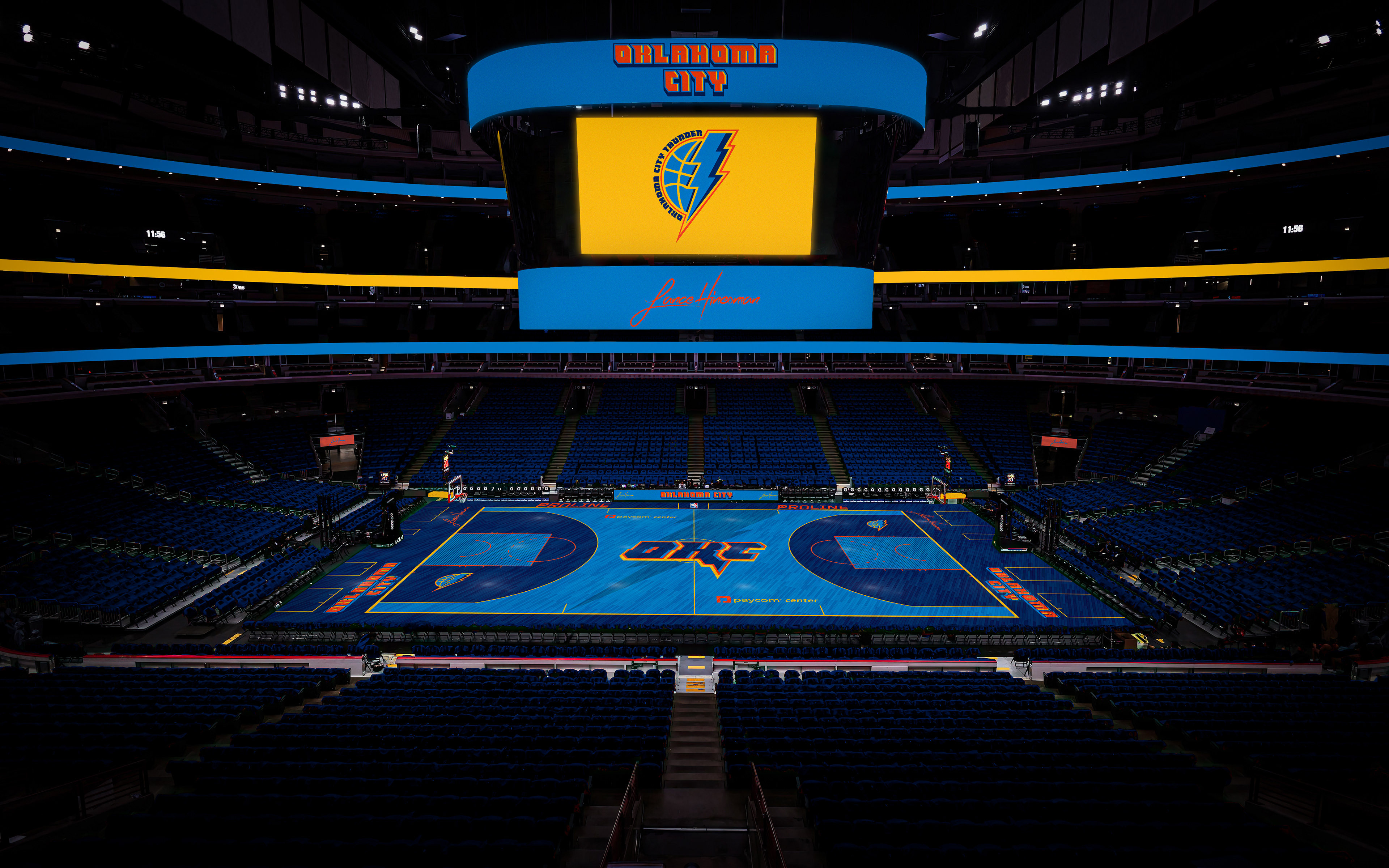
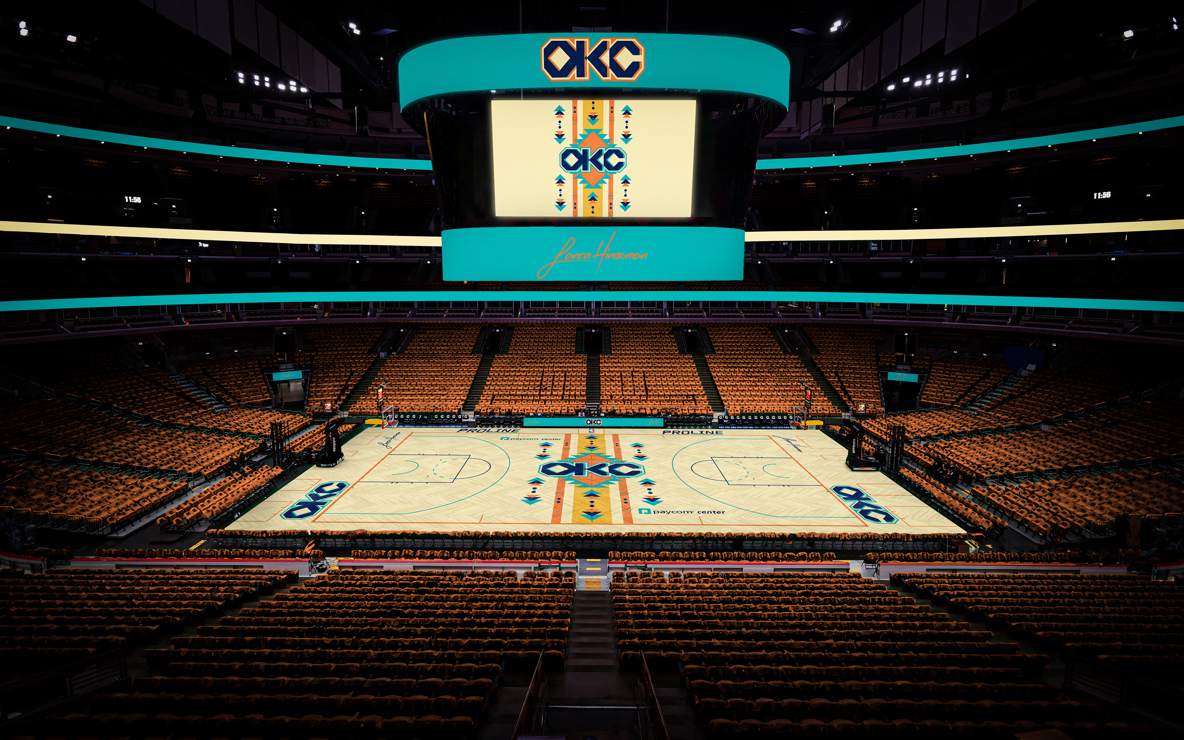
I kept the Thunder's current color scheme, but made new wordmarks to go with a new lightning bolt/ball logo. The City Jersey is inspired by their 2018-19 one which took inspiration from Native American culture and heritage in OKC. The courts are my boldest yet, with the main one being a two-toned blue one and the City one having a court-spanning native pattern.
Orlando Magic
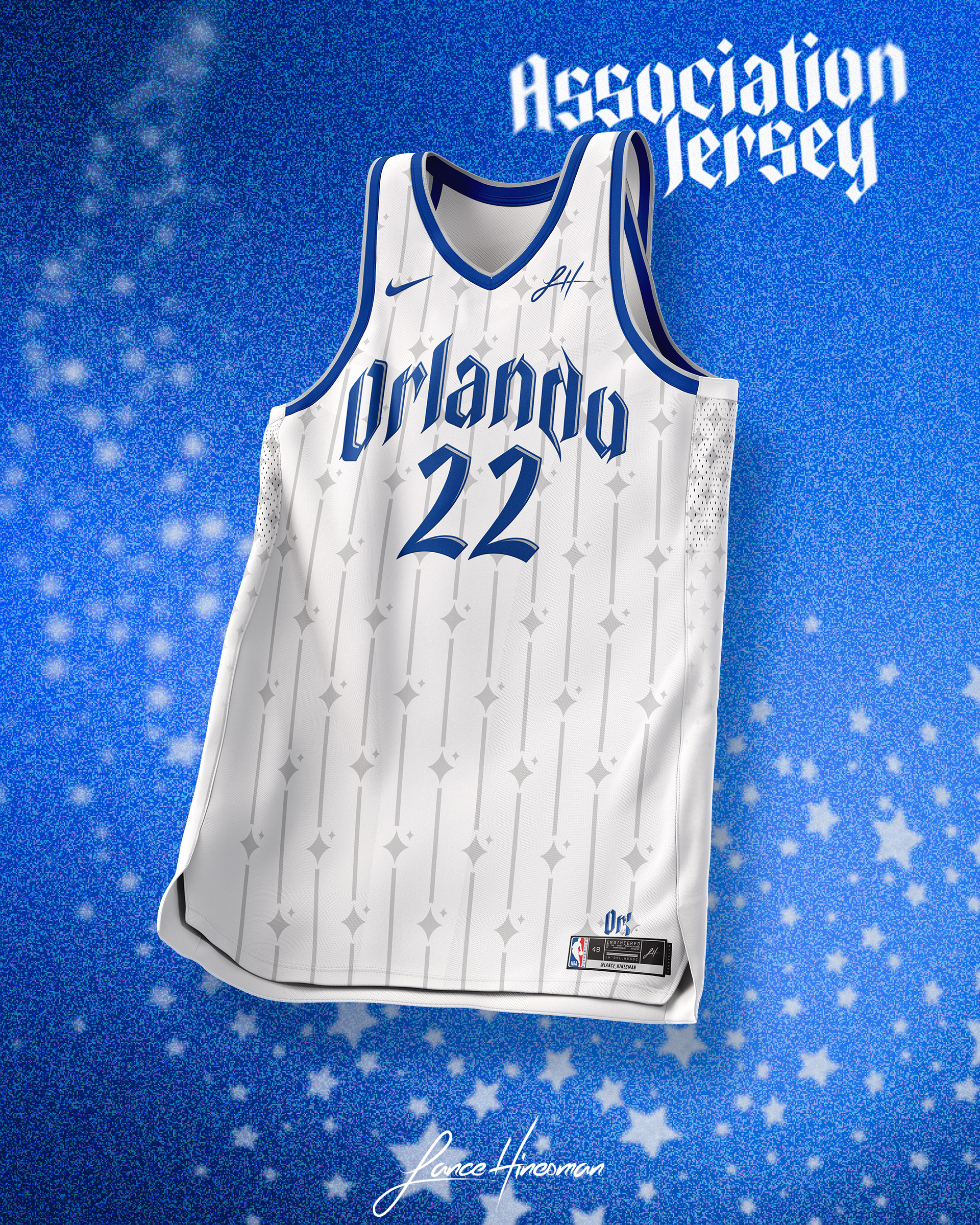
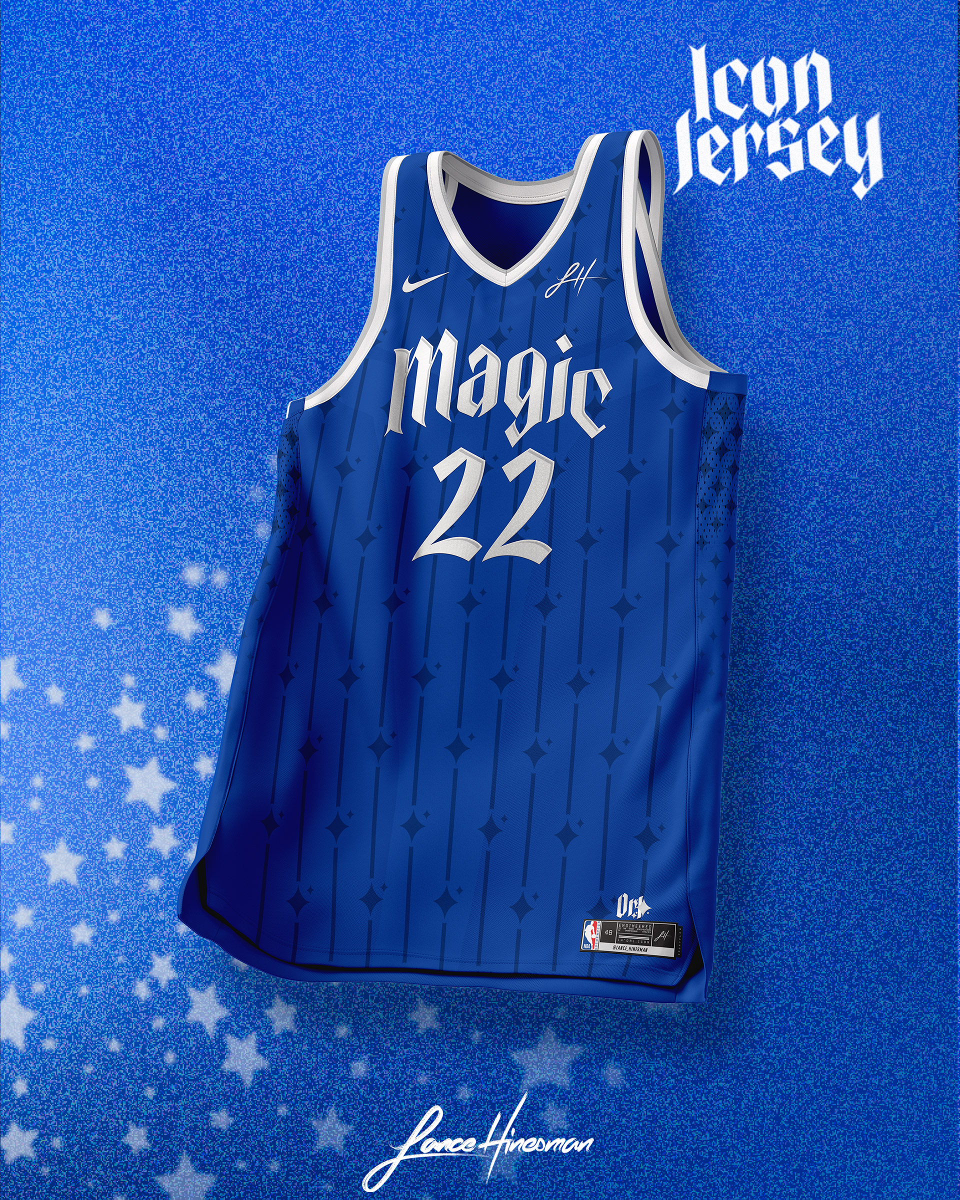
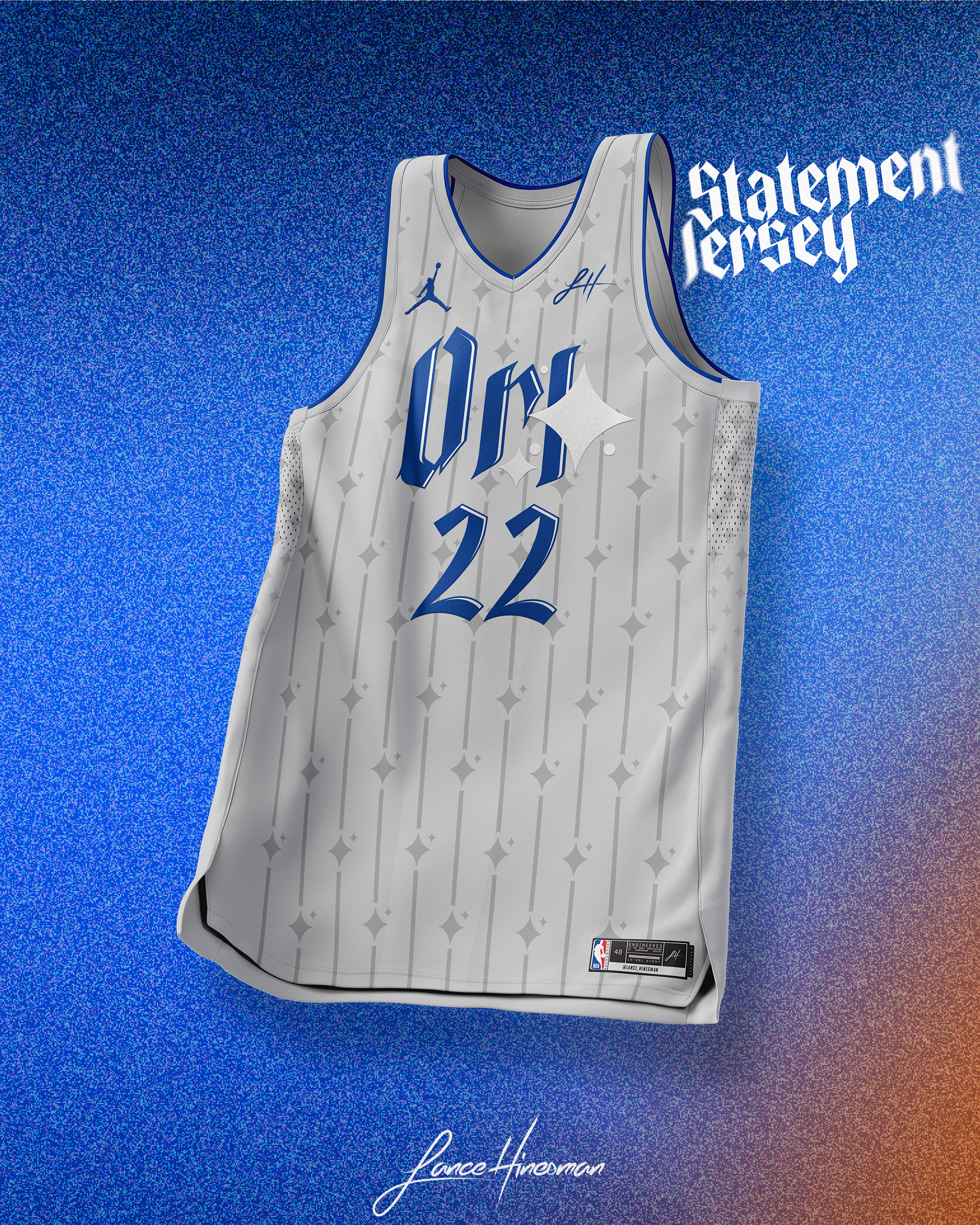
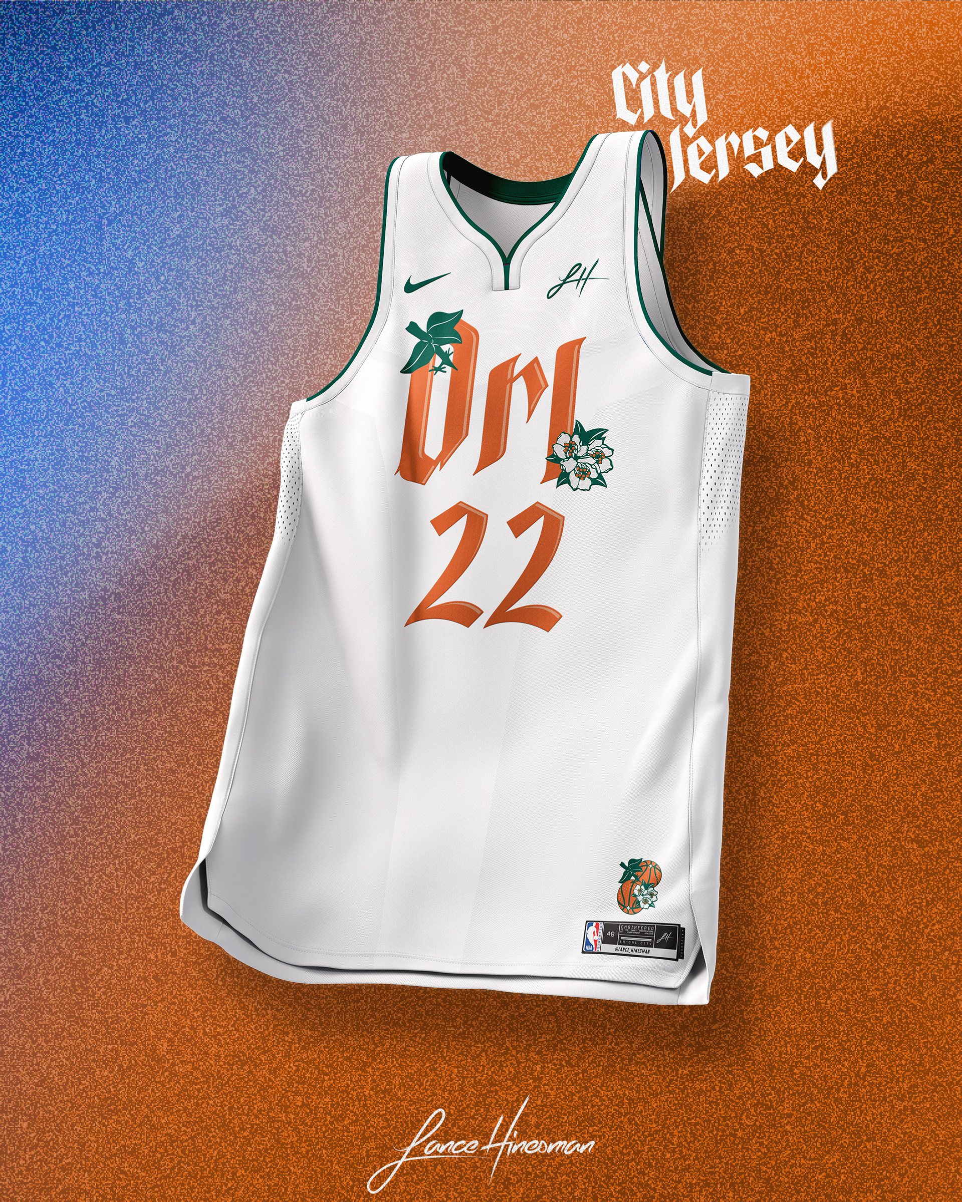
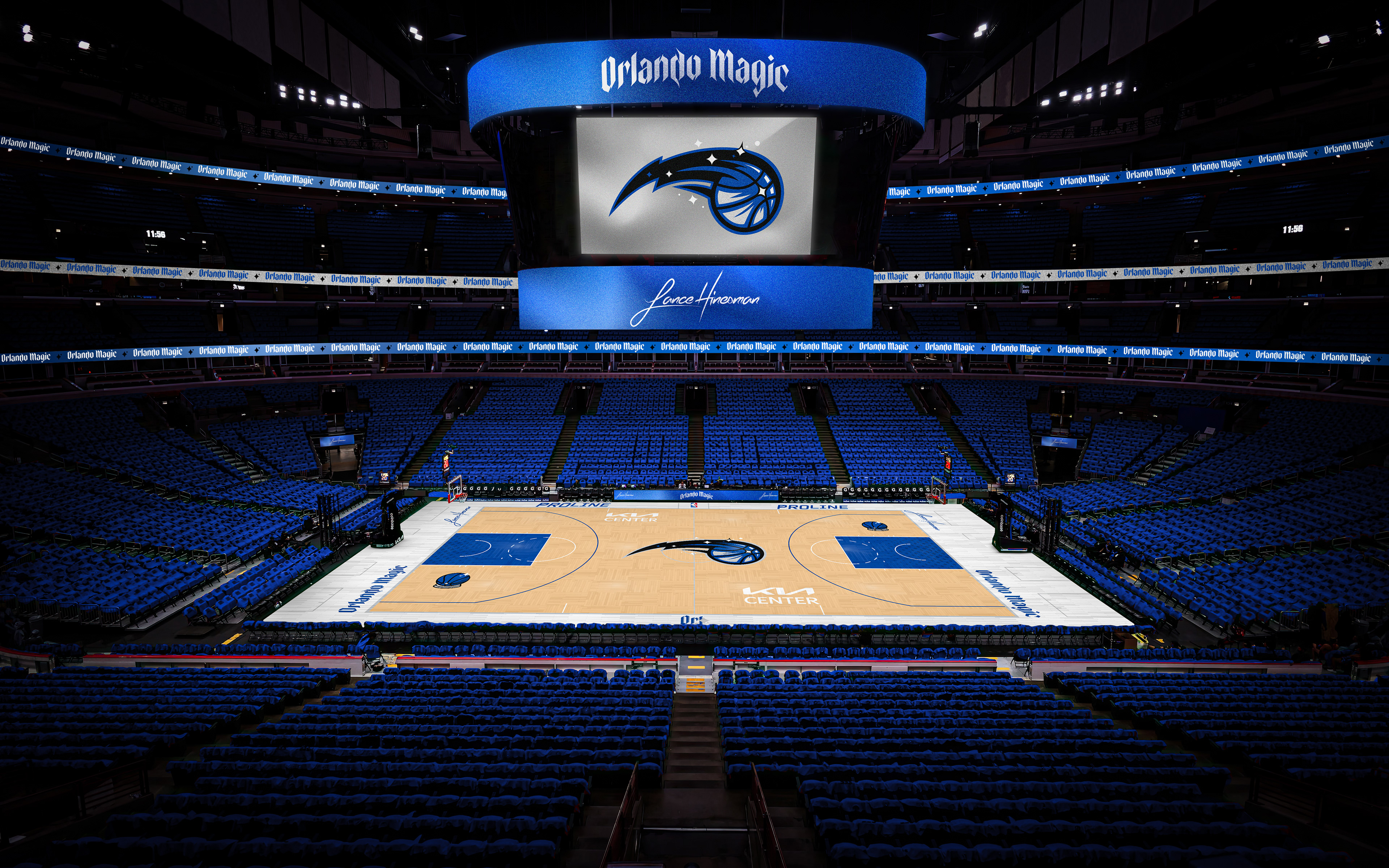
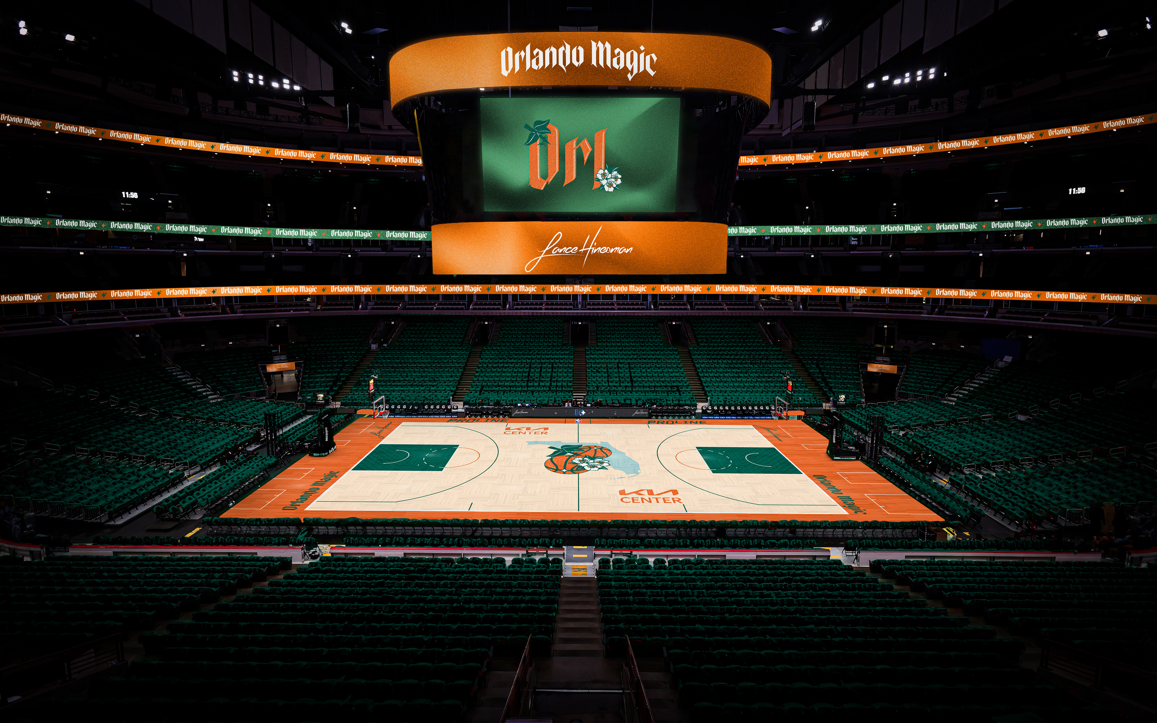
While tweaking the Magic's main logo and keeping their colors, I created more medieval style wordmarks and used a star-pinstripe pattern. The City Jersey is inspired by Florida's orange and green license plates.
Philadelphia 76ers
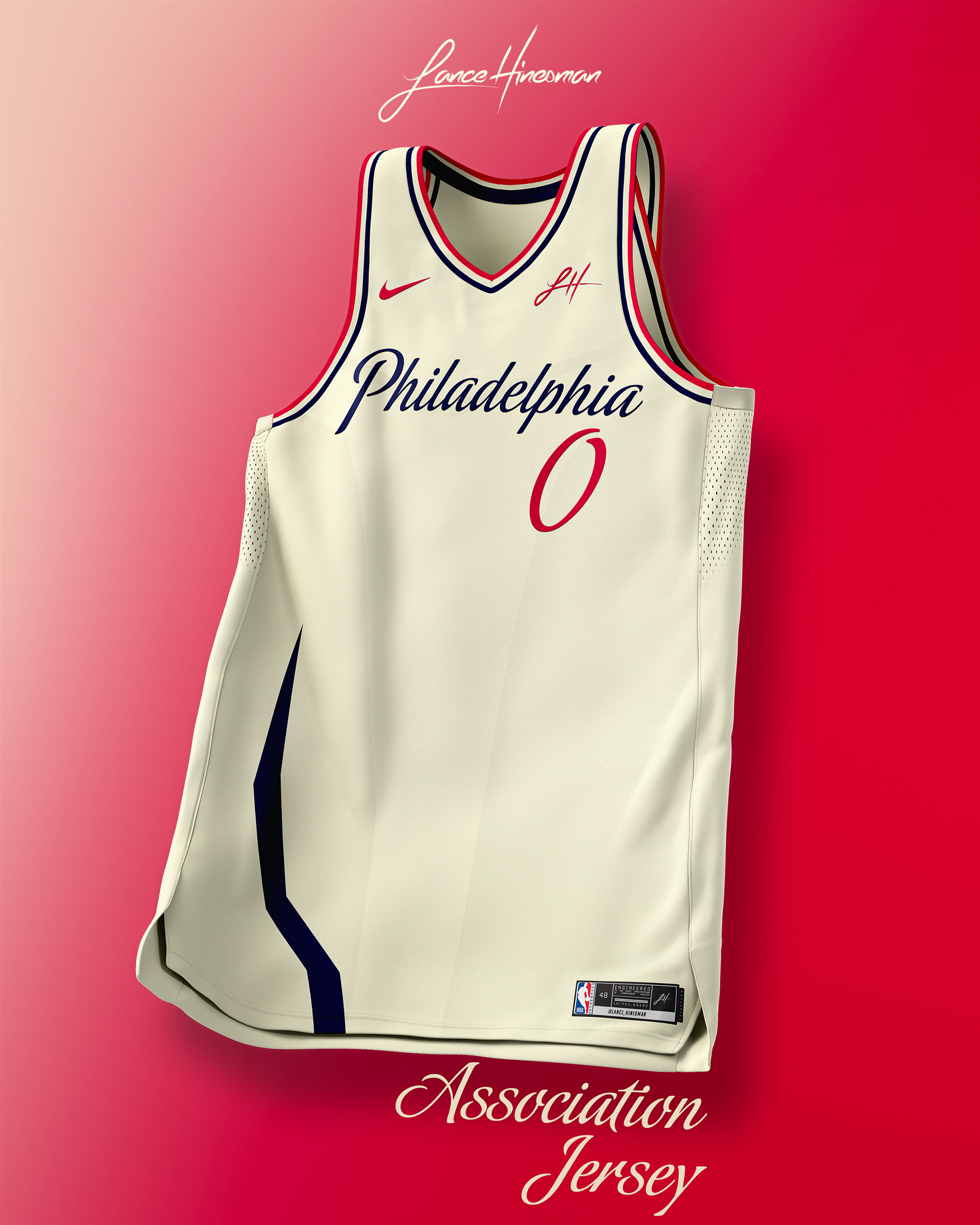
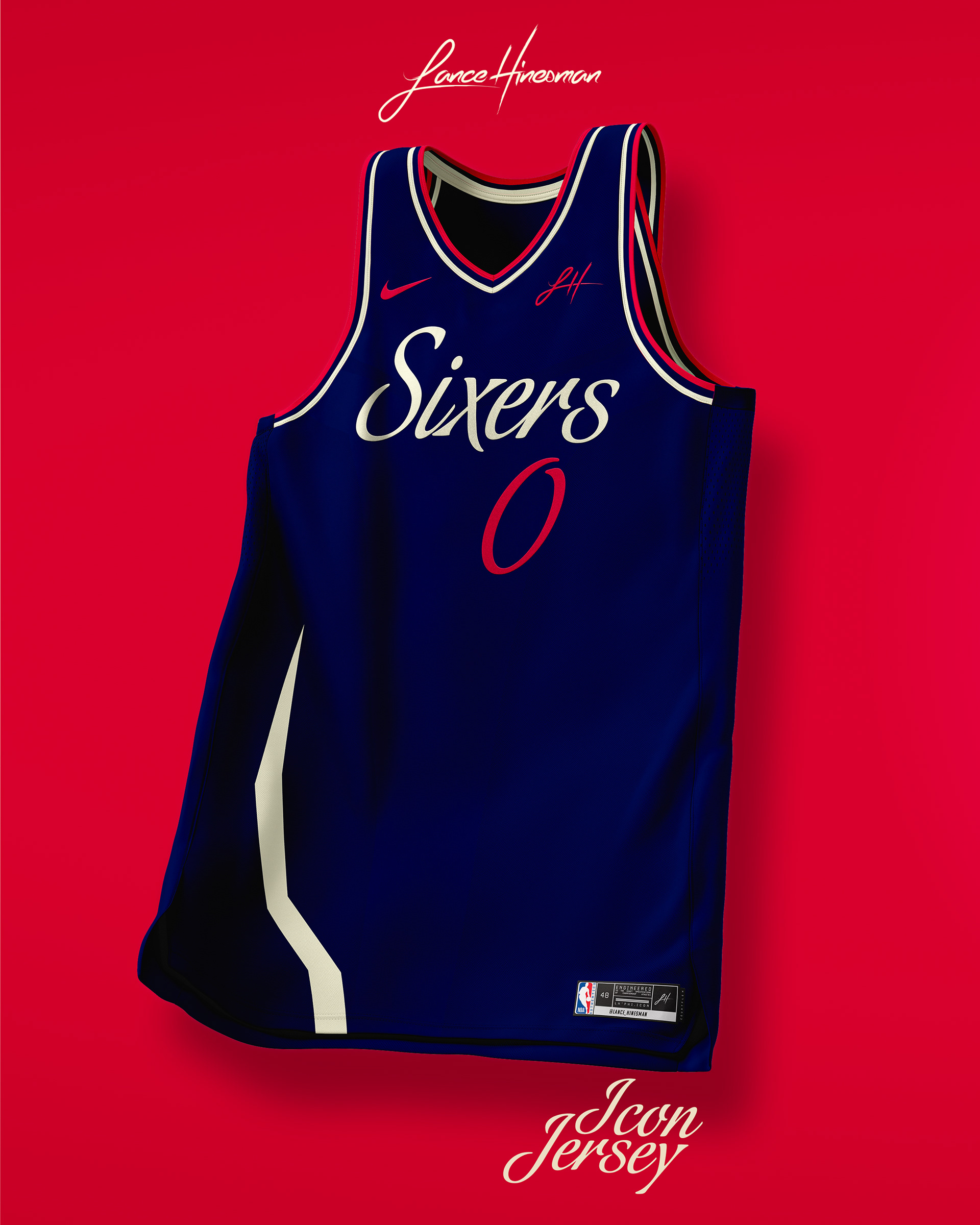
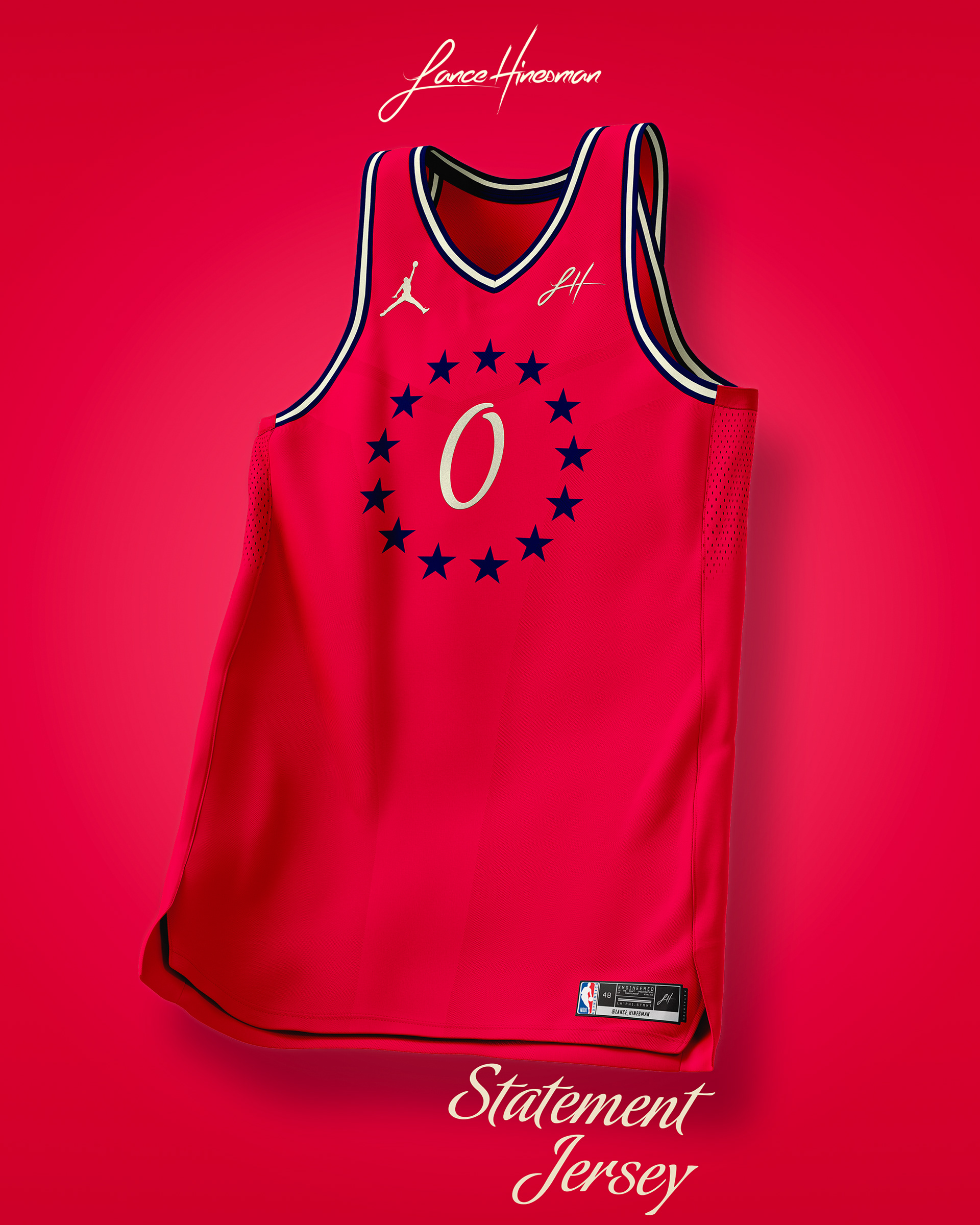
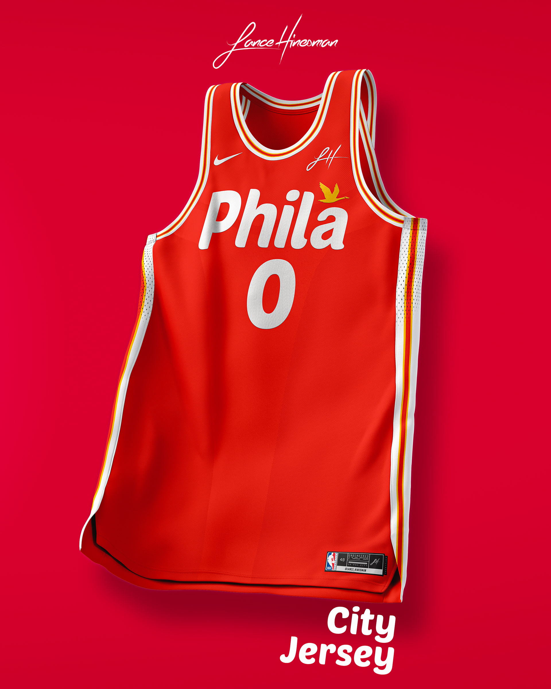
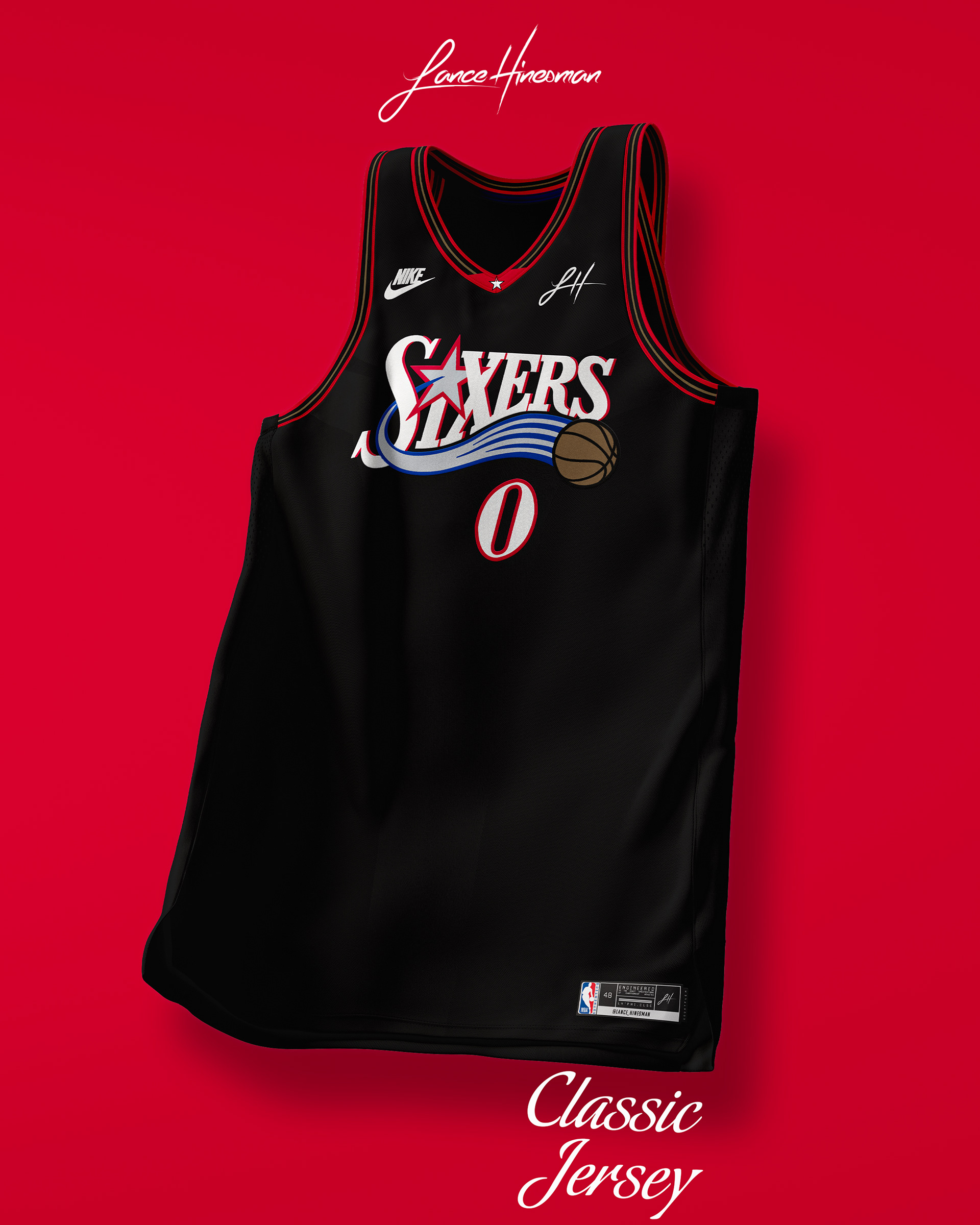
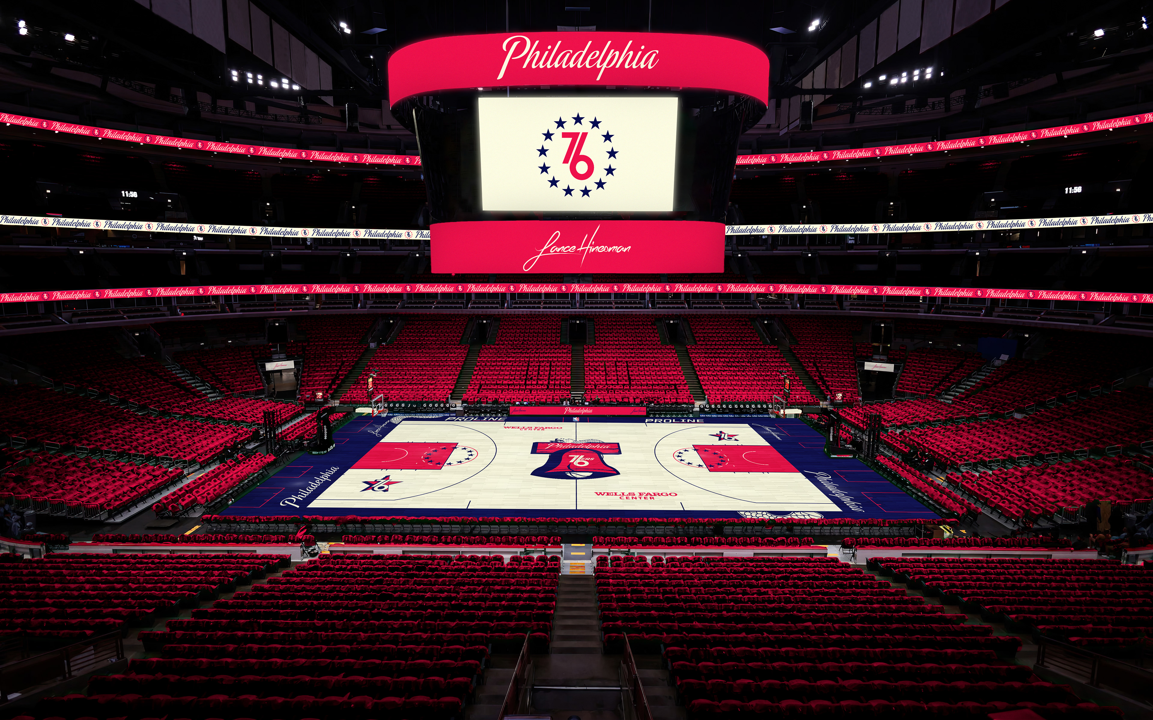
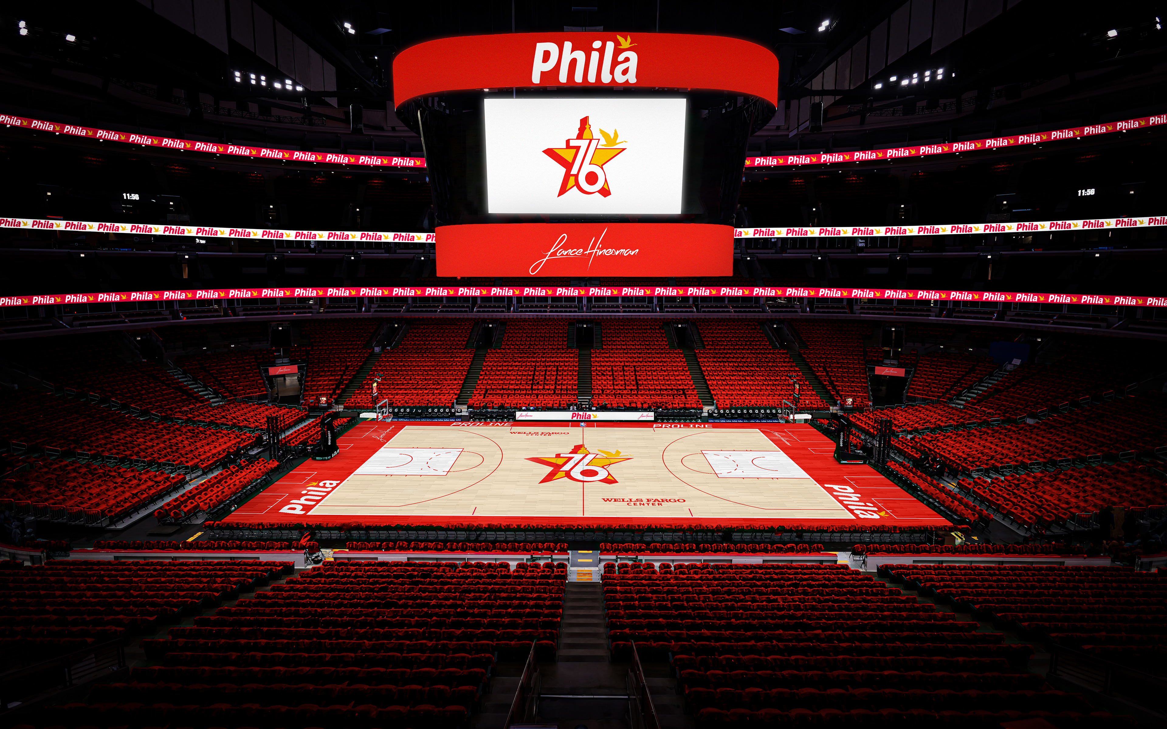
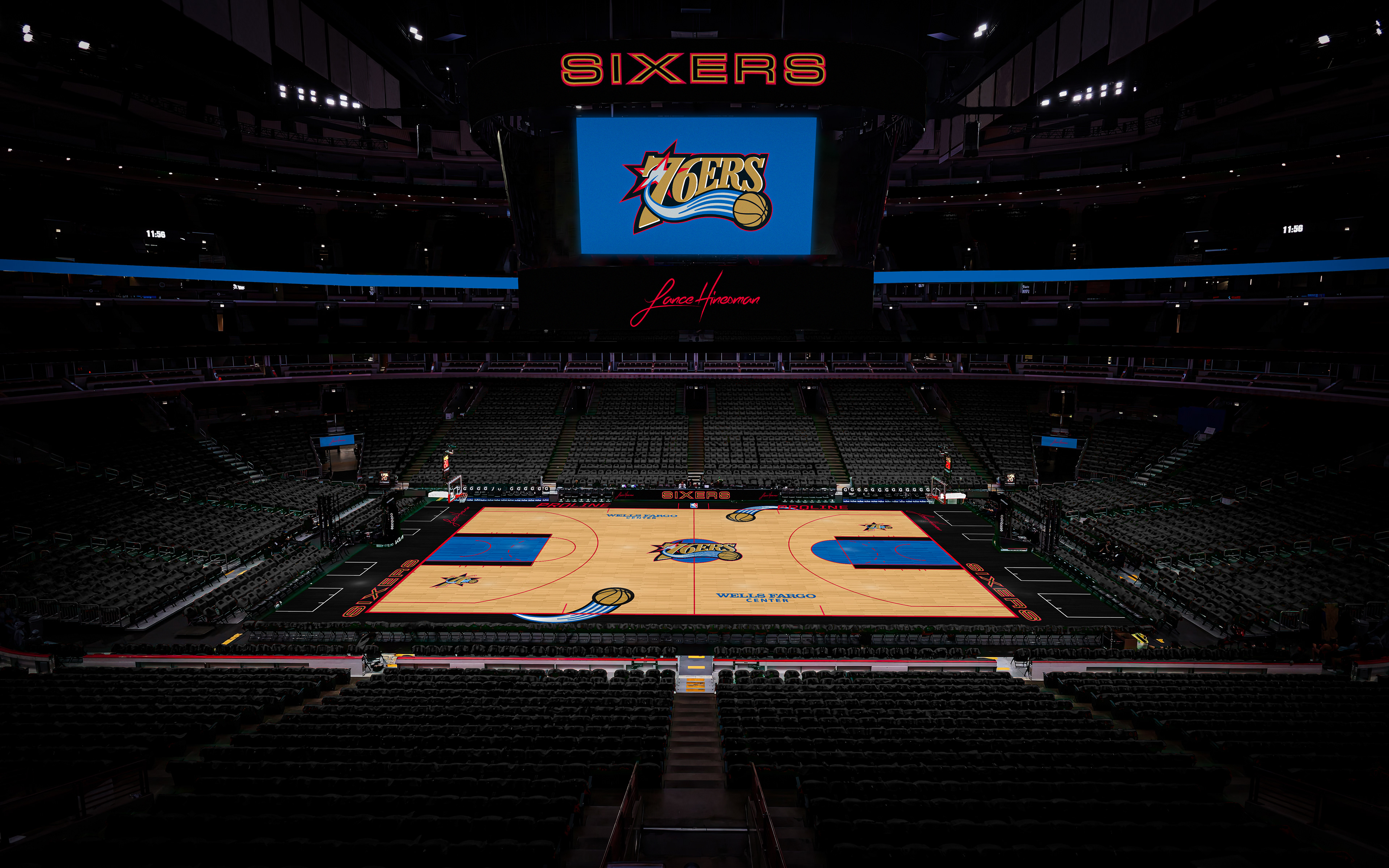
The Sixers redesign is inspired by a few of their previous City Jerseys, while also adding in the Liberty Bell crack. The Bell is also what's featured as the logo with Philadelphia city hall making an appearance on the alternate logo. Their City Jersey takes inspiration from the greatest convenience store ever, Wawa 😁
Phoenix Suns
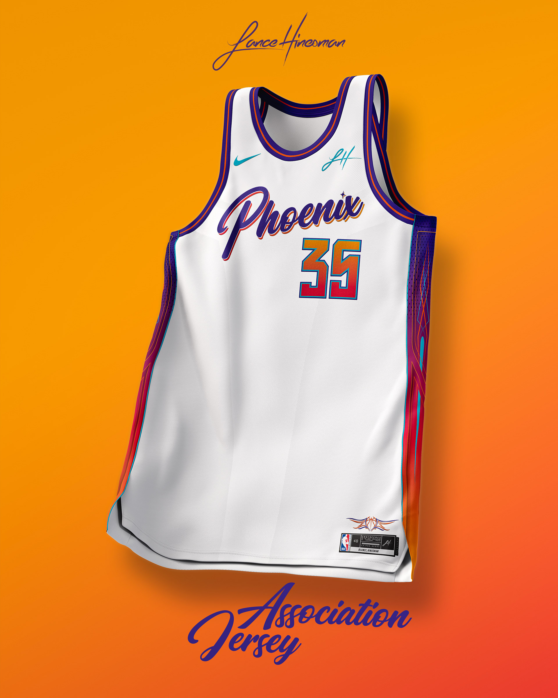
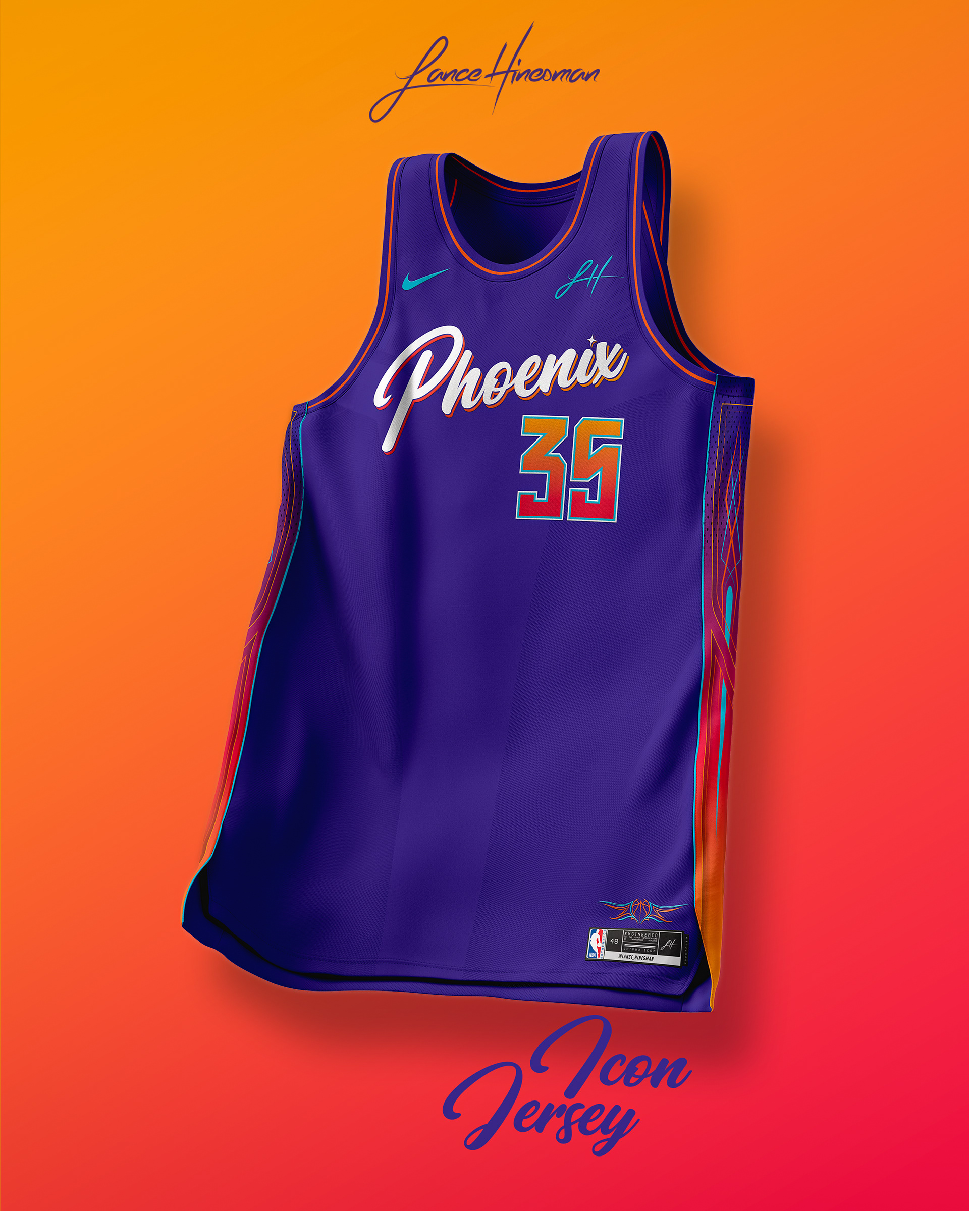
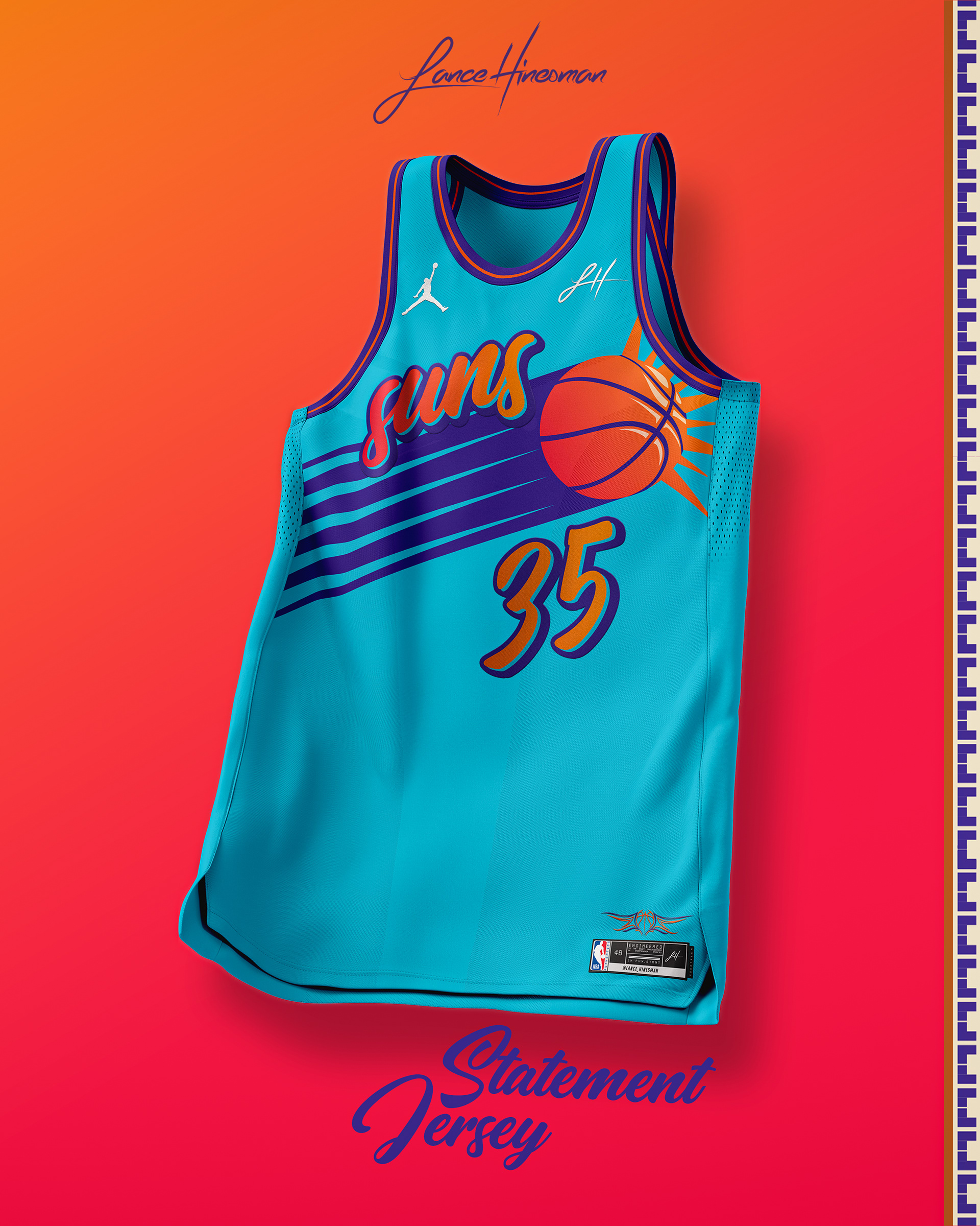
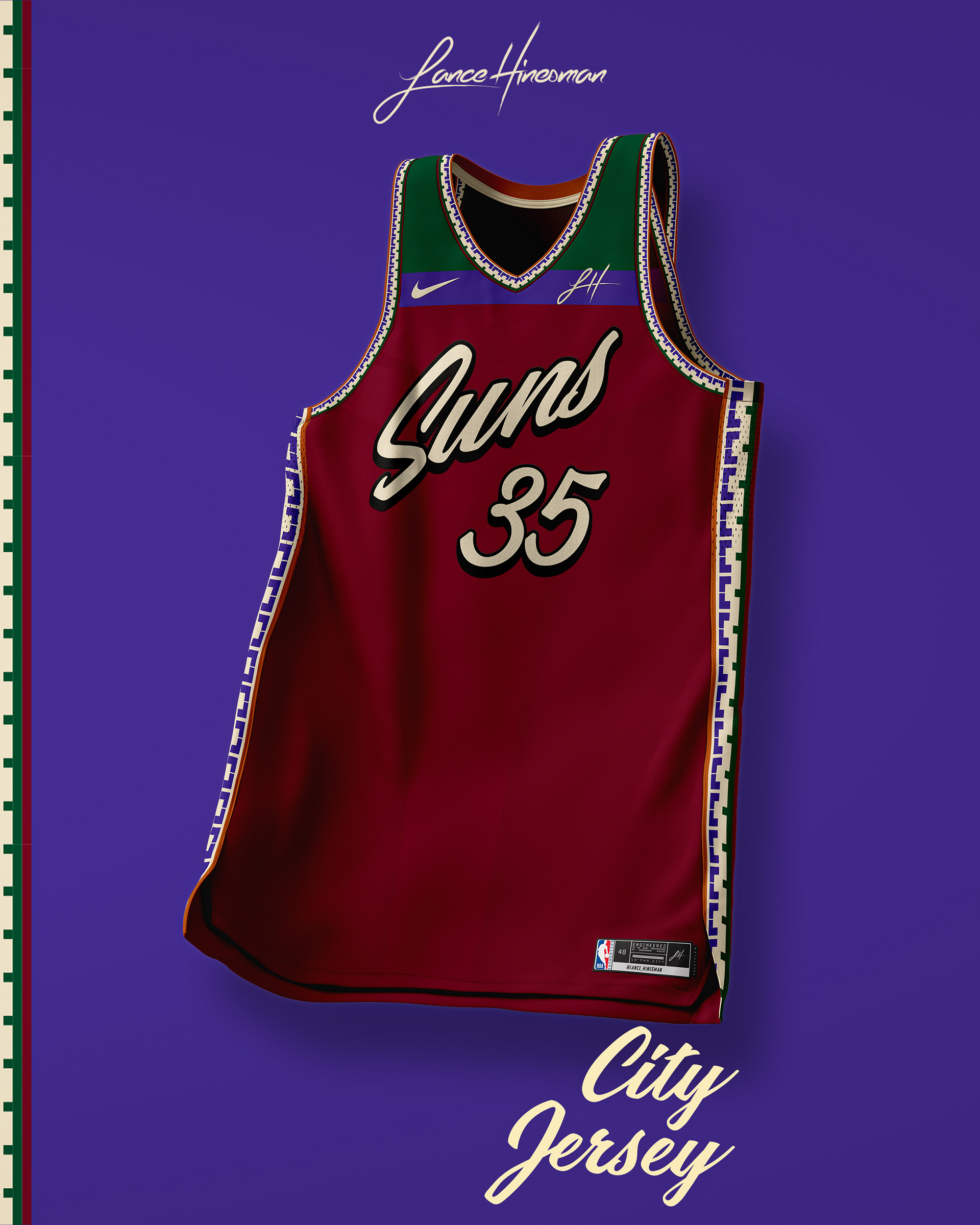
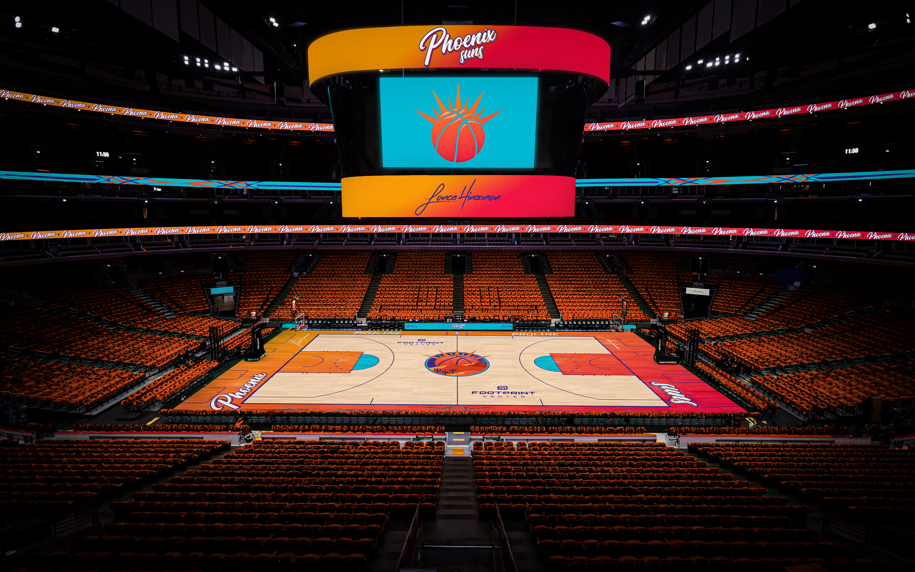
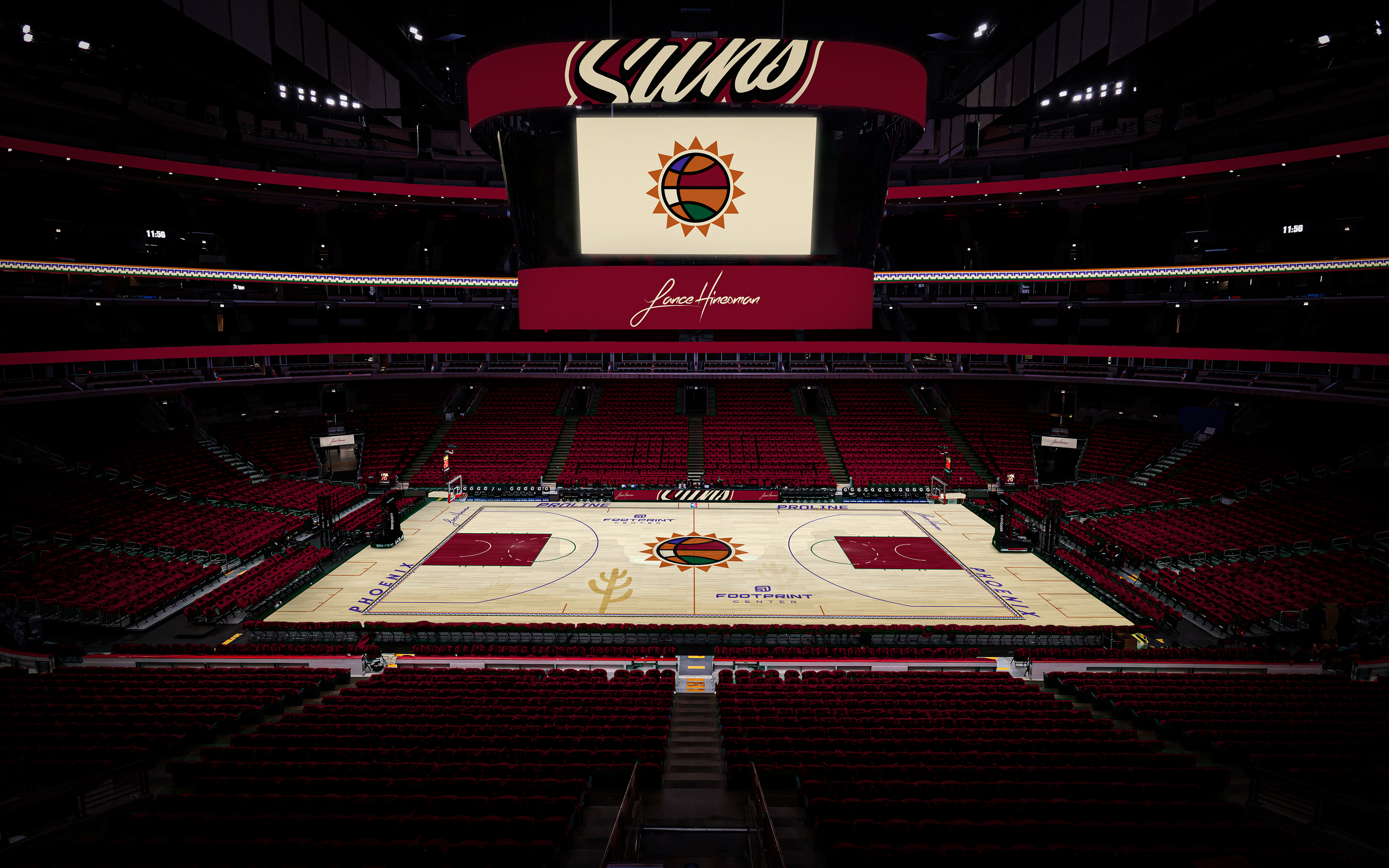
I was a huge fan of the Suns' City Jerseys from this year and wanted to expand the concept across a full brand. Along with a more fitting main logo, I used more vibrant colors across the brand as well. The City Jersey pays homage to the late Arizona Coyotes. 🕊️
Portland Trail Blazers
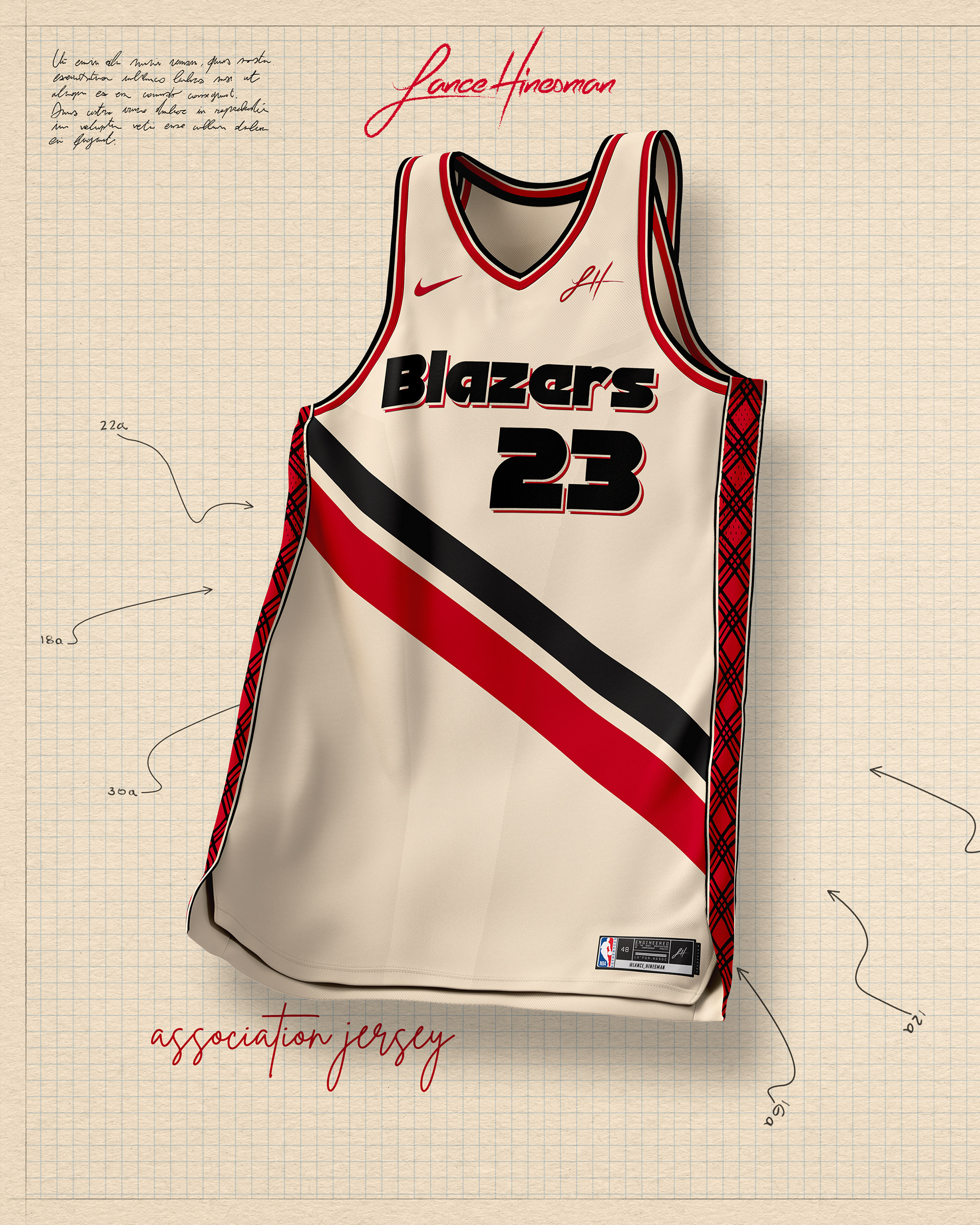
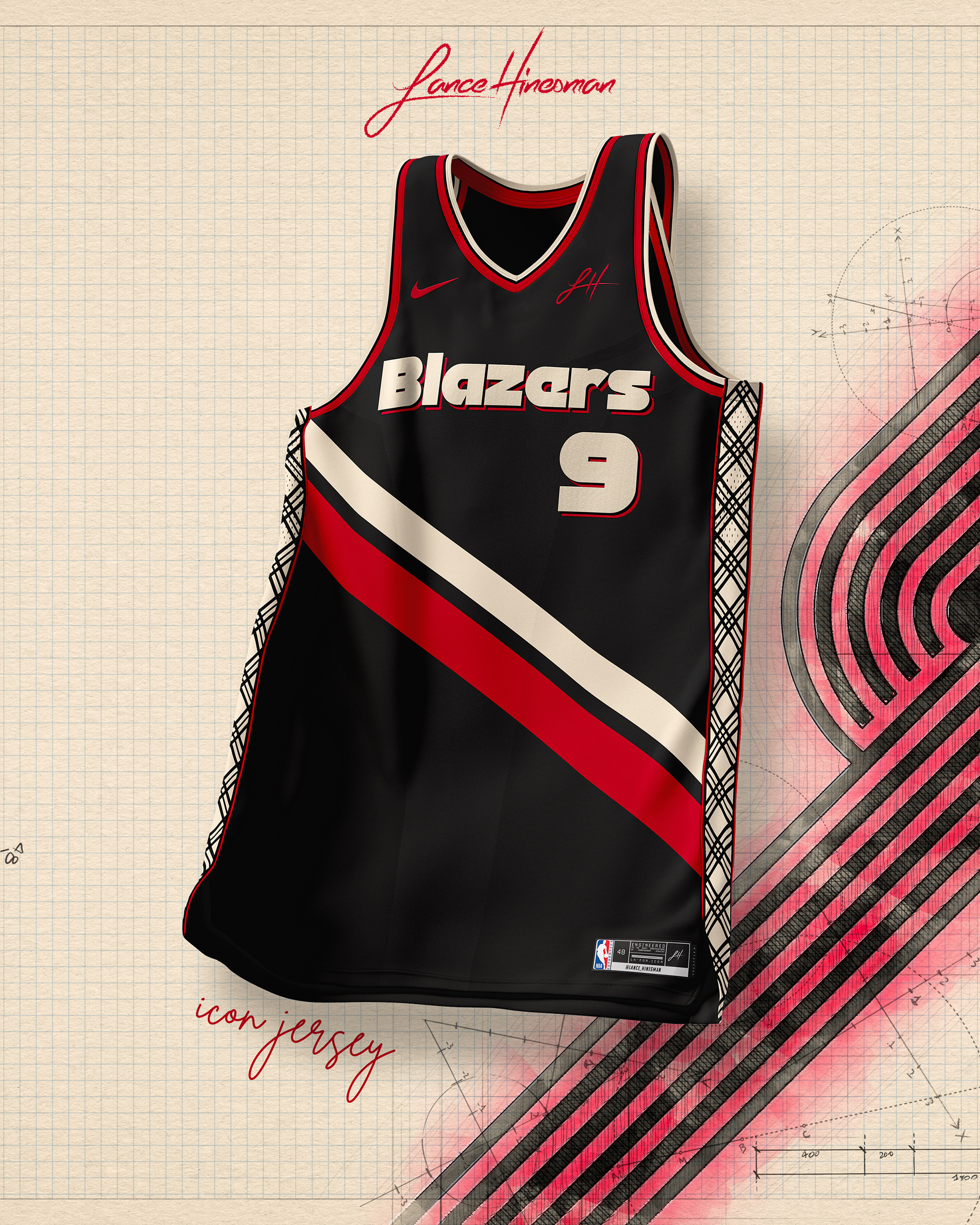
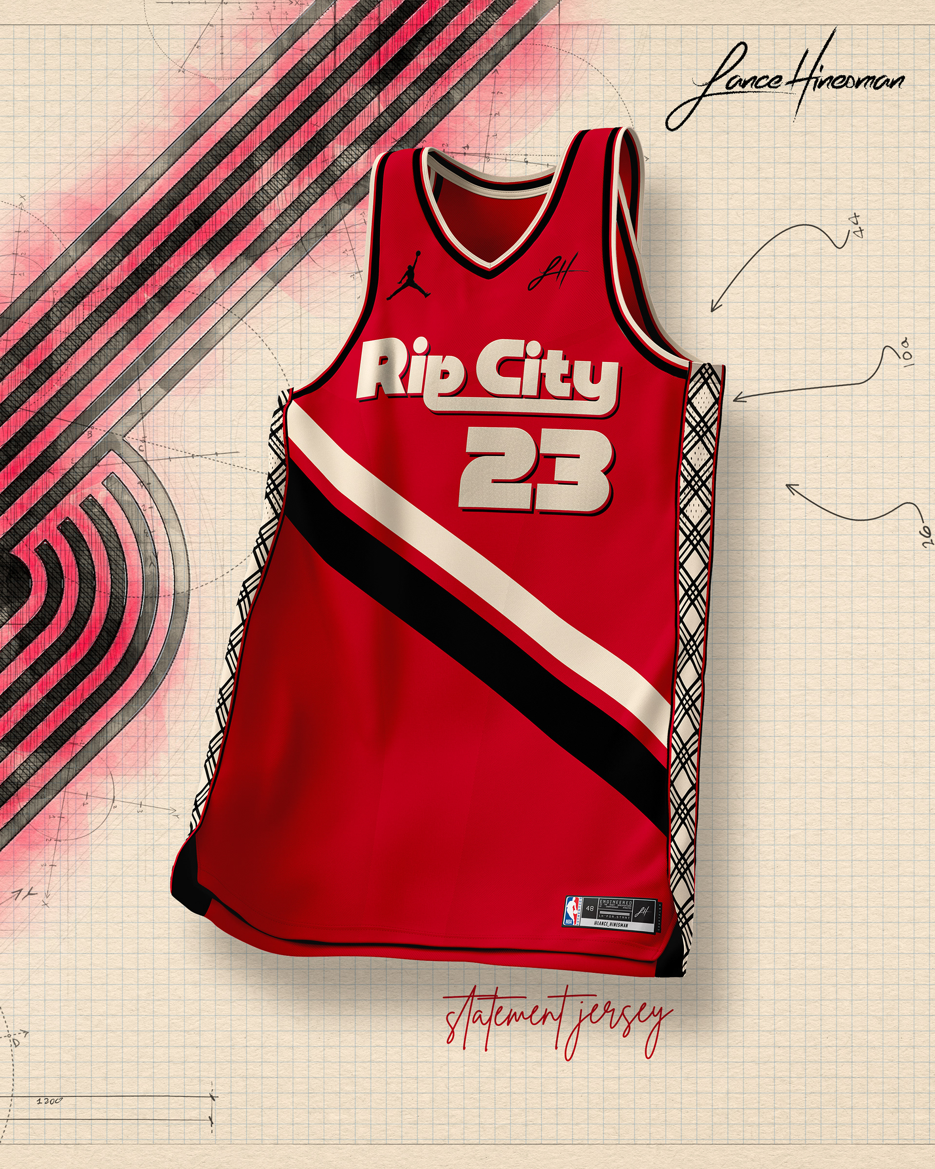
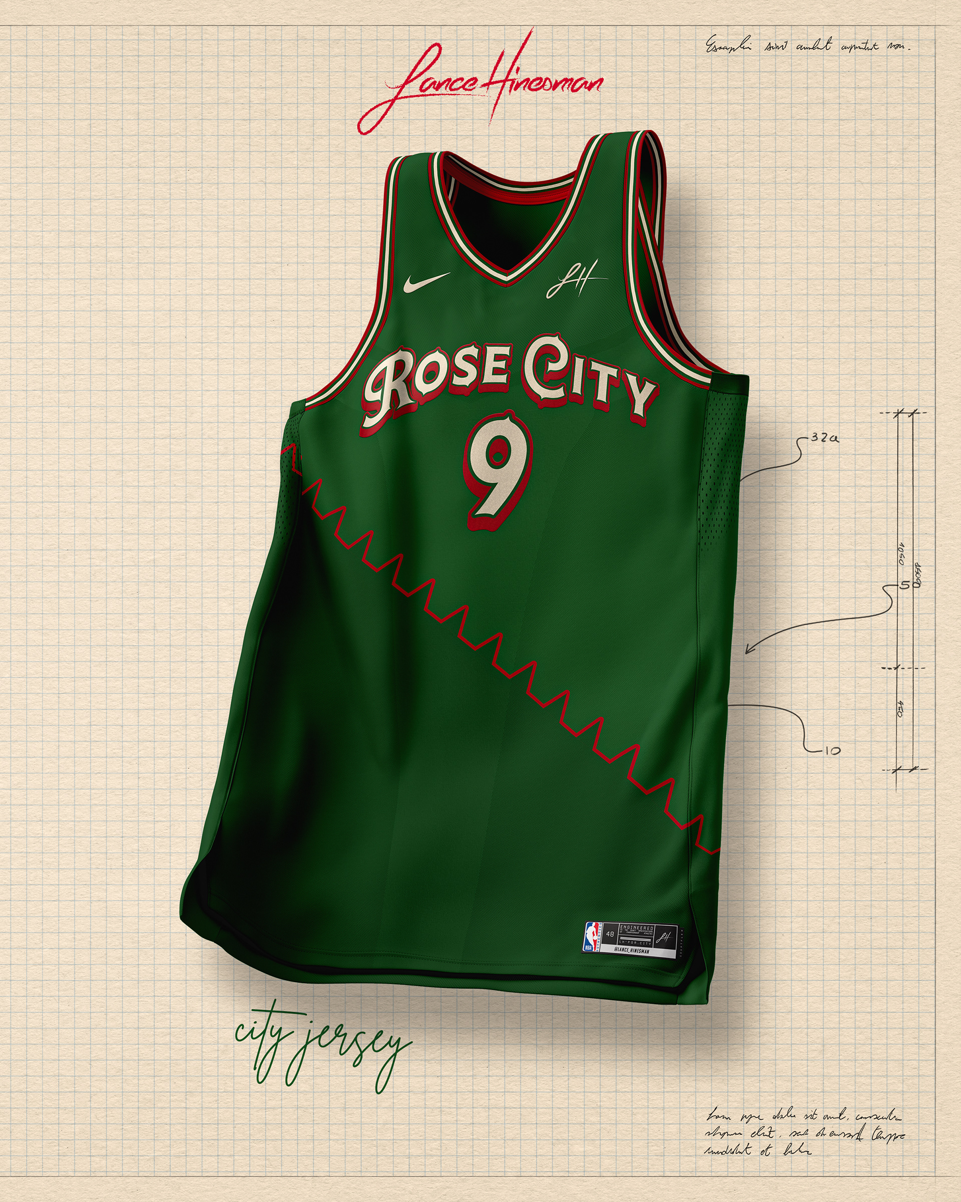
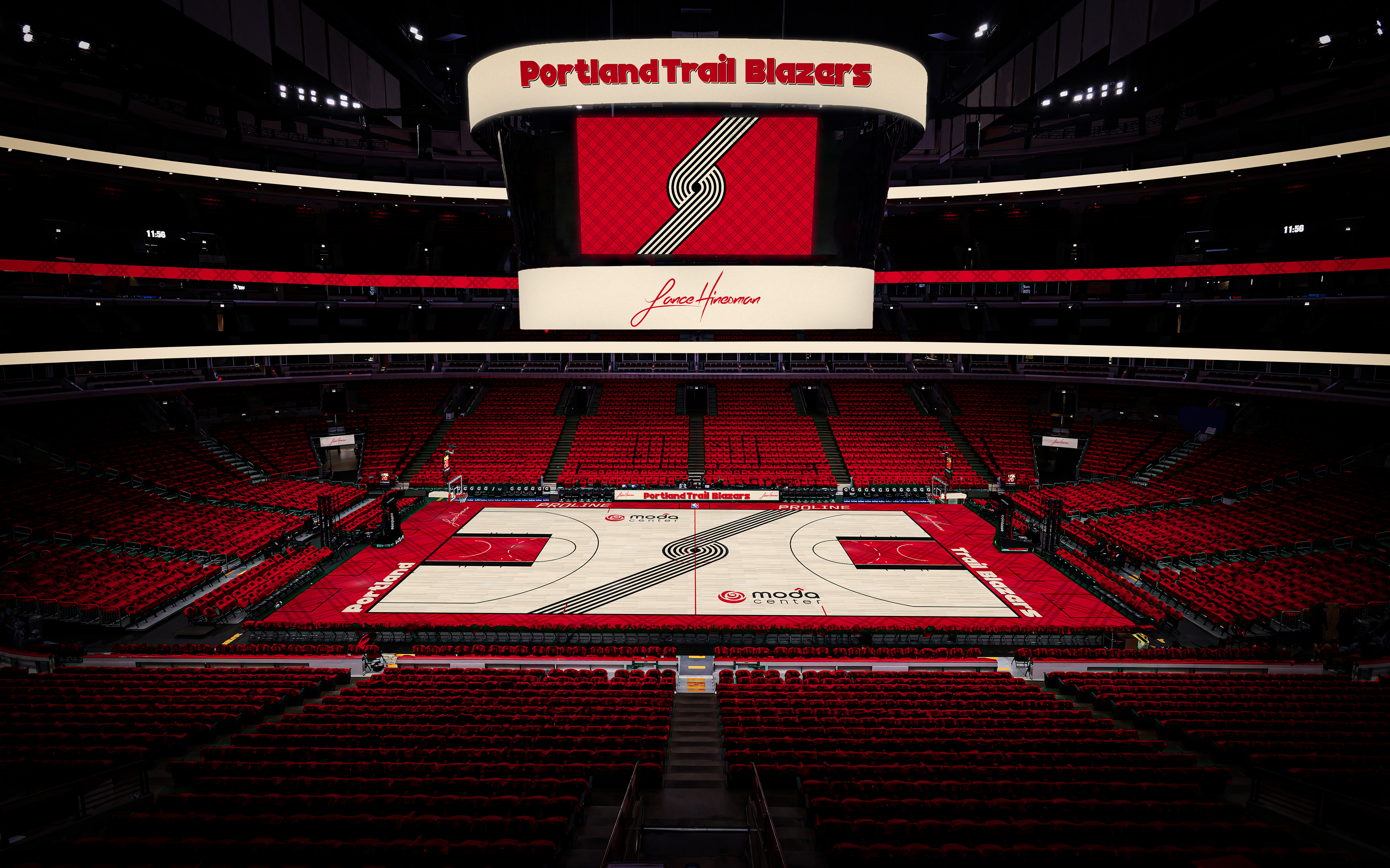
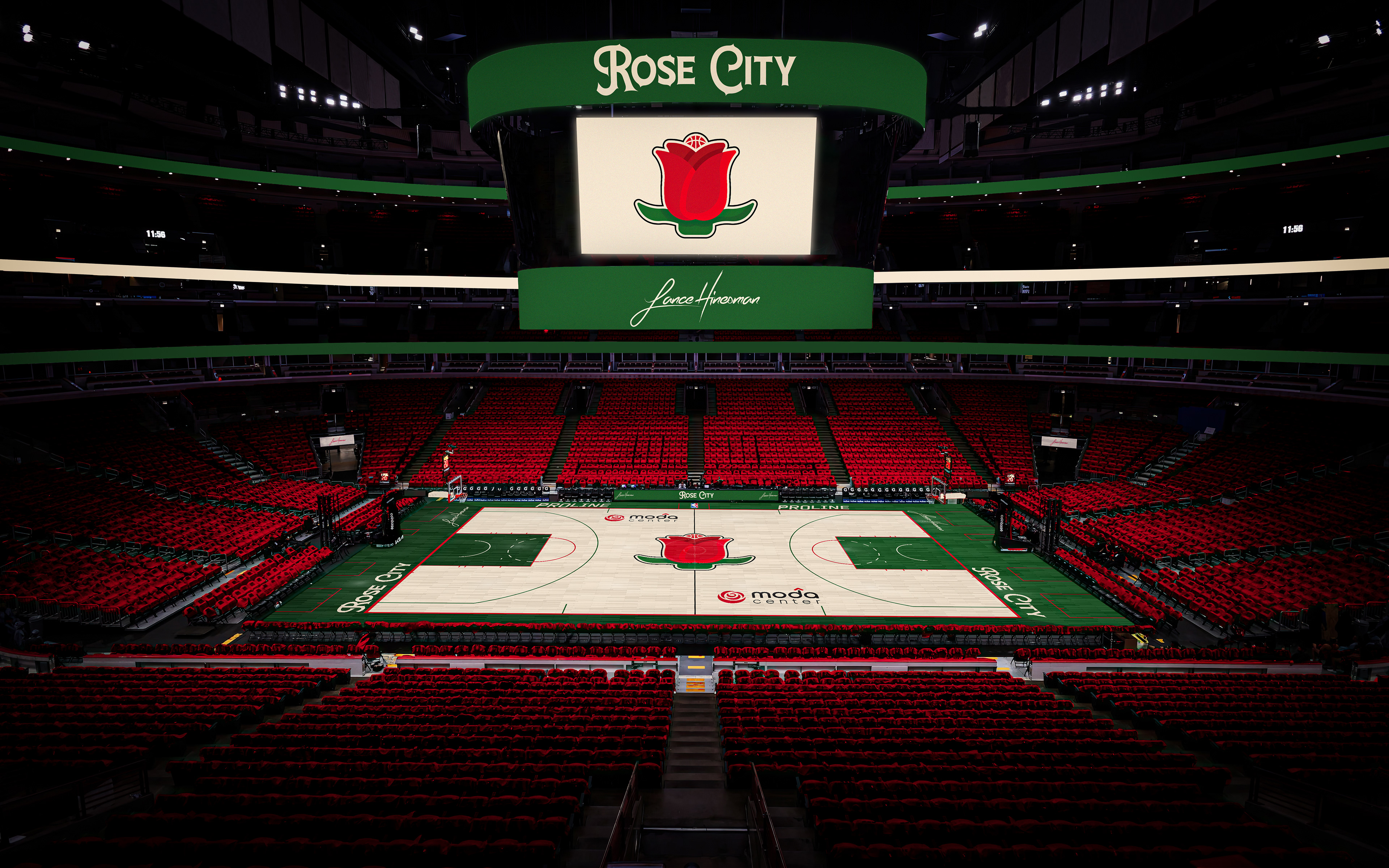
For Portland, I kept the Blazers’ primary logo but added new wordmarks. Plaid patterns lay on the side of the jerseys as well as the addition of cream to the color scheme. The City Jersey is based on Portland's iconic nickname with a thorny stripe down the front, and a rose logo to match.
Sacramento Kings
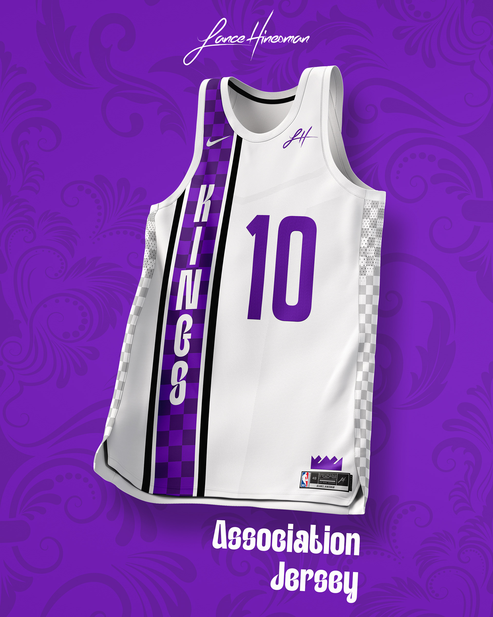
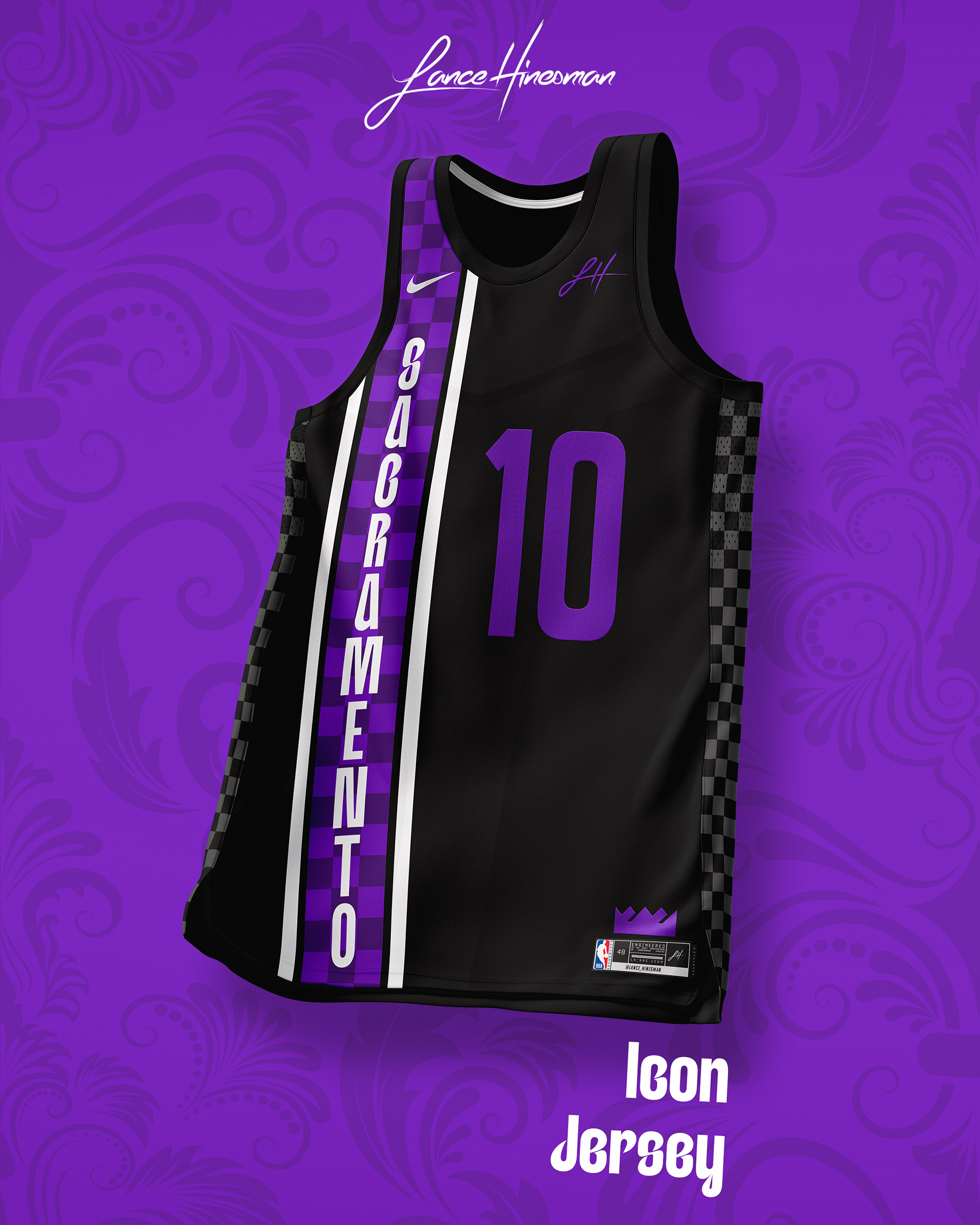
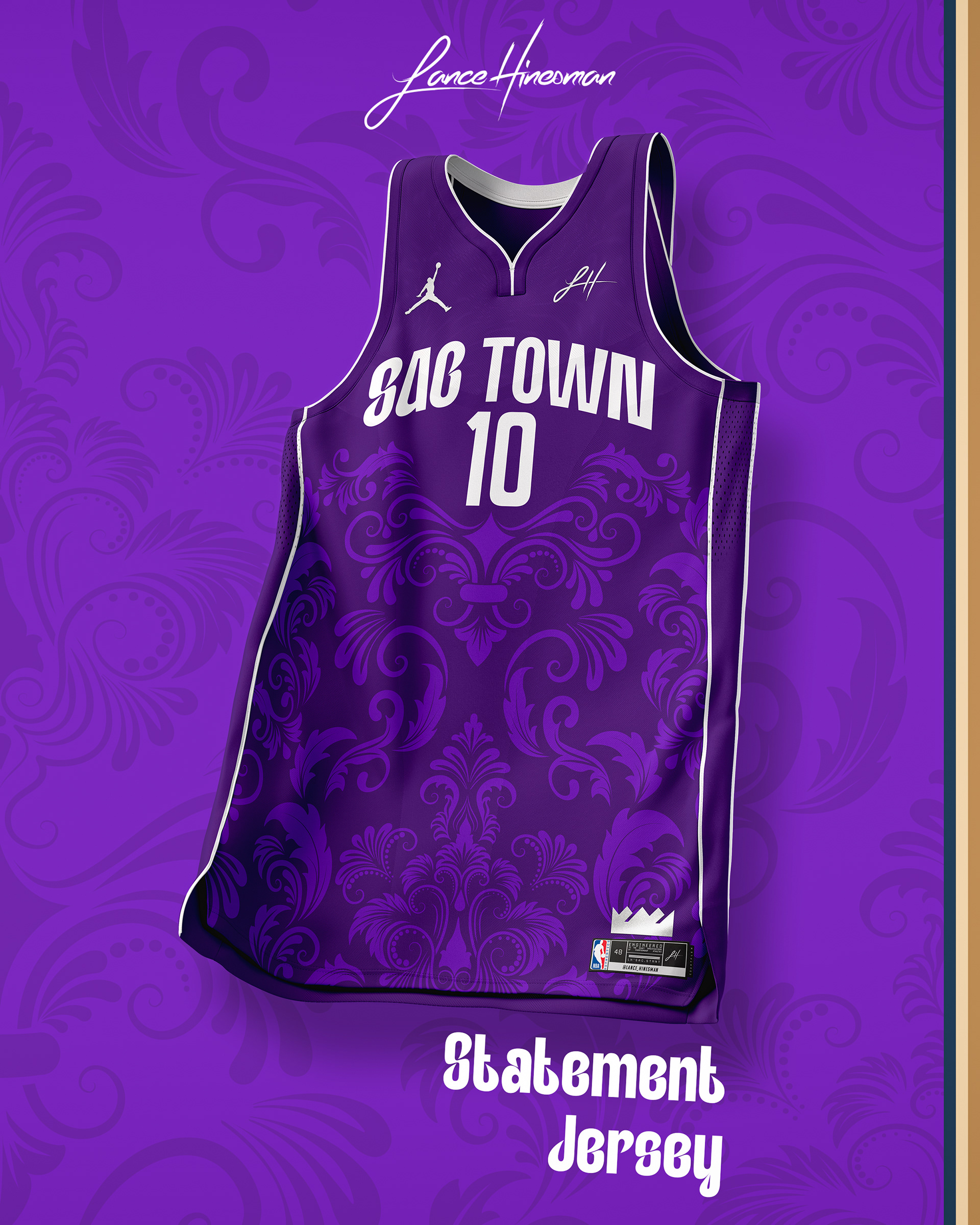
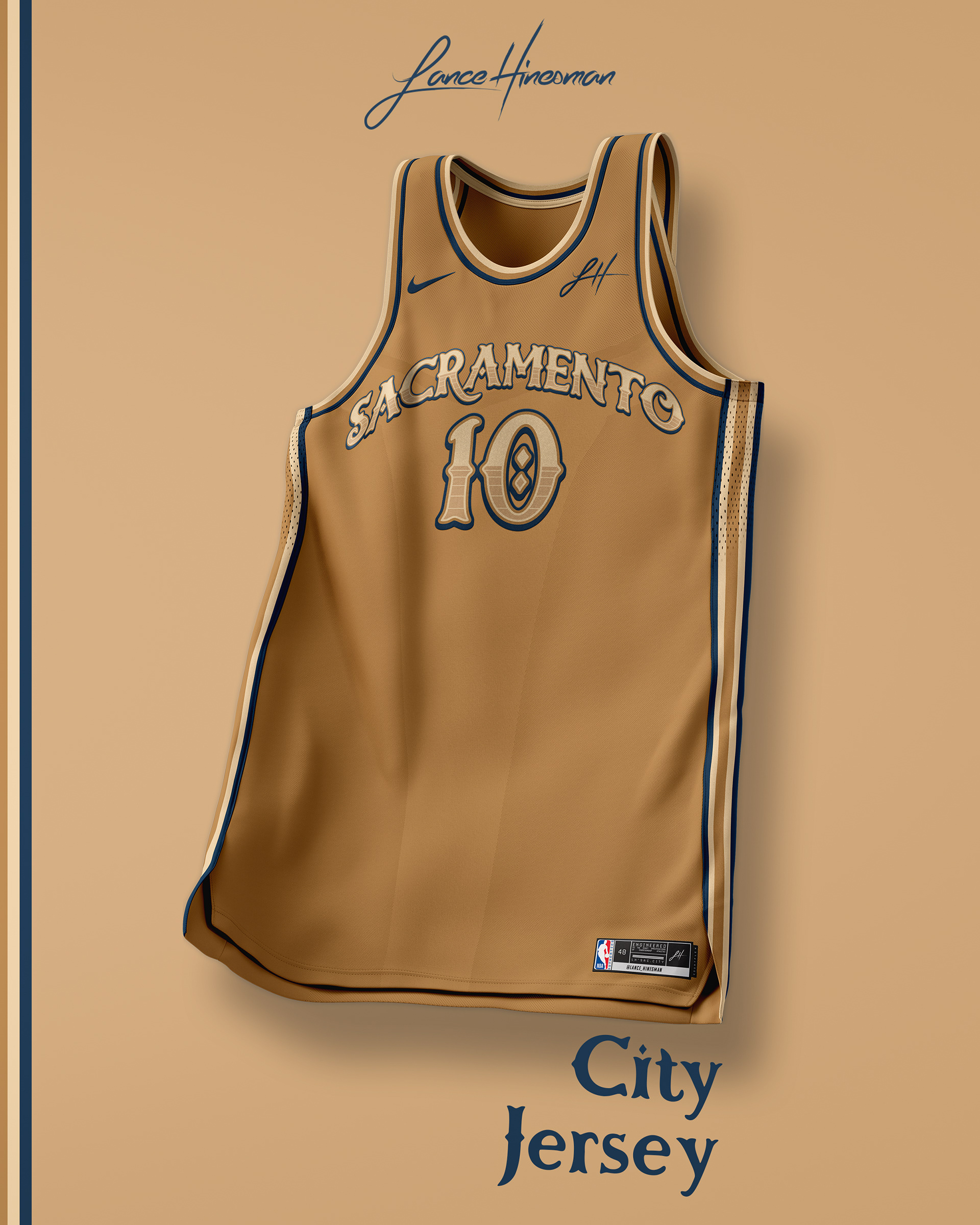
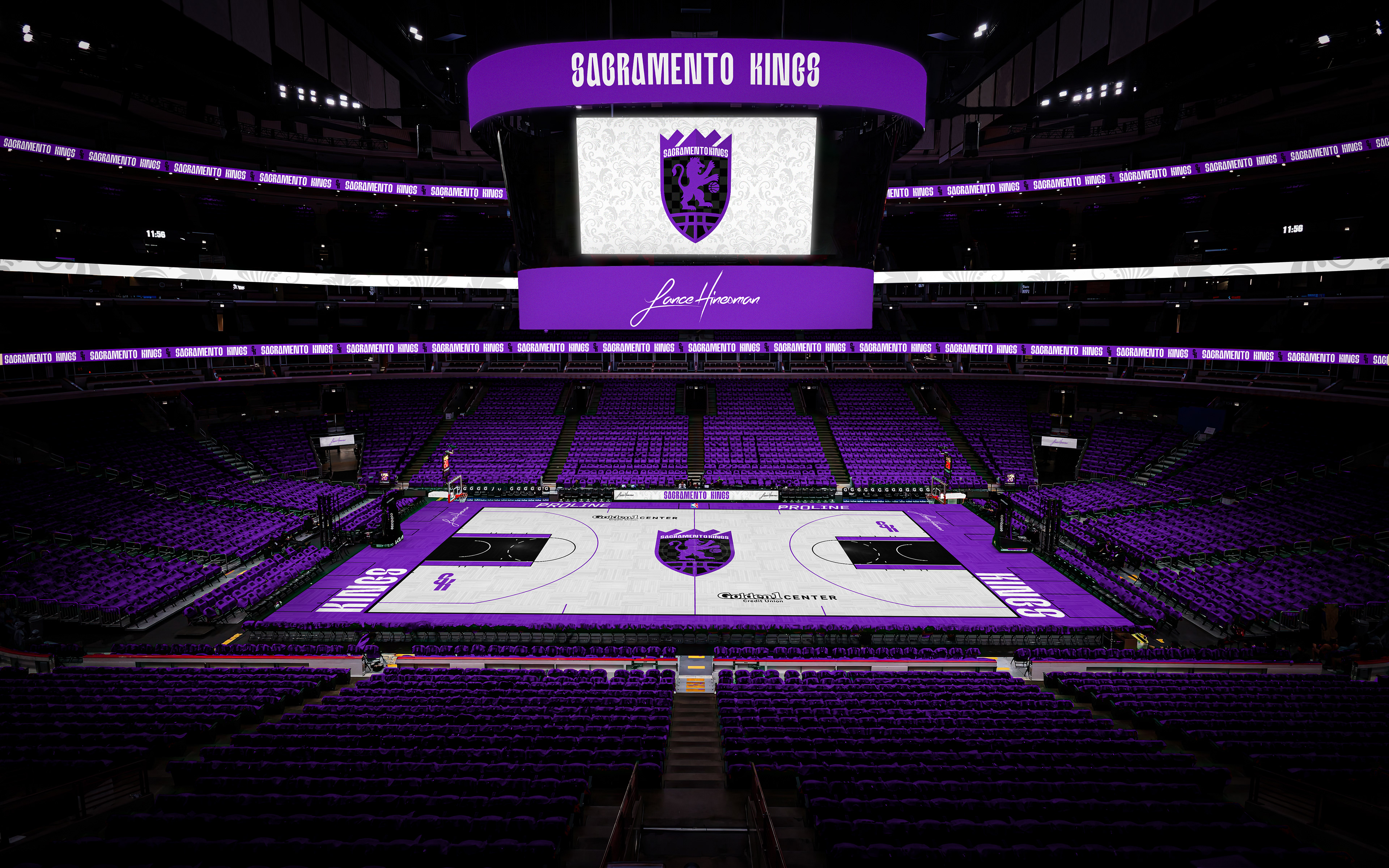
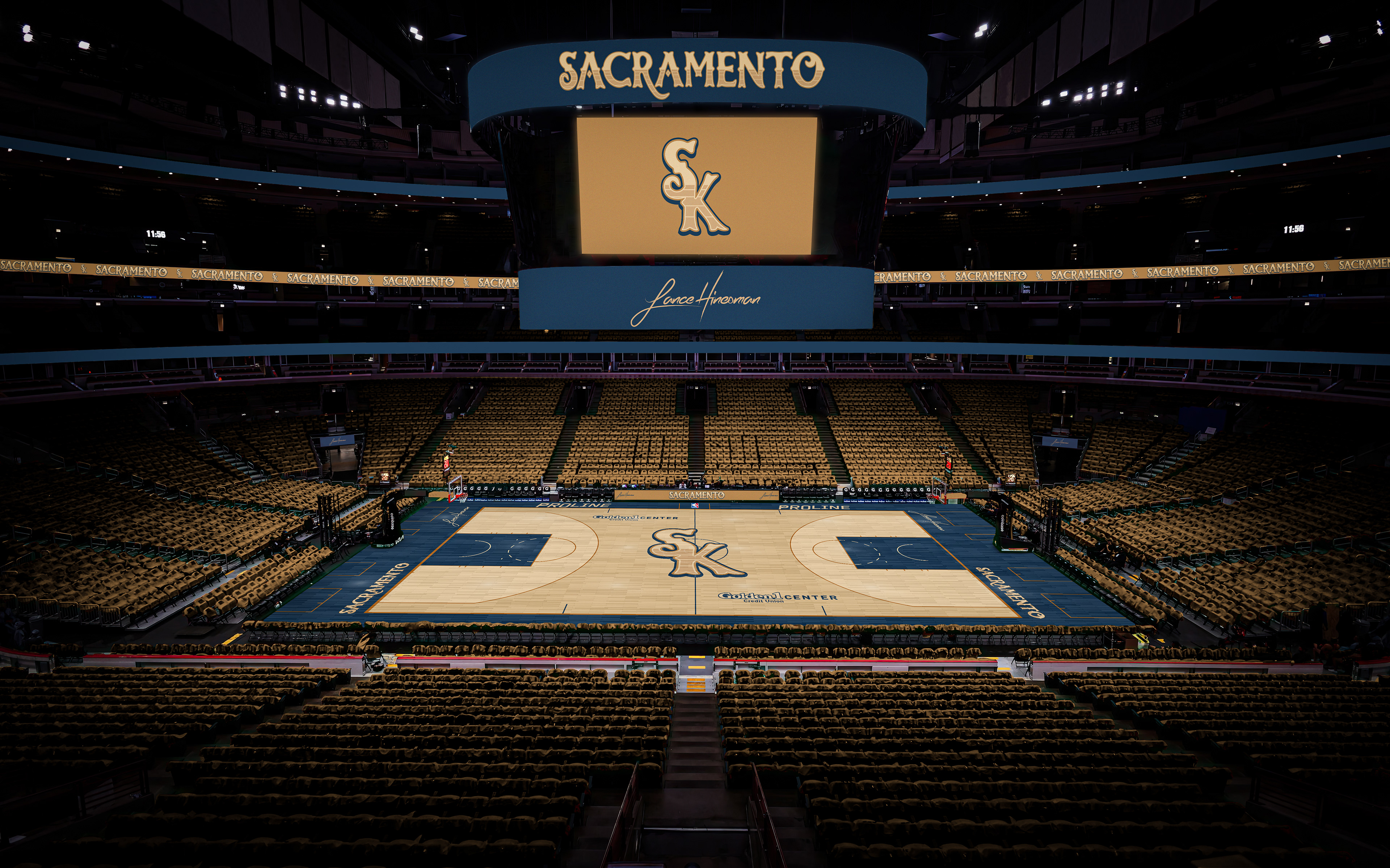
Along with a new logo and wordmarks, I included checkerboard and damask patterns as apart of the branding. The City Jersey is based on 'Old Sacramento' and the roots of the city.
San Antonio Spurs
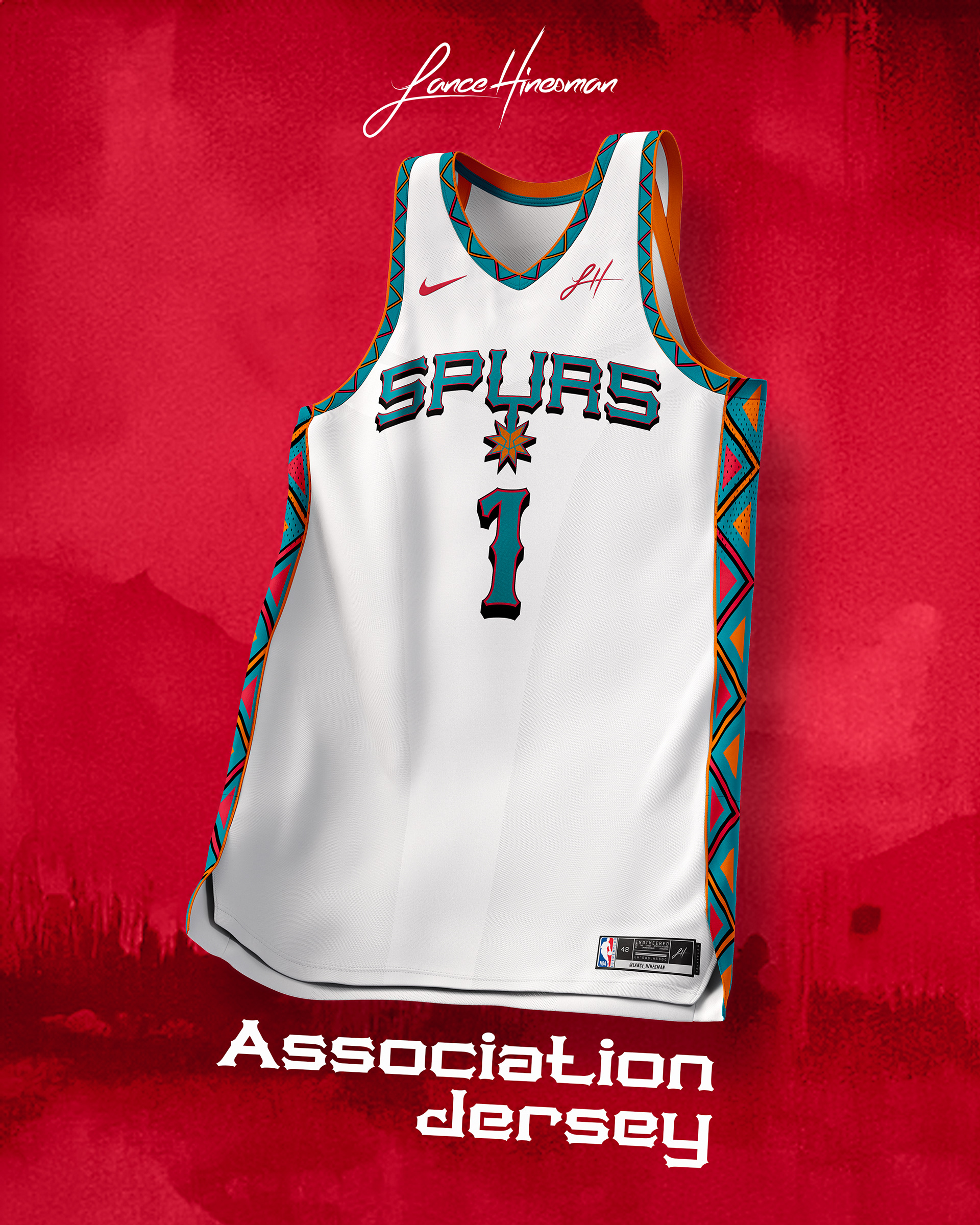
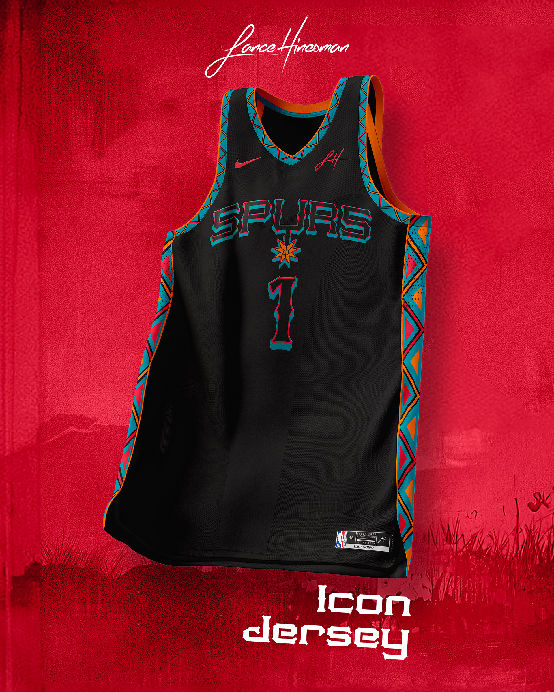
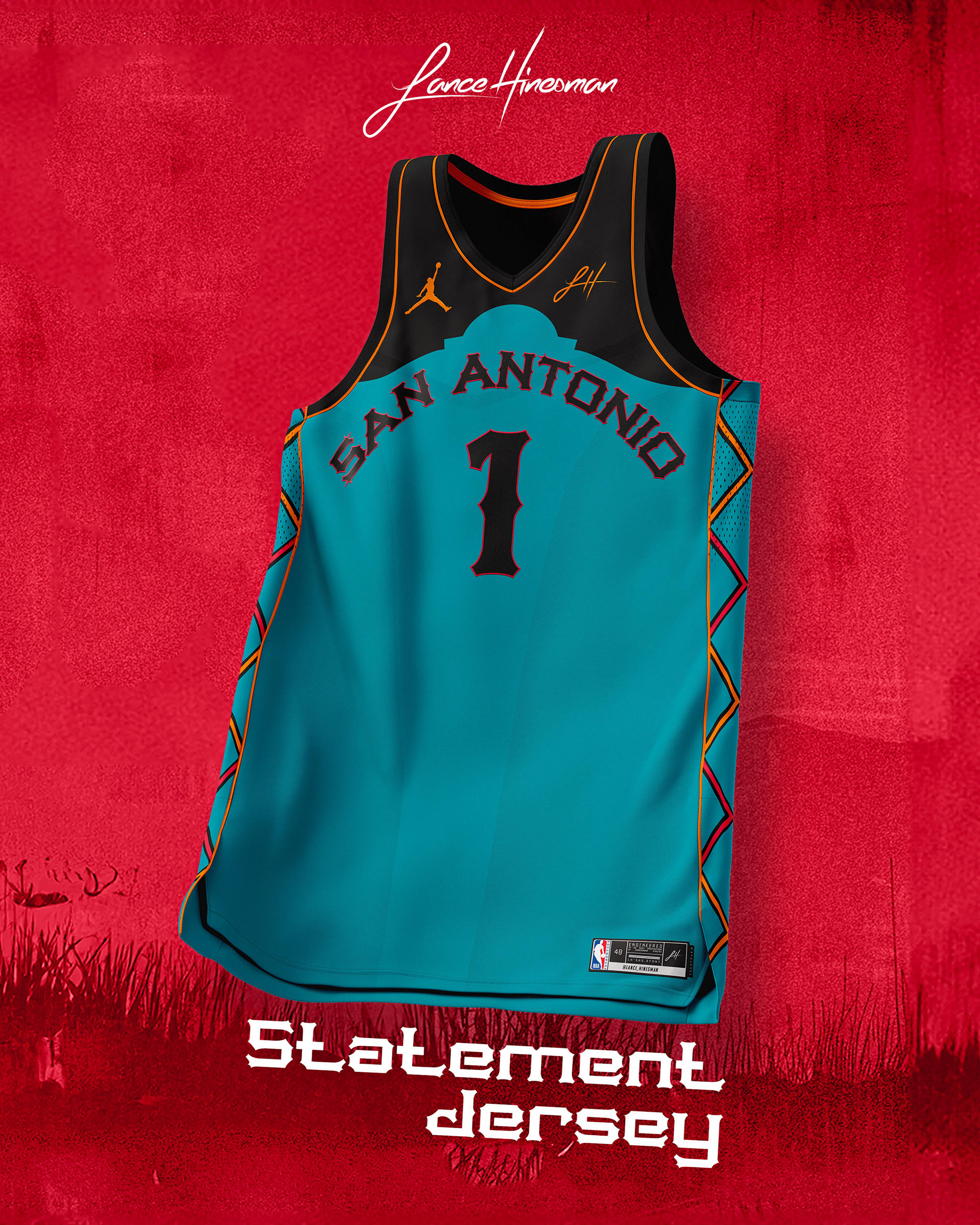
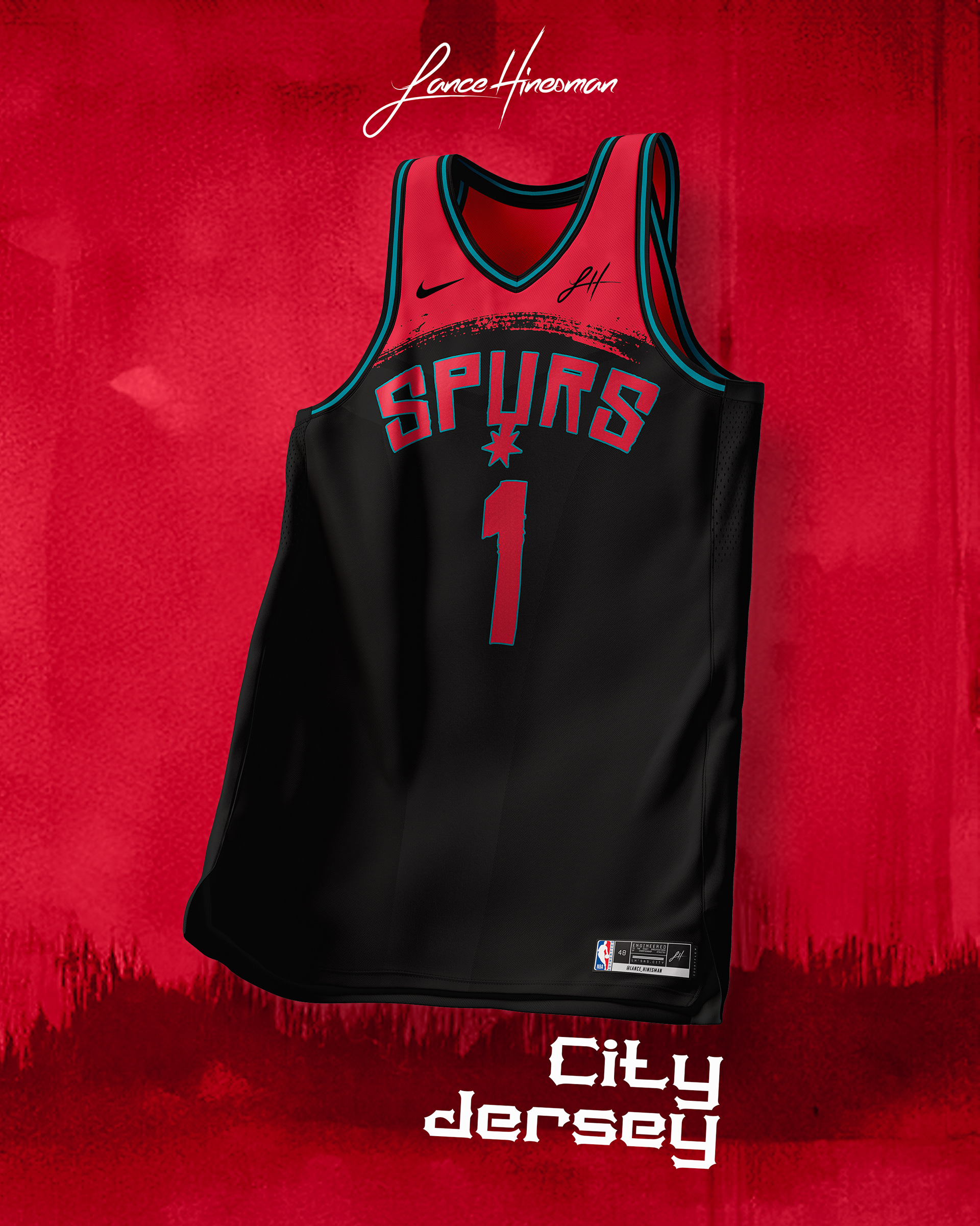
I had to bring the fiesta colors back along with a new logo and wordmarks. The Statement Jersey features a nod to The Alamo and the City Jersey is inspired by Red Dead Redemption.
Seattle SuperSonics
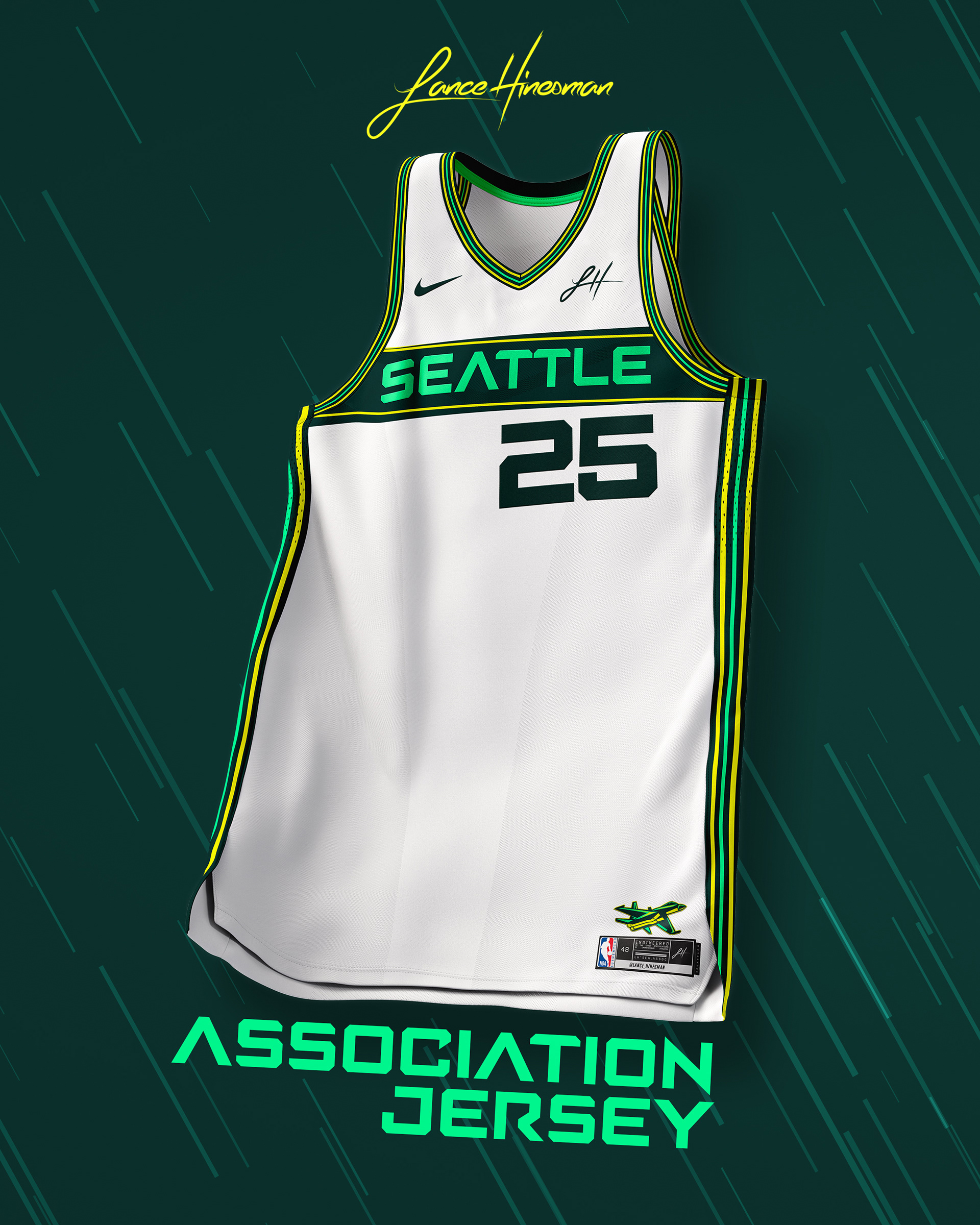
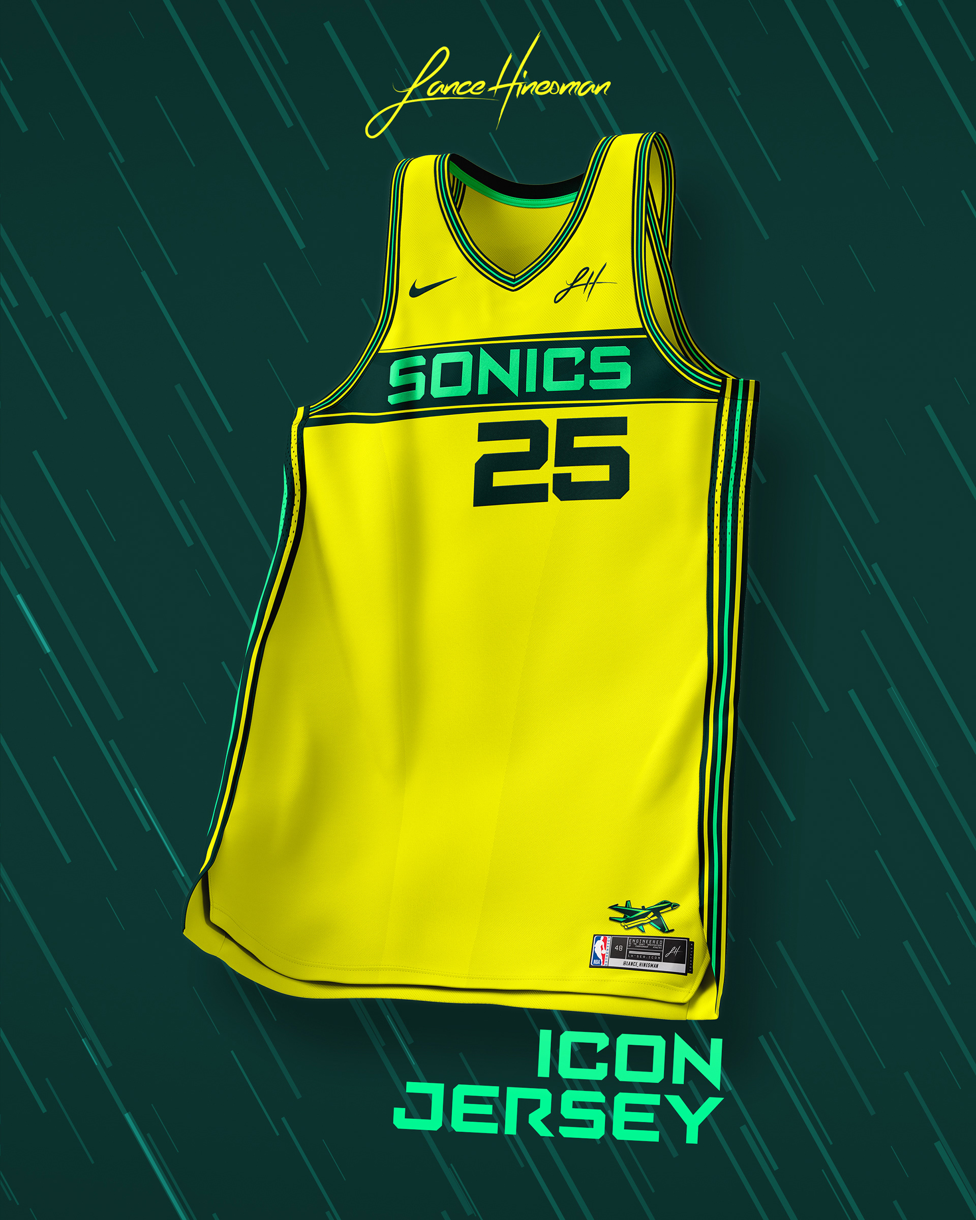
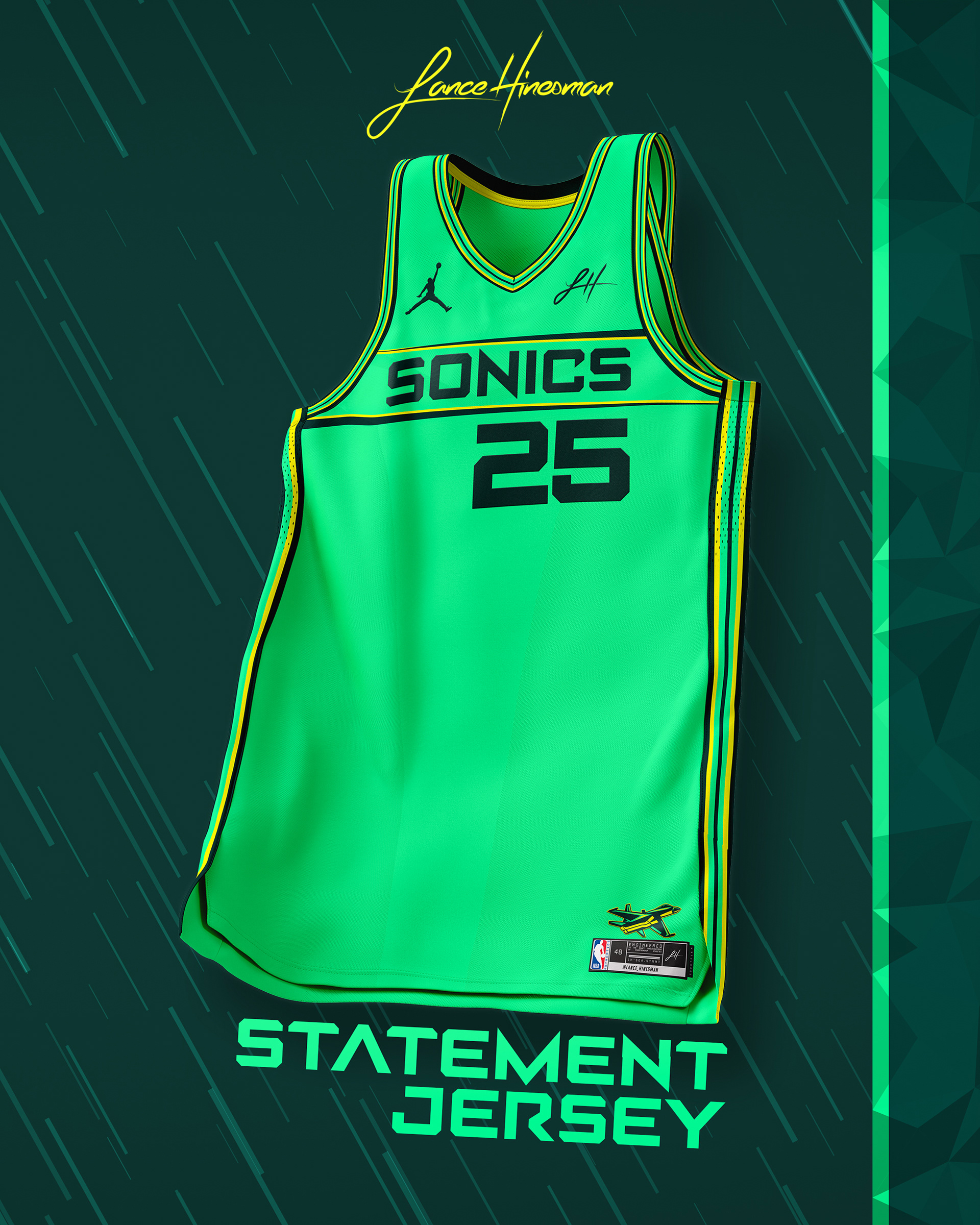
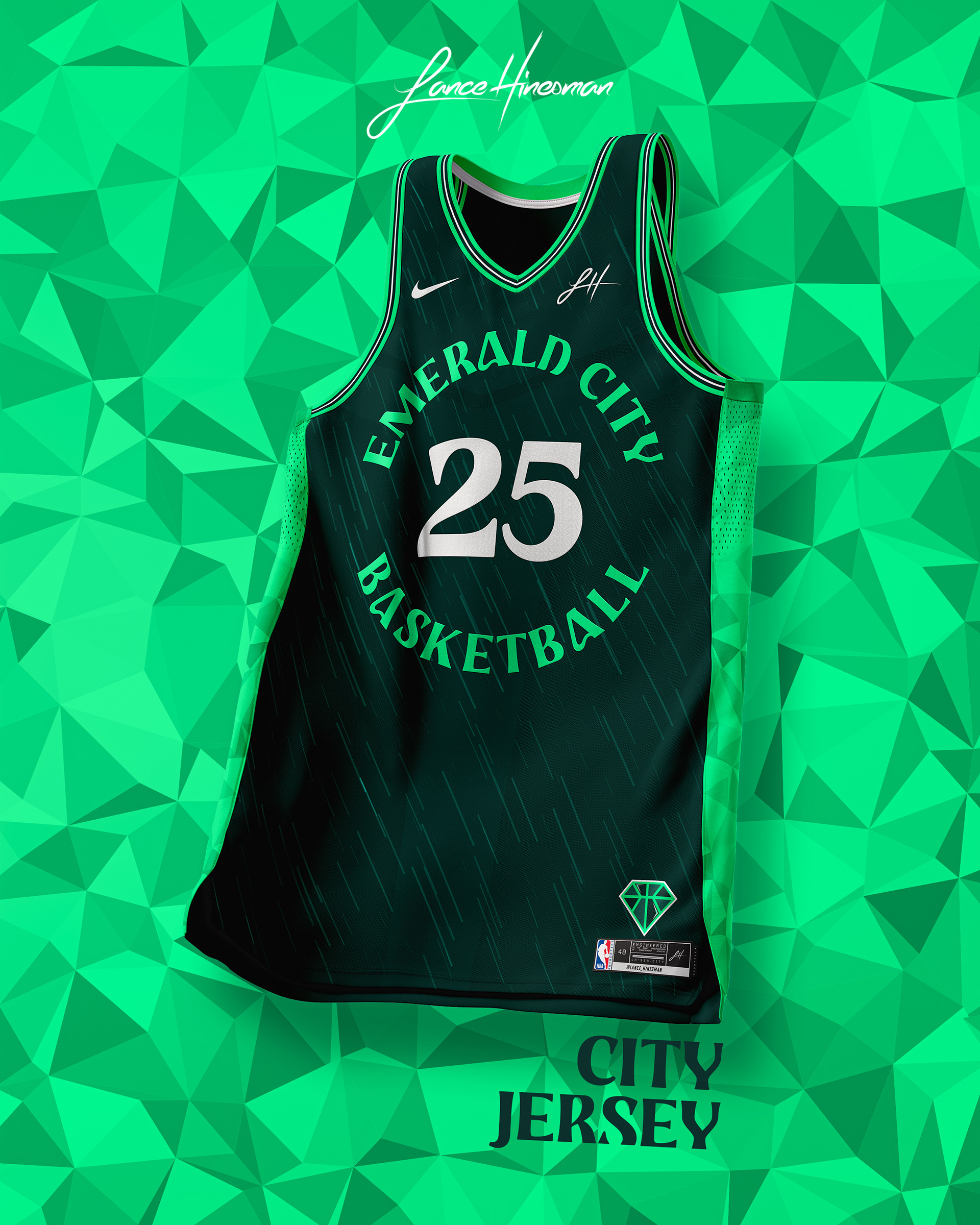
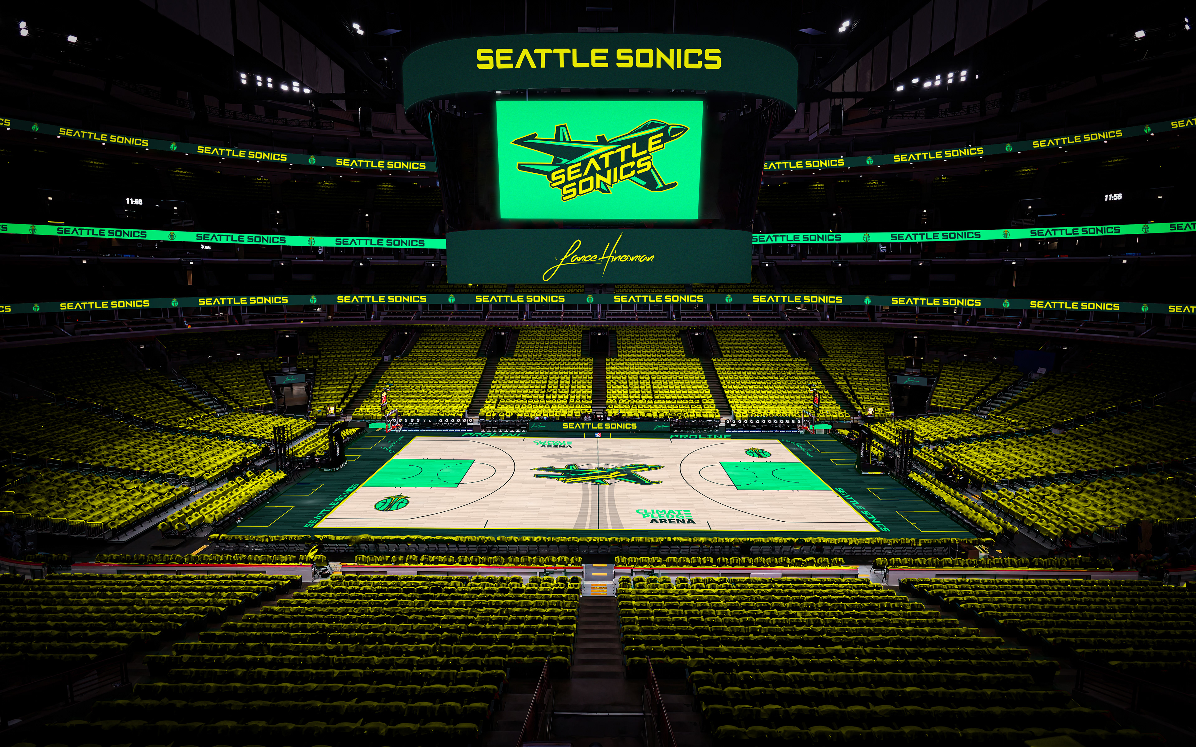
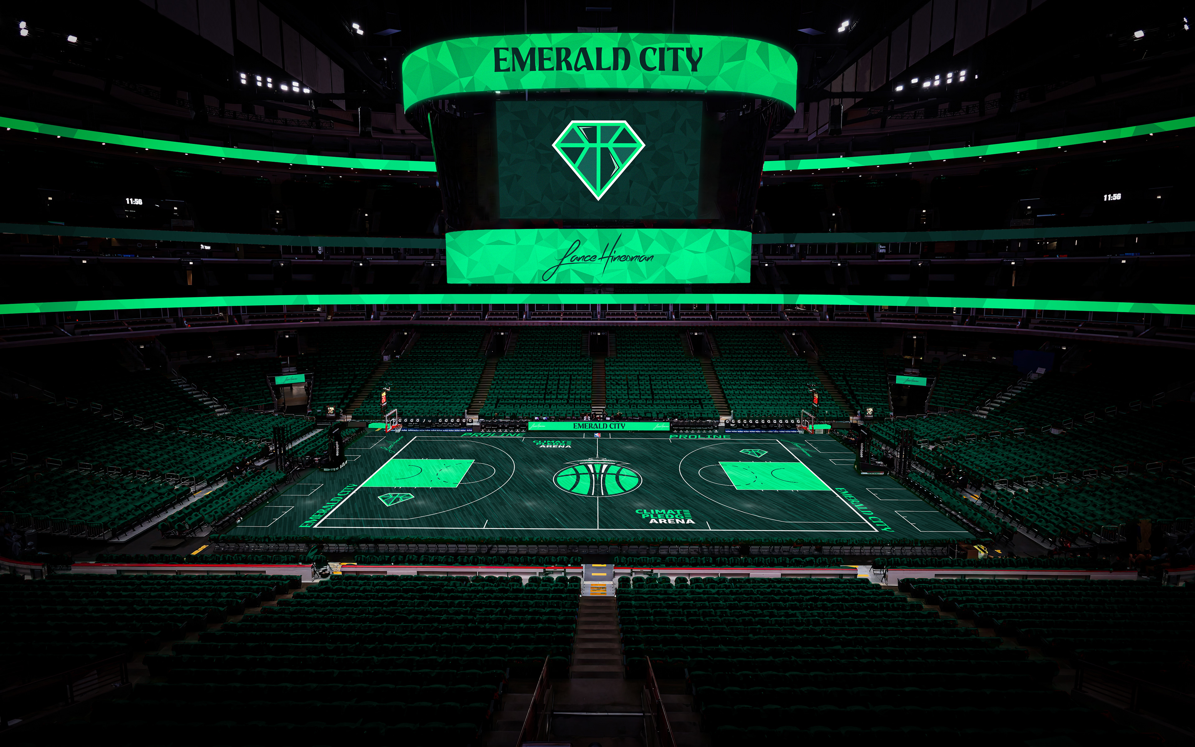
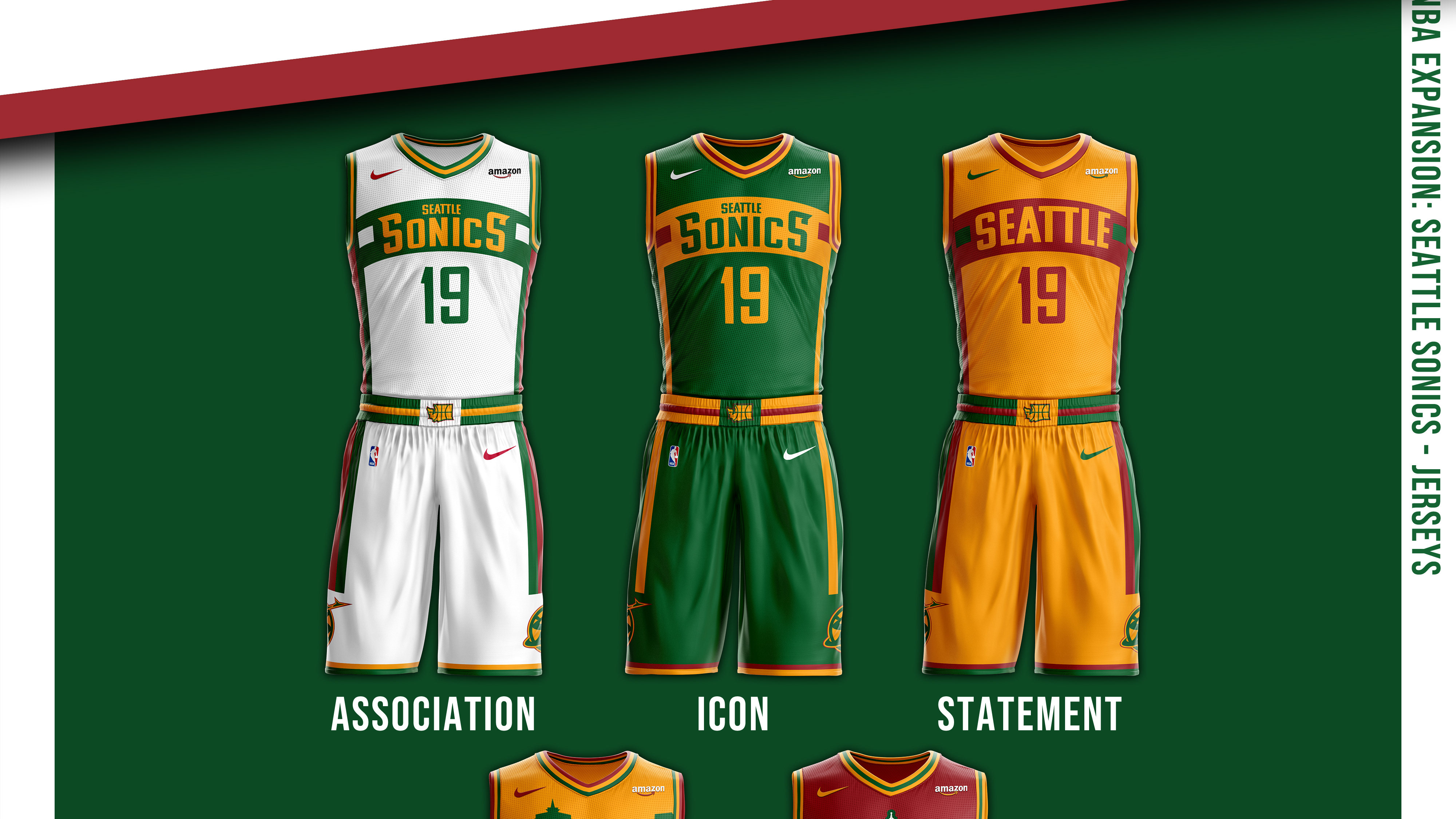
The 2nd expansion team in the series sees the return of a beloved franchise. A bolder, brighter green and yellow highlight this redesign. The logo is modeled after an F/A-18E/F Super Hornet, with an alternate logo being based on the Space Needle. The City Jersey is inspired by Seattle's nickname and also features a subtle rain texture across the jersey.
Toronto Raptors
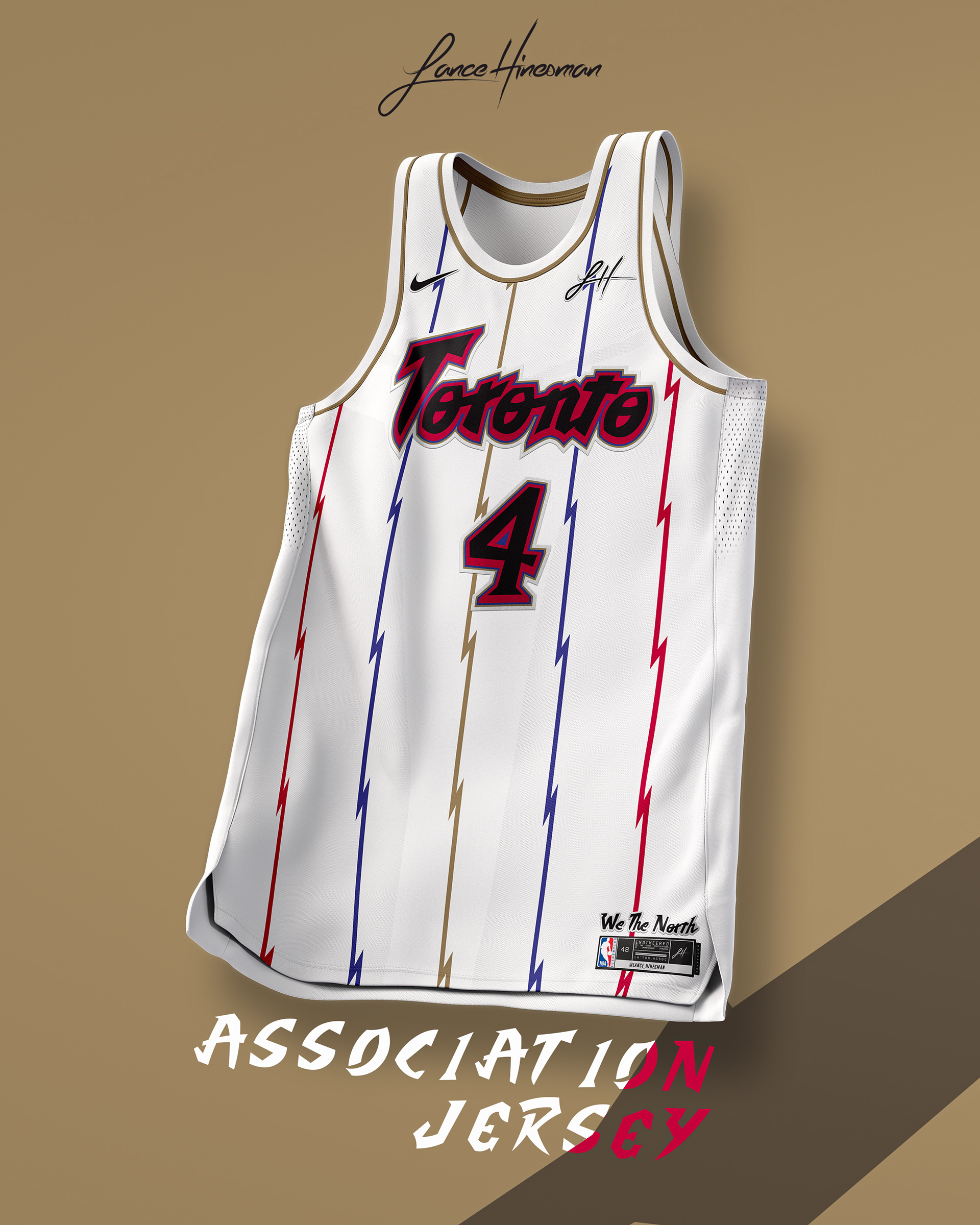
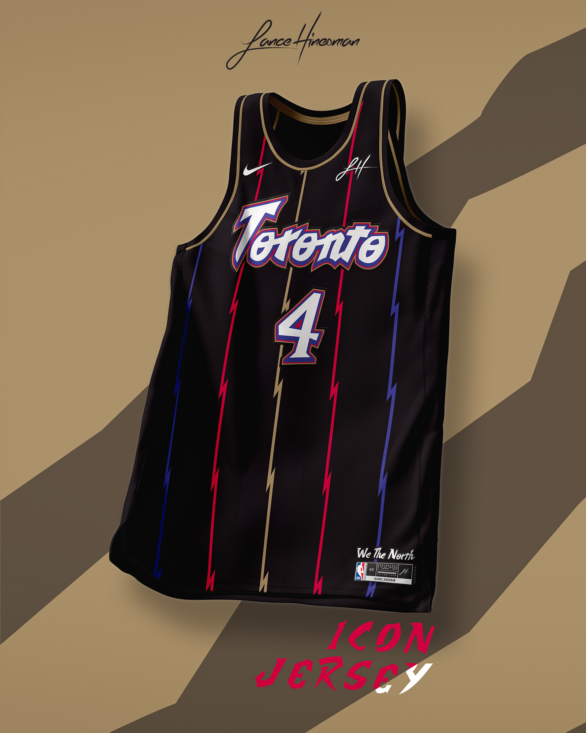
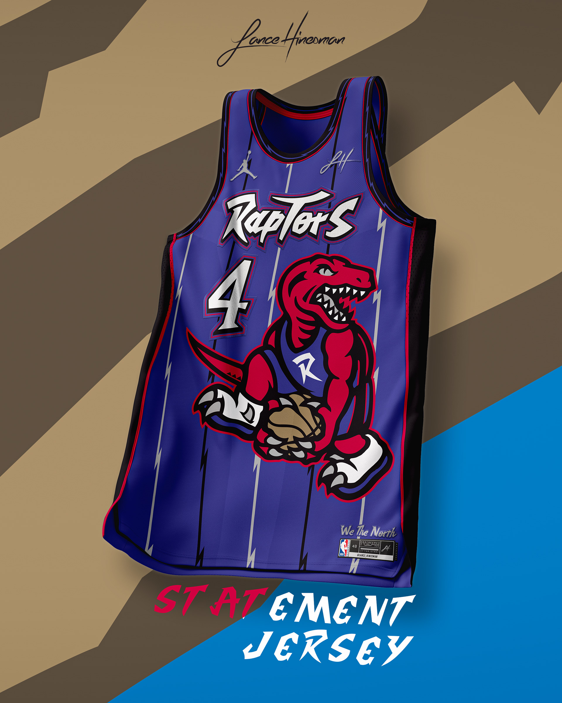
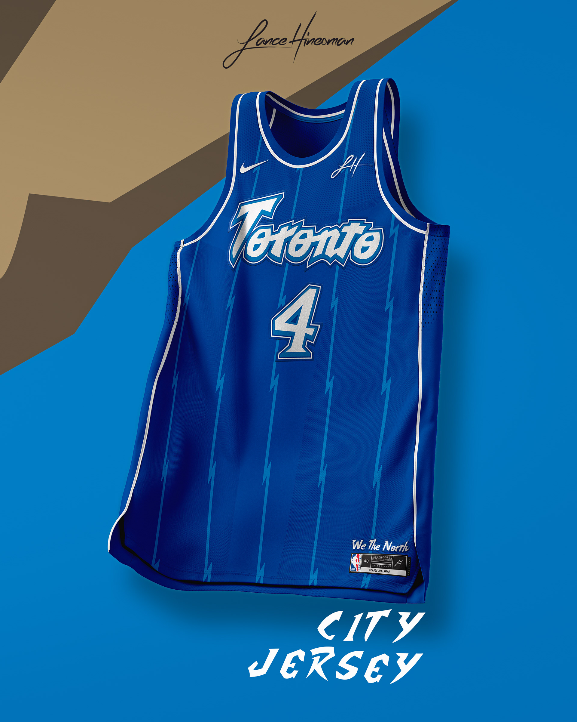
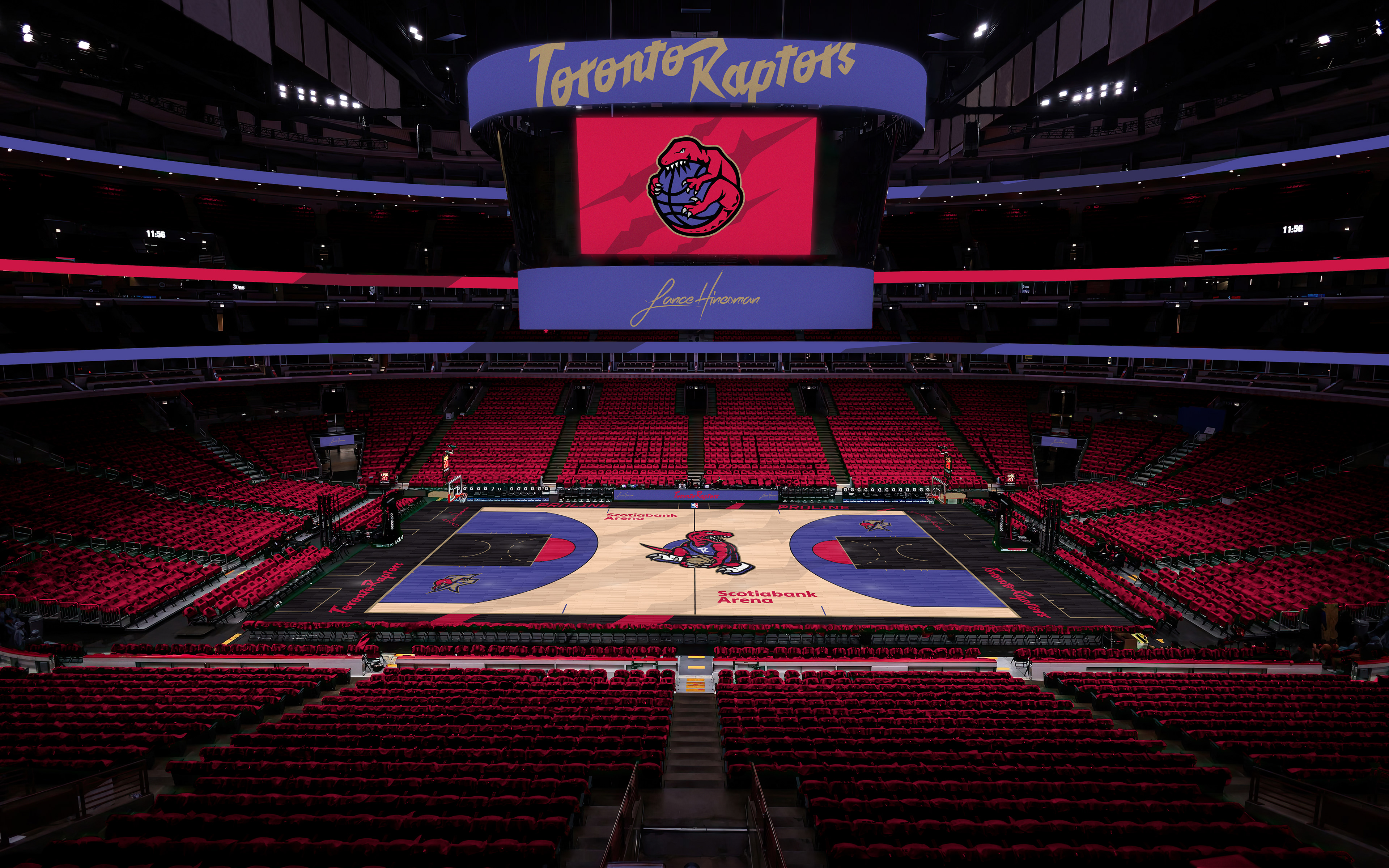
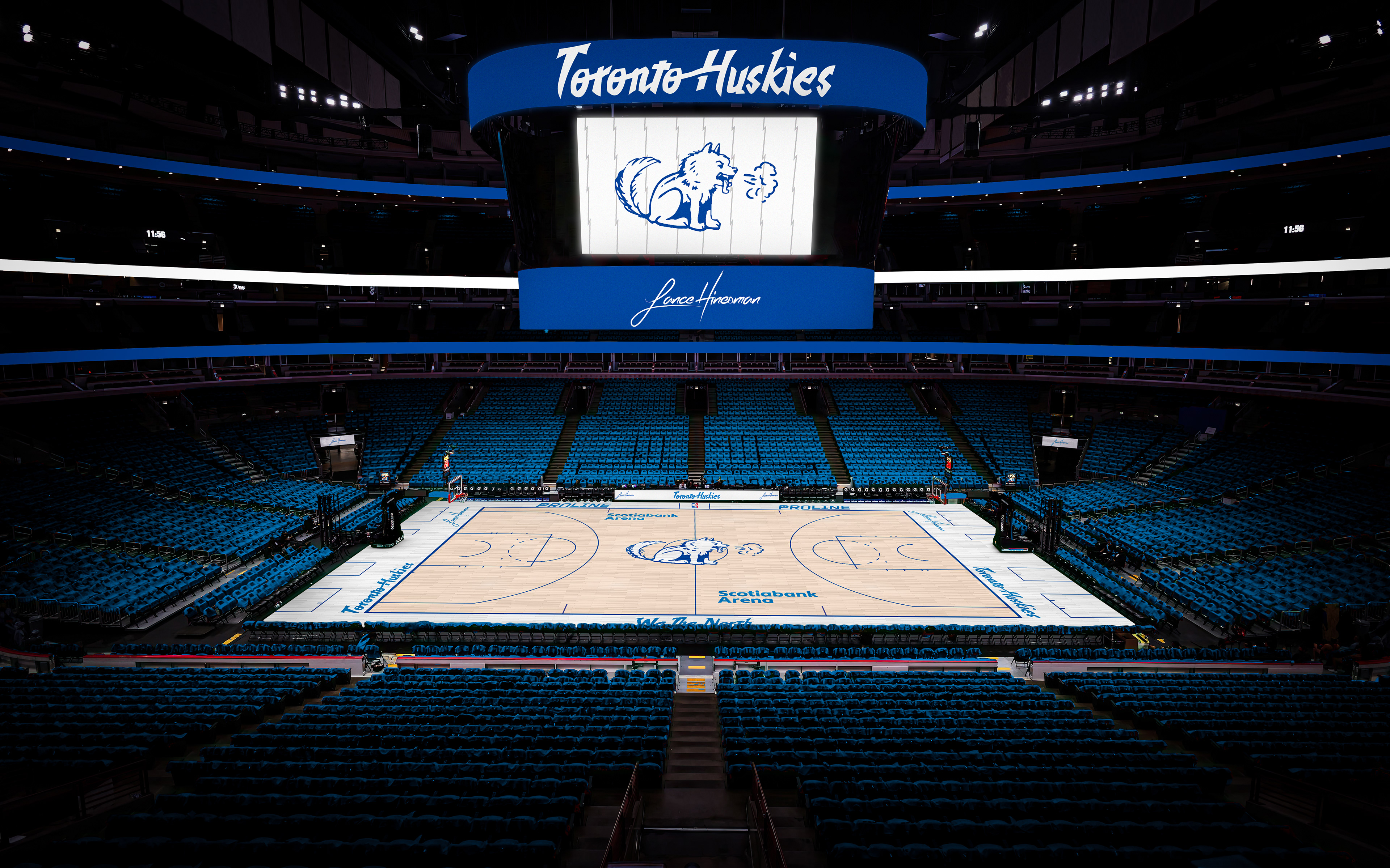
Using the Raptors' new alternate dino logo as the main logo, I added gold as a tertiary color and used the 90s jerseys as inspiration for this set. The City Jersey blends the original Toronto Huskies with a more modern style.
Utah Rail Riders
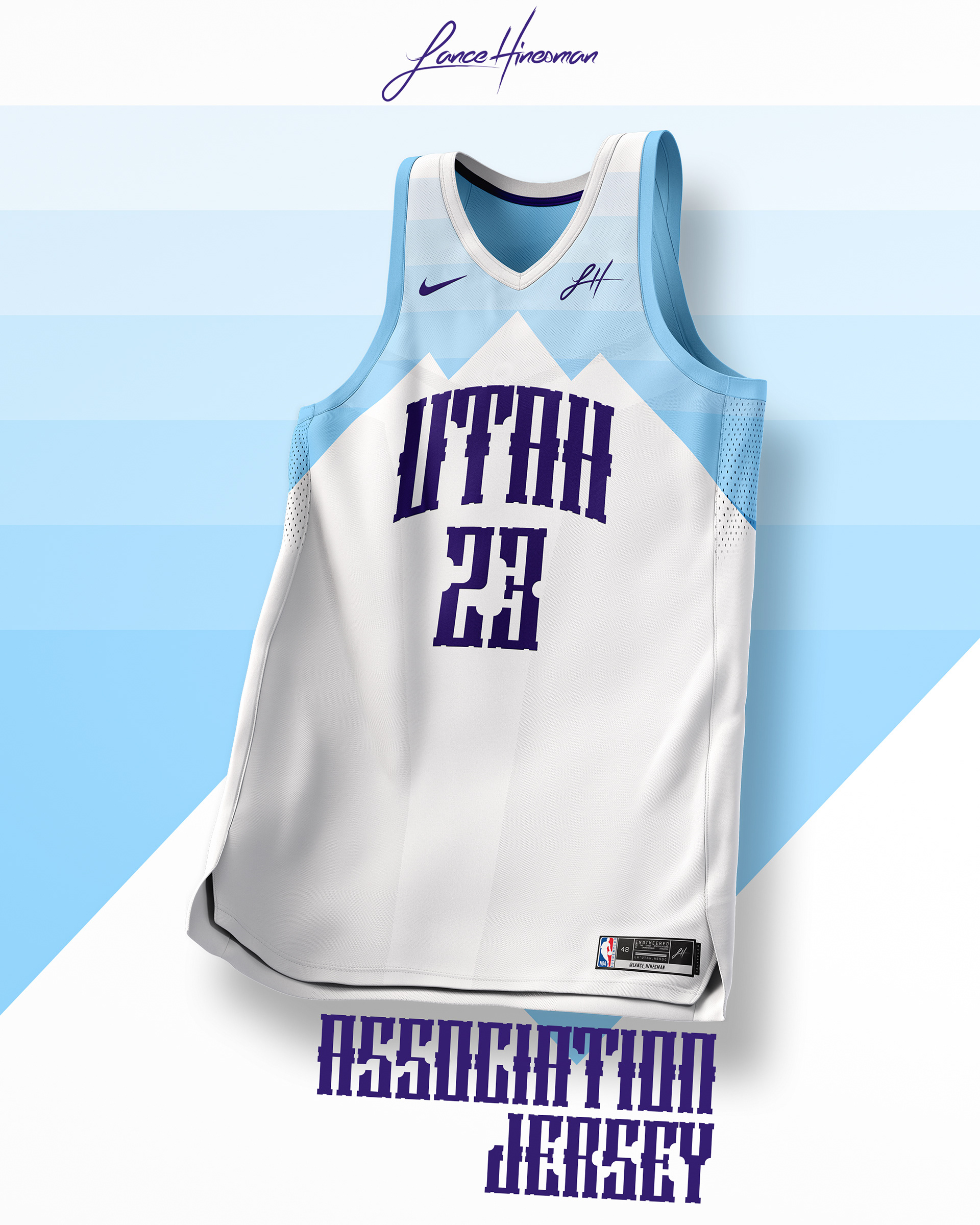
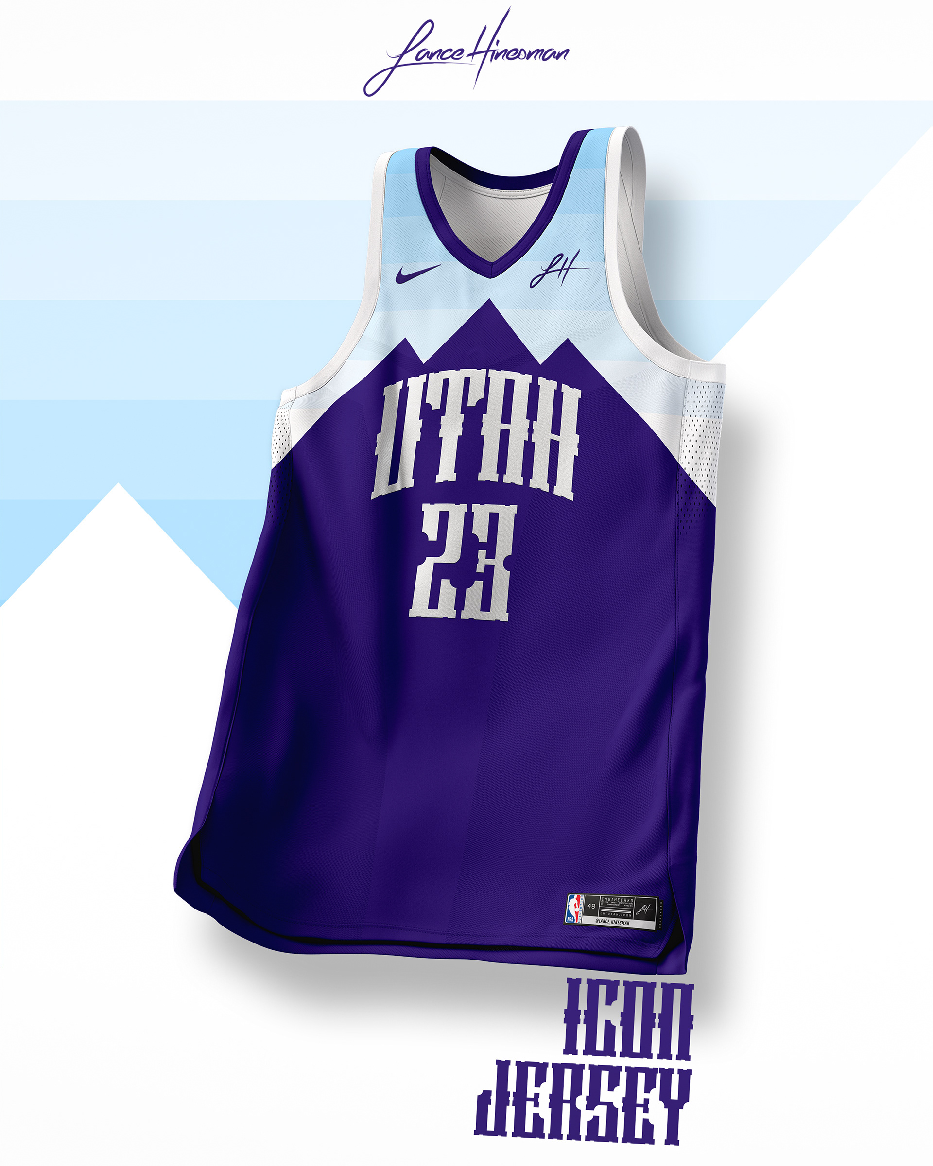
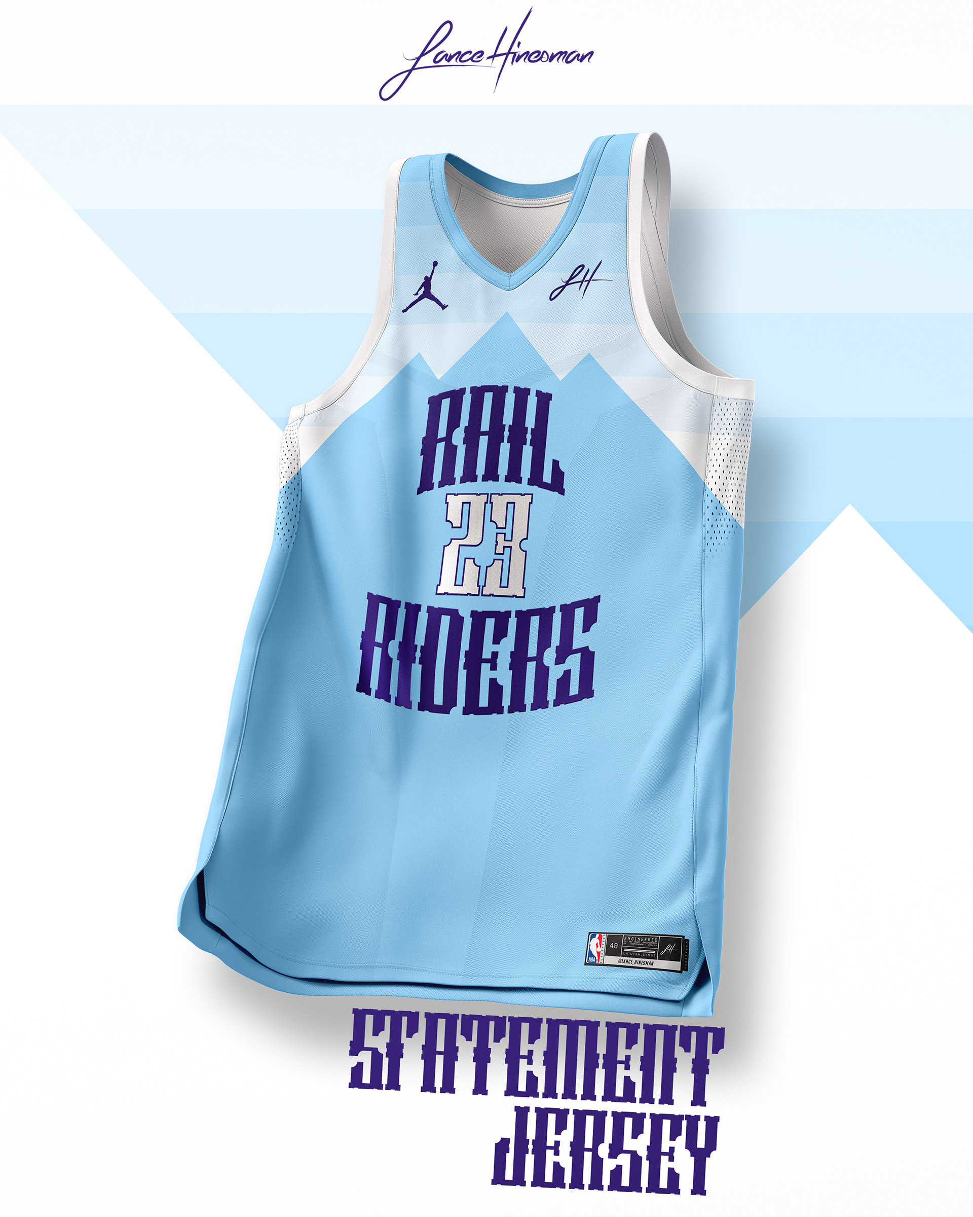
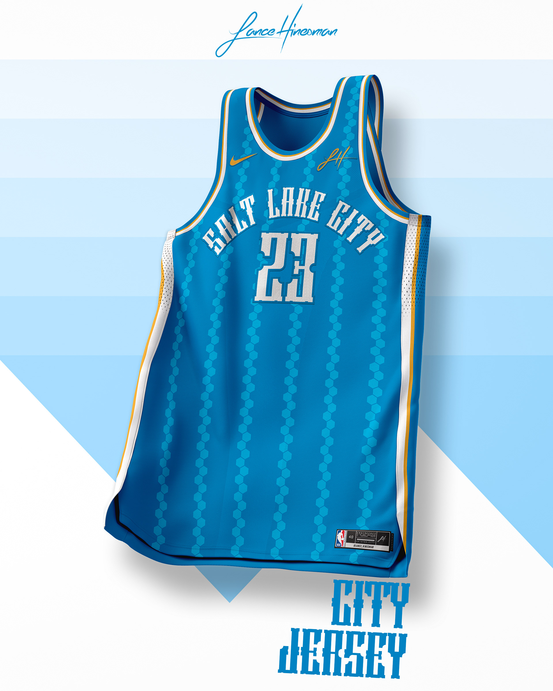
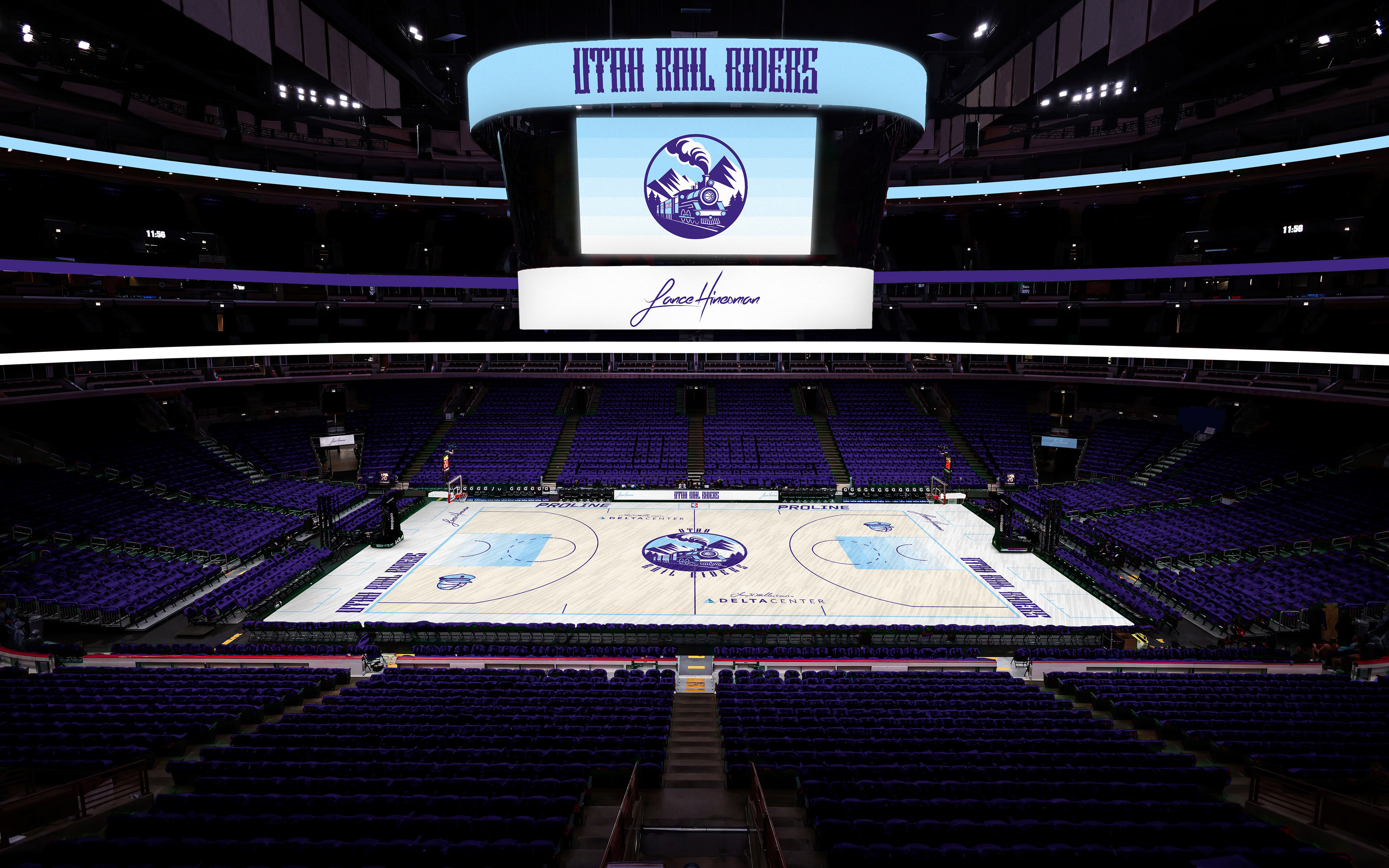
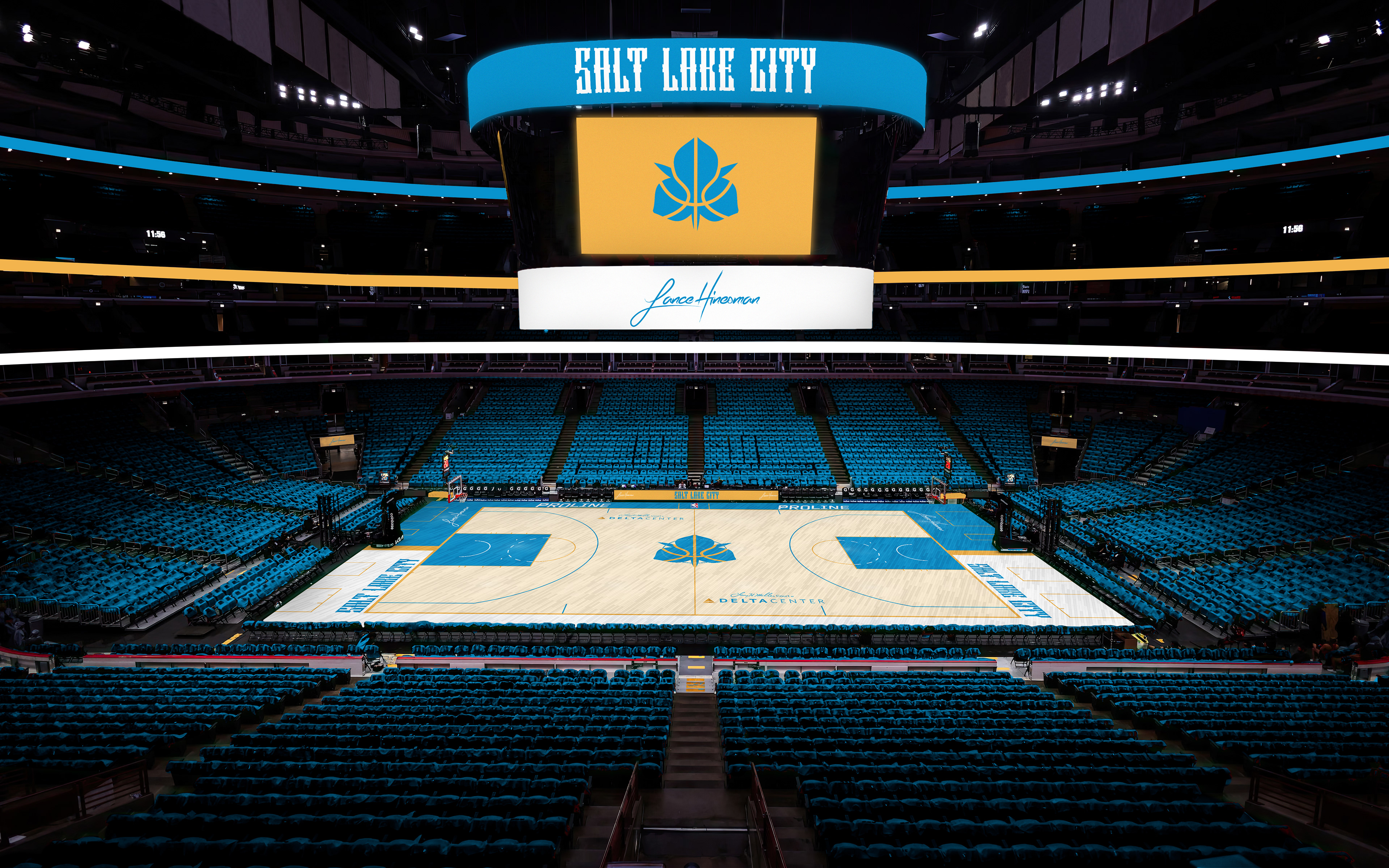
With the 'Jazz' name being returned to New Orleans, Utah needed a new identity. The Rail Riders get their name from Utah's involvement in the completion of the Transcontinental Railroad. The logo itself has a more retro feel while the jerseys are sleeker, borrowing the block gradient element from Utah's old city jerseys. This city jersey takes inspiration from both SLC's flag and Utah's nickname, the Beehive State.
Washington Wizards
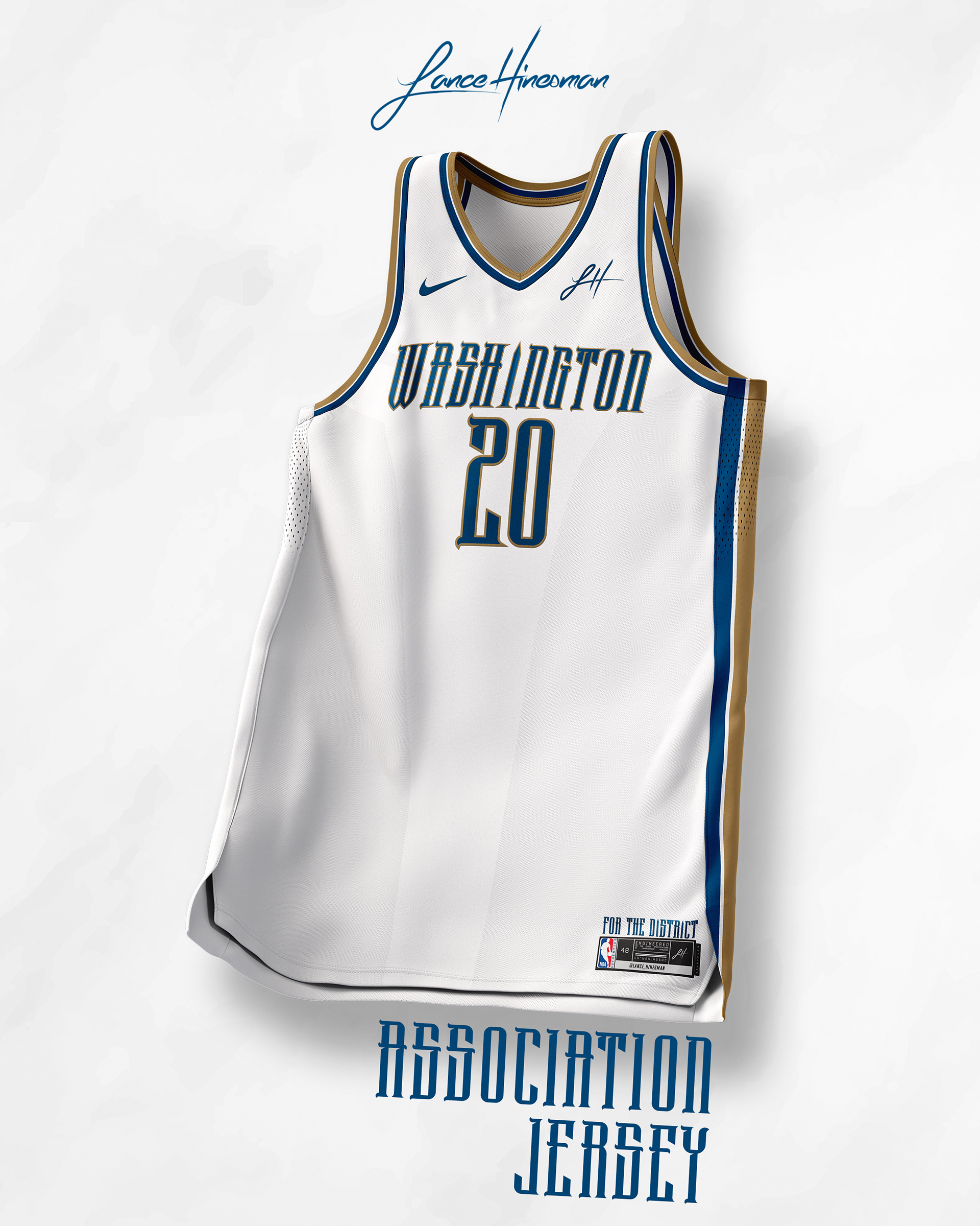
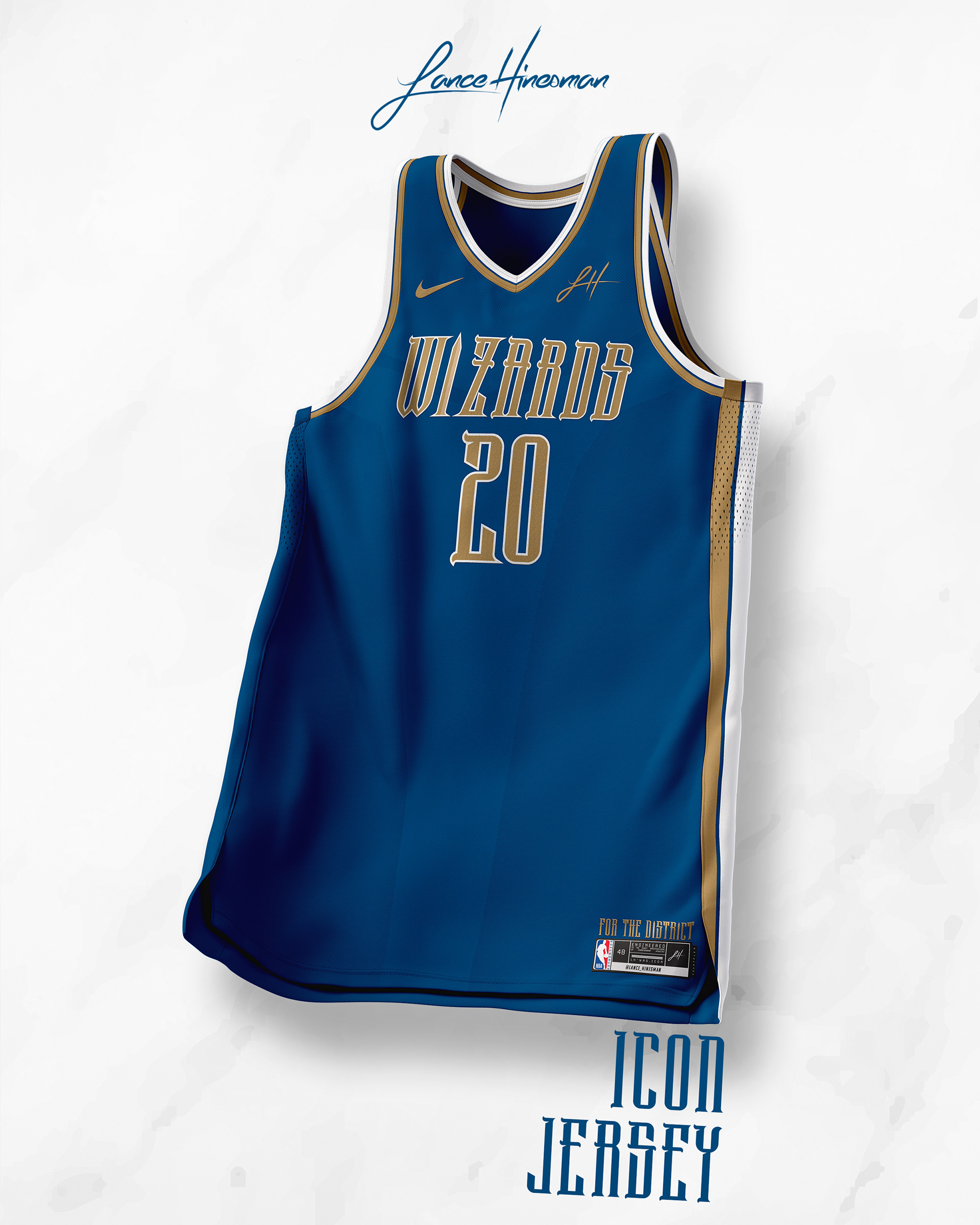
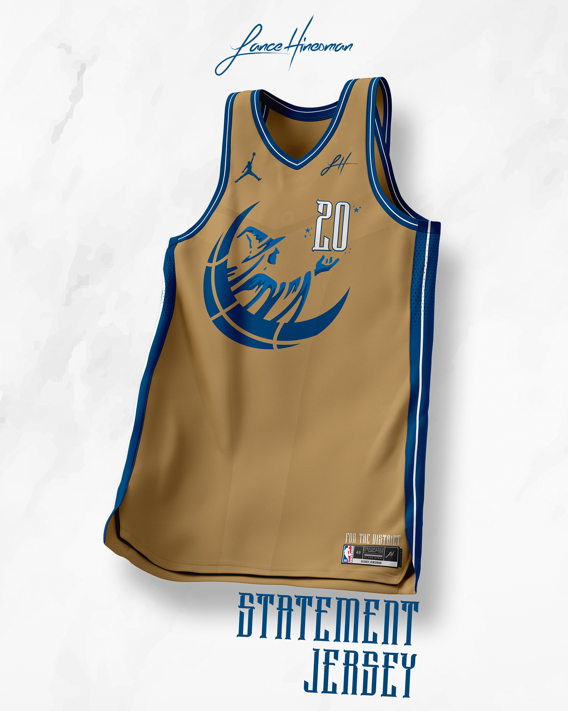
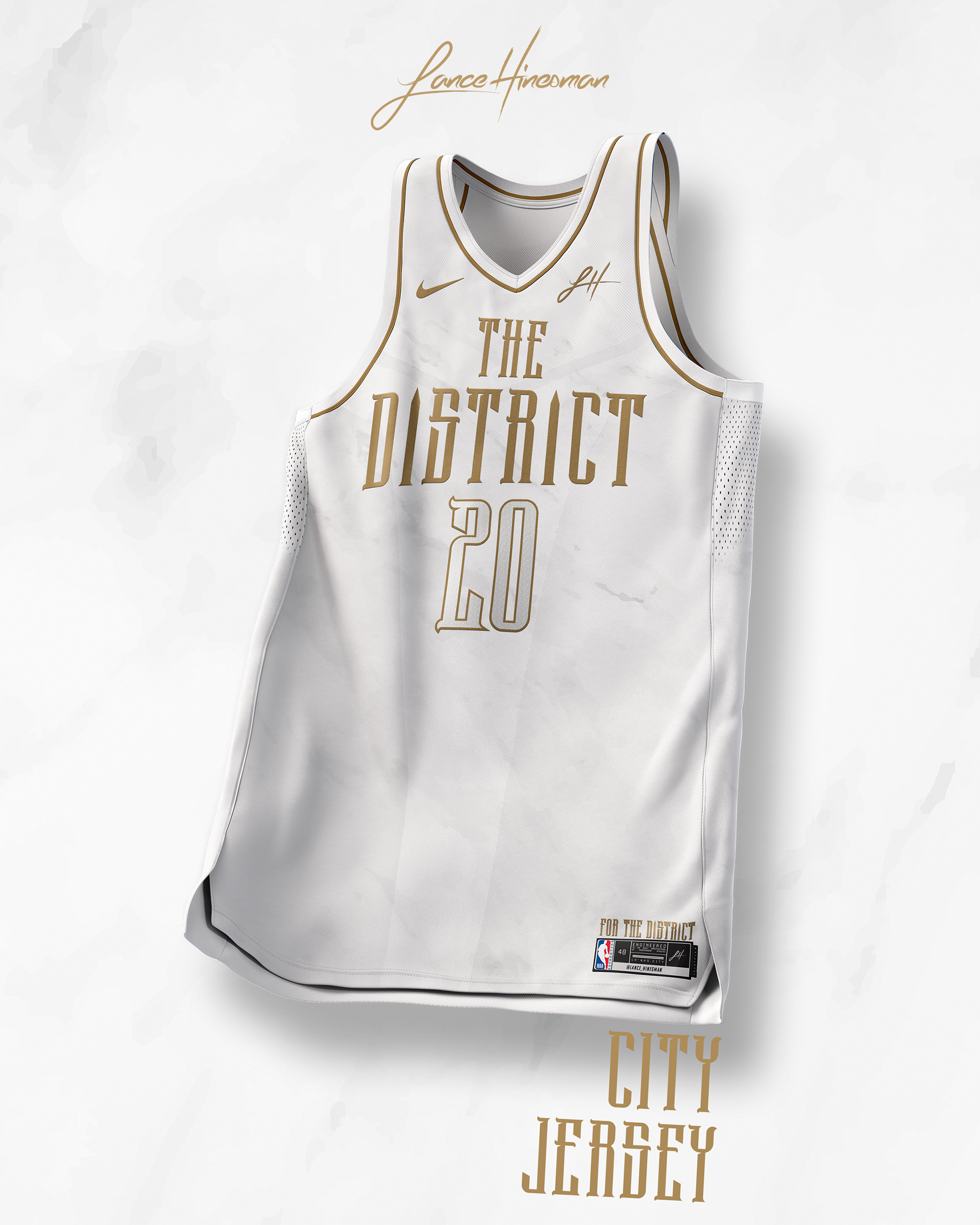
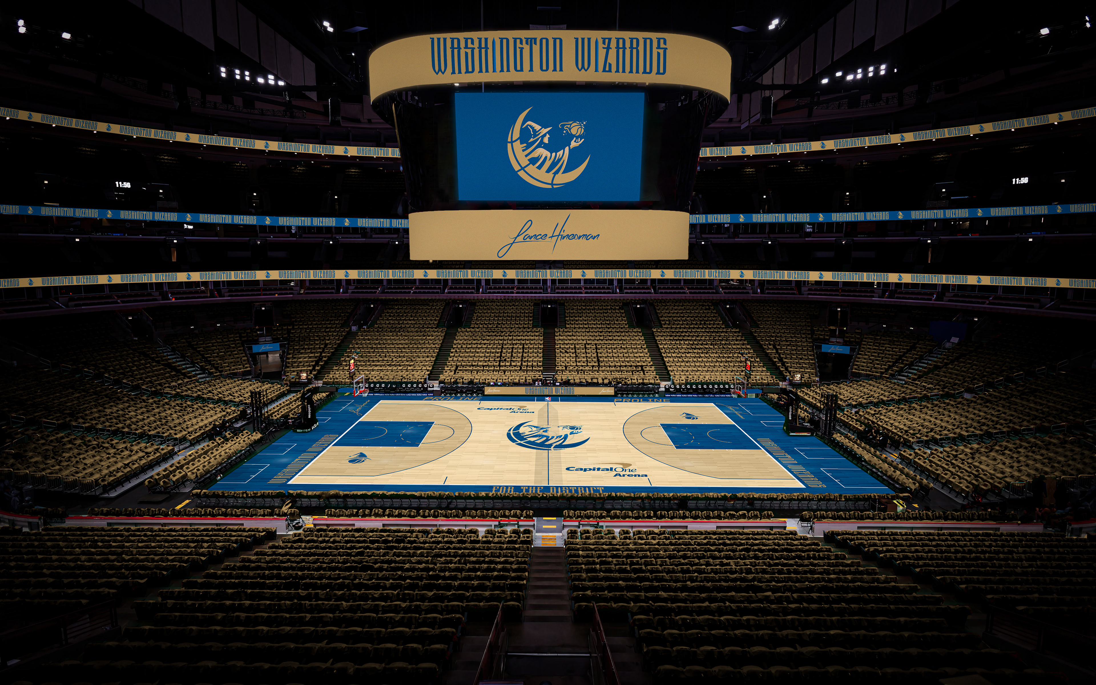
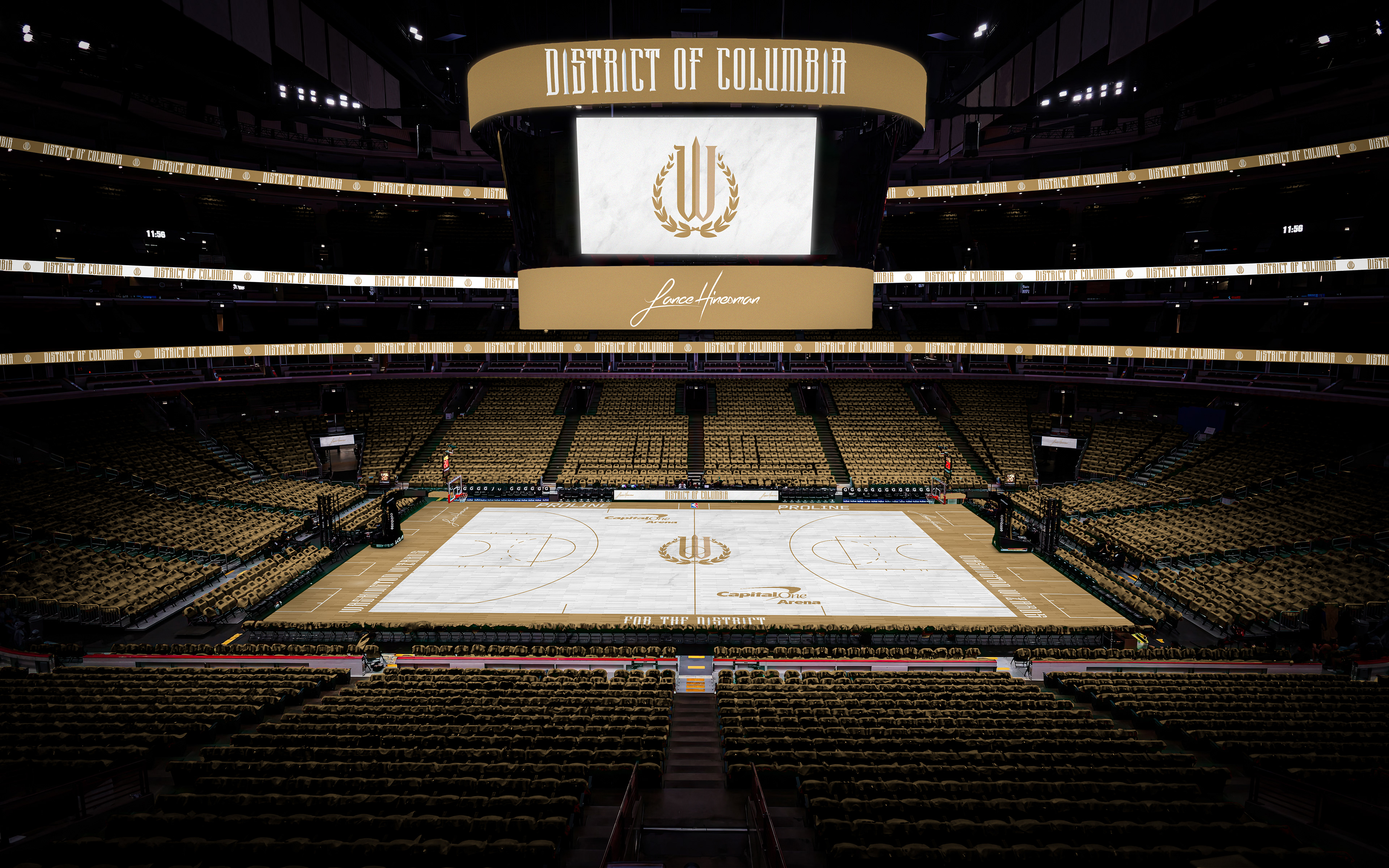
The Wizards' older branding inspired the core of this one. With those old colors, I made a new wordmark and logos to match. The City Jersey and court has a marble base for the material that makes up most of DC's statues.
All-Star Weekend
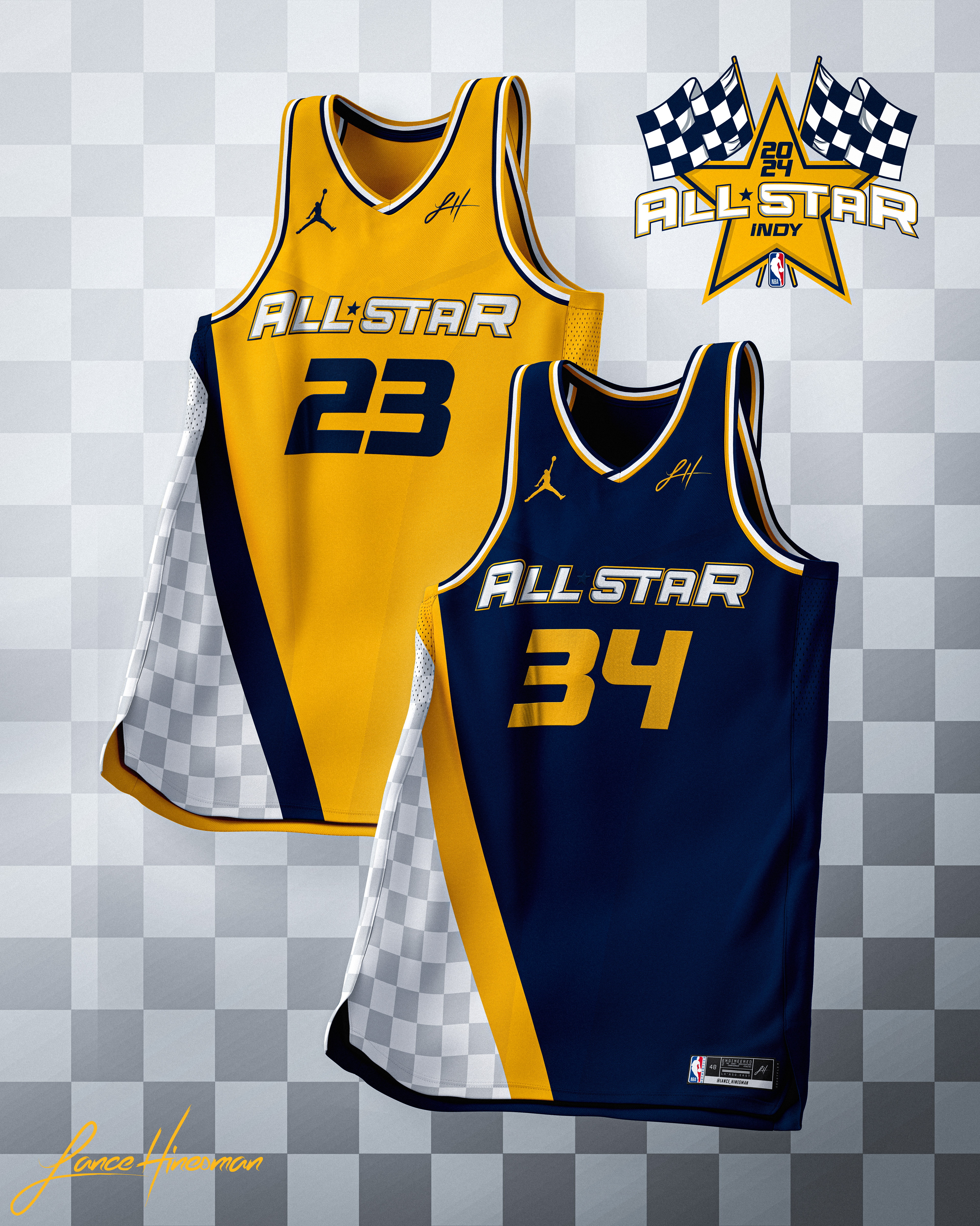
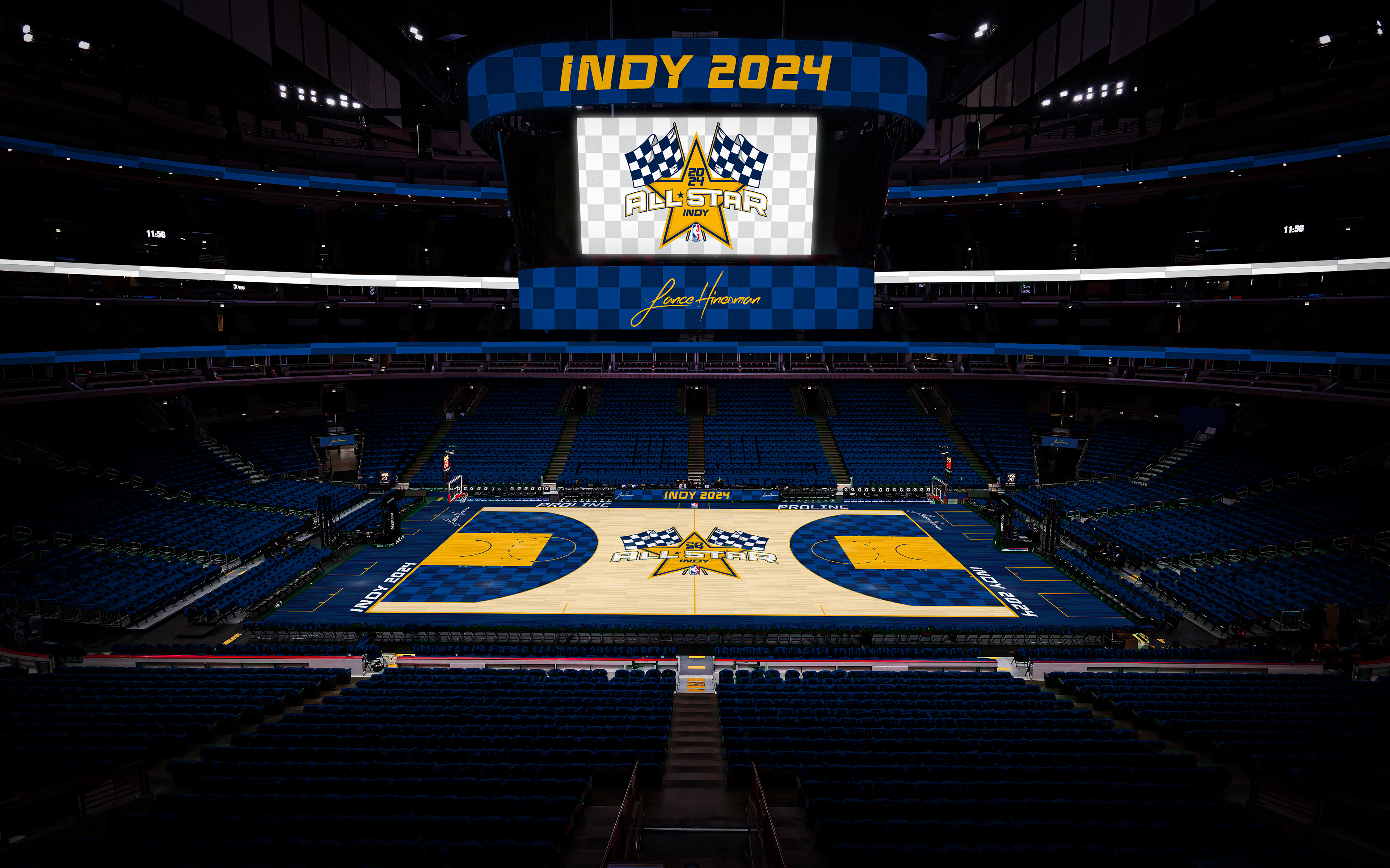
In the lead up to All-Star weekend, I decided to pause the team redesigns to create one for ASW. For the last few years, the NBA has foregone any originality in their All-Star branding and I wanted to bring that back. I kept the design similar to the Pacers one, with uniforms that pull on Pacers’ jersey history, and a bolder court.
Team USA
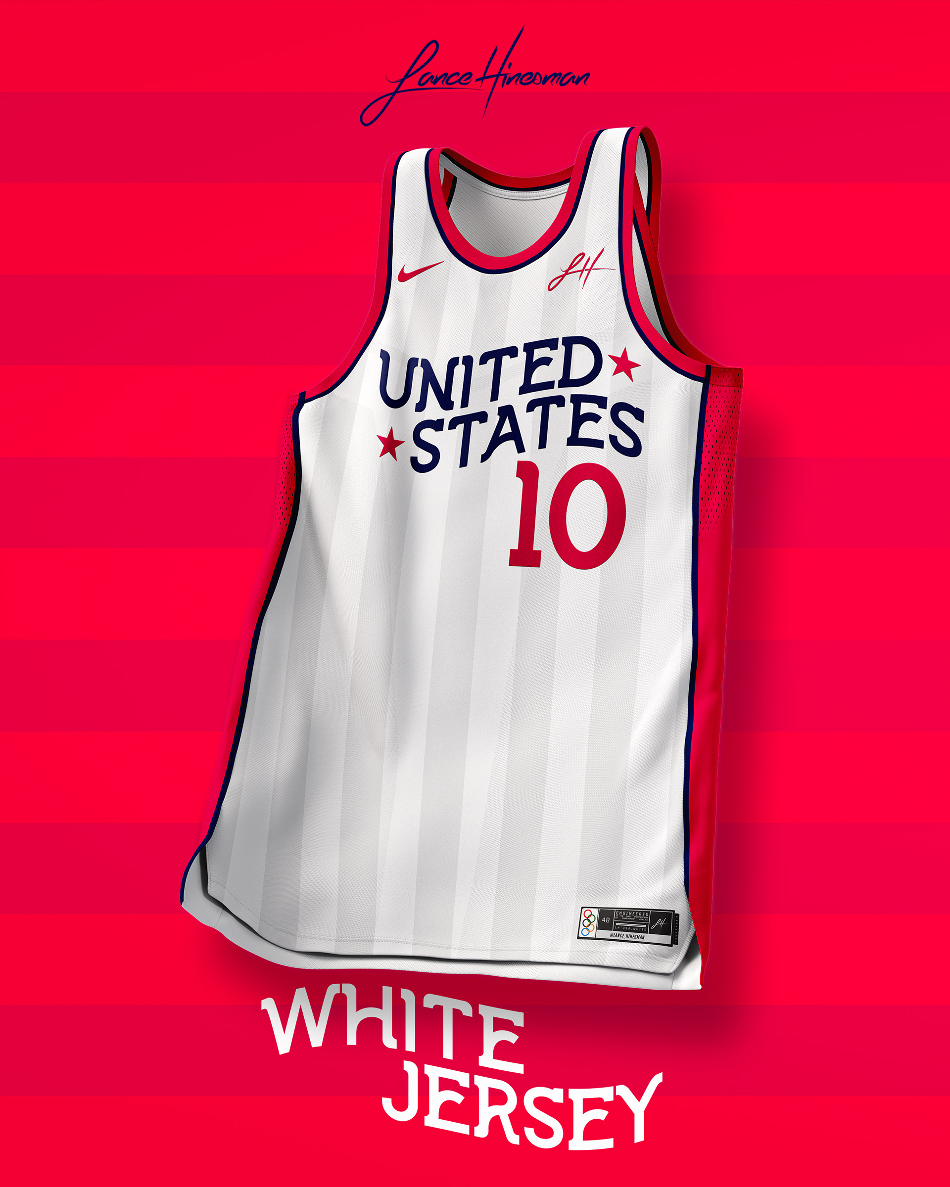
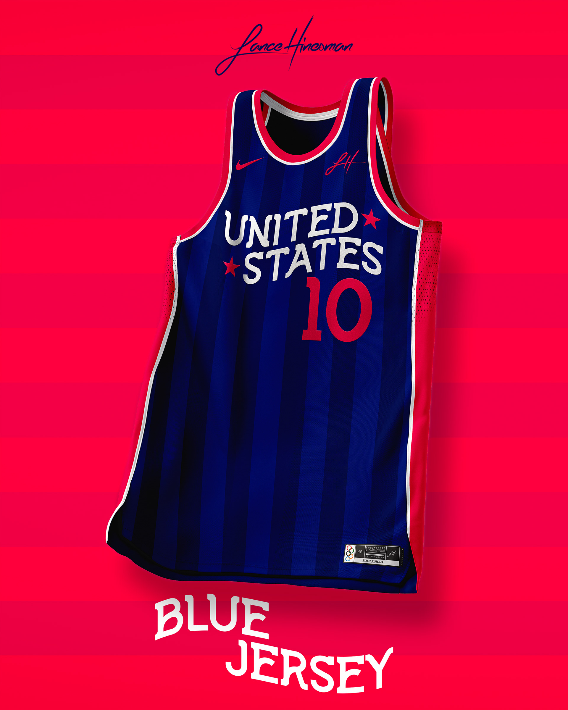
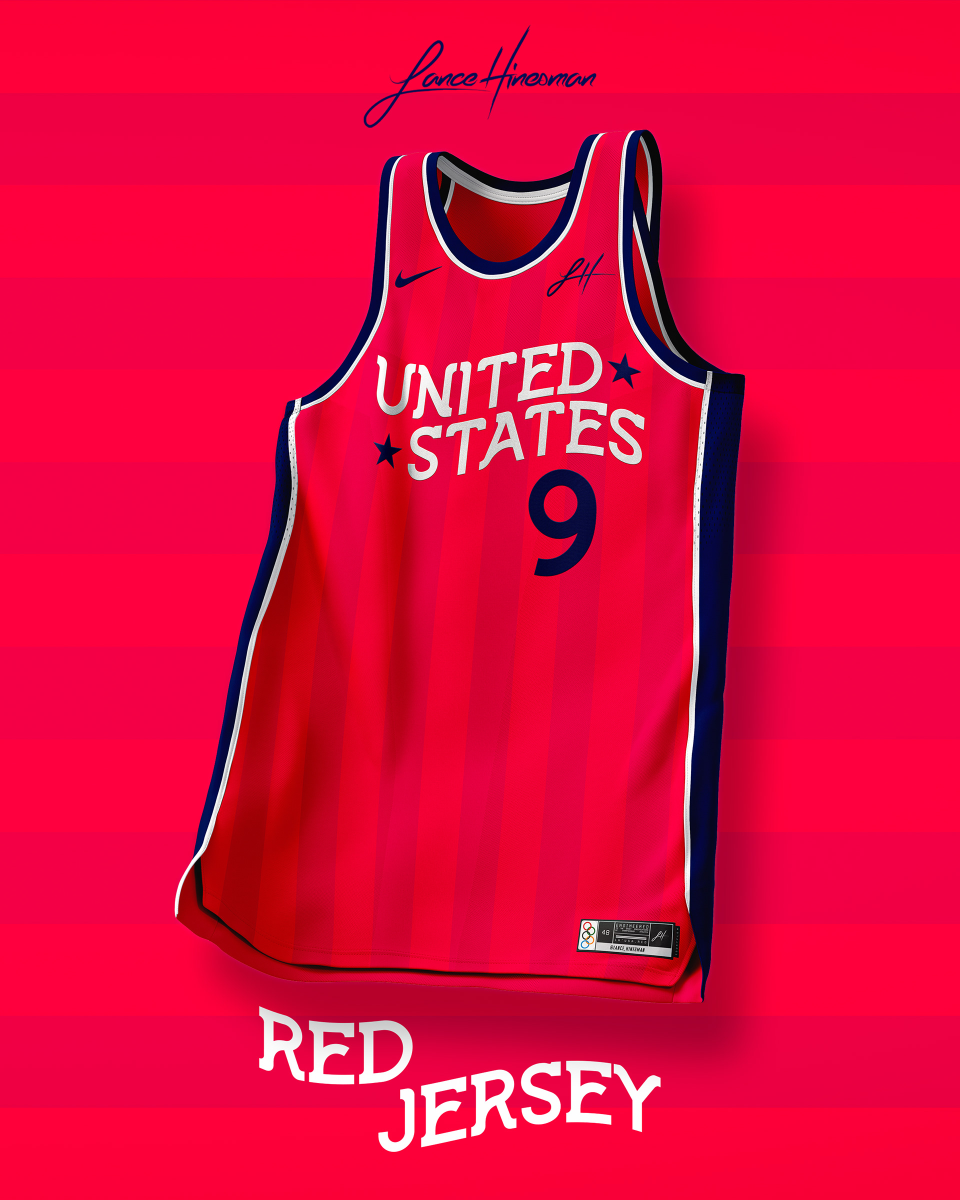
While not technically part of the NBA, I wanted to ring in the Olympics with new concepts for Team USA. I deviated from the traditional 'USA' wordmark and used a flowing text style. In the background is a subtle 13-stripe pattern as well.
